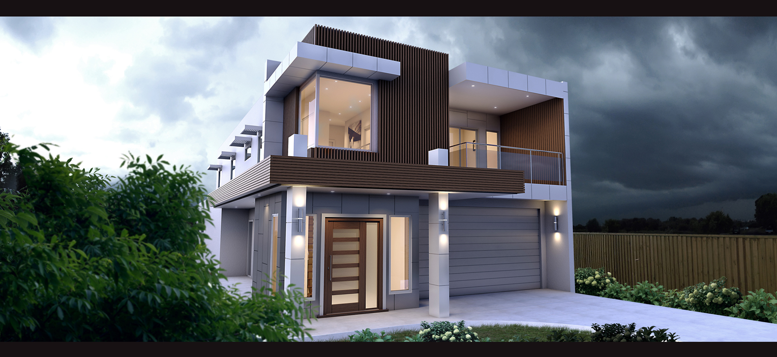
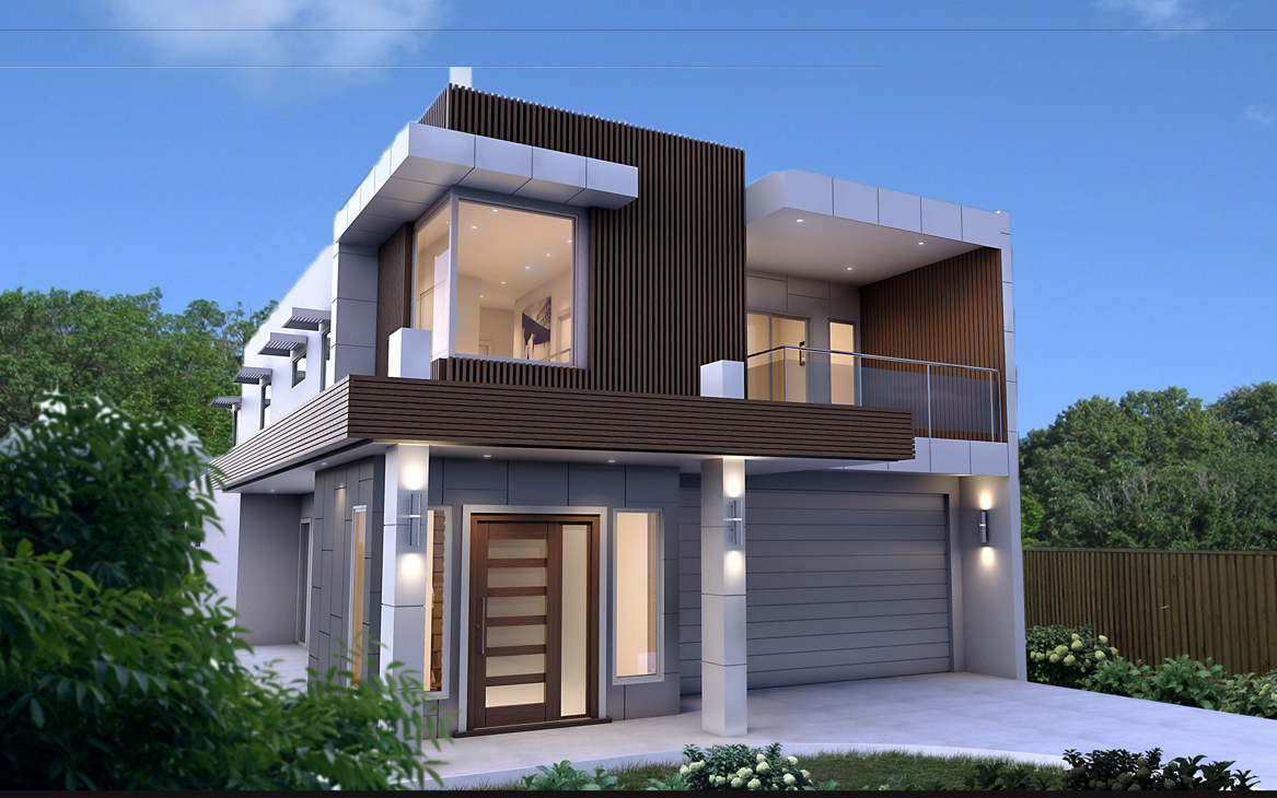
New render (External House)
-
Hi guys
Just a new render i did using SU and Vray - comments are welcome thanks
lighting can do with a bit more work but again i was pressed for time....

-
Nice, I really like the design. One comment - I think the background on the right is too foreboding and stormy, it gives the image an uneasy feeling. Especially in contrast with the bright left half. Maybe get a more even background that doesn't have as much drama.
-
thanks Andy - appreciate the feedback... only problem is, im limited with the sky background of good quality... i got that from cgtextures and they only have a limited amount... any ideas where i can get some others?
-
I actualy like the impending storm. But I am not a normal human. I think andybot is correct in suggesting a less foreboding back drop.
The best place to get backgound images in my opinion is outside in the real world. Take your camera for a walk.paul

Hope you don't mind...I just grabbed your image and threw an image in the background that I took with my cheapy digital camera as an example
of how real world shots can work. Granted the lighting of the image does not match your render, but if you go hunting in your own area at the right time of day in the right neighborhood for your needs you will end up with a pretty convincing back drop.This place looks like it would have a neighbor so if it were me I would be tempted to maybe show just a little bit of a neighboring home in the distance and maybe a power line or some other "normal" neighborhood item to add realism.
One more thing I would say...actualy two more things I would say. I would move a little further away from your building to show a little more foreground and a little more sky above. It feels a little squeezed. Moving back may also help a little with the verticals. The building feels like it is falling away from the viewer. Straightening up those verticals would help I think.
Now...I am done.
Did I say nice job?
Nice job.
p
-
@pmolson said:
I actualy like the impending storm. But I am not a normal human. I think andybot is correct in suggesting a less foreboding back drop.
The best place to get backgound images in my opinion is outside in the real world. Take your camera for a walk.paul
[attachment=0:2vff31vk]<!-- ia0 -->SUadjusted.jpg<!-- ia0 -->[/attachment:2vff31vk]
Hope you don't mind...I just grabbed your image and threw an image in the background that I took with my cheapy digital camera as an example
of how real world shots can work. Granted the lighting of the image does not match your render, but if you go hunting in your own area at the right time of day in the right neighborhood for your needs you will end up with a pretty convincing back drop.This place looks like it would have a neighbor so if it were me I would be tempted to maybe show just a little bit of a neighboring home in the distance and maybe a power line or some other "normal" neighborhood item to add realism.
One more thing I would say...actualy two more things I would say. I would move a little further away from your building to show a little more foreground and a little more sky above. It feels a little squeezed. Moving back may also help a little with the verticals. The building feels like it is falling away from the viewer. Straightening up those verticals would help I think.
Now...I am done.
Did I say nice job?
Nice job.
p
Nice tip Pmolson - I didnt even think of that... so much easier than scouring around the net trying to find something fitting... simple solutions are always the best as they say

In regards to the vertical lines, i should have fixed those in photoshop using the lens correction... hard to remember all this when i do post pro lol
thanks for the feedback! Working on a similiar house which will be built near this one... ill post it here when done
Hello! It looks like you're interested in this conversation, but you don't have an account yet.
Getting fed up of having to scroll through the same posts each visit? When you register for an account, you'll always come back to exactly where you were before, and choose to be notified of new replies (either via email, or push notification). You'll also be able to save bookmarks and upvote posts to show your appreciation to other community members.
With your input, this post could be even better 💗
Register LoginAdvertisement


