New project
-
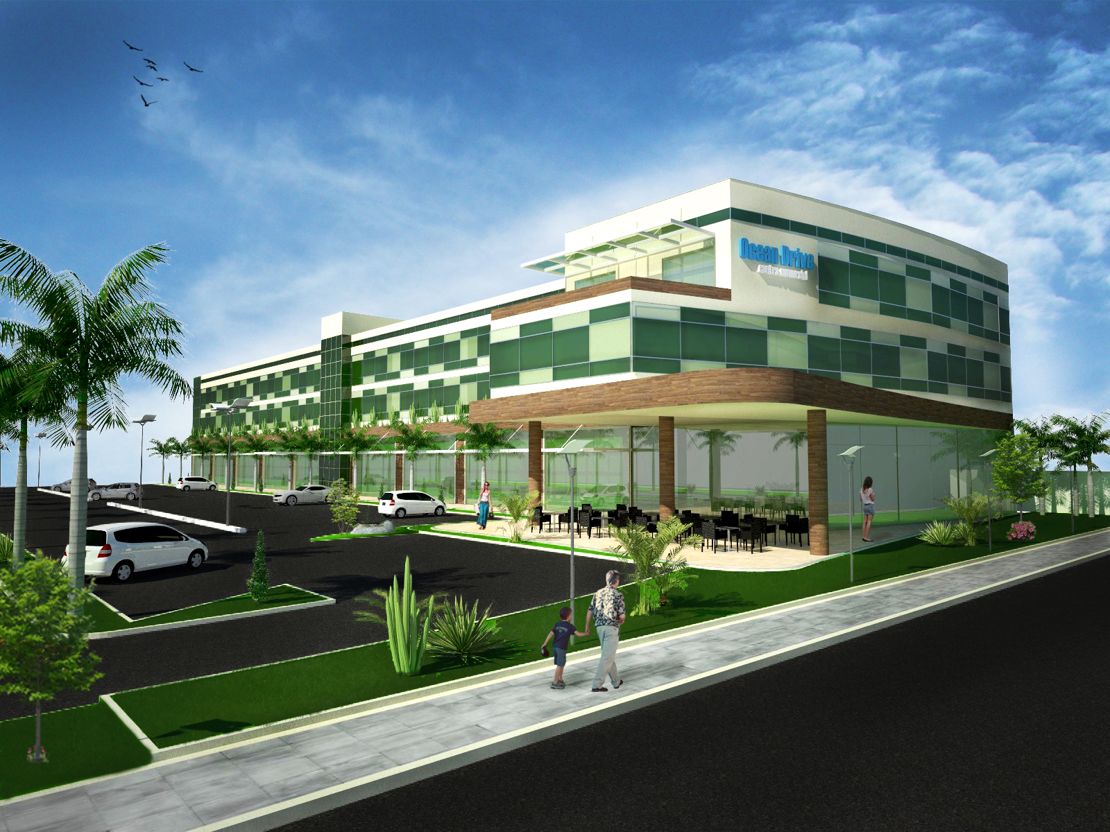
This is a new project im working on.. still a test image
Criticisms are welcome!


-
I think some creative cropping is needed, bring the birds down and try 16/9 maybe even rotate the view a touch. The tarmac texture is too flat and un-interesting also the hard horizon at the rear left is distracting. The Building itself looks well modelled and interesting however with this (retail?) scenario you have to dress the interiors behind all that glass. I know this problem it's a nightmare the client wants thousands of objects and people ! I got around this before by placing images of storefronts from google on planes behind the glass. At this range no one will realize and it will help colour up the area. Also a bit more love parking spaces, different color cars etc etc.I would also suggest an eye level view. What render engine did you use ?
chedda
-
Thank for the reply!
?I really havr trouble with the asphalt.. always!

I use Sketchup + Vray + photoshop
I´ll try to crop the image. Thanks again
-
Come on, man, looking forward to your better works!
-
Hi llonghi,
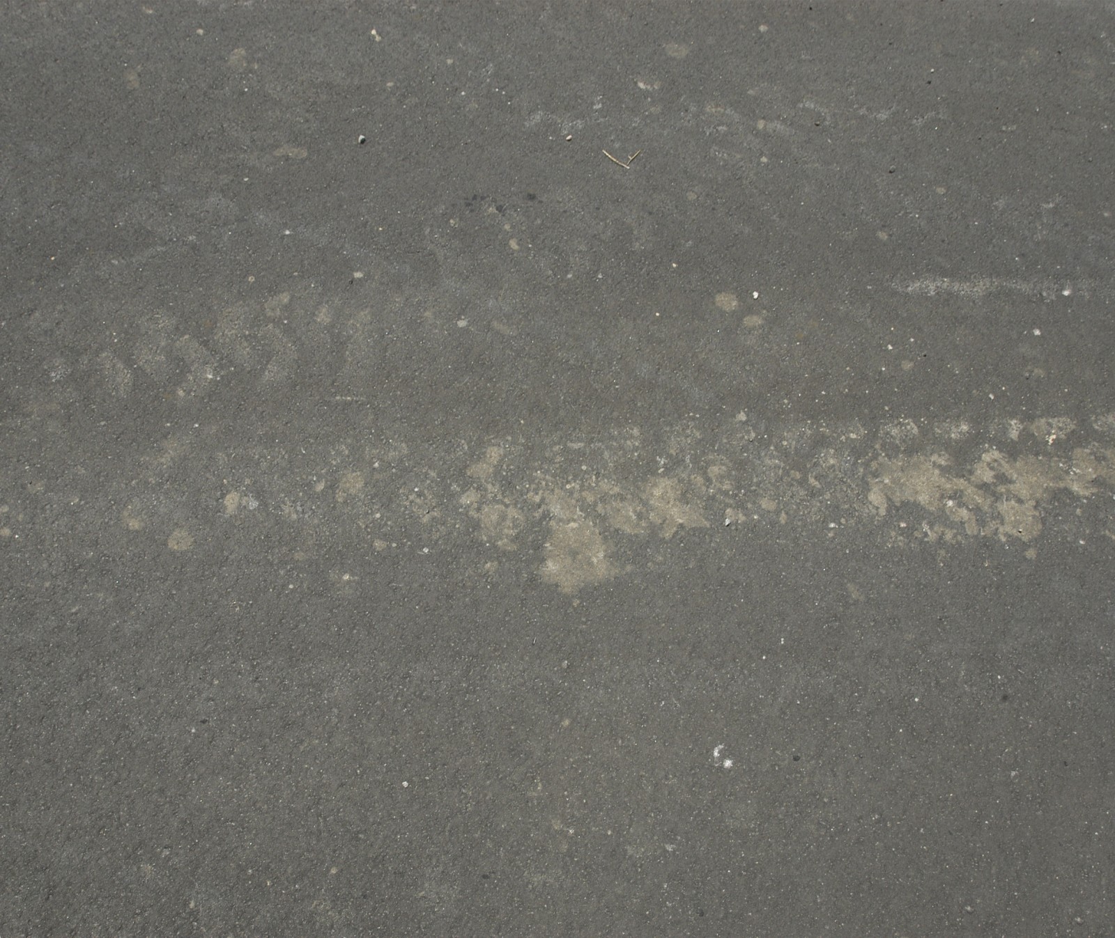
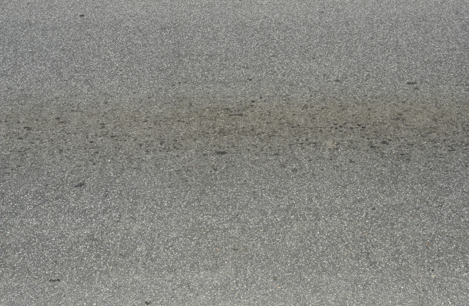
Glad to share with you and other these asphalt textures i found somewhere on the web but can't remember where....
Hope that help.


-
Looks not too bad

- the plants in the foreground should be better quality, have better shadows (at least the strange tree down left), not have flowers around their trunk, try to merge them better to the green (later in PS)
- think of if you really want to have these plants there as is look a little arbitrarily (like one little leftover conifer next to the palm and such
 )
)
(as it's te foreground it's of much importance to have sth. good there- or just leave it nice lawn with eg. some shrubs to the right) - leave that wall on the right side if it's not part of the concept and add background to the left and the right
- desharpen edges (eg. of the canopy corner) with bevel plugin, they are too sharp
- the sacling of the woman to the right is incorrect i guess
- use an AO (ambient occlusion) pass from Vray to add later in PS
- render a MaterialID pass to better select certain areas in PS (glass facade, street, lawn) and add textures multiplied or set to transparent to these areas in PS
(adds realism, varity, give little dirt to certain areas eg. like where the pillar meets the ground) - i personally would leave that glow around the building
- don't use such a strong green in the lawn as you want to draw attention to the building
- rotate the palms to have variation
- desaturate the very blue sky a bit to smooth it little
- other good critics already mentioned

Good textures can be found at cgtextures.com
Good luck

-
In addition to the above comments, I'll offer some advice from a former professor in regards to presenting retail designs: Show more people. Your client does not want to spend a fortune developing a project only to see it empty.
Hello! It looks like you're interested in this conversation, but you don't have an account yet.
Getting fed up of having to scroll through the same posts each visit? When you register for an account, you'll always come back to exactly where you were before, and choose to be notified of new replies (either via email, or push notification). You'll also be able to save bookmarks and upvote posts to show your appreciation to other community members.
With your input, this post could be even better 💗
Register LoginAdvertisement


