Last work
-
Hi guys, all the best in 2012.
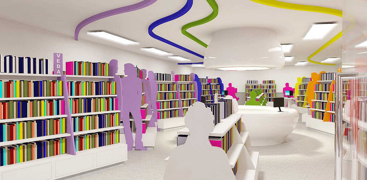
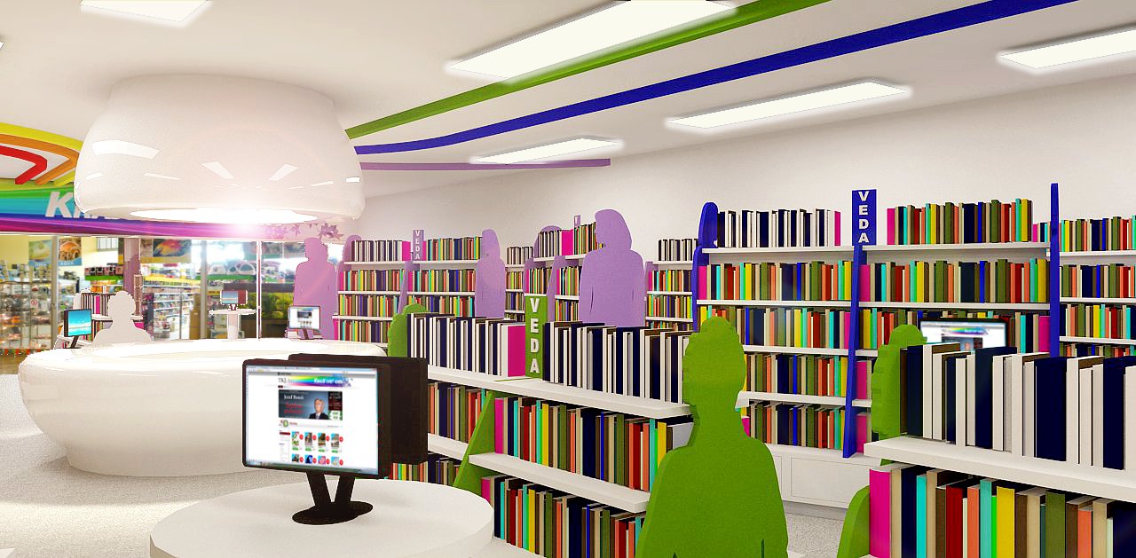
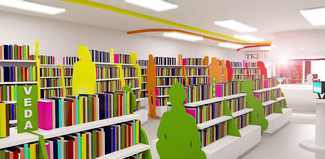
This is my last work. Just finished the post pro. It's concept for book store (focused on youth clients). comments and critics welcome.
Modeling done by Erik ( my co worker) in SU 8free, final touches by me in Vray and Gimp.
-
@tomankubik said:
Hi guys, all the best in 2012.
This is my last work. Just finished the post pro. It's concept for book store (focused on youth clients). comments and critics welcome.
Modeling done by Erik ( my co worker) in SU 8free, final touches by me in Vray and Gimp.please some critics will be great to push me forward
-
Hi.
Kind of a nice idea to use figure profiles as end panels for the bookcases. Does double duty as "entourage" for the model scene. Nice lively colors. Conveys the concept quite well. I understand the use here of non photo real books.
Good work, the both of you. -
@mitcorb said:
Hi.
Kind of a nice idea to use figure profiles as end panels for the bookcases. Does double duty as "entourage" for the model scene. Nice lively colors. Conveys the concept quite well. I understand the use here of non photo real books.
Good work, the both of you.thanks alot
yes we used book components from warehouse, I know that its not photoreal but to bring the books to be real is alot of work and we were not able to do it now, we started whit brainstorm about the design around 1pm and after 10 hours we had these 3 images -
Generaly very cool, cannot make out what material is on the floor. I think the coloured people do not work, they confuse the whole thing. They look like public art and make the colour scheme 'pop' to much which makes the interior dificult to read. I would suggest a more nuetral abstraction for them.
Good luck

-
It's a nice design for a bookstore that caters to the younger crowd. I used to love to browse in bookstores, but it's been years since I've even been in one. I still read a lot, but I get all my books from Amazon now, much cheaper and easier to find what you want. Is this a design for an actual bookstore that might be built, or just an exercise? The reason I ask is that most of the local bookstores here have been put out of business by online stores, and from what I've read it's pretty much the same everywhere. And it would seem that this would be especially true for the younger crowd, who tend to do everything online. Sign of the times I guess.
One question - what is the "bathtub" shaped thing under the light? -
@steved said:
Generaly very cool, cannot make out what material is on the floor. I think the coloured people do not work, they confuse the whole thing. They look like public art and make the colour scheme 'pop' to much which makes the interior dificult to read. I would suggest a more nuetral abstraction for them.
Good luck
to steved: thanks alot your your crits. the floor should be made out of vinyl flooring (honestly I'm not very satisfied how it looks on renders but wasnt able to work on that material more, maybenext time)
The "people" in combination with the colored lines on celing should work as a navigation system, each color represents genre of book, but I do agree that they look "too much" I will wait what client will say a nd maybe this will end up in trash -
@hellnbak said:
It's a nice design for a bookstore that caters to the younger crowd. I used to love to browse in bookstores, but it's been years since I've even been in one. I still read a lot, but I get all my books from Amazon now, much cheaper and easier to find what you want. Is this a design for an actual bookstore that might be built, or just an exercise? The reason I ask is that most of the local bookstores here have been put out of business by online stores, and from what I've read it's pretty much the same everywhere. And it would seem that this would be especially true for the younger crowd, who tend to do everything online. Sign of the times I guess.
One question - what is the "bathtub" shaped thing under the light?thanks for opinion. well this should be the protoype of a bookstore for a big distributor of books in my country. The idea is to make the youth read again and have "cool"shop where they can find the book, to have there computers connected to online bookstore, to have place where they can meet and comunicate but not to stay for long /to read a book in store isnt very economical for seller/ also in my country lot of people use to buy things via internet but they are still looking for the store to have the feeling of a book /or anything else/. therefore the concept of such a bookstore should be something like fastfood for books and not the cofetery. the bathtub thing is the cashdesk and info place when you need to pay or have some question.
-
I like the silhouette concept, but the rest of it is too sterile for me. I would not want to spend much time browsing there, and I certainly would not want to sit down and read anything...it reminds me of a elementary school library.
I like book stores with lots of wood, leather chairs, brass fittings, etc. Maybe it's because that is what I'm used to since it's been the standard design motif.
It is a nice render though, and clearly communicates the idea!
-
@tomankubik said:
thanks for opinion. well this should be the protoype of a bookstore for a big distributor of books in my country. The idea is to make the youth read again and have "cool"shop where they can find the book, to have there computers connected to online bookstore, to have place where they can meet and comunicate but not to stay for long /to read a book in store isnt very economical for seller/ also in my country lot of people use to buy things via internet but they are still looking for the store to have the feeling of a book /or anything else/. therefore the concept of such a bookstore should be something like fastfood for books and not the cofetery. the bathtub thing is the cashdesk and info place when you need to pay or have some question.
Please accept this criticism as constructive, (as that is how it is intended) as it may seem quite critical.
First of all I am a bookstore haunter. I go to bookstores in every city or country I travel to, whether or not I can read the language is no matter, bookstores have a fascination to me.
So when i first looked at your images, I thought that the intended market was younger children, and therefore their parents, not youth, and probably one that was intended to be in a department store or at least be aiming at a market similar to stores such as "Gap". This was just a first impression, before I read any text.
I would like to understand the context and program for the choices made re: colors and shapes in this design, that would make this design appeal to youth. Are the colors linked to wayfinding?
Is there a primary youth demographic that you are intending to appeal to? By this I mean that the youth niche market stems from Gap to Goth to Metal, and beyond. Has your client done any market research on their demographic and provided it to you?
I ask these because I think that their premise in the quote I attached is dead wrong, and I am going back to my bookstore haunting observations alone in this comment.
The bookstores that I see that have large youth components, nearly always have coffee shops. I am not referring to the North American chain bookstore combinations like Chapters and Starbucks, but the smaller owner run bookstores that have to compete against these. These quite often look like the coffee area may be run by a separate party on a leased basis, but the one thing that makes them seem appealing is there is no separation between these spaces.
If you sit in one of these spaces you will notice that the workers in both "stores" are young, and the clientele is usually also young. They usually are somewhat bohemian in design and decore, and are totally connected to youth culture with notice boards and posters connecting the clients to concerts, workshops, and other pertinent events.
They usually have their own workshops and readings.
And I am always amazed by the number of books I see leaving the store in their hands.
If I were you I would have your client re-think this approach by challenging them to do some market research. Present the images you have created, and one of one similar to the one I have described, and go to where the youth are and ask them which they would prefer.
Again this is written with the best intentions in mind, as I don't think that there is anything wrong with your design as such, I think that you have been given the wrong context. If you really want youth to read, as opposed to up the volume of sales, then give youth a place where they really want to be.
Cheers. -
Special nice design. Nice works!
-
Toman, you didn't specify what the age group is for the youths. For children, I think it's a bit too sterile, and I wonder if the people silhouettes aren't too abstract for them. Every bookstore (or area) I've seen that caters to children is filled with colors and cartoon images. I think the concept might appeal to teenagers, however. I do think your falling into a trap, though, that a lot of designers do in that your ignoring point-of-sale - retailers are going to put up displays for sales, new merchandise, etc. If you ignore that during design, you might not be to pleased with the end result.
Hello! It looks like you're interested in this conversation, but you don't have an account yet.
Getting fed up of having to scroll through the same posts each visit? When you register for an account, you'll always come back to exactly where you were before, and choose to be notified of new replies (either via email, or push notification). You'll also be able to save bookmarks and upvote posts to show your appreciation to other community members.
With your input, this post could be even better 💗
Register Login


Advertisement