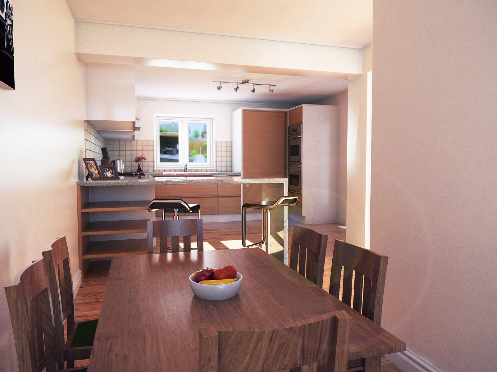
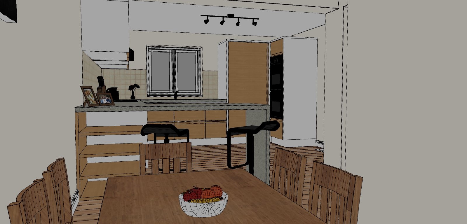
Kitchen render
-
Another render, this time part of a set of renders I am doing for a client.
Created using sketchup, vray and PS .
C & C welcome


-
That looks awesome!
My only slightly negative comments are:
The bowl of fruit - looks great, awesomely real, but it really attracts the eye. It is quite difficult not to focus on it so I would think about toning it down (or selling fruit)
the scene outside the window doesn't quite work. Because of the cool colours used and the contrast between that and the muted, warm tones of the kitchen itself, again it stands out. It is probably a desired effect to emphasise the warmth and comfort of the kitchen but it draws the eye a little too much. Could either tone it down a little, use warmer colours so as not to contrast as much or maybe think about curtains or something.
Note: I do landscapes and would not even come close to this level of realism for an indoor scene. Looks great
-
photographic reality!!!!!!!!!!!!!!!!!!!!!!!!!!!
-
simple yet great.. my only comment is the bakground from the window.. i am not sure what it is. but render setting is excellent.
-
Thank you for the comments, as for the the background view I think you are definitely right this needs to be improved. With all the PS it ended up getting a bit distorted.
Will try and do another revision over the next couple of days and post it on forum.

-
If these are just initial concepts, the images are fine. In the next phase of further development, I suggest either narrowing the table so the space will be more accessible, or widening the space. You might also add some supporting framework for the bar top so that it can span that ~105 cm without fracturing.
-
What's that outside the window? It improves the render to some extent.
-
great render and realism
 , the only thing that looks fake/photoshopped is the lens flare otherwise really good render
 -
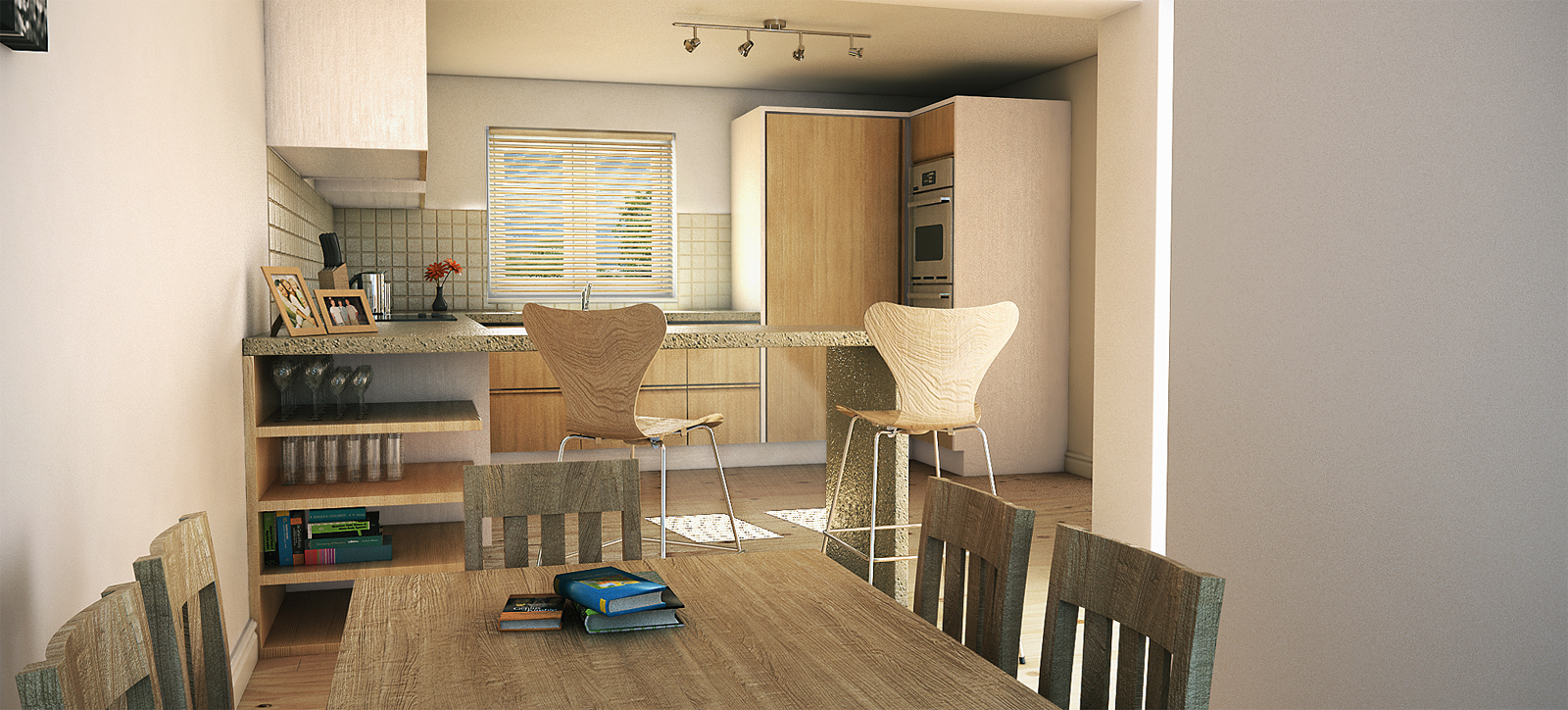
Been a while since last post, but here is my latest update.
As always C&C welcome

High res version:

-
This is great,but I would like to see more of the cabinets and one or two more perspectives.
--- joe -
Hi Joe, thanks for the post...currently working on different shots at the moments, expect something in the next couple of days.
-
i like the updated one more
nice
-
Thank you Mojtaba
-
nice render!

just put a lttle less bump on all your mats, the chairs and table for example look way too rough.
Hello! It looks like you're interested in this conversation, but you don't have an account yet.
Getting fed up of having to scroll through the same posts each visit? When you register for an account, you'll always come back to exactly where you were before, and choose to be notified of new replies (either via email, or push notification). You'll also be able to save bookmarks and upvote posts to show your appreciation to other community members.
With your input, this post could be even better 💗
Register LoginAdvertisement


