NPR attempt
-
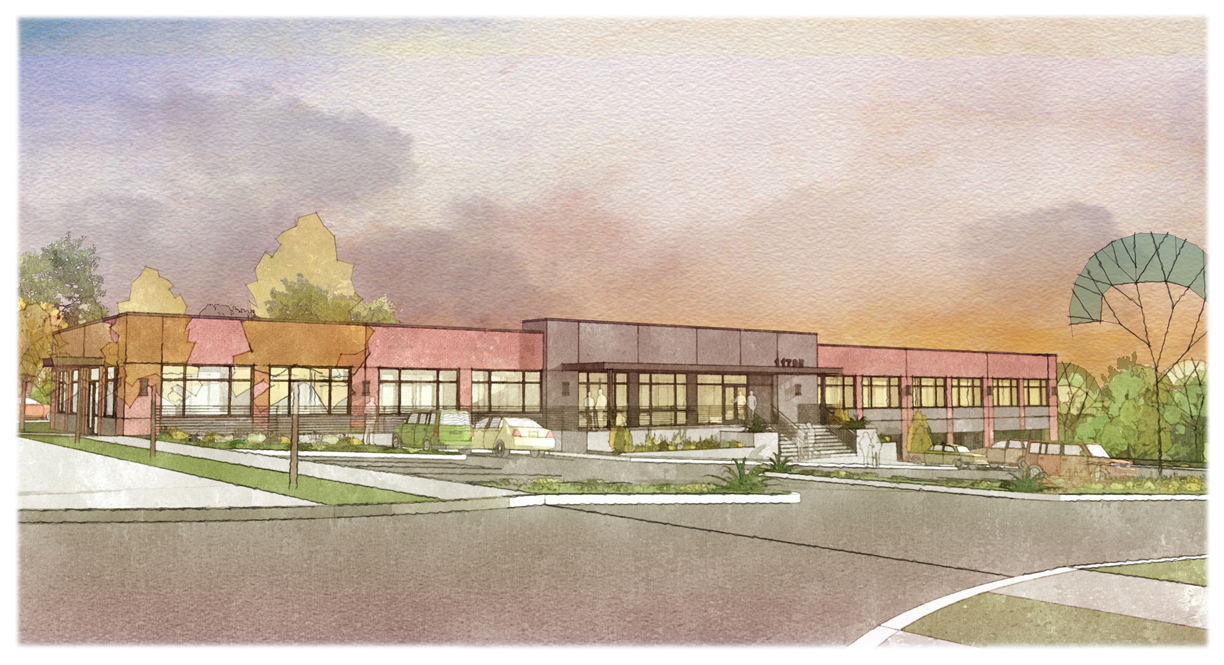
An attempt at NPR. Various_SU_styles>photoshop_layering>Fotosketcher>photoshop_adjustment. Critique please? How can I improve? I have stared at the image long enough and it seemed a bit flat to me. I struggled with NPR sky as well before settling on this current version.

-
I think what you really need here is some shadowing.It can help break up large areas of colour into different tones of the same colour.For instance,some foreground shadows on the road cast from trees behind the camera.This will also result in the foreground being darker than the middle ground where you want people to focus(in this case on the building) Remember shadows are not simply ‘black’. Use darker tones of the colors in the objects, or dark complementary colours.
I would also add some texture to some of the materials,maybe a bump map or even some paving slabs to the pavement.This will also help break up areas of continuous colour.
Finally,and this is just my preference, I would increase contrast and saturation in order to get the image to stand out.Dont be afraid of having dark areas in the image,thats the only way for the light areas to really work
here is a tutorial I did last year on post processing
http://forums.sketchucation.com/viewtopic.php?f=18&t=31369 -
I go by first reaction. In this case I was impressed. You've hit on a light wash look which is exactly how watercolour can be used. The line work sits well back and the stylised trees work really well. I think you got it right. As for the sky, you should fade to a pale yellow in the far right...have a look at Thomas Schallers work
I do agree with Davidh about adding more to the foreground and creating that dark/light/dark/light layering with shadow. But you're well on your way. -
@davidh said:
I think what you really need here is some shadowing.It can help break up large areas of colour into different tones of the same colour.For instance,some foreground shadows on the road cast from trees behind the camera.This will also result in the foreground being darker than the middle ground where you want people to focus(in this case on the building) Remember shadows are not simply ‘black’. Use darker tones of the colors in the objects, or dark complementary colours.
I would also add some texture to some of the materials,maybe a bump map or even some paving slabs to the pavement.This will also help break up areas of continuous colour.
Finally,and this is just my preference, I would increase contrast and saturation in order to get the image to stand out.Dont be afraid of having dark areas in the image,thats the only way for the light areas to really work
here is a tutorial I did last year on post processing
http://forums.sketchucation.com/viewtopic.php?f=18&t=31369Thanks for your suggestions David. I have been following your inspiring work here.
-
@landie said:
I go by first reaction. In this case I was impressed. You've hit on a light wash look which is exactly how watercolour can be used. The line work sits well back and the stylised trees work really well. I think you got it right. As for the sky, you should fade to a pale yellow in the far right...have a look at Thomas Schallers work
I do agree with Davidh about adding more to the foreground and creating that dark/light/dark/light layering with shadow. But you're well on your way.Thanks for your comments and suggestion. I was trying to achieve an evening scene hence a brighter yellow in West (far right).
-
I think it looks great. I wish I could do as well.
That said, I would suggest less pavement in forground, if possible. The tree on the right is too stylized for the rest of the picture.
Hello! It looks like you're interested in this conversation, but you don't have an account yet.
Getting fed up of having to scroll through the same posts each visit? When you register for an account, you'll always come back to exactly where you were before, and choose to be notified of new replies (either via email, or push notification). You'll also be able to save bookmarks and upvote posts to show your appreciation to other community members.
With your input, this post could be even better 💗
Register LoginAdvertisement


