Summer/autumn
-
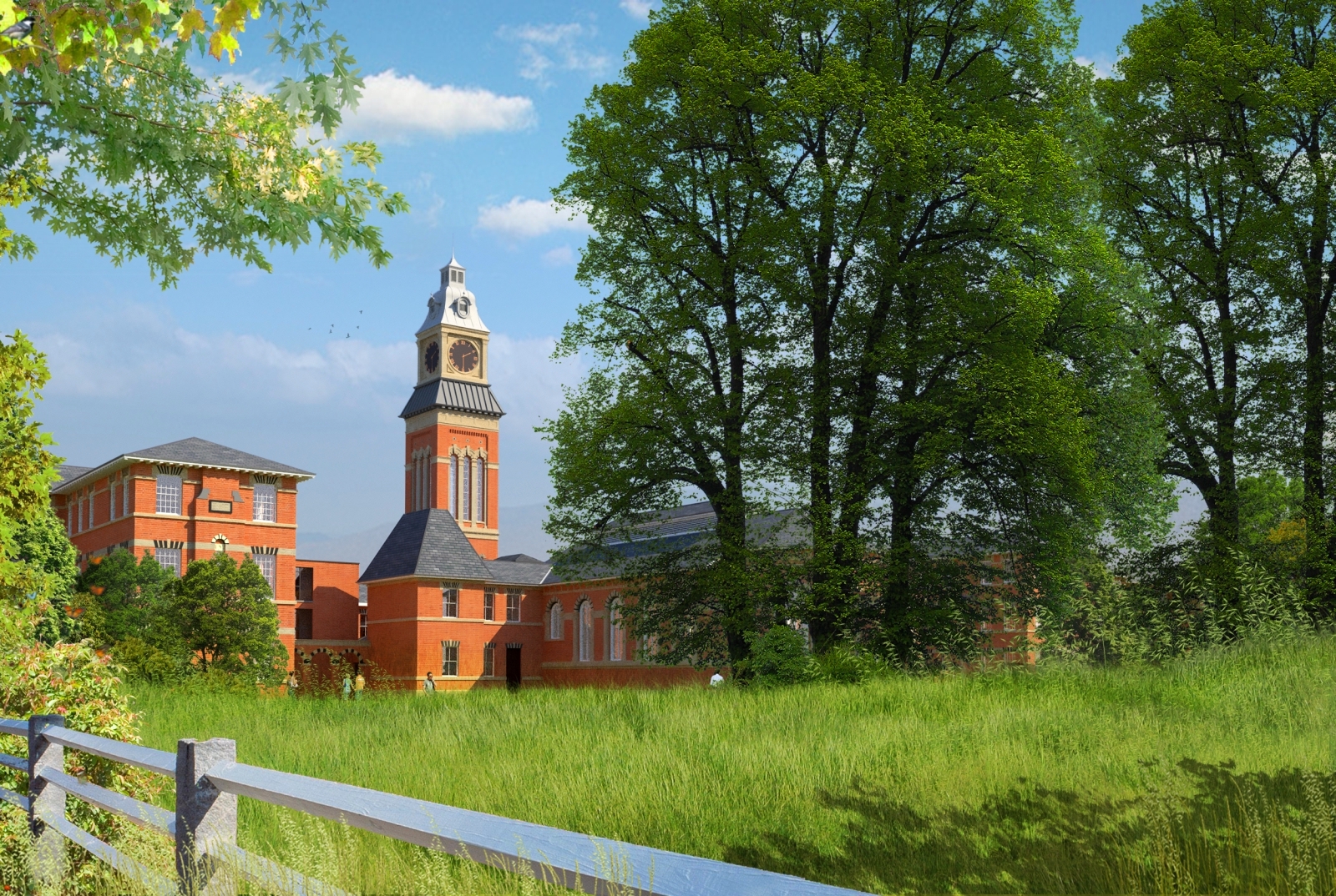
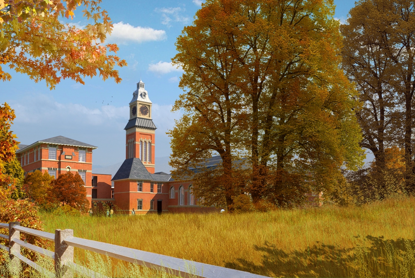
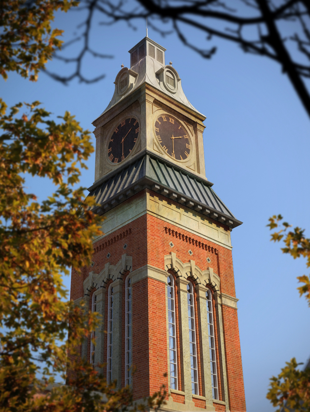
attached are versions of the same view,one summer one autumn.all vegetation is photoshop with each plant on its own layer which made it easier to change the colours.The third image is a close up of the bell tower with dirt maps added in photoshop.originally rendered in maxwell.
-
Great post pro! Bravo.
-
You really have a wonderful render style
-
I'm not fond of the first two (too saturated), but the last one is really great.

-
I really like this render style. Great work!
-
nice work, nice dof use
-
Very well done. Nice artwork.
the third one is really striking realistically. Fine modelling on the stone work. In the first two images the buildings look less convincing compared to the trees, perhaps too clear and colorful for the distance. Don't ask me how to fix it, this is way beyond my work. Thanks for posting.Peter
-
Mate your a master!
Like stinkie - the first few the saturation is a bit high!
Are all your trees rendered in as 3d?
-
Beautiful images.
-
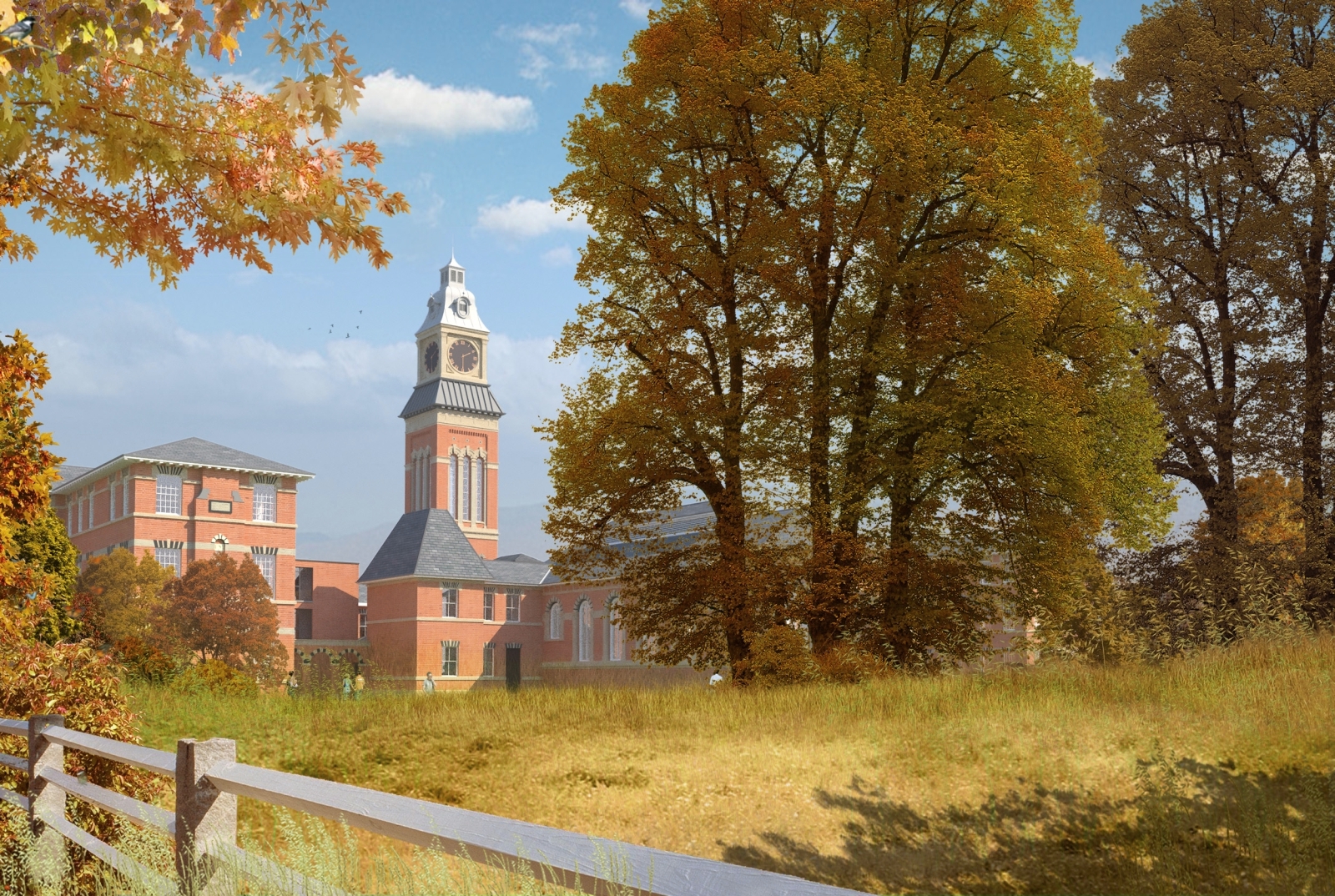
attached is a revised image.I have lightened the building so it sits further back in the image.I have also desaturated it a bit and revised the foreground to add more texture .Rich,all trees and plants are 2d photoshop.for me,the fun only starts when I take the rendered image into photoshop.I try to render the minimum required with the model and then add all entourage in post.it saves a lot of time in rendering and allows extra leeway to experiment with vegetation.
-
Look great...like 2 & 3 better than the other one
-
Well I'll be buggered then!
BTW number three is a reference photo right?

That is as good as it ever gets without doubt!
-
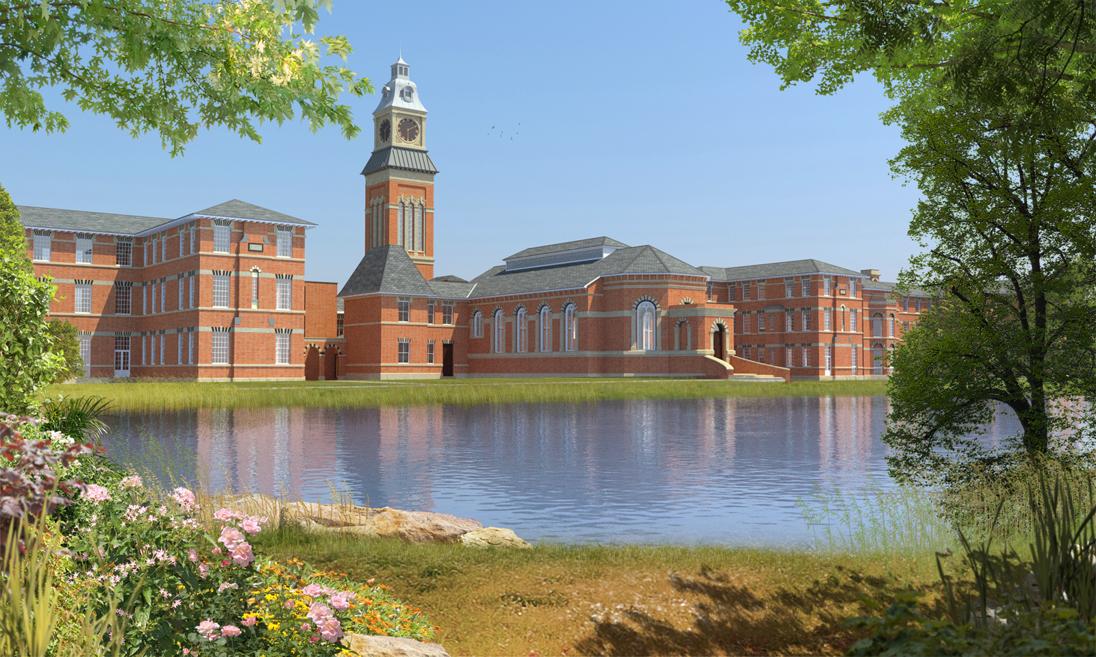
Attached is a lakeside version of the previous images.I have reused most of the original vegetation,just repositioning them.the reflection was done in photoshop using a technique from http://www.sketchupartists.org/tips-and-tricks/.
-
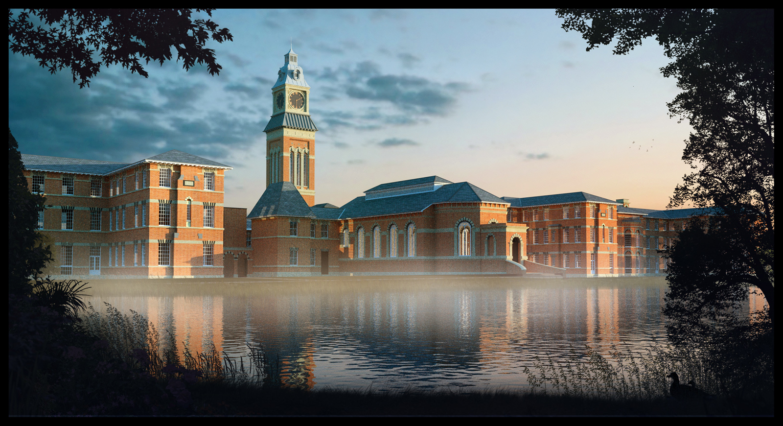
a misty morning version of the lakeside image.the model was re-rendered with a low sun but,again,all the same vegetation was used,just darkened and a low mist added over the far bank.
-
Great!
I am sure you have been asked before but where do you get your Photoshop entourage? -
A lot of the stuff I use over and over are Dosch and Evermotion products.I purchased them about 4 years ago and they were one of the best investments ever.But I also make a lot from images on the net,overlaying and blending in photoshop.I'm also constantly looking out for elements such as rocks leaves etc which can be easily extracted from their original image.It takes time but it means that you will have a ready made library and you can start post processing very quickly.
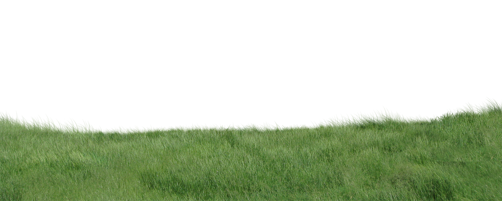
One thing I usually do is render out a very low res version of the model at the correct size and instantly start adding the entourage in photoshop while a hi res version of the render is cooking.Then, once the final model image is finished rendering at a higher resolution,you only have to drag and drop the hi res image in place of the low res and do some small tweaking.(I have attached a grass layer from the images, made in photoshop,feel free to use)
-
Great, thanks for the explanation.
-
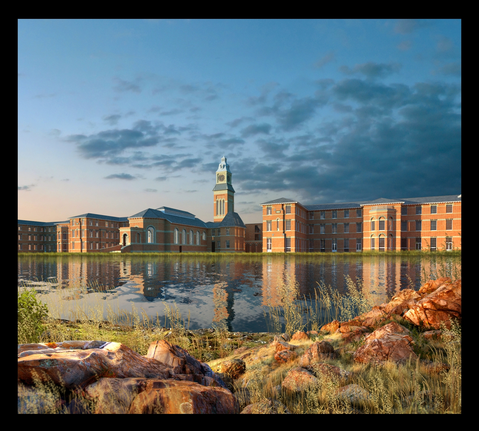
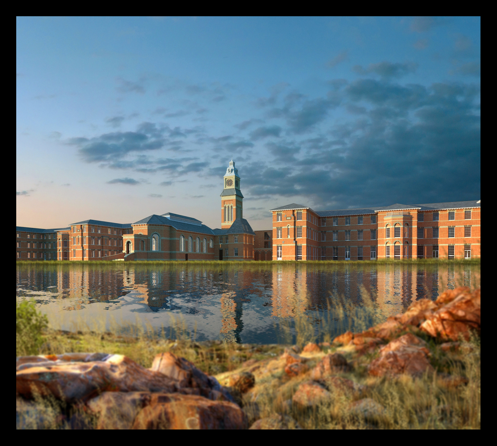
1 more lakeside view with foreground depth of field added in the second image.the foreground rocks have had highlights burnt onto them in photoshop to try and make them more compatible with the lighting in the render.
-
Nice!
-
@davidh said:
a misty morning version of the lakeside image.the model was re-rendered with a low sun but,again,all the same vegetation was used,just darkened and a low mist added over the far bank.
Very nice, most excellent, love it!
Hello! It looks like you're interested in this conversation, but you don't have an account yet.
Getting fed up of having to scroll through the same posts each visit? When you register for an account, you'll always come back to exactly where you were before, and choose to be notified of new replies (either via email, or push notification). You'll also be able to save bookmarks and upvote posts to show your appreciation to other community members.
With your input, this post could be even better 💗
Register LoginAdvertisement


