Lastest work (Thea4Su 13 May)
-
Its been ages since I posted anything.
Here are a few projects Ive been involved in over the last year.
I take all designs through to working drawing stage.
These are the only clients who wanted to pay for renders for advertising.
All were done in SU8 Vray PS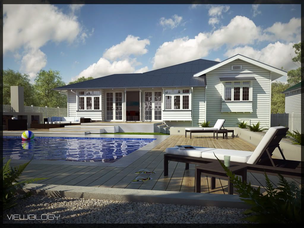
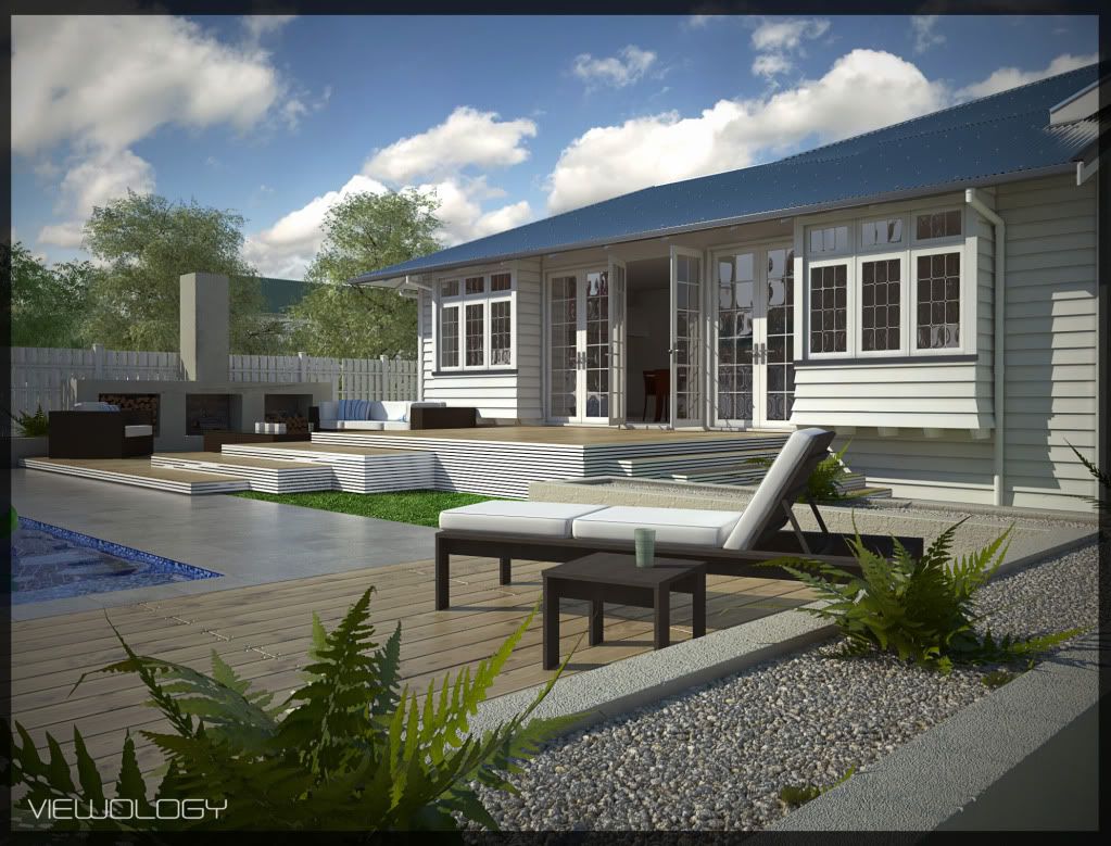
This was an alteration. They wanted to get rid of a porch and extend the living area out.
Which flowed out to a minimal landscape design. Fun project.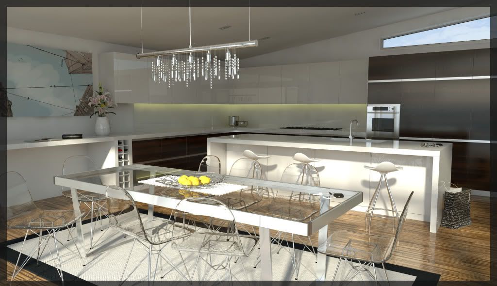
Just an interior a client wanted. I went abit overboard on the chairs. I just wanted to
play with refraction.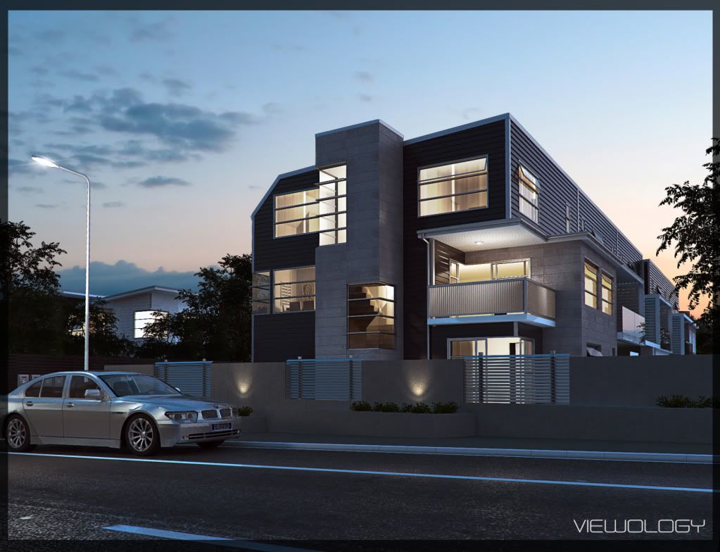
This is the latest job. 6 appartments. Very tight time line and as always budget. I would like to go back and add to this when I get some free time.
As always would love to get any Crits on these images.
I'll add more projects soon.
-
Beautiful, very clean and sharp

-
Superb!! Well done!
Keep them coming! -
These are great images and I would have to be critical to find fault but there are a few things (minor) that I see:
First image
The furniture wood looks flat and without any shine
The flip flops dont look groundedSecond Image
Can't find anything wrong
Third Image
At first glance the clear chairs throw me off for some reason.
I would change the angle of the shot just a bit to get more seperation between the island and the back counter. currently they look to blend a bit.
The lemons are blown out a bit
The placement of the cooktop seems odd to me (under cabinets?)Last image
The BMW....The side skirting is way to low and is incorrect. The paint almost come off as chrome or aluminum. I would not add to bright of a color but some color would look better.
The flare on the street light looks forced.Again, great images!
Scott
-
Hi Jonathan,
congratulations, I would be interested to know your settings for the external renders.
Thanks
David -
WOW. Very clean.


-
great images
 . first one is my favorite
  . how did you make that gravel?
 -
Nice work.

-
Great work. Love 'em all! The exteriors are exceptional. Is the roof and siding displaced or modeled? My only critique would be adding more in the way of plants and landscape as it's a bit boring. Love the deck material and the details down to the screws.
-
all really bright, clean, and beautiful... very impressive!
-
@unknownuser said:
These are great images and I would have to be critical to find fault but there are a few things (minor) that I see:
First image
The furniture wood looks flat and without any shine
The flip flops dont look groundedSecond Image
Can't find anything wrong
Third Image
At first glance the clear chairs throw me off for some reason.
I would change the angle of the shot just a bit to get more seperation between the island and the back counter. currently they look to blend a bit.
The lemons are blown out a bit
The placement of the cooktop seems odd to me (under cabinets?)Last image
The BMW....The side skirting is way to low and is incorrect. The paint almost come off as chrome or aluminum. I would not add to bright of a color but some color would look better.
The flare on the street light looks forced.Again, great images!
Scott
Thanks so much for your time.
Third image
The kitchen has been built as Ive designed it. The cupboards over the bench are alittle higher. The cupboard over the
stove top is actually mock. There is an extactor fan there. As for the chairs, I agree totally over the top. But like I said was playing with refraction.Thanks so much for your other comments. At some point I would like to go back and clean them up. Addressing the crits you have pointed out.
-
@dvd63 said:
Hi Jonathan,
congratulations, I would be interested to know your settings for the external renders.
Thanks
Davidhi David
My settings are actually standard for the first two images. I just
popped up the hSph Subdiv's to 80 in the Irradiance Map options.For the last image I used an HDRI.
-
@earthmover said:
Great work. Love 'em all! The exteriors are exceptional. Is the roof and siding displaced or modeled? My only critique would be adding more in the way of plants and landscape as it's a bit boring. Love the deck material and the details down to the screws.
Thanks, glad you like them. The Roofing and Sliding are all modeled. Ive just had better results using modeled cladding than displacement. Your totally right about the planting. I have had mixed results on using clipmaps. The model was getting pretty heavy using models. I really need to improve my PS skills.
The Landscaping architect took over after me. Im sure he was alot more creative than I was. -
Very nice work.
-
Plz share ur setting for night render
-
-
@imabzeous said:
Plz share ur setting for night render
My settings are standard. In the Environment tab, I used an HDRI image in the GI and reflection slot.
I left the Backgound slot empty. So that in PS i could include the HDRI backgound and have more control of
it. -
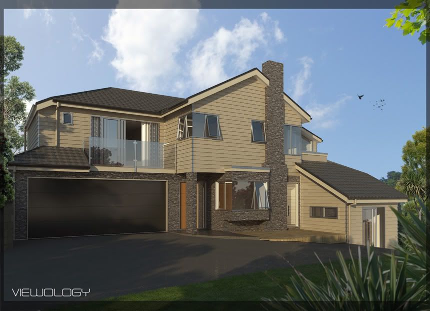
Design wise Im not so proud of this one. The client watched far to much TV home improvement shows and thought she was a designer.
Oh well some jobs are bread and butter. As always crits welcome. -
@unknownuser said:
The client watched far to much TV home improvement shows and thought she was a designer.

I have the same problems -
Great work!
Hello! It looks like you're interested in this conversation, but you don't have an account yet.
Getting fed up of having to scroll through the same posts each visit? When you register for an account, you'll always come back to exactly where you were before, and choose to be notified of new replies (either via email, or push notification). You'll also be able to save bookmarks and upvote posts to show your appreciation to other community members.
With your input, this post could be even better 💗
Register LoginAdvertisement


