Need scene suggestion (something "artistic")
-
Hello, I don't know how legitimate this request is, but I am in a lack of ideas.
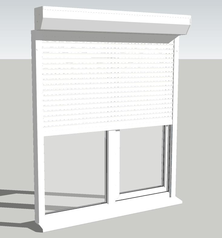
I need a nice scene to render this model. Something expressive. I know... windows go on walls and blinds over the windows, but it's just not enough. This blinds must be expressive, because are for a website that sells such things.-The image needs to look good at small size(266px x 138px), but large too.
-The scene can have several of them with different grades of closing.
-The box (the magazine, where the blinds roll-up) need to get out from the wall about half.
-Also minor changes are allowed, of shape, color, or anything else as long as the idea remains the same (i mean don't make a car from it )
)In exchange for that ideas, I give the model !

This is how the window looks.

And here is the model:
Window with roller-blinds.skp -
Uhh, it seems that people around here are in lack of ideas too ...

-
Hey Man,
My only thought would be that you don't want something that is going to distract the potential buyer from the window. Do a simple background, just maybe a pale brown for the ground and light blue for the sky.
Cheers,
-
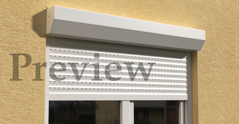
My own try was this attached one, but It seems to fade somehow... nothing special, nothing dramatic, just too technical


-
Looks good to me! That's a nice, basic, wall, and it makes the window look very nice. Good work.
-
@crankston shnord said:
Looks good to me! That's a nice, basic, wall, and it makes the window look very nice. Good work.
Don't you think it's a little to "spartan" ?

-
Hmmm....spartan as in bare or rustic? No, i think that it looks really good. Another idea might be to show a similar picture with wood siding and see how you like it. Nothing beats experimentation. In fact, if you want you could post the model and I'll fool around with it a bit, see if I can come up with anything. Either way, I would say that you have a winning render right there,
Cheers,
-
@crankston shnord said:
Hmmm....spartan as in bare or rustic?
Yes, this is what I wanted to say... I'm not a native english speaker, I don't know if the expression means the same as in my language.
@crankston shnord said:
In fact, if you want you could post the model and I'll fool around with it a bit, see if I can come up with anything.
The window + blinds model is in my first post just after the image, feel free to download it. A cube with a hole I think is not too hard to make

-
Are you using any kind of HDR/EXR image with this?
Some interesting (subtle) reflected colors and softer shadows could give this alot of life -- right now it looks a bit spartan (as you say)... maybe some curtains on the other side of the window to soften things up a bit as well.
There a bit of a "prison" vibe here and anything you can do to open it up and feel less confining would be good -- can you open one side of the window?
Best,
Jason. -
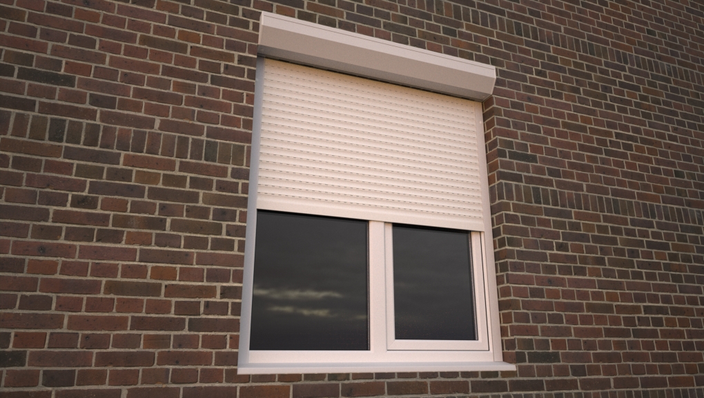
Here's a softer sunrise/sunset HDR based render (sample from http://www.hyperfocaldesign.com )

I didn't bother fully texturing as this was mostly about seeing it with some softer lighting.
Best,
Jason. -
Wow ! the bricks wall looks pretty cool! I thing it's a better approach than my wall.
-
How about colonial trim and shutters, on horizontal wood siding.
-
@honoluludesktop said:
How about colonial trim and shutters,
I have to use that roller-blinds model. It's a product-specific image.
-
I think that the wood siding looks a lot better, and would recommend going that route. If you want a render I can do that for a minimal fee (J/K, but I'll be happy to help).
Cheers,
-
@unknownuser said:
@honoluludesktop said:
How about colonial trim and shutters,
I have to use that roller-blinds model. It's a product-specific image.
Understood, the trim and shutters are in addition to the roller-blinds. I once did windows like that for a masonry hurricane proof house.
-
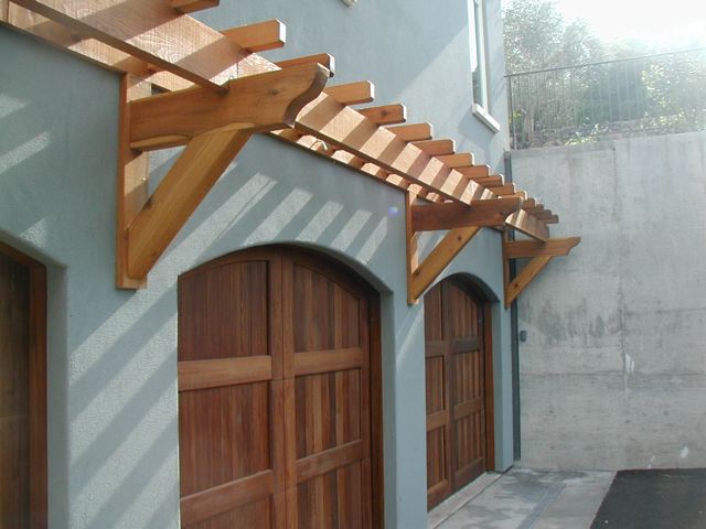
I think you need a wall mounted natural wood trellis above that to soften the look of the magazine. If done simply it wouldn't detract too much from the product. Would look good on your stucco wall. Also soften the light or change sun angle to not be so stark. Perhaps the blinds are too pure white? Here's a picture of a trellis I designed but I don't think I have a model.

-
I wouldn't add more elements because it would distract attention from the product you are trying to sell.
Maybe the blinds with a nice soft background and make it common to all the images of the catalogue?
But if you want to set a scene, the first image you showed looked nice, I'd just open one window put a light inside that room and place maybe curtains and elements inside to make it look like a nice place to be in
Nice stucco wall BTW
-
@karinagm said:
Nice stucco wall BTW
Thanks
 Stucco bump is from here or twilight forum, can't remember where I found it
  , but judging after file name, it was downloaded from http://www.openfootage.net/
Hello! It looks like you're interested in this conversation, but you don't have an account yet.
Getting fed up of having to scroll through the same posts each visit? When you register for an account, you'll always come back to exactly where you were before, and choose to be notified of new replies (either via email, or push notification). You'll also be able to save bookmarks and upvote posts to show your appreciation to other community members.
With your input, this post could be even better 💗
Register LoginAdvertisement


