Interior in V-Ray
-
Hi everyone,
it's been a while since I posted much... I hope you guys like the below render... comments en critics welcome.
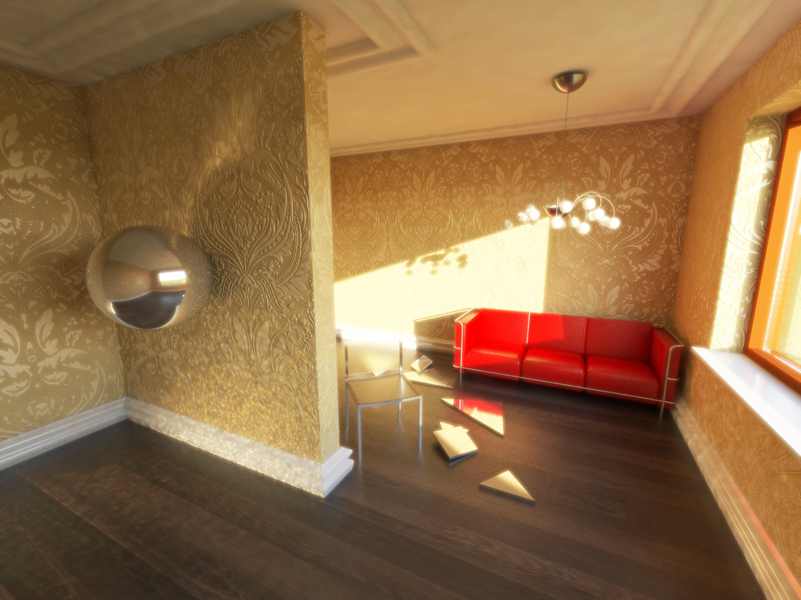
Model made in SU... couch and chair were made for a library CD for my work, lamp downloaded from warehouse. The wallpaper pattern is from Graham&Brown.
Rendered in V-Ray 1.49.01. Trying out caustics, bump- and reflection-mapping.
Post-pro in photoshop: bit of lighting up, cause I made the render at night and then this morning with daylight it seemed way too dark. also a bit of solarizing.
-
A fine render, great work on bumps but too much glow effect.

-
Hello Pyroluna, evrything looks out of scale, the wallpapers massive! you'd bang your head on that light. The walls are all falling out over..but I like the red couch.
-
I noticed stain on left of ceiling you must increase HSph subdivision values of irradience map 120 would be enough but it causes long render time
-
i hope you intend a slightly surreal image - i like it!
why is the skirting on the left not a uniform colour? -
the bump looks nice and clean.
-
hi guys.. thanks for the C&C... I made a new version.
ok so I wasn't paying attention to the verticals before - that was stupid of me
the yellowish hue of the wallpaper is too sensitive. some screens it shows golden yellow, other screens it shows more of a mustard colour. I don't like that. so I switched to grey/silver.
thanks @mimarhamza for pointing out the HSph subdivision setting. I got better results now. although some of the 'stains' in the first render weren't the effect of that setting being too low, but the effect of caustics being turned on. And a chrome sphere does lots of caustics. That's also the reason for the spots on the skirting, @designerstuart. And yes the slightly surreality was intentional. Although I think this second image is a little less surreal. hm.
@tadema, I raised the ceiling so you won't bang your head on the lamp But the out-of-scale wallpaper is intentional!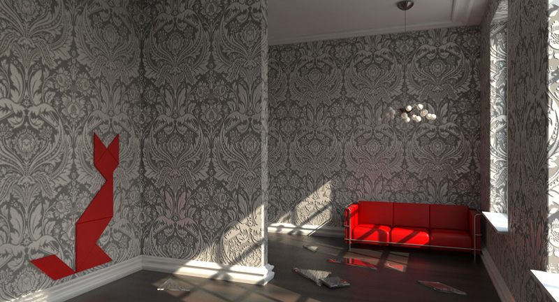
no post-pro this time... -
They look great. Wall paper and ceiling looks real and makes you want to touch it.
-
I prefer the first post.
-
@michaliszissiou said:
I prefer the first post.
 Dang, and I liked the last one.
But both are equally well done. Looks like a fun place to hang out. Great renders on both.
Hello! It looks like you're interested in this conversation, but you don't have an account yet.
Getting fed up of having to scroll through the same posts each visit? When you register for an account, you'll always come back to exactly where you were before, and choose to be notified of new replies (either via email, or push notification). You'll also be able to save bookmarks and upvote posts to show your appreciation to other community members.
With your input, this post could be even better 💗
Register Login


Advertisement