Studio/Guesthouse - Updates
-
@unknownuser said:
i like this one but i think you need more trim and realism in the roof. some soffits and/or gutters would do the trick
You're right. It could use more trim. Thanks for the suggestion.

-
I salute you for presenting directly from Sketchup, rather than employing third party rendering software. Or, at least that is what I perceive.
I like the model and the images. As was previously mentioned, perhaps express the standing seams on the metal roof. -
Update.
Thanks alexanderSIMPLE. Great suggestions. I'm still working on the gutters.
Thanks mitcorb. I hadn't thought about the roof. That's just standard SU material. Good idea though.
Yep. Straight SketchUp. I added stucco to the main walls and siding to the attic end caps. Moved the trees a little bit for better shadows. Still not quit where I want them, but they are huge models and stubborn about fine movement. Also fiddled with the shadows.
More suggestions welcome!
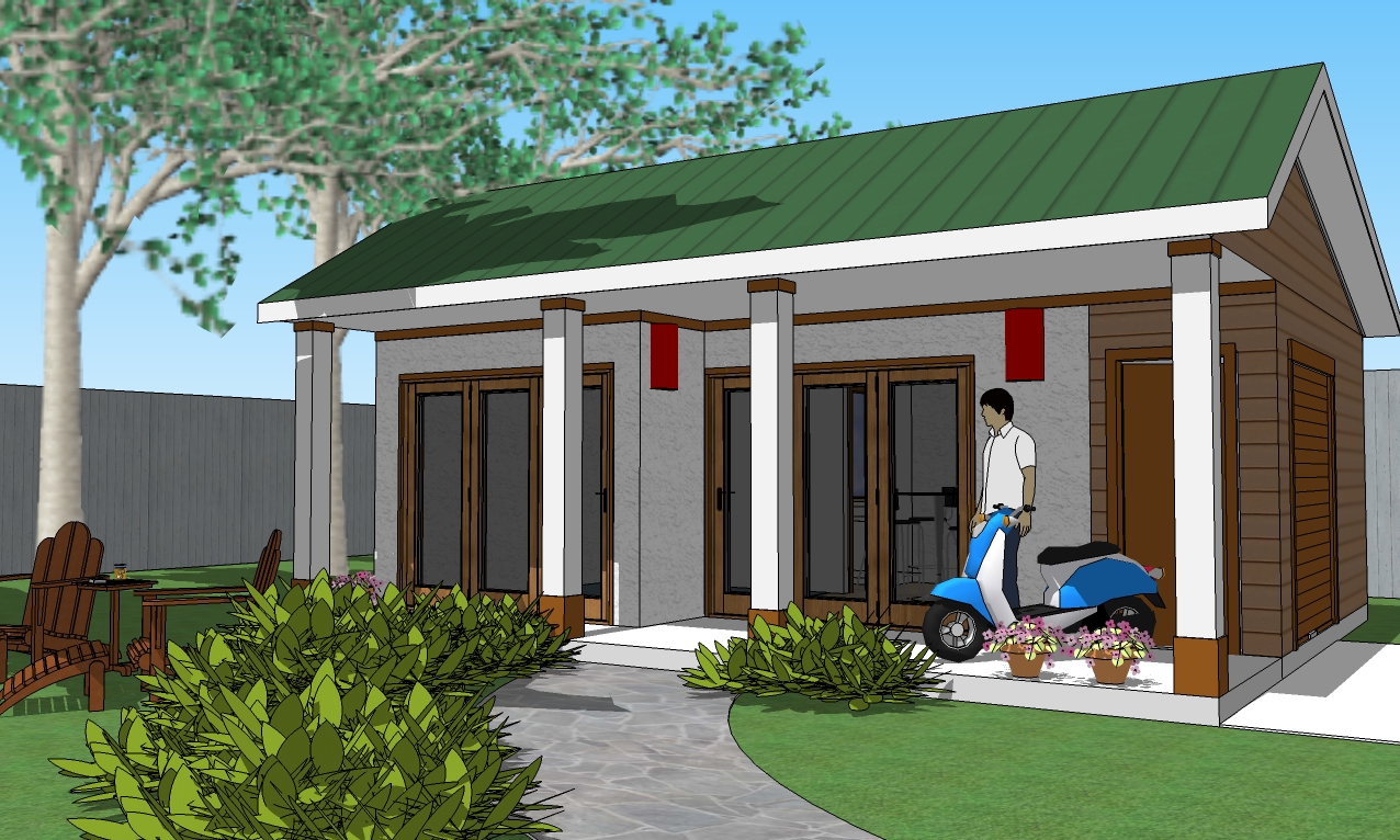
-
maybe pull the roof 20mm and then pull the edges out around 50, just to add some more playful shadow and depth, and some guttering to break up the front boards...
-
@loafin andy said:
maybe pull the roof 20mm and then pull the edges out around 50, just to add some more playful shadow and depth, and some guttering to break up the front boards...
I'm working on the guttering.
I don't understand which direction to pull on the roof. I LIKE the suggestion, I just don't fully understand which way and exactly which parts as you described it. Please give me a little more detail. It sounds good.
-
Regarding the moving of the trees, if you go to Window> Model Info> Units, uncheck length snapping, and perhaps angle snapping, they should move more smoothly. After placement, you can re-enable these.
I suggest setting your length snapping to 1/16" when you enable it. You have a choice of angles. -
One more angle.
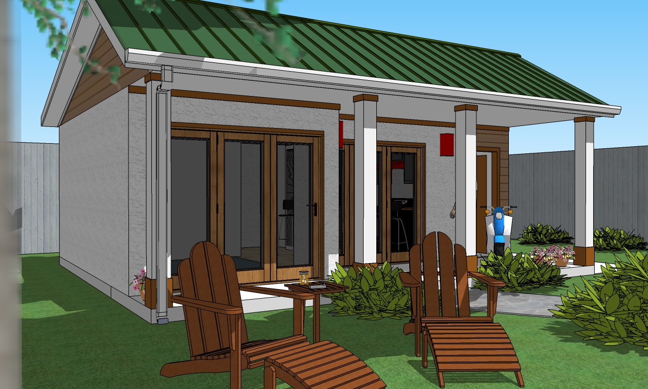
-
Some nice images here. You have made progress.
If you are developing this for construction accuracy, I would suggest that the lap siding surface be projected out a small distance to appear to overlap the stucco, because that is where the rain will get in, in the real world. Further, I believe the edge that meets the porch ceiling would need to project lower than the ceiling for similar reasons. Water, driven by the wind has a tendency through capillarity, cohesion?, and surface tension to travel significant horizontal distances to spoil your porch party.
The metal roof will need some type of rake trim.
-
I thought about that overlap. Good idea.
"Wicking" is what it's called when water travels in any direction but down on a surface.
Roof rake trim. Check.
I appreciate all the suggestions from everyone. This model is just small enough that I can do these details without totally overwhelming my PC. While I have a great CPU, I still don't have enough RAM, but I've been wanting to do a very detailed model for some time.
-
Thanks mitcorb. That helped.
Gutter and downspout added (do NOT get me started on that downspout
 WAY over designed)
Ridges and cap for metal roof added.
More suggestions welcome.
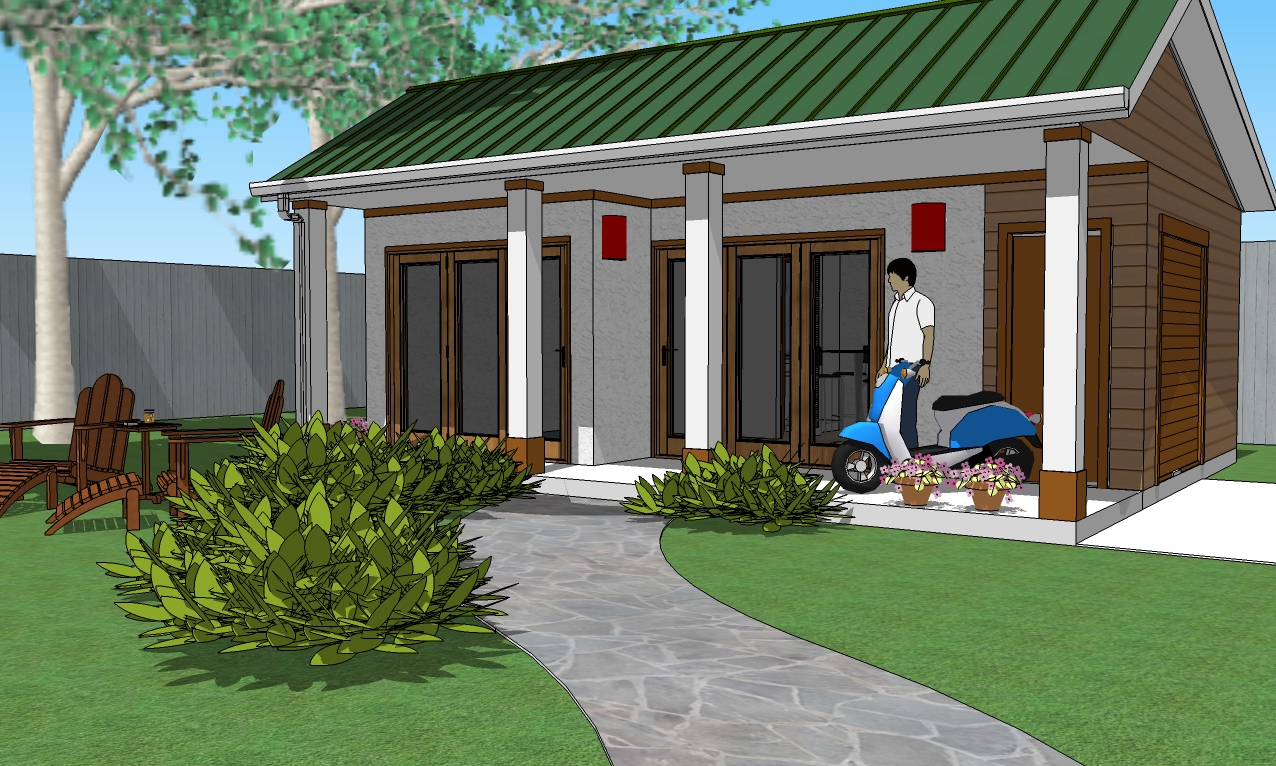
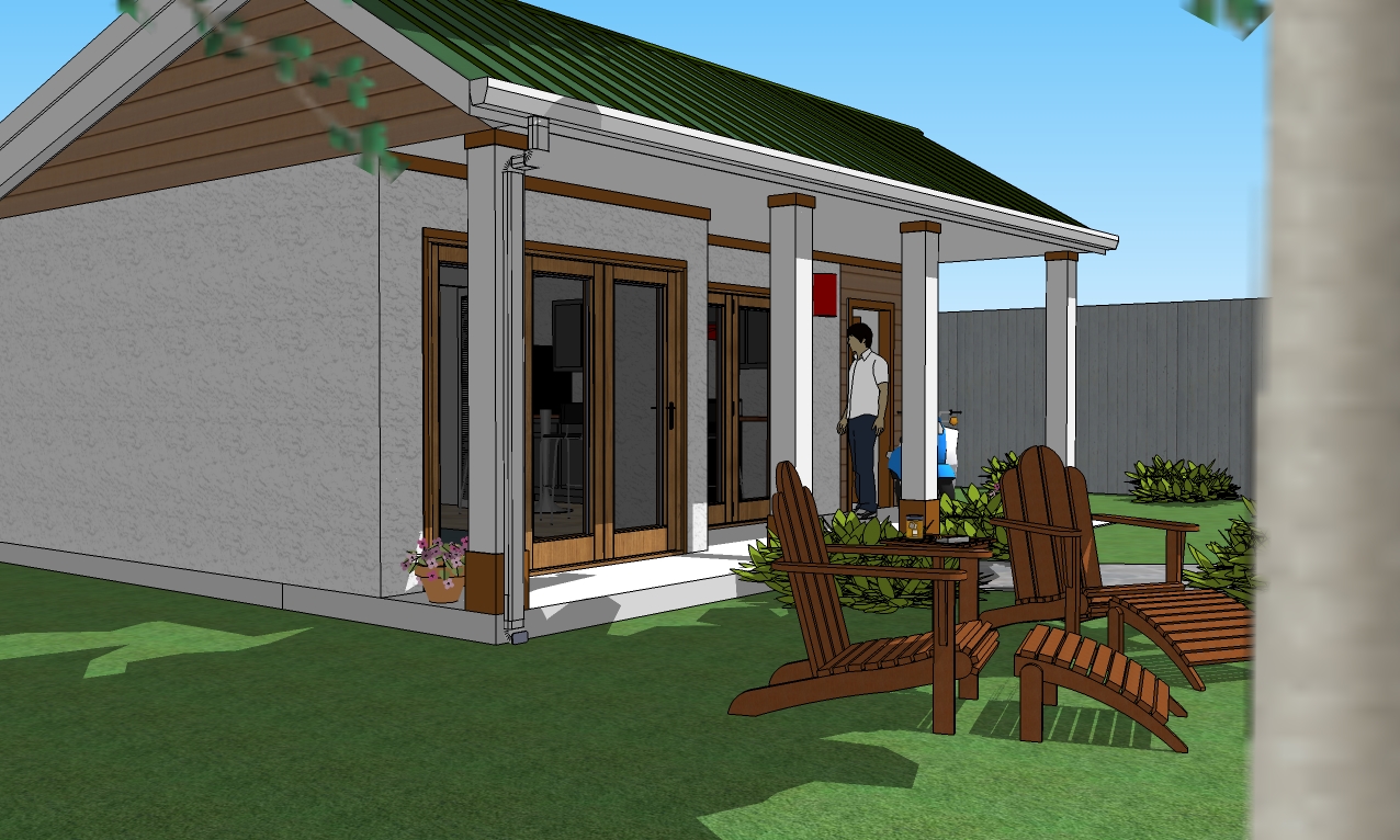
-
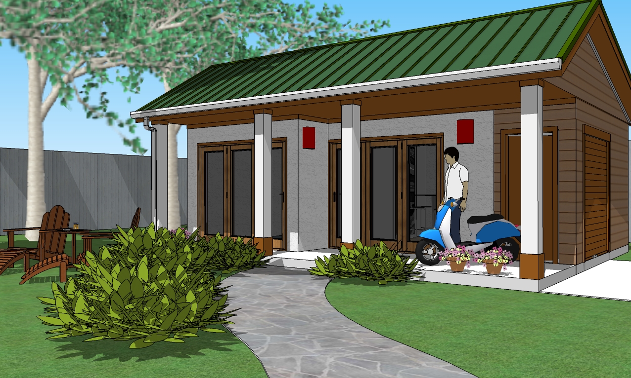
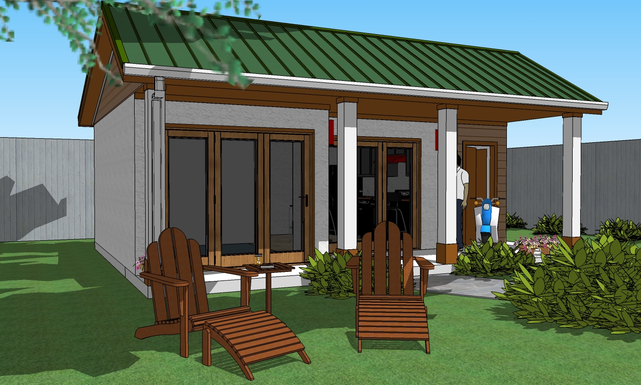
Update incorporating previous suggestions.
Just noticed I need some more trim.
-
Dear Bryan,
One of the main problems with living in a small space is storage. There appears to be scope for a small 'loft' above the bedroom space (this assumes that you are not going full height to the roof rafters, which would be nice in the kitchen/living area.
A small skylight would be nicer for the bathroom. There is nothing like 'sky light'to illuminate a small space. A largish skylight with low E glass and a sunshade would be good in the kitchen. The porch overhang, while providing shade in summer, might make the interior a little gloomy in winter.
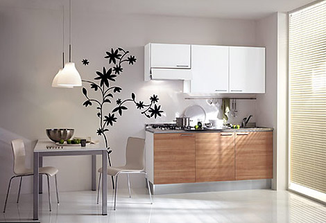
The kitchen looks too large for the likely occupancy (guest, single person etc), so a more modest kitchen would seem appropriate. Presumably, you have your washer/drier in the small, attached service room. I would consider dividing the service room in two and accessing the rear space from inside, which would be possible if the kitchen was made smaller (small door opposite the built in storage unit). I have attached an image of a very small kitchen. Being open, plan, kitchen smells will get everywhere, so a good extractor is needed above the oven hob.
Consider making the bathroom more compact (2 metres x 2.5 metres should be enough), as one doesn't live in the bathroom.
Could you post a few setions to illustrate the construction?
Regards,
Bob
-
Hi Watkins
Really nice study and presentation.

Fun to see you flesh out the details.
Maybe an inset reveal on the columns to complement the siding dtl. but ??
Small request.
Good tree too and where did you find it please.
Just nothing like the native SU to properly describe the architecture.Cheers


dtr
-
Dear dtrarch,
Not mine I'm afraid, and as far as I know a photograph. I found it browsing on the web for kitchens for really small spaces, and used it to illustrate my suggestions. Perhaps someone could have a go at modelling and rendering that scene.
My apologies for the confusion.
Kind regards,
Bob -
Hi Bob
Thanks for getting back.I'll try the "Author" this time.
Help!!!!!
Dave
-
Hi Bryan
I meant to send this to you but just a little mind fade
 and Bob Watkins was good enough to intercede.
SO here tiz again.Really nice study and presentation.

Fun to see you flesh out the details.
Maybe an inset reveal on the columns to complement the siding dtl. but ??
Small request.
Good tree too and where did you find it please.
Just nothing like the native SU to properly describe the architecture.Cheers


Dave
-
@watkins said:
Dear Bryan,
One of the main problems with living in a small space is storage. There appears to be scope for a small 'loft' above the bedroom space (this assumes that you are not going full height to the roof rafters, which would be nice in the kitchen/living area.
A small skylight would be nicer for the bathroom. There is nothing like 'sky light'to illuminate a small space. A largish skylight with low E glass and a sunshade would be good in the kitchen. The porch overhang, while providing shade in summer, might make the interior a little gloomy in winter.
The kitchen looks too large for the likely occupancy (guest, single person etc), so a more modest kitchen would seem appropriate. Presumably, you have your washer/drier in the small, attached service room. I would consider dividing the service room in two and accessing the rear space from inside, which would be possible if the kitchen was made smaller (small door opposite the built in storage unit). I have attached an image of a very small kitchen. Being open, plan, kitchen smells will get everywhere, so a good extractor is needed above the oven hob.
Consider making the bathroom more compact (2 metres x 2.5 metres should be enough), as one doesn't live in the bathroom.
Could you post a few setions to illustrate the construction?
Regards,
BobThank you Bob.
I agree that many of the features can be more compact. The size and scale were meant to be larger than required to illustrate that the space is capable of handing them. But the larger items are not required.
I was going to do another version using the bare min. in every area to illustrate the flexibility of the design. I just made the large scale one first. It was also a personal challenge to see if I could configure the space to accommodate the full size items.
Also, I'm a tall guy and full size things tend to suit me better, so a bit prejudiced in that direction.

It's not shown nor have I modeled it, but there is a loft or attic space for more storage.
The storage room was to be divided, with utilities (water heater, house heater, etc.) in one. smaller section, and storage plus a compact vertical washer dryer in the larger part. I just didn't do it either. I will probably go back to that.
The decision on the bathroom was based on the offset space of the main living area. That, and I hate small bathrooms.
 But again, your suggestion is good and illustrates the other possible alternative for the overall square footage.
Skylights are an excellent idea. I didn't even think of that. The bathroom window as modeled is to act as a fire escape.
Again, the concept was to challenge myself to get the larger items to fit and still keep the space usable, which would mean more compact items would then obviously provide even more usable space.
Great suggestions Bob. Thanks again for the compliments. I will probably take a break from this project for now. It's just an exercise for me.
Oh, and sorry, no sections.
 I didn't put that much detail into it.
 -
@dtrarch said:
Really nice study and presentation.

Fun to see you flesh out the details.
Maybe an inset reveal on the columns to complement the siding dtl. but ??
Small request.
Good tree too and where did you find it please.
Just nothing like the native SU to properly describe the architecture.Cheers


Dave
Thanks dtrarch.
There are actually 3 trees in the model, but one is just for creating shadows and providing foreground leaves.
The trees are from Rp Tree Maker
http://www.renderplus.com/wk/RpTreeMaker_Free_w.htm
FREEThe best way to use it to create a set of trees as a standalone SU file and then import them as needed because they consume a lot of computing resources. As an imported file is automatically made into a component, this help to control the size. But even then, they are still "heavy."
I'm not sure I understand about the inset reveal for the columns. The tops and bottoms of the columns are trimmed in 1/2" board. Can you show me an example?
Thanks again for the compliments.
-
Bryan
Thanks for the link.

See attached SU file
Just a fast guess about dimensions a color but you can re-size and give it a look to see it it has merit.Looks like an 8x8 col with 1x over and same for top and bottom trim.

Again really fun to see the evolution of a small project.
Good stuff.
Dave
-
Hello! It looks like you're interested in this conversation, but you don't have an account yet.
Getting fed up of having to scroll through the same posts each visit? When you register for an account, you'll always come back to exactly where you were before, and choose to be notified of new replies (either via email, or push notification). You'll also be able to save bookmarks and upvote posts to show your appreciation to other community members.
With your input, this post could be even better 💗
Register LoginAdvertisement


