NPR Residential Renderings
-
Hello all,
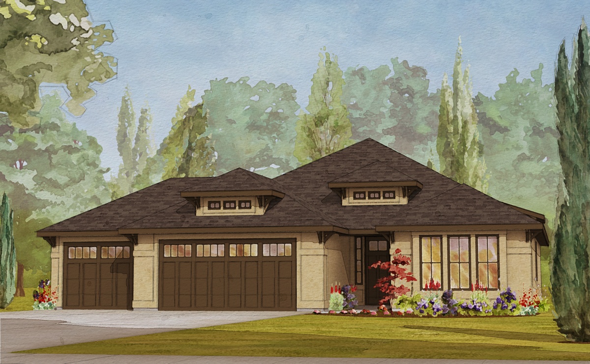
I've been dropping by these forums for a while now but this is my first post. I've seen so many great renderings here. Very inspiring stuff. The attached image is a style I've come up with for marketing the homes the company I work for builds and sells. I'd love to get your comments and suggestions.
Many thanks,
BradE

-
Hi Brad and welcome to the forums (even if you registered earlier).
I definitely like your style (although you should not trust my eyes as I am generally blind at design and style
 )
)Well, if I may be honest, I like the style better than the building itself but I guess that's what you have to market...
-
@gaieus said:
Hi Brad and welcome to the forums (even if you registered earlier).
I definitely like your style (although you should not trust my eyes as I am generally blind at design and style
 )
)Well, if I may be honest, I like the style better than the building itself but I guess that's what you have to market...
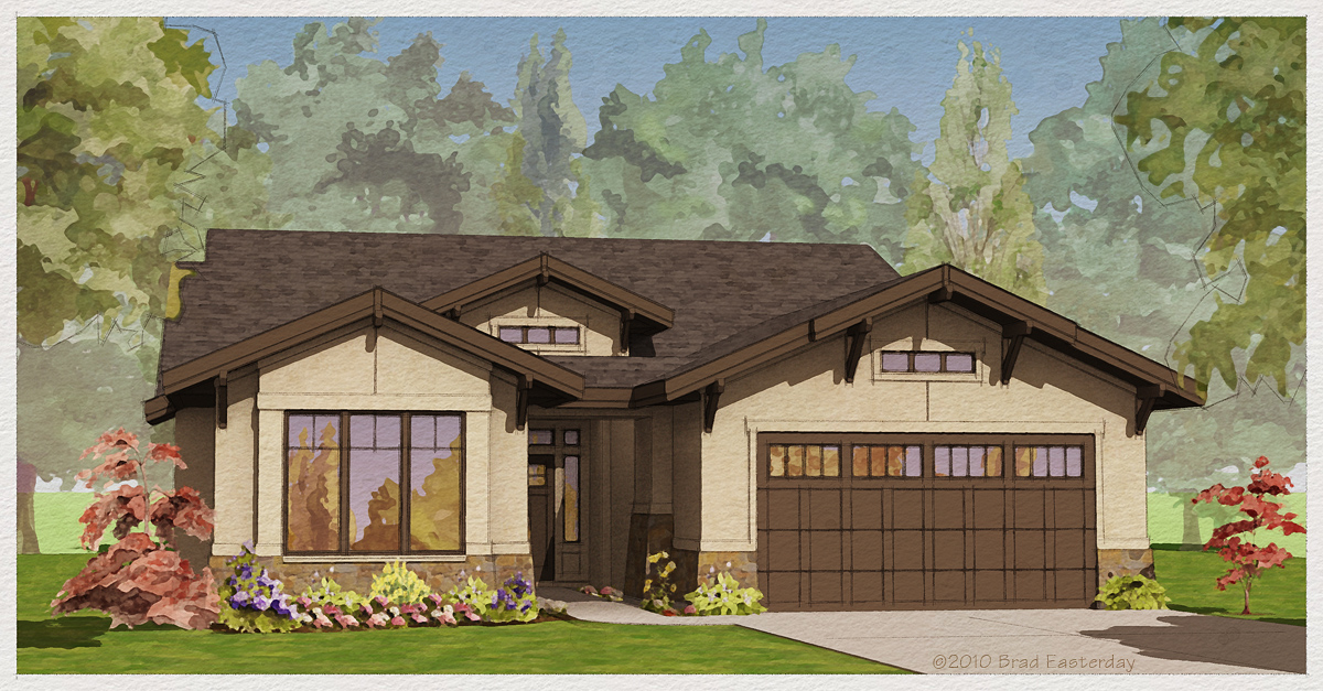
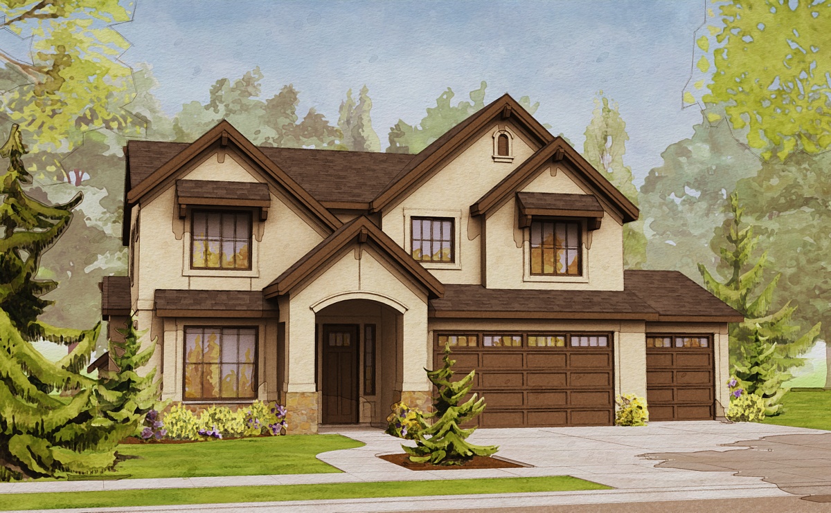
Thanks Gaieus. Here are a couple others I created while working toward the final style.
BradE


-
From the reflection in the windows, it seems you are (also) using some rendering software in the workflow (unless it is some post-pro).
-
Nice style!

One thing that may help is to hide the outer lines on the 2D cutout trees in Sketchup before exporting. The lines are most noticeable in the foreground entourage.
-
True.
See, Brad, I told you that I have no eyes!

-
@gaieus said:
From the reflection in the windows, it seems you are (also) using some rendering software in the workflow (unless it is some post-pro).
I used rendering software to create the soft shadows. They were rendered over a clay model essentially, and then merged with the SketchUp image in Photoshop. I also used Painter to fill in the windows.
BradE
-
@d12dozr said:
Nice style!

One thing that may help is to hide the outer lines on the 2D cutout trees in Sketchup before exporting. The lines are most noticeable in the foreground entourage.
Thanks d12dozr. I added those lines intentionally to help distinguish the foreground trees from the background. In some ways I think it adds an interesting rawness to the images. On the other hand, I haven't decided if they'll stay or go. I'm leaning towards go. They are a bit "edgy"
 .
.BradE
-
@turbobrad said:
They are a bit "edgy"
 .
.BradE
 I see the benefit for the sketchy style, Brad..I mentioned it as they were just distracting my focus from the house.
 -
@turbobrad said:
I added those lines intentionally to help distinguish the foreground trees from the background. In some ways I think it adds an interesting rawness to the images. On the other hand, I haven't decided if they'll stay or go. I'm leaning towards go. They are a bit "edgy"
 .
.Keep 'em, keep 'em! They look great.

Nice models and images!
-
it's really nice mood.
also you may don't do any render ,if use my trick here: http://www.sketchupartists.org/tutorials/sketchup-and-photoshop/create-a-fake-render-in-photoshop/what about foreground tree edges? are you still keeping them? or just maybe color-brightness perspective is enough?
-
Very nice, Brad. One thing I noticed, that you might want to correct, is that the stone(?) base on the second and third images is washed out - hard to tell what the material is.
-
Hi Brad,
Nice style, I especially like how you render the house...play of shadows and color very inspiring....
I would like to comment on the trees, they are very washout...try to balance that in your composition.
allanx
-
Lovely!
-
Fantastic stuff. I'd love to see some screen shots during the process so I can see how the magic happens.

-
You've captured a classic architectural rendering style. One that I've loved since I was a kid.
Very nice designs as well.
-
Thanks everyone for having a look. Your suggestions are definitely appreciated.
majid, great tutorial, thanks.
Hello! It looks like you're interested in this conversation, but you don't have an account yet.
Getting fed up of having to scroll through the same posts each visit? When you register for an account, you'll always come back to exactly where you were before, and choose to be notified of new replies (either via email, or push notification). You'll also be able to save bookmarks and upvote posts to show your appreciation to other community members.
With your input, this post could be even better 💗
Register LoginAdvertisement


