Spa floor with Vray 1.48.89 Trial version
-
Hi all,
Here is a new project, a Spa floor with indoor pool and hamam that I have rendered with the trial version of the new Vray for sketchup 1.48.89. Apart that all my Visopt settings from the first version does not work with this new one, and my old vismat material too.
A good improvement is the IES spotlights... In those renders, I have used the default setting...You can see the survey plan that the client provide me, It's quite funny to see what we can do with Sketchup...
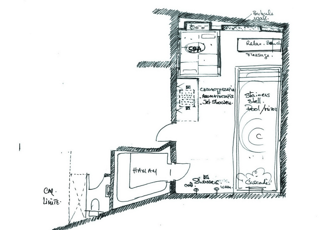
I have modeled everything except the furniture and accessories. Each renders took 2 hours to get cleared.
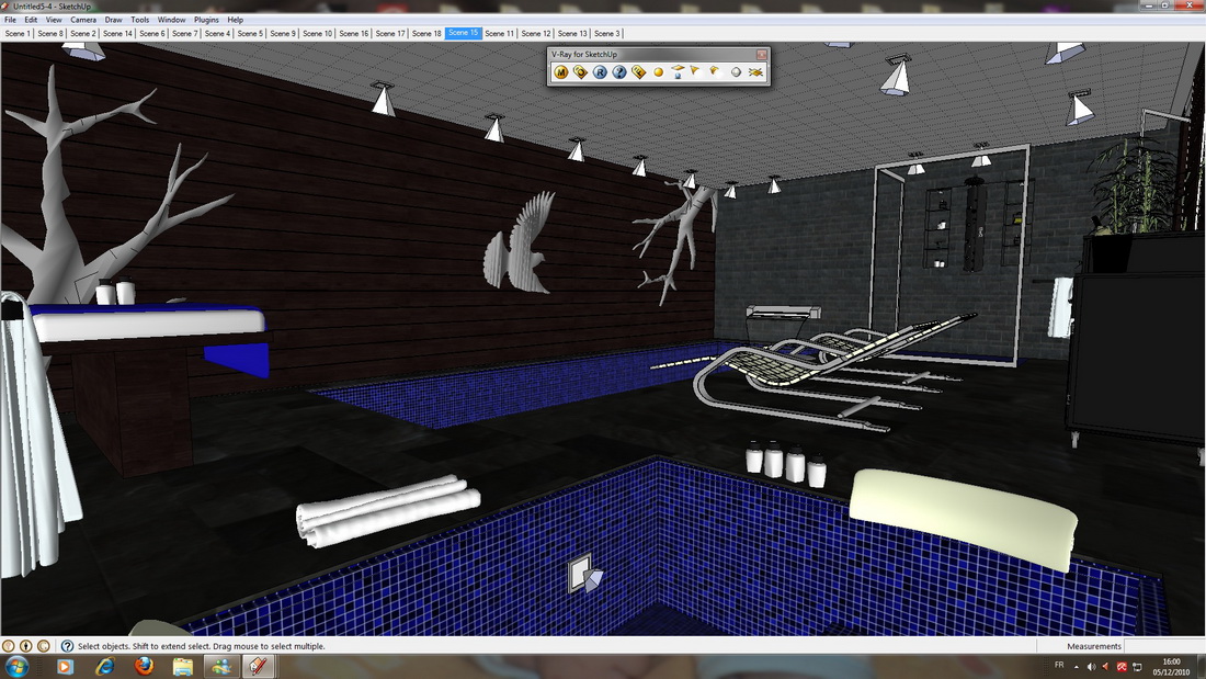
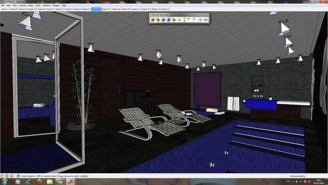
Hope you like it, comments are welcome...

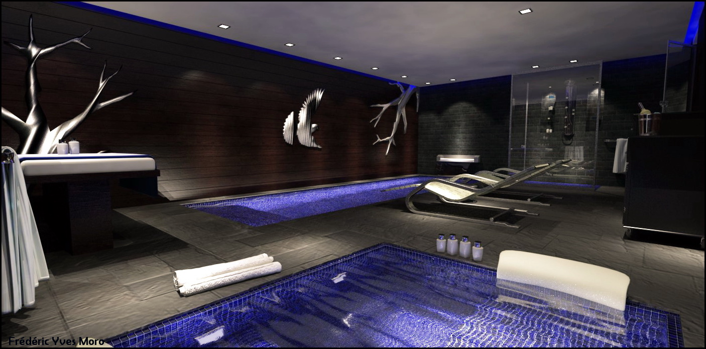
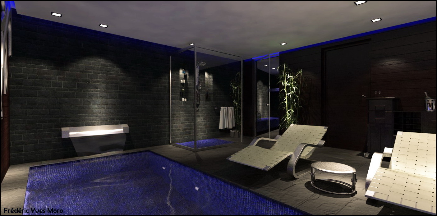
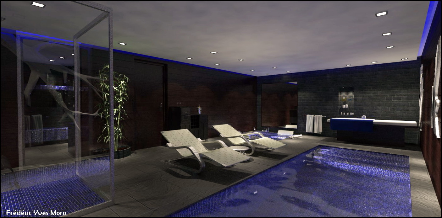
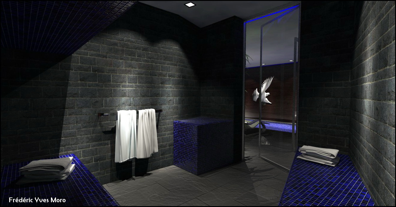
-
@fymoro said:
You can see the survey plan that the client provide me, It's quite funny to see what we can do with Sketchup...
Yes, and always .Nice renders
 .
.
I would change the light's color. White is too strong and unpleasant for eyes. Spa is for relax.
And I would change the mood of the room. It looks like in dungeon, but it is only my feelings about the room.BTW: Good renders
 .
. -
Well done Frederic! I still can't get the IES lights to work for me, even though I assign millions of light power in the slot.
Another thing I also get in my renders is that sort of splotchy ceiling you've got in the render. Is it "normal"? I tend to think my renders are a failure when I get this, but maybe that's the way it should be.. Can people elaborate on that?
Excellent work as always, I'm a huge fan of your Twilight renders as well.
Anastassis -
Very nice!
-
@anstvam
ies lights can be tricky if you don't have good files. The ies files have light intensity as part of the file - so it varies greatly from one file source to another. Try finding other sources of ies lights with greater intensity and the values you need in vray can be much more reasonable. Also, make sure your settings are for interiors - if you are trying to compete with daylighting, it is very difficult to get ies lights to show at all.@frederic
Your modeling is very nice. I agree it's great to bring a sketch into 3D, that's why SU is so far ahead of other modeling programs. I have to agree with jarynzlesa that there is something about the renders that don't look very warm and spa-like. One part of the image that sticks out is the stone wall. Maybe if you add some soft reflection to it, it would look less forbidding. Otherwise, your materials look quite convincing. One thing you could play with is emmissive materials - that could add some warmth - like having the candles give off a warm glow.
For the rendering settings - the splotchiness can definitely reduced. One option is to try using DMC sampler for the final image (that will give more of a photo graininess.) There are some good tutorials that explain the quality settings.
-Andy
-
Fred
Mate nice work as always! Though would suggest the spa needs some caustics and the lights in the spa would tend to illuminate the water.
Mate one can use some trickery there, here is a quick test I did for someone over at the maxwell forums a while ago to see what could be produced using 1. Fake caustics and 2. making the pool textures an emitter material. certainly not the greatest test but food for thought.

-
Did you model the branches?
-
nice work fymoro ..
i like ur sketch

the renders r cool too
but i have an architectural comment .
instead of these dark materials u can use a bright one , since dark give us a feeling that the space is much smaller , while a bright color makes a feeling that the space is larger ..if the colors is brighter i think it will be better ...
thanks and happy new year

-
Nice model and renders, Frederic!

-
good start fred. nice trick there richard.. tfs.
Hello! It looks like you're interested in this conversation, but you don't have an account yet.
Getting fed up of having to scroll through the same posts each visit? When you register for an account, you'll always come back to exactly where you were before, and choose to be notified of new replies (either via email, or push notification). You'll also be able to save bookmarks and upvote posts to show your appreciation to other community members.
With your input, this post could be even better 💗
Register LoginAdvertisement


