WIP: The Avenue
-
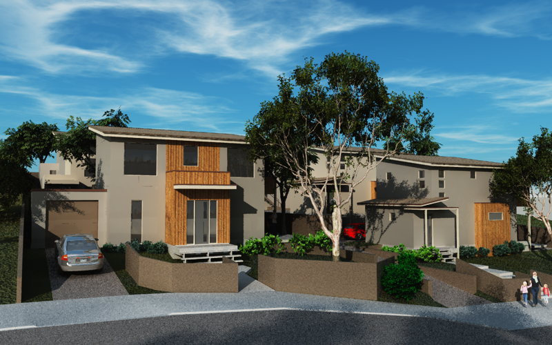
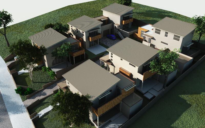
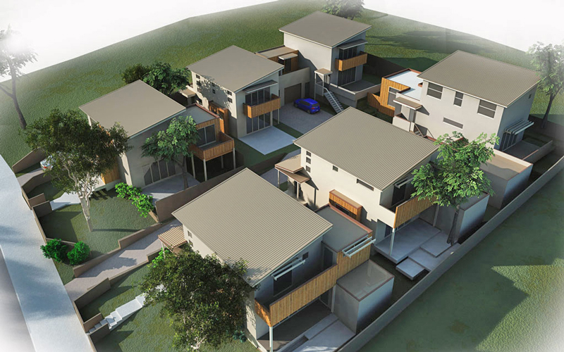
This is my fist render ever with Vue...design and model by the architect, Tufan Chakir of poligot...detailing, texturing, and render by me. The final(much higher res) renders will be displayed on a 10' sign in front of the site, so I want them to look good!
Being a WIP, comments are welcome, especially tips to make textures(road, sidewalk, and walls) look better in Vue

-
Those are really nice, I especially like the aerial shot of it. How did you like working between VUE and SketchUp? I am hoping we finally buy a Vue license at the office. I am excited to really get into that renderer.
Chris
-
Thanks Chris.
The Vue exporter is fast (of course this SU model was only 10MB), and imports very nicely into Vue. There are more things I wish the exporter supported, i.e. multiple cameras, but this is the first version of the exporter and I understand they are working some of those features into a new version.
The best thing about Vue is the vegetation, its just so easy to make a good outdoor scene...I think the only drawback in Vue is getting realistic architectural materials, but that may just be my inexperience.
BTW, the architect was delighted with the renders.
-
Those are perfect for signage! (I used to make signs)
-
Marcus
Mate I like them generally though they seem very dark in the shadows.
In the aerial shot I'd probably turn the sun to the front (camera) side so that the character is picked up a bit more.
The other thing I would suggest for a sales sign the option to show less and create more intrigue is a very powerful tool.
You are right about Vue's vegetation capabilities, we've seen this for a while with Solo's work. I so wish they would develop a stand alone plant generator!
Cheers, Richard
-
Sorry mate just to add I note that the windows look a bit lifeless, maybe some interior lights might make it just a bit more!
-
Richard, I see now what you are saying re the shadows...details get lost in the darkness. Good call about lighting inside the windows, I was wondering how to spice them up.
Thanks Richard!
Thanks for your comment Bryan.
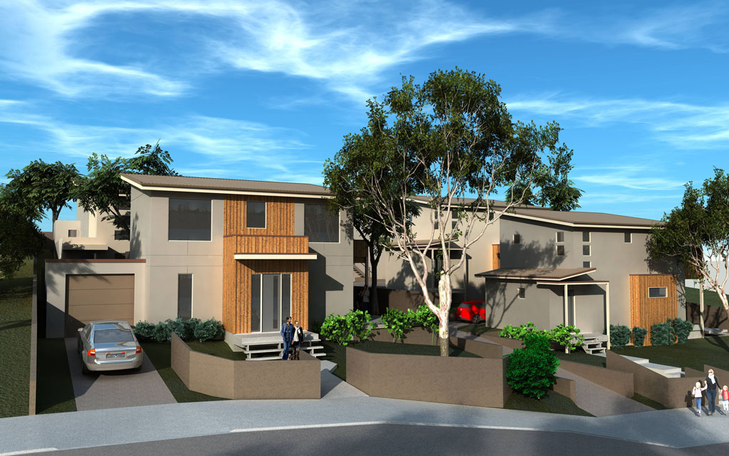
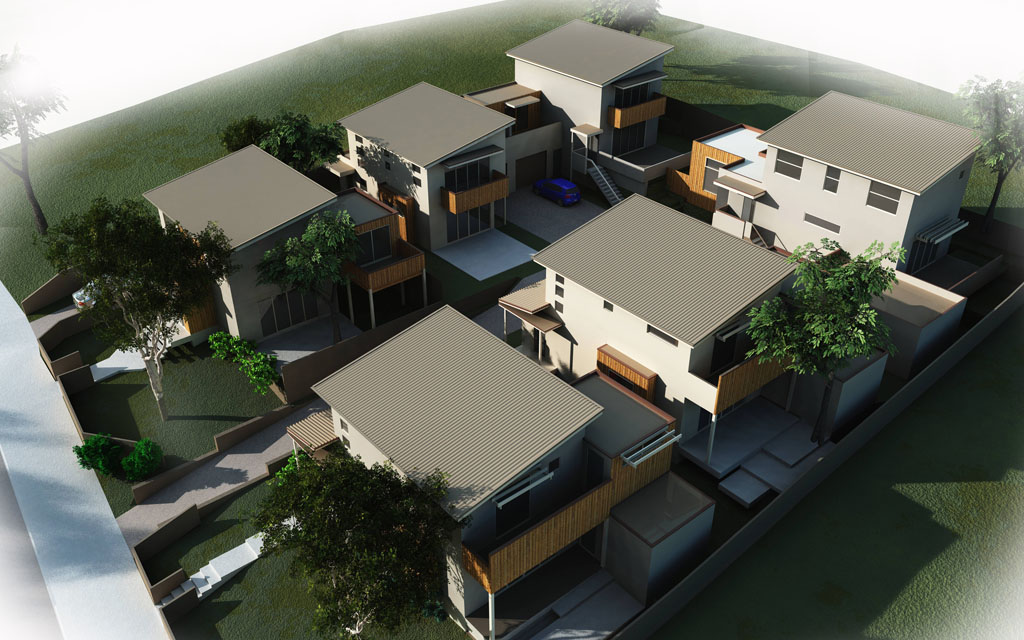
Here are the final submitted renders, although I am still playing with suggestions to for my own learning experience and will post back here.
-
Mate here is the aerial shot with a bit of photoshop to drag out of the shadows.
Hello! It looks like you're interested in this conversation, but you don't have an account yet.
Getting fed up of having to scroll through the same posts each visit? When you register for an account, you'll always come back to exactly where you were before, and choose to be notified of new replies (either via email, or push notification). You'll also be able to save bookmarks and upvote posts to show your appreciation to other community members.
With your input, this post could be even better 💗
Register LoginAdvertisement


