A Thread for Fine Design
-
Sorry for my laxness on the Thread. Just a time of a lot of output.
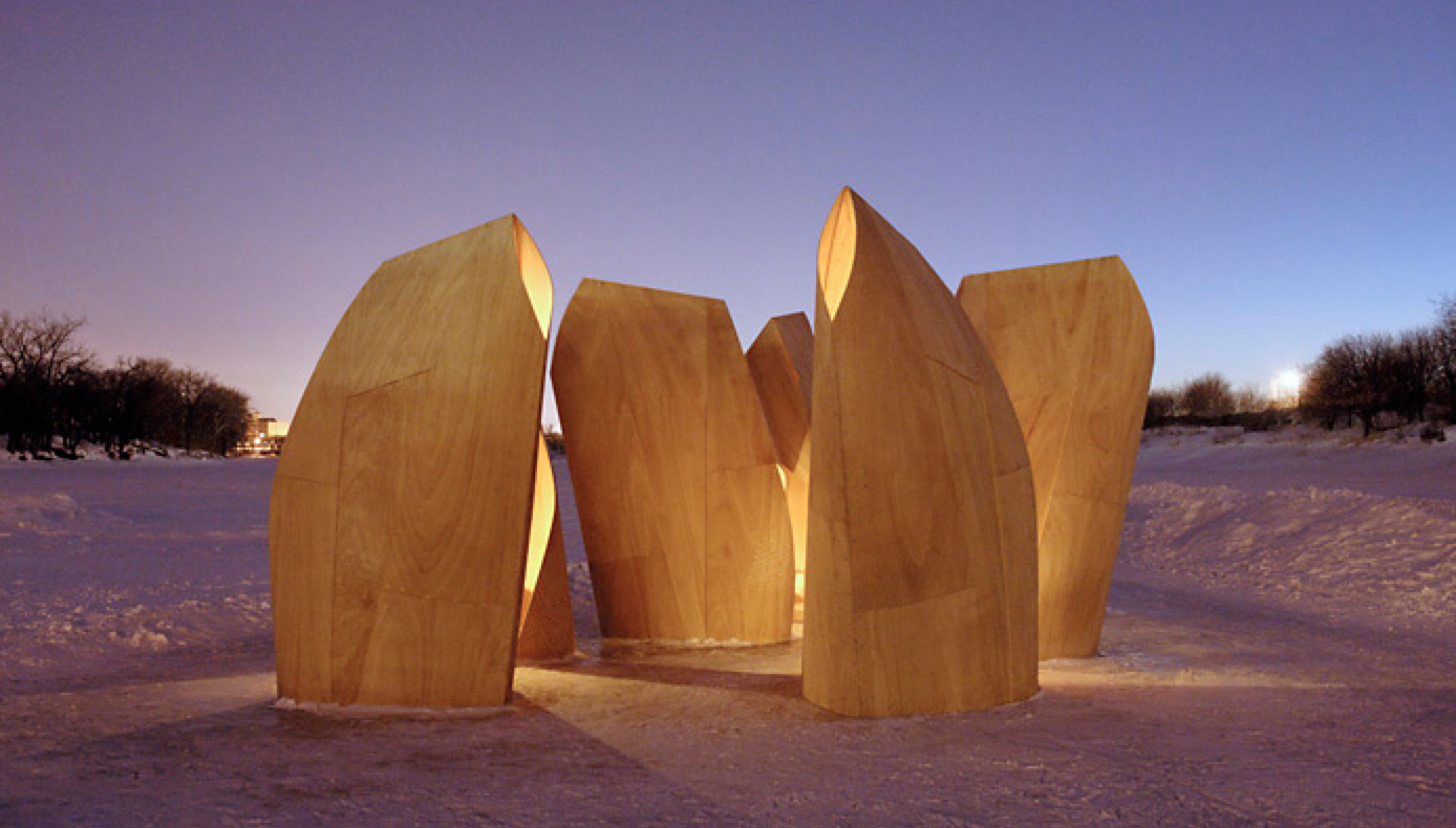
But I came across this. At first I thought it was just sculptures, and liked it any way. But it's relationship to the landscape had me thinking of a good friends thoughts on prairies versus mountains. He would say." I'm not fond of the mountains, everything is already done. But if you put a shape on the prairie, its effect is profound"
http://www.patkau.ca/
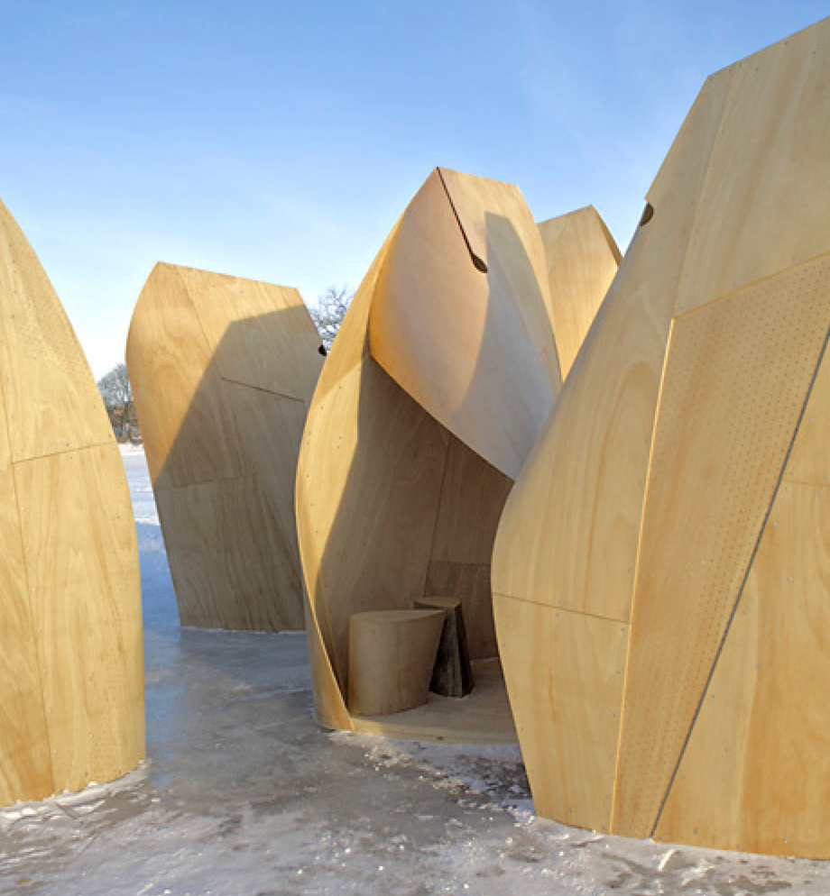
Patkau Architects designed and built the Winnipeg Skating Shelters in response to a competition, and to Canada’s impossible cold, but also to an unprecedented setting generated by the anomaly whereby a river that flows through the city of Winnipeg froze when the water level rose much higher than normal, producing an 'entropic' landscape (as Robert Smithson might put it), or a new form of urban wilderness. Faced with this situation – and with the task of installing shelters for chilly skaters
-
Some cool ideas.
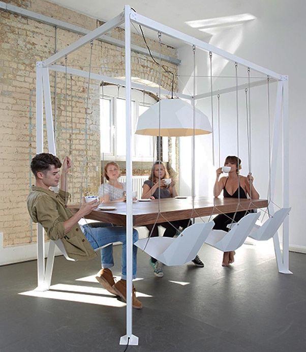
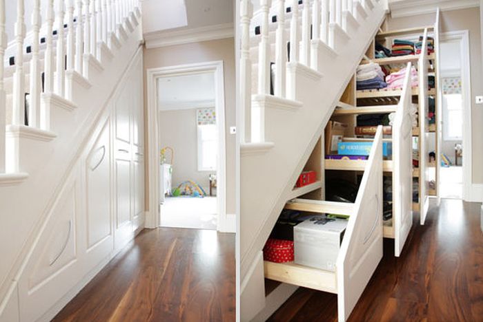
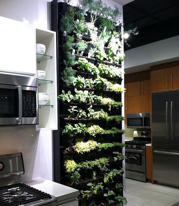
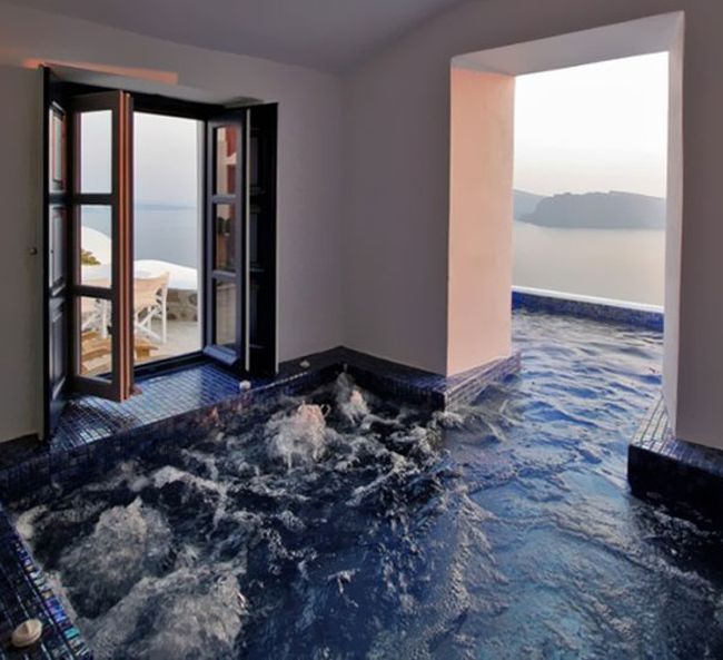
-
Astley Castle wins Riba Stirling Prize for architecture
Regards,
Bob -
-
The URB-E comes in two versions, Commuter (three wheeler) and GP (two wheeler). Its an Indegogo project and I was quite taken with the concept and the design. It ticks all the right boxes for those wishing to get by in cities without a car.
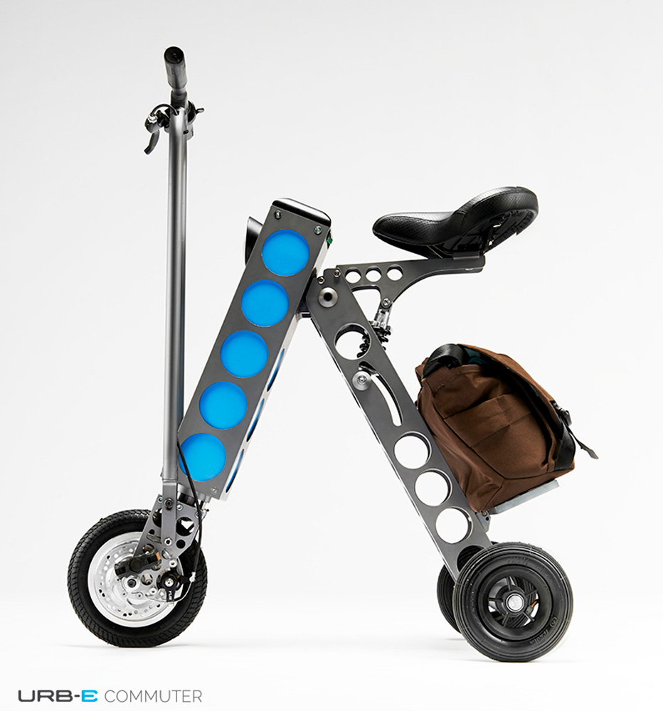
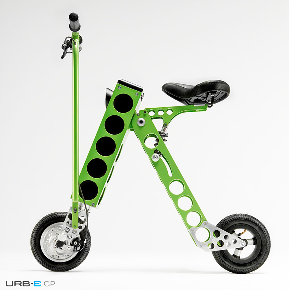 .
.The guys behind the URB-E have put in place a clever sales package. They have two purchase options, a hand-crafted in the USA version at $1,599 and a Chinese manufactured URB-E at $799.
The US version will be serial numbered in order of purchase, and will be specially badged with a plaque saying "This frame was handcrafted in Pasadena, CA by Brent Foes"
Its good to see manufacture staying in the USA and I think this is a very good way of adding extra value to the product that will definitely appeal to patriots.
The link for further details is here, http://www.indiegogo.com/projects/urb-e-the-world-s-most-compact-e-vehicle
-
It would be a shame not to see this interesting thread continuing, so I'll kick it off again with the revived Jaguar Mark II. I remember the first Mark II I saw back in the early 60s! From any angle it looks so well balanced and proportioned.
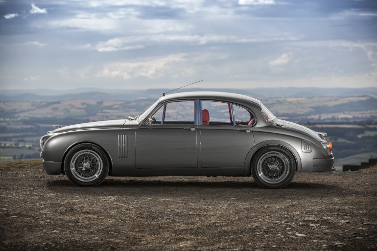
Updated Jaguar Mark 2 puts new spin on a classic
http://www.gizmag.com/jaguar-mark-2-update/33582/?utm_source=Gizmag+Subscribers%26amp;utm_campaign=9d1d7cc0ab-UA-2235360-4%26amp;utm_medium=email%26amp;utm_term=0_65b67362bd-9d1d7cc0ab-76676071 -
'The Duke Engine is an Advanced Internal Combustion Engine'
Very balanced engine! http://www.dukeengines.com/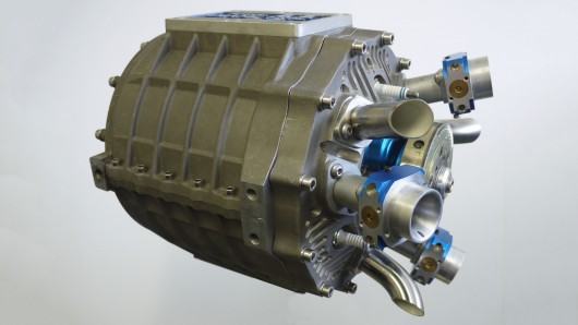
Good artical by Loz Blain, here, http://www.gizmag.com/duke-engines-axial/33631/?utm_source=Gizmag+Subscribers%26amp;utm_campaign=7b7ef0c546-UA-2235360-4%26amp;utm_medium=email%26amp;utm_term=0_65b67362bd-7b7ef0c546-76676071
-
Thank you, I was missing this thread.

-
Great find Mike!
Although I chuckled when I saw the "Thread for Fine Design" title in the new posts.
Couldn't help but think of the Monty Python "Bring out your dead" sketch.
Sorry for being lax on this thread. I always enjoyed it.
I strapped the tools back on and have been working on a design/build project in a remote location, for the past 2 years. Even phone access is difficult. I end up, like now, being out for only a couple of days at a time, and domestic catchup fills my days then.
I'll complete this fall, and then should have time to search out interesting things to revitalize this thread.
Cheers, and till then, keep posting. -
@dale said:
Great find Mike!
Although I chuckled when I saw the "Thread for Fine Design" title in the new posts.
Couldn't help but think of the Monty Python "Bring out your dead" sketch.
Sorry for being lax on this thread. I always enjoyed it.
I strapped the tools back on and have been working on a design/build project in a remote location, for the past 2 years. Even phone access is difficult. I end up, like now, being out for only a couple of days at a time, and domestic catchup fills my days then.
I'll complete this fall, and then should have time to search out interesting things to revitalize this thread.
Cheers, and till then, keep posting.Will do Dale and looking forward to having you back in the fall

-
Well, maybe not exactly fine design but definitely clever and innovative design in this studio (bedsit) conversion.
First, Hide the Bed

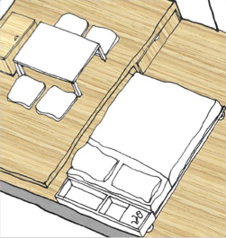
Living with Less: First, Hide the Bed
http://www.treehugger.com/sustainable-product-design/living-with-less-first-hide-the-bed.htmlMore on the design here,
http://www.nytimes.com/packages/html/realestate/20070902_SKETCH_FEATURE/index.htm
http://www.nytimes.com/2007/09/02/realestate/02sketch.html?_r=0l -
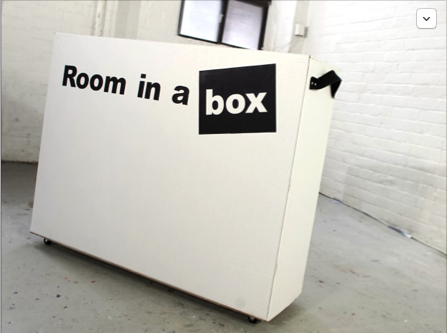
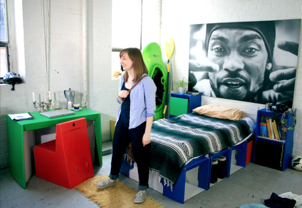
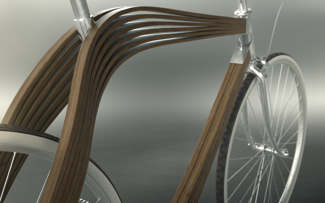
This could be a parents dream! 'Room in the Box' a very clever suite of cardboard furniture for students that they can easily move from area to area!
-
-
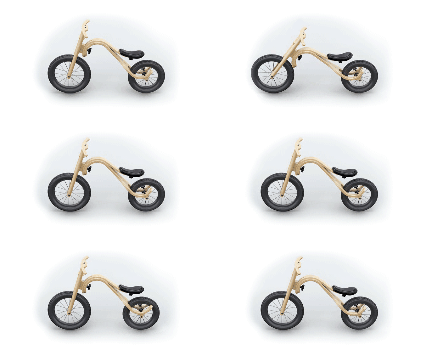
Just came across the Leg&Go kids push bike, cycle bike, cycle trike, rocking horse, sled, etc. I thought its a really well designed and eco friendly kids bike. I've put my grandson's name on one hopefully for his birthday in January when he will be two. https://www.kickstarter.com/projects/1112924950/legandgo-everything-a-first-bike-should-be
-
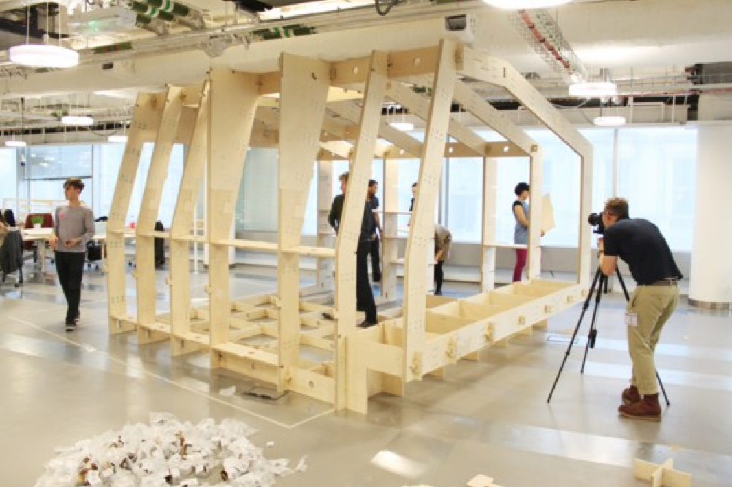
This may have made the 3D printer threads, but certainly deserves a mention in the realm of Fine Design.
Could be the basis for a great challenge, or think tank topic.
http://inhabitat.com/sketchups-open-source-3d-printable-wikihouse-snaps-together-like-lego-bricks/
-
@dale said:
This may have made the 3D printer threads, but certainly deserves a mention in the realm of Fine Design.
Could be the basis for a great challenge, or think tank topic.
http://inhabitat.com/sketchups-open-source-3d-printable-wikihouse-snaps-together-like-lego-bricks/Yes indeed Dale, it really would be an interesting challenge but for what type of structure? I would be thinking along the lines of a garden studio / office that could also act as occasional guest accommodate.
It would be interesting to hear other ideas and then decide on something. If we can get this far I will rustle up some competition prizes.
Mike
-
@mike lucey said:
@dale said:
This may have made the 3D printer threads, but certainly deserves a mention in the realm of Fine Design.
Could be the basis for a great challenge, or think tank topic.
http://inhabitat.com/sketchups-open-source-3d-printable-wikihouse-snaps-together-like-lego-bricks/Yes indeed Dale, it really would be an interesting challenge but for what type of structure? I would be thinking along the lines of a garden studio / office that could also act as occasional guest accommodate.
It would be interesting to hear other ideas and then decide on something. If we can get this far I will rustle up some competition prizes.
Mike
Hi Mike, I like your idea, and will add perhaps a quickly assembled accommodation for a disaster. Seems to be more of those occurring lately.
-
Just spotted a brilliant new shower design, the Nebia Shower. Not only is it a beautiful design its also a huge water conserver which uses up to 70% less water used in a normal shower and folks are raving about the actual shower experience which delivers atomizes tiny water droplets.

The Nebia Shower will also be a DIY retrofit which makes it even more appealing. Detail may be found here,
https://www.kickstarter.com/projects/1499369835/nebia-shower-better-experience-70-less-water -
Hi Guys,
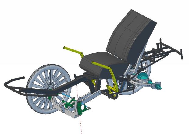
I have just noticed PodRide, a velomobile that is meant to be a practical every day vehicle. The Swedish designer, Mikael Kjellman has produced a really well thought out and designed 'Car Bike' that could be ideal for rainy or cold climates!
From what I can gather the finished PodRide will cost in the region of €2500 but he offers lots of 'buy in' options on his IndieGoGo campaign, here,
PodRide a practical and fun bicycle-car
https://www.indiegogo.com/projects/podride-a-practical-and-fun-bicycle-car/x/286680#/I think its definitely one to keep an eye on particularly if the designer can, as he proposes, produce a reasonably priced self build kit.
Mike

-
The words 'good' and 'Russian Car Design' were never two words I would have used in the same sentence but after reading about Malyshev Alexander's, OneDoorCar, the Mirrow Provocator, I might be about to change my mind.
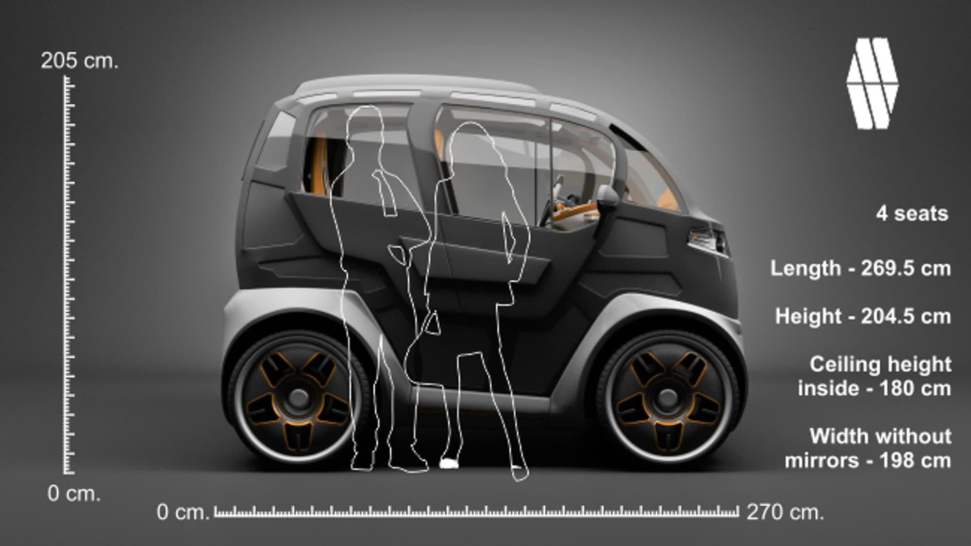
This 2.7 m (8.86 ft) long and 1.98 m (6.5 ft) wide 'city car' ticks a lot of the boxes when it comes to what a family car should be.
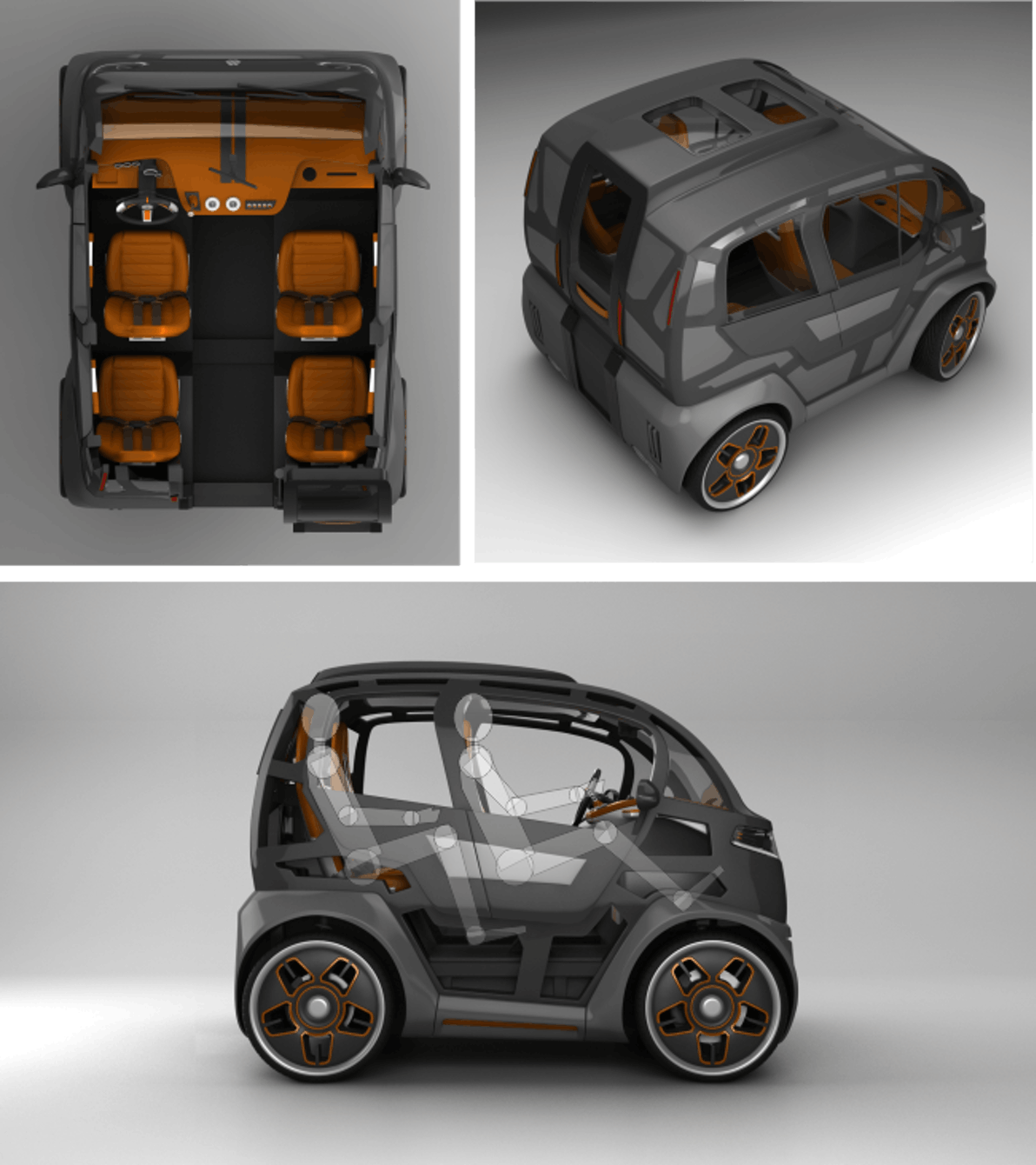
Check out the full details and more images here,
Russian city car leaves convention behind
http://www.gizmag.com/mirrow-provocator-city-car/43303/pictures?thumb=true#picture9
Hello! It looks like you're interested in this conversation, but you don't have an account yet.
Getting fed up of having to scroll through the same posts each visit? When you register for an account, you'll always come back to exactly where you were before, and choose to be notified of new replies (either via email, or push notification). You'll also be able to save bookmarks and upvote posts to show your appreciation to other community members.
With your input, this post could be even better 💗
Register LoginAdvertisement
