A Thread for Fine Design
-
And on the topic of boats and design - anything by Wally.
Its my dream to live on a Wally Ace - on the Thames.
-
@liam887 said:
And on the topic of boats and design - anything by Wally.
Its my dream to live on a Wally Ace - on the Thames.
Ok, you got me, had to check it out. Not to my taste tho'

-
@baz said:
@liam887 said:
And on the topic of boats and design - anything by Wally.
Its my dream to live on a Wally Ace - on the Thames.
Ok, you got me, had to check it out. Not to my taste tho'
[attachment=0:2zxbuhm8]<!-- ia0 -->11128_Wally Ace Hero Bow.jpg<!-- ia0 -->[/attachment:2zxbuhm8]
I could probably find more pleasing to the eye boats but I love the interior of this one, its so spacious.
The 73 is my favourite but its not big enough to live on
-
Boat owners (I had one 17 years ago) have a saying:
"The two best days of being a boat owner are the day you buy it and the day you sell it".
-
I guess you gotta actually live it to appreciate that bit of wisdom

-
Our boat saying: A boat is a hole in the ocean in which you pour money.
-
@dale said:
Our boat saying: A boat is a hole in the ocean in which you pour money.
Ours is.. 'sailing is like standing under a cold shower, tearing up 50 dollar notes'
-
Golf or tennis, anyone?
Alright now stop it this is off topic. -
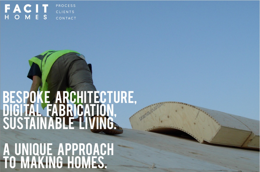
FACIT HOMES is an excellent example of an architect lead Design & Build company.
I was also very impressed with their site as I was not bombarded with textual information, just great interview videos which explain what the company does.
I also noticed that they use Revit for final Con Docs and start the initial, and from the looks of things, continue with quite a bit of the preliminary planning, using pen and paper. I wonder if SketchUp might be a good fit for them at the idea consolidation stage. They like 'fluid planning' and as far as I'm concerned SketchUp offers this capability bar none.
I am sure anyone interested in house design will enjoy learning about the FACIT HOMES concept, so be sure to check it out and let me know what you think.
Mike

-
I mentionned Facit during BC2010 at my Un-conference on 3d modeling for 3d fabrication.
they are great !
-
Yeah, they look to be down to earth guys that get it done!
-
Thanks Mike.
I think this could spark a couple of good long conversations, and though some may think that it is a stretch to include website design in a 'Fine Design " thread, I will thoughtfully submit that I think that long videos should only be used when the user has the alternative to watch them if he or she chooses, with lots of informative non video content as well. Using it as a main format in the website almost goes against the grain of both the way most of us surf, and the good old attention span factor. I also think that by allowing me to browse the non video content, will only serve to draw me to the Video, which I will probably subconsciously have committed to watch all the way through by then.
I can in the first few seconds, be quite intrigued by the content in a gallery, making me want more.
This, I feel is very difficult to do in the first few seconds of a video.As for their content, it is worth going through the video. This is very interesting find.
I really would like to hear what you and others think about the Video as content.
Then there is the workflow and philosophy of Facit, and that is another conversation. -
My iPad has a video function. This doesn't make me a filmmaker.
Even professional filmmakers can make a lot of fluff out of a couple usable facts. For example see the endless production of "history" shows that offer little to the text but some blurry clips of marching sandals--and draw-out a 5 minute read into half an hour.
There's a lot to be said for succinct text and still pictures on websites, along with an ergonomic structure.
But I think this thread is veering towards clever, odd, and unlikely design that is not always that fine. Media discussion would be a nice thread but where?
-
Dale,
I can't get that link. It is misprinted or maybe blocked outside UK?
I guess I am trying to read the mind of some the posters who are regular here, who have clearly developed tastes, and I am assuming they might agree if pressed???? Just a feeling. I think of fine art together with fine design. And it's not always a classical or beauty judgement. It can be an elegant solution, a boon for the world, that would make it fine design. And something that makes you feel like a "mere mortal".
And don't get me wrong. For example, I think that loft is very fine interior design, enchanting (just wish it had radiant heating). Something I really wish I could come up with (along with clients who won't scream about the lack of wall cabinets).
Peter
-
There is a line between fine design and good design, IMO fine design is aesthetically nice and good design is functionally good. I guess it all goes back to the old form vs function debates.
I often page through a Dwell magazine and I'm attracted to the wonderful lines, great reflective materials and minimalist scenes, but I would not live in such a place as it's probably cold, lacks cabinets, not functional.
-
@pbacot said:
My iPad has a video function. This doesn't make me a filmmaker.
Even professional filmmakers can make a lot of fluff out of a couple usable facts. For example see the endless production of "history" shows that offer little to the text but some blurry clips of marching sandals--and draw-out a 5 minute read into half an hour.
There's a lot to be said for succinct text and still pictures on websites, along with an ergonomic structure.
But I think this thread is veering towards clever, odd, and unlikely design that is not always that fine. Media discussion would be a nice thread but where?
I know that I sometimes place things here to invite discussion and criticism, and frankly I would love to see more of that, which is why I appreciate your comments. I think I have mentioned that I believe one's perception of what is fine may lay in the eye of the beholder. An example is that I feel that Prince Charles and I would not necessarily eye to eye on architecture http://www.telegraph.co.uk/news/uknews/theroyalfamily/5317802/The-Prince-of-Wales-on-architecture-his-10-monstrous-carbuncles.html
So I encourage people to post, but would really welcome critique and frank discussion.
-
Peter, the link is fixed. Sorry bout that.
I think your use of "elegant solution" is is well put. And I am sure you know what it means to try and arrive at this solution recognizing the needs and wants of clients, the rules and regulations of local jurisdictions, and the fashion of the moment.
I have just had the occasion to be in discussion with a City Planner over a projects connection to the neighbourhood. I told him that if connection is truly desired, then it must be recognized how the greater neighbourhood was built out. There is a certain variety and resilience in traditional neighbourhoods, at least in North America, that developed through the emotional identity, artistic aspirations, pride, and sense of community, and craftsmanship of it’s residents.
Replacing that with the instant artificiality of modern development, that tends to rely on the trends of the architectural fashion, will only amount to a loss of this identity.
So can sensitive well executed design express this while at the same time being somehow fresh?
I think the best of Fine design can. -
@solo said:
There is a line between fine design and good design, IMO fine design is aesthetically nice and good design is functionally good. I guess it all goes back to the old form vs function debates.
I often page through a Dwell magazine and I'm attracted to the wonderful lines, great reflective materials and minimalist scenes, but I would not live in such a place as it's probably cold, lacks cabinets, not functional.
Pete, I was just looking, well actually marveling, at a picture of the interior of a "modern" home given to me by a client. It was as you described "wonderful lines, great reflective materials and minimalist scenes", and I really loved it, but, at the same time I just couldn't for the life of me picture a baby crawling on those reflective marble floors or flinging mushed peas around the kitchen, let alone the dining room. It looked as if it was intended to be looked at and appreciated, but not really lived in.
Given what you said about form and function, this would be Fine Design, and I think it was, but... -
Mayor, thanks for the link. In my country, people homes are big, ugly, inefficient in every aspect. People with money, of course.
It strikes me every time I read something like this:
"The house requires a heating system with an output of just 4 kW (the equivalent of a single radiator) for the entire 200 sqm house! Facit buildings are designed to be airtight, so as not to lose heat. This necessitates the implementation of a heat recovery system that draws in fresh air and expels stale air, while retaining the warmth."
And by the way....the houses are beautiful!
Cheers!
Stefan -
What interests me most about the FACIT crew is that they are a D&B firm. I think there is a lot of merit in these types of firms as they are able to see the job through from start to finish and of course include the client in each step along the way.
They must also develop good solid practical construction methods as it would not be the case of the designer just 'getting it right' on paper. In this case the fabricator would most definitely have his say on what works for him on site. The video also seems to get this message across quite well, this is what I read into areas anyway.
From what I gather these types of firms are common place in Scandinavia but again this does not surprise me as those guys often lead the way in many areas.
I suppose the only drawback for the client, if it could be construed as a drawback, is that a particular D&B firm might only concentrate on producing a particular design style range. But again, this could leave things open to various D&B firms offering a variety of design 'style' solutions. Everyone is not on the same hymn book, so to speak

Hello! It looks like you're interested in this conversation, but you don't have an account yet.
Getting fed up of having to scroll through the same posts each visit? When you register for an account, you'll always come back to exactly where you were before, and choose to be notified of new replies (either via email, or push notification). You'll also be able to save bookmarks and upvote posts to show your appreciation to other community members.
With your input, this post could be even better 💗
Register LoginAdvertisement


