Depth or atmosphere in PR render
-
Hello all,
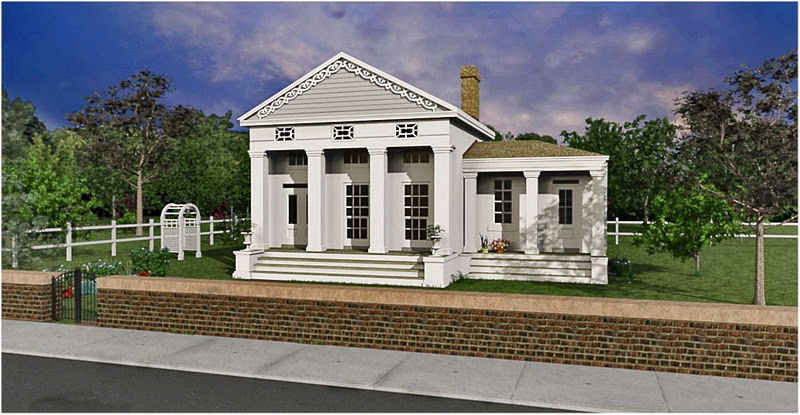
I have gotten back into working on my rendering skills. Having some OK results but I am wondering what folks do to add depth to their renderings. This scene has a lot of layers and depth but I am not getting the punch I would like.
Is depth of field what I am missing?
This is just a learning exercise, any tips would be appreciated.
Looking to make it more natural and less CG

Thanks to all in advance,
-
Patrick,
I'll give you my "hacks" method: I "screened" the edges and "soft-lighted" the center (using DC's free "mergency4" plug-in) to quickly give your image the "punch" I look for...but the guru's will surely have better methods

-
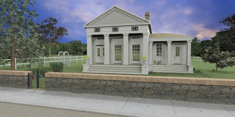
I was trying some other settings-- HDRI seems to help with things.
Tom, I'll look into you hack method, I'm outside and the screen isn't reading to well in the sun. (Shouldn't complain it's 85 degrees today!)
-
I find that oftentimes depth is difficult to get without some foresight in the design of the building. In other words I'm not sure even a good photographer could walk up to any given house and produce a photograph with a lot of depth, and I think it's probably even harder for us.
For example, in your rendering, I think one of the main things hampering the depth is the massive (not as in huge but as in heavy) stone fence blocking your eye from traveling logically from the foreground to the background.
Color-wise, I've read that it can help to have warmer tones in the foreground and cooler ones in the background, but I don't think that's meant as a photoshop after thought so much as a compositional tip - as in how to set up your shot, not how to fix it after the fact.
Playing with camera lenses can help, or FOV in SU. Using a long lens will flatten your image while a shorter one will add depth, but if you go to far the distortion gets distracting and will look unrealistic.
As for your image in particular, besides the fence, you may think about moving the camera further to the right. As is, your looking almost straight on at the house with only a hint of the side showing. Being able to see more of the side should at least help add depth to the house itself, if not the whole image. And if you have design freedom with where that gate is, perhaps it could be somewhere more directly in front of the camera (opened up) with the path leading the eye to the front steps of the house. Adding an interior to the house would add depth as well, or failing that (lots of work) some better reflections would help.
Shadows can help as well. Currently the camera is a bit to the right of the house and the sun is similarly placed it seems (I'm confused by the shadows. There are sharp pillar shadows on the house, very soft shadows directly under the tree to the right, and a fence shadow coming towards the camera. The overall effect is that it looks less like sunlight and more like some sort of studio setup with multiple lights - an effect that is strengthened by the sky which seems to be more dusk unlike the color of light being cast onto the scene.). Having some strong shadows from a sun coming from behing and to the left or right of the camera will provide more contrast and depth.
-Brodie
-
Looking back through the images, I realized that the first one's had the camera further to the right as I mentioned. I think that was probably a better setup as far as depth is concerned.
Also, I think the improvements you made to the foreground are great, the fence, sidewalk, and road are done quite well (although there seems to be a dot in the middle of each square of your sidewalk, easy enough to remove in PS).
-Brodie
-
Hi,
in my opinion the problem is the kind of image.
The depth of field in photography you get when you use a diaphragm very open (F2,8 or more) in addition to a long/medium lens (100, 200 mm).
Architectural photography usually use depth of field is very wide, and the whole scene is well focused.
This is because the lenses used are usually very short (10-20 mm) and relatively closed aperture (f11, f16 or more).
What you get in your image is an unnatural result in architectural photography in my opinion.
The pictures where you play with the depth of field are other, more likely still life (design objects, interior etc.) or portraits and so on.Ivan
-
Well, it's definitely much more difficult to get DOF with a large scene like a building (with small scenes like jewelery the trick is to NOT get so much DOF), but I'm not sure that makes it 'unnatural.'
I think at that point it becomes personal preference. If you truly want to get something 'photorealistic' then your best off not playing much with DOF, or at least having a VERY light hand with it. On the other hand, if you just want an image that looks 'good' regardless of whether it could be produced by a camera then I think playing with DOF is fine.
I myself tend to play with it on occasion. I use Maxwell Render which is unbiased so I know that the outcome is exactly what I'd get from using a real camera but sometimes I'll post-process some DOF in PhotoShop by using a Z-Depth layer. If you do a search here for z-depth you can even find a good way to get a z-depth map in SU if your rendering engine can't produce one.
-Brodie
-
Hi Patrick
Just wondered if have you tried/found(its a separate program) the post render image editor that comes with the rendering engine (I presume its nXt). Its got vignette, real time haze, depth blur and lighting channels. I use it quite a bit to tweak final renders, and some then PS work etc. Just save out finish render as nxtimage -
Great comments everyone, I appreciate your time and input. I definitely need to work on my PS skills, I have only tapped the surface of what you can do in post processing, I spend a lot of time fidgeting with the render when sometime things can just as quickly be fixed with a few clicks in photoshop.
Richat-- just beginning to tap into manipulating nxtimages, the haze feature looks like it may come in useful for giving depth.
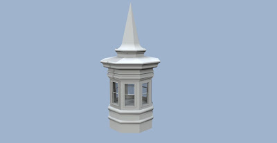
I'll post more soon, spent a little time modeling the tower that goes on top.

Thanks for the help
-
Well, I ended up with something I am happy with for now. It's a combination if a HDRI rendering with an overlay of a Sun rendering for the shadows.
Not perfect but I learned a lot pulling it together.
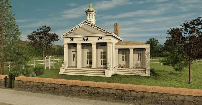
After thinking about the comments I began to wonder--- am I trying to render what I think I would see, or what a photograph of the building might look like. They are different things I believe (?).
I guess in the end it is all a matter of personal preference and what you are trying to communicate.
Any thoughts? I haven't dabbled in much landscape & entourage before.
-
Use all the depth cues available to you.
You are only showing the front of the building, so you don't have any of the side receding in perspective toward the horizon.Use overlap. Let a foreground tree overlap some of the building. Let some of the wall overlap the first row of steps.
Change the time of day so you can let longer shadows establish the perspective and also separate building from background.
The arbor and the gate look too small creating a reverse perspective.
The building is too white. A neutral color like white is going to pickup the color of the environment, especially in the shadows. The white building looks like a flat cutout pasted on the scene. I needs to acquire some of the coloration of the scene via reflected light.
Divide the scene into three layers. Closest layer jfully saturated mid layer slightly unsaturated far layer somewhat desaturated by atmospheric haze.
Add some object of known size in the background.
Your background trees may be too high, thus forcing the background foreward.
Why does the wall throw its shadow forward and the shadow of the building go backward?
Be careful with the sky. You can't just grab any sky. The field of view should match the render. You can't have a telephoto sky and a wide angle building or visa versa.
Have more texture in the grass and make sure it diminishes at the same rate as the perspective.
If you google "Country Church,"you will find hundreds of example photos to study and see how these comments might relate to each of the pictures.
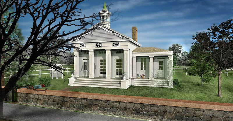
Here is a possible interpretation of the scene.
-
Lots of good advice here. I apply a couple of very simple rules I learned from hand rendering. With exterior scenes, objects on the horizon are atmospheric, lighter in value then the subject, and much lighter then foreground elements. The sky is the same, the portion on the horizon is lighter then at the top of the render. I pp the sky, and the objects on the horizon before placing them in the scene or the render. In addition to value, I often find that blurring the background elements helps to focus attention on the middle ground.
Don't forget the classical architectural photographic method of framing the subject with an overhanging branch. Not always applicable, but darker foreground feature often helps.
Too much graphic attention on minute elements on the model sometimes distracts from the subject itself. IMO, the right amount is best judged by eye.
I like computer rendering. Often my hand renders were judged as being too artistic. While I basically do the same things with computer renders, the illustrations are regarded as representing reality.
-
Again, from hand rendering: Atmospheric perspective is implied when items that recede in the background are both less detailed and become progressively more blue because the atmosphere particles between the viewer and the item viewed are thicker the more the depth.
When I was doing illustrations in Piranesi, it was very easy to apply all surface colours with a "depth" fade. I always painted over a white surface ( I was careful NOT to us a grayscale version of the colours applied in SketchUp because the grays then are not really shadow areas, they are the tonal value of the colours applied) with gray shading that I would change to a blue hue in areas in shade and a purplish hue on the sunward side,but that is a whole other topic. So that when the colours applied faded they would fade to whatevers was beneath, white generally so less saturated. As a second step, I would sample the sky colour and use a semi transparent version of it as a reverse fade toward the viewer: So more transparent blue far away and less so as you approach the viewer. I would paint bucket the background trees with this semi transparent blue which also would fade as the trees approach the viewer. Doint this would serve 2 purposes, the semi-transparent blue/white colour would de-saturate the background trees and also obscure the details as the colour shifs would merge close to the blue paing colour. I often exaggerated this, as artists often do, in order to really get the sense of depth.This works with Photorealistic work as well and really does improve the image. However, this does not rely on sliders or settings or anything technical. It is something that is measured by the eye. It can be done in Photoshop as well because one can apply colours in fades, whether you have Photoshop 3D or not.
Changing the colours of the shadows and applying some reflected light (that is incorporating colours of items around the structure on the surface) would go a long way to making it look more like real life and less like CG, also.
There is an additional step. It has to do with focus. Entourage such as trees and plants is necessarily supplied at sharp focus as it is not possible to create sharp focus from difuse. The opposite IS possible however, and foreground details may be "DE-emphasized" so that it allows the viewer to focus on the central object. In my opinion "blurring" objects is NOT the same as less focus. In order to de-emphasize, I sample a midtone colour of the object that I am trying to lower in focus and paint bucket a semi-transparent version of this over that object. Again the colour distinctions begin to fade as the paint bucket makes them merge and the details are lost.You don't need to use entourage out of the box, you can make it fit the purpose, the perspective and the lighting by using "paint".
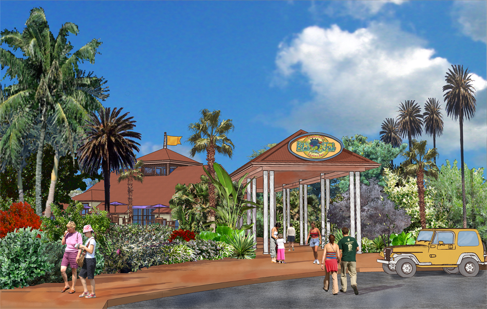
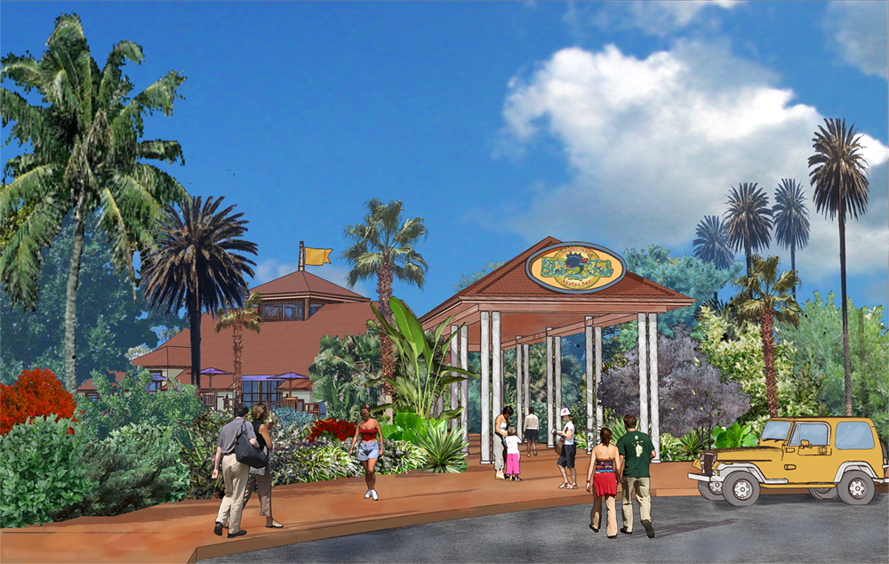
I am attaching 2 pictures, a "Before" and "After" so to speak of an example used from my Chapter on Composition from Bonnie Roskes Piranesi Book.
Please note, the "Before" has many more things wrong with it from a compositional or rendering perspective, than were addressed in the "After". The "After" is NOT intended to be an exampler of a "fixed" or "good" rendering. What IS illustrated, amongst a few other issues addressed in it, is the result of some of this "atmospheric" as well as "de-emphasizing" paint bucketing.
-
WOW all of this is fantastic advice and very helpful.
Stay tuned, I need to digest all of this.
Thank you for your time and insights. Still much to learn.
-
Susan, Regarding the following part of your post: "When I was doing illustrations in Piranesi, it was very easy to apply all surface colours with a "depth" fade. I always painted over a white surface ( I was careful NOT to us a grayscale version of the colours applied in SketchUp because the grays then are not really shadow areas, they are the tonal value of the colours applied)...." What's interesting was my recollection that as I render by color pencil, I often blend depth into the shadows with black, that for me, in the media of color pencils, tonal values were not enough. However rendering on a computer, I do not even consider this.
Sound like you put a lot more work, and care into your renders then I.
The first lesson my mentor taught me, was that illustration should not be limited by the number of colors you have access to. He then proceeded to teach me how to render with the smallest tin of pencils. Sigh....... times have changed:-), now I render with 16m colors.
-
Just to follow up, I have tried to implement a lot of the useful suggestions.
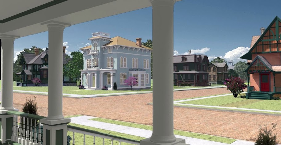
I got the depth, now I need more detail in the foreground. grass is a pain

Thanks to all, any c&c is welcomed.
-
-
@unknownuser said:
Just to follow up, I have tried to implement a lot of the useful suggestions.

I got the depth, now I need more detail in the foreground. grass is a pain

Thanks to all, any c&c is welcomed.
Patrick, very impressive improvement. Pretty much spot on. The only comments I would make are:
If the blue bldg is the prime subject I would crop away the right third of the scene. However if the village is the subject, I would leave as is.Use a bump map to raise the cobbles in the street. I used to live next to a brick road and even after 50 years can still hear the tires whizzing over the bricks.
I would go for a cloud pattern than comes all the way forward to add to the perspective.
Hedges, open fences, some delineation at the property line?
Regarding grass, learn how to use the instancing brush (also NOTE TO SELF: I need to learn this too)or strip in photos taken at a golf course.
-
Wow, huge improvement here. Great job.
Here's the new C&C
-
Something weird going on with your handrail in the foreground there. On the left side it's very wide, then it seems to bypass the middle column and also gets really really thin. Not sure what's going on...reminds me of an M.C. Escher.
-
Grass is always hard. My tip, if you're going to do flat grass like that it to do some photoshop work to break it up. What really gives away the fact that the grass is a flat plane isn't so much the middle where you just see grass but rather at the edges where the grass meets the sidewalk, for example.
What I do is use the Clone/Stamp tool in Photoshop to clone some nearby grass and then change the brush from the normal round brush to an image of a few blades of grass (if you're using Photoshop there's a standard brush that works perfectly - if not you may have to create one yourself). Basically you just paint that along the edges where grass meets sidewalk and it fools the eye.


- I'm not sure what material the road is. I'm guessing brick? Maybe some more variation and the coloring seems like maybe it's off.
-Brodie
-
Hello! It looks like you're interested in this conversation, but you don't have an account yet.
Getting fed up of having to scroll through the same posts each visit? When you register for an account, you'll always come back to exactly where you were before, and choose to be notified of new replies (either via email, or push notification). You'll also be able to save bookmarks and upvote posts to show your appreciation to other community members.
With your input, this post could be even better 💗
Register LoginAdvertisement


