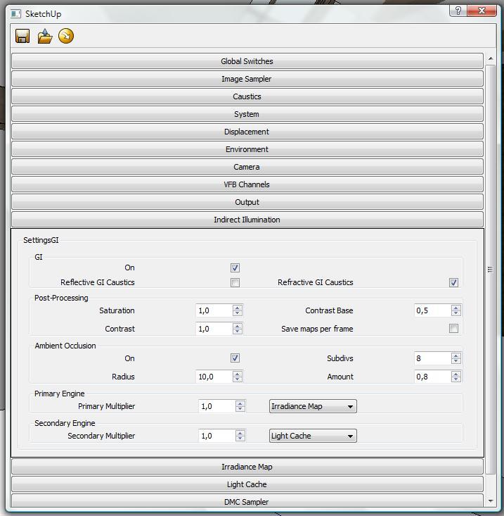
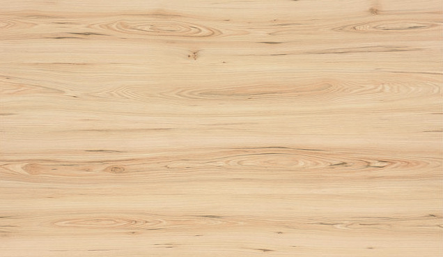
Some interior - IKEA style
-
@slimaczysko said:
Thx for yours comments!!! im happy you liked

@ivanscotti said:
WOW!
These images are really stunning. Very good, congratulations!
I noticed that V-Ray can produce image quality truly superior, should i decide to learn it.
A stupid question: How long did it take you to learn to use in this way V-Ray?
naka
IvanHmmm... something about 1 Year... but I learn all myself... if you want to start you must download a manual from asgvis and watch all clips on youtube from andyciuala... andyciuala have the best tutorials for v-ray and sketchup...

Thanks a lot for the information, i went now to see the video on youtube, they seem really well done.

See you soon
ivan -
No problem man !! If You have any question just ask .... i will try to help if i can...

-
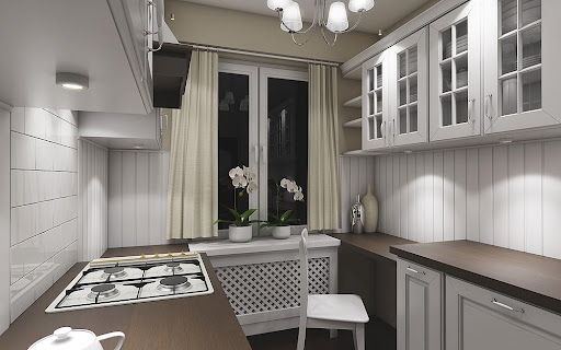
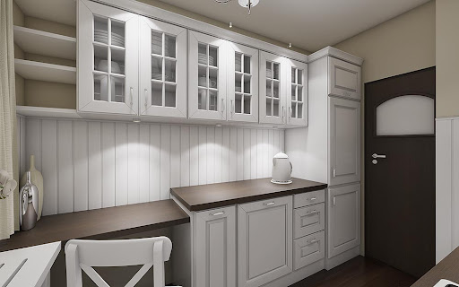
Another version of a previous project... different style...
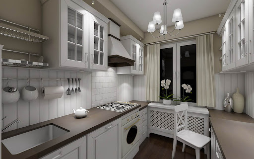
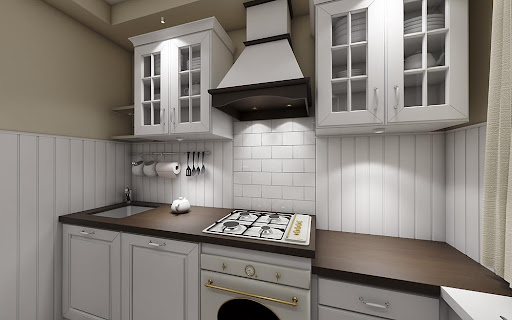
-
For some reason, I'm hungry?

Wow. Those are excellent.
-
Again congratulations, you're my idol!(Just kidding)

Take back seriously, i love that satin surface of the wooden top, is simply fantastic.Let me ask you some information because, as you know, I'm going to start working with VRay.
How long did it take to render each image? (I'm not talking about the time taken for the adjustments, the preparation and post production: i mean only rendering time)
What is the size each original image?
what kind of hardware you use?
Thank you very much
Ivan -
Did you use the fur plugin for the white shag rugs?
-
@bryan k said:
For some reason, I'm hungry?

Wow. Those are excellent.
Thx a lot ! Now I'm hungry to

@ivanscotti said:
Again congratulations, you're my idol!(Just kidding)

Take back seriously, i love that satin surface of the wooden top, is simply fantastic.Let me ask you some information because, as you know, I'm going to start working with VRay.
How long did it take to render each image? (I'm not talking about the time taken for the adjustments, the preparation and post production: i mean only rendering time)
What is the size each original image?
what kind of hardware you use?
Thank you very much
IvanI'm glad you liked

The render time for each image was 2h... The oryginal resolutionis 1600x1000... it's a long time but i use high level setup for Light Cache and when you add a few IES lights and bump maps it's take a ages

My hardware is Pentium i7 920 2,67GHz ( 8 square render in F window of V-ray ) 7GB Ram memory , ATI Radeon 4850 HD.... nothing special or adwanced...
No problem... I will always help You if i can...
@unknownuser said:
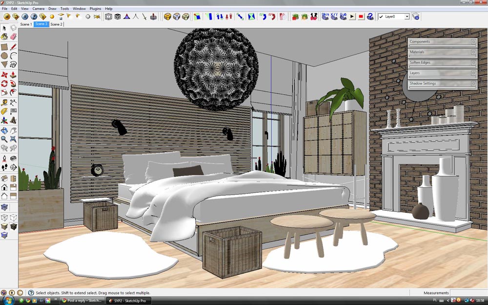
Did you use the fur plugin for the white shag rugs?
No it's look like this... model with displacement map... when i want to use a Fur plugin i have always some errors in this model...
-
Thanks, my friend.
I hope to show you soon my first renders with VRay!
-
Hi all !!!
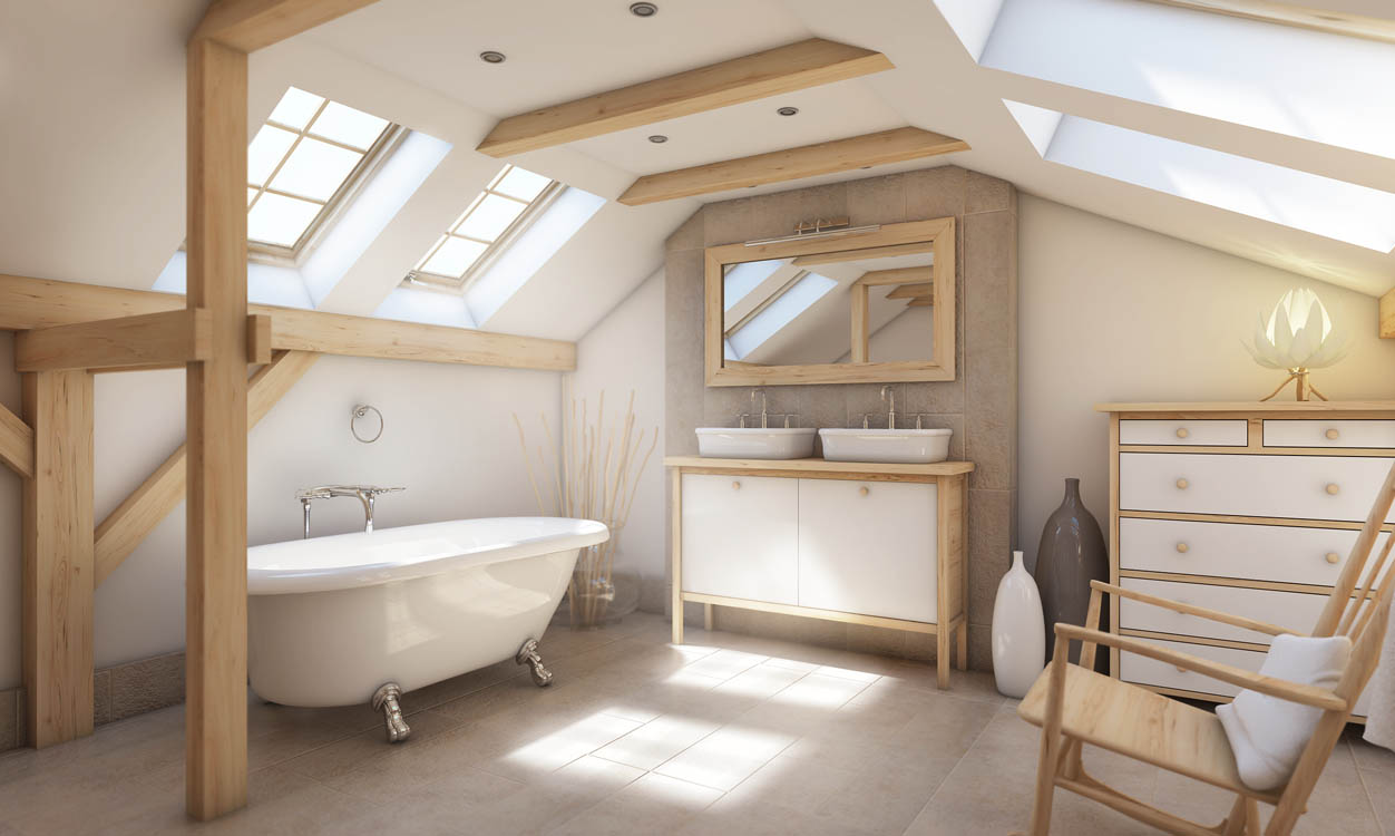
My new project... bathroom
 I'm waiting for your's comments...
Will be more of this
Sketchup, v-ray, PS...
-
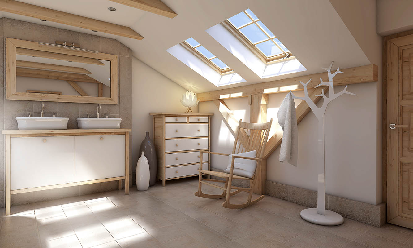
And next one... i back from swimming pool and it's done

-
You've got serious skills. That's one lovely image.
-
@unknownuser said:
You've got serious skills. That's one lovely image.
Thank you very much
 But it's still a lot to learn !
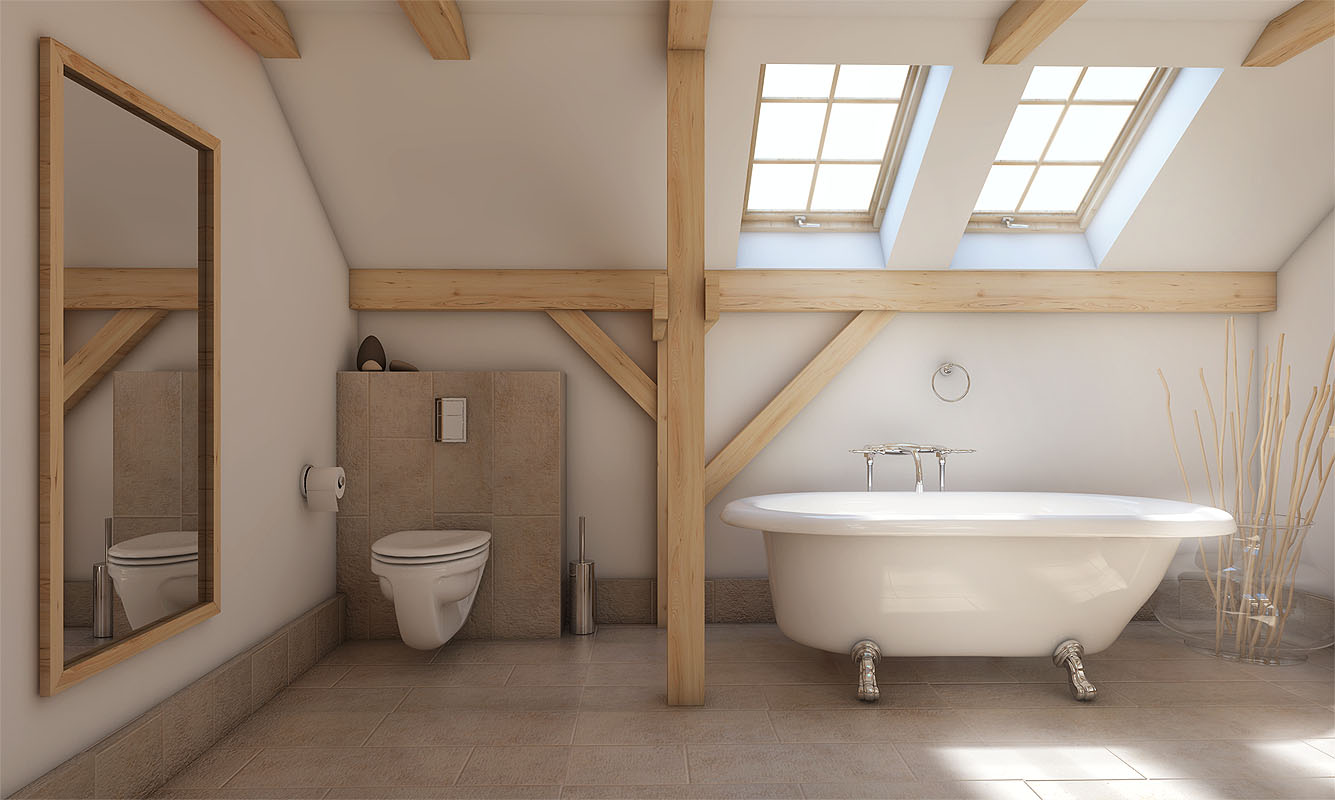
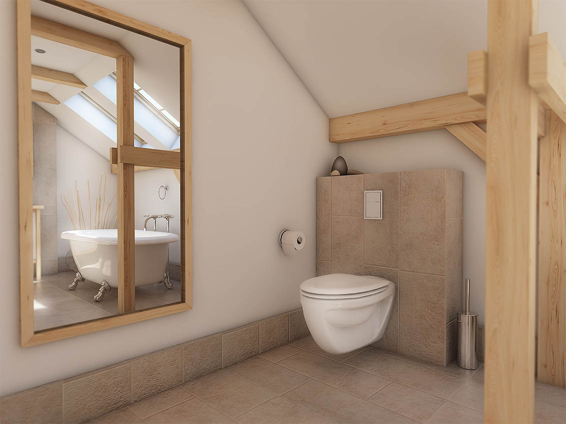
Next two ( but not too showy like last one

-
Great renders. Textures, light...
Shadow in corners, edges... are defined by AO?...or is it in postpro? -
-
Nice
 . Your style is sweet
  . All pictures downloaded.
 -
thank you...for texture also

-
@jarynzlesa said:
Nice
 . Your style is sweet
  . All pictures downloaded.
thx my friend

@srx said:
thank you...for texture also

No problem

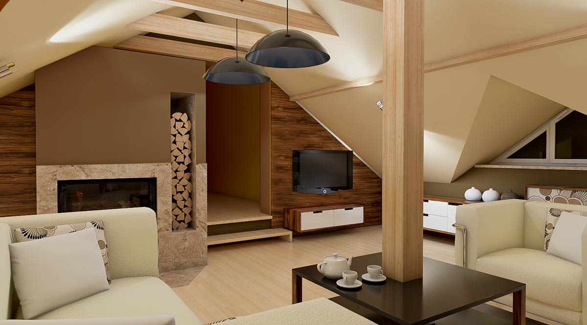
My new project for a client
 I'm waiting for your's advices !!!
-
- The night renders are great, clean and sharp
 .
. - You cope with lack of ambient light very well. Position and number of lights is adequate for this room.
- The room is furnished nice and sufficient. The furniture's design goes with whole idea of room's architecture pretty well.
- I would get rid of yellow colors in the room, because already there is a lot of colors in the room. And I would get rid of a led lights behind the TV.
- I don't know, how do you want to get coffee table in place, but I would choose bigger coffee table made of four parts. These parts could be used separately. Maybe, the post (supporting beam) in the middle of the room could be used for hanging nonsense home necessities.
- Nice modeling, Nice renders, Nice design = three N of three.

- Can you send me *.visopt for dig.jpg or dig2.jpg. Thx.
- The night renders are great, clean and sharp
-
Stunning

Hello! It looks like you're interested in this conversation, but you don't have an account yet.
Getting fed up of having to scroll through the same posts each visit? When you register for an account, you'll always come back to exactly where you were before, and choose to be notified of new replies (either via email, or push notification). You'll also be able to save bookmarks and upvote posts to show your appreciation to other community members.
With your input, this post could be even better 💗
Register LoginAdvertisement
