Need your help....
-
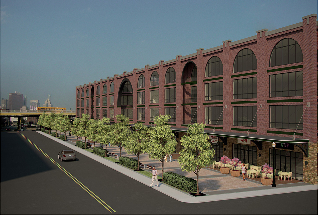
I think that I've been looking at this too long, but "something" just seems to be missing. I need some C&C from you guys. I already got the obvious, like the shrubs and table and chairs. Need some "wow" to this image. Thanks.
Mike

-
my thoughts. . .and they ain't worth much, but . . . just to get the conversation going
Sky is flat. In fact the whole thing looks flat. Use a sky image with some clouds maybe.
some reflections. . .If you look at old school renders or car adds, they usually show the street and sidewalk "wet" like after a rainstorm in order to show color in what otherwise would be dull and grey. .streets and sidewalks.
Likewise with the glass. A bit of livliness would be good.
More street activity. . .cars, people etc. I'd probably crop the image on the left to cut out a good portion of the street that doesn't contribute. it just adds a lot of dark gray.
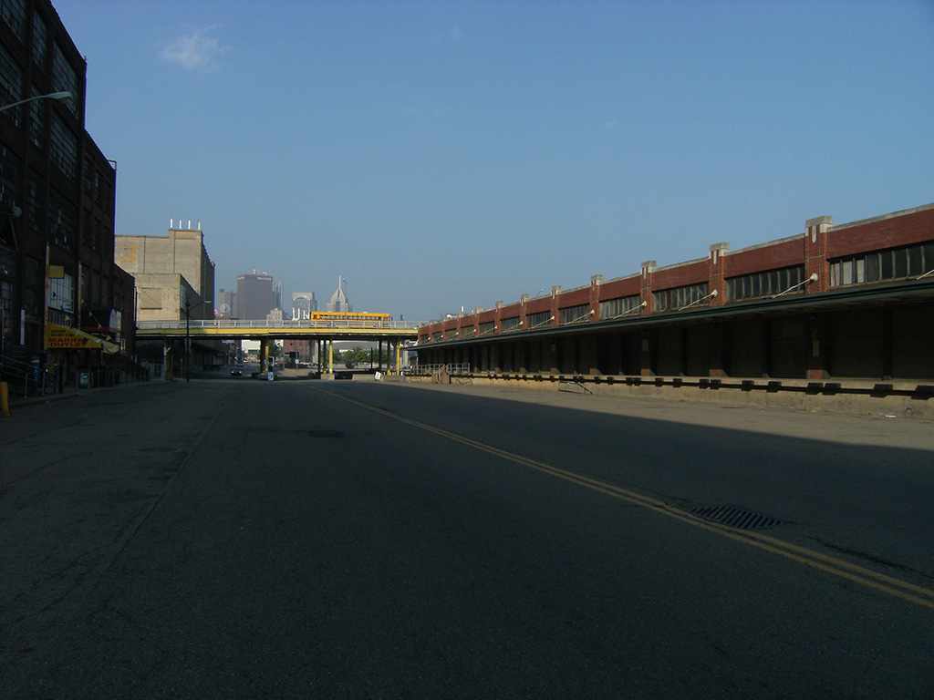
the building looks like it set in kind of a ghost town. is this the accurate setting? are there more buildings in the view?Any. .. just my very humble opinion.
But hey! It beats the heck out of what I can do.

-
Thanks for the comments David. About it being flat, I did desaturate the image some cause it seemed too colorful before, maybe I did it too much. Also the setting is pretty accurate. Thanks again.
Mike

-
The building looks very similar to the Texas Rangers ballpark.
-
I agree with David_H: add a sky with some clouds and reflection in the windows. I'd also make the road asphalt much lighter. Older roads are always sun bleached. You also could add some noise to it to give it a little more texture. More people and a few more cars would liven it up some more, too.
Finally, I'd lighten up the whole image. It might not be as true to the setting, but representation is not always true to life, right?
-
-Yep, the glass would look better with some reflections
-A different sky would really help, a couple clouds and some pigeons
-Make the trees greener
-Make the car and other metal (light post, awning supports, etc.) shiny/reflective
-Is the brick and stonework bumpmapped? That may help...Just my 2 cents, hope it helps
-
@alpro said:
Thanks for the comments David. About it being flat, I did desaturate the image some cause it seemed too colorful before, maybe I did it too much. Also the setting is pretty accurate. Thanks again.
Mikebut where is the building gone now ?
I would say that it depends on what are you pointing at, if the building itself , by making the corner detailed, or you want the perspective as you have it. If so I will change the material of the fachade and make it more orange light.
salud

-
my observations..
- lighting is fairly bland, if ur using vray increase your sun size multiplier, your shadows are too flat and crisp.
- use bump maps, esp on your brick work.
- lower the eye level, this viewpoint does nothing for the sense of realism floating 8ft off the ground.
- adjust your curves and colour balance in photoshop
- dodge and burn your people to blend them into the scene lighting
- the horizon line is out on your background bmp
i would also be tempted to light the interior somehow, it currently look unoccupied
the saturation is fine, i wouldnt increase this too much or you'll get lime green trees.
potential for a nice lil image tho! -
Hey I work like two blocks from there, neat! It's this a proposed project or something else (school, just for fun, etc..)? I've love to see something happen there.
Hello! It looks like you're interested in this conversation, but you don't have an account yet.
Getting fed up of having to scroll through the same posts each visit? When you register for an account, you'll always come back to exactly where you were before, and choose to be notified of new replies (either via email, or push notification). You'll also be able to save bookmarks and upvote posts to show your appreciation to other community members.
With your input, this post could be even better 💗
Register LoginAdvertisement


