FotoSketcher is pretty cool
-
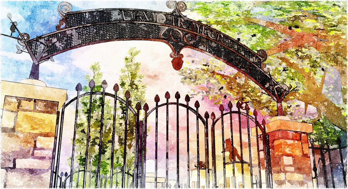
I'm just very happy with all I've learned in the last two weeks following the couple of threads about using FotoSketcher...here's my attempt to put it all together:
-
Here is mine Foto sketcher combo with PS.
Used two FS output then recomposed them in PS.Water color effect
-
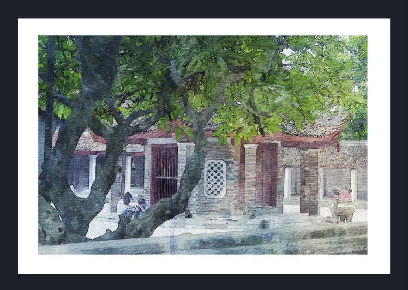
I used FS which I also find very cool to turn one of my marker renders into a more watercolour-y approach. I thought I'd increase image simplification, to give it a "hazier" feel...
Anastassis


-
Nice work Anastassis.

Anástassi
-
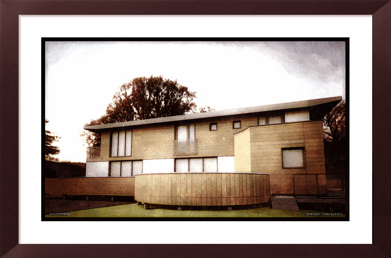
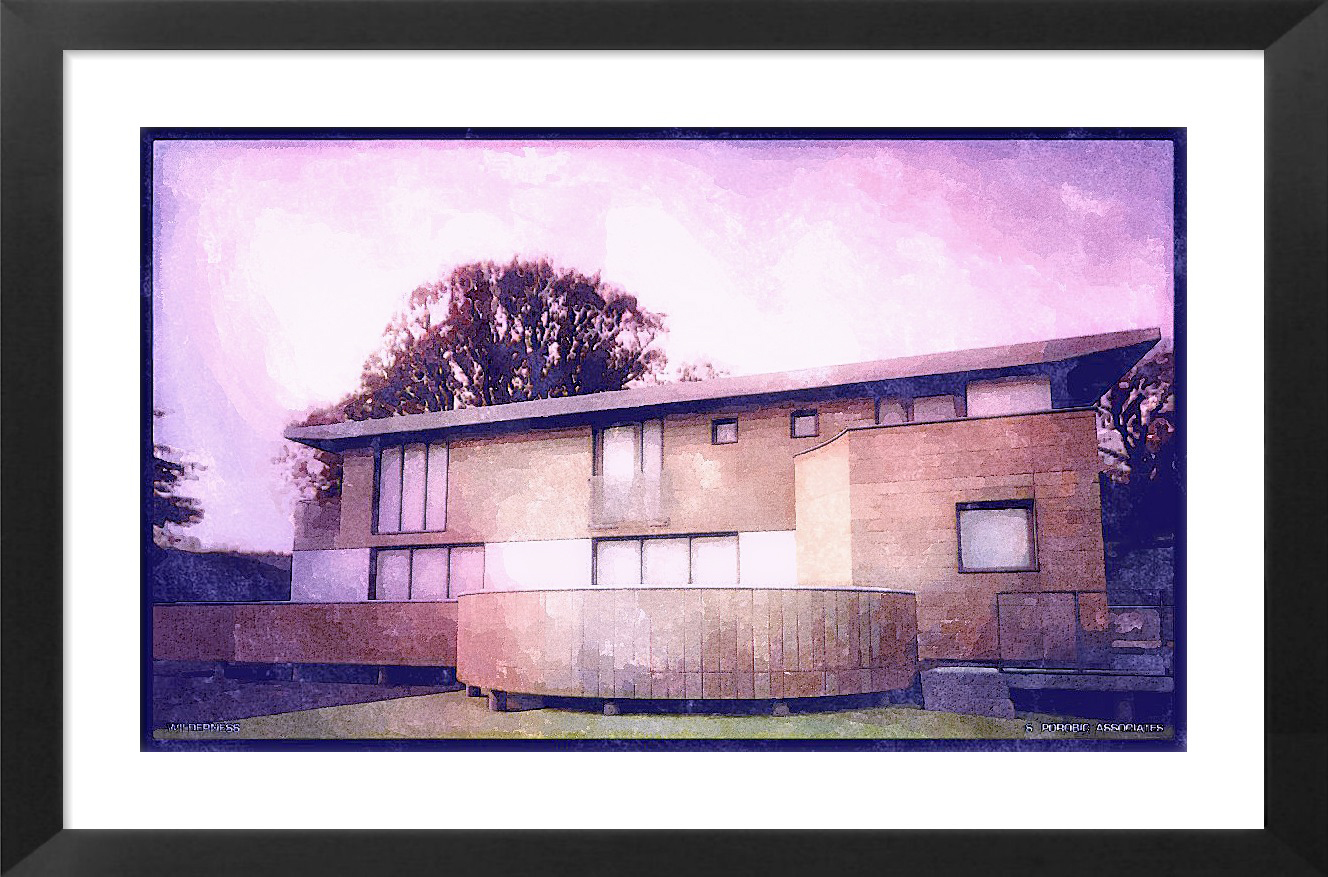
PS and Photosketcher on render
-
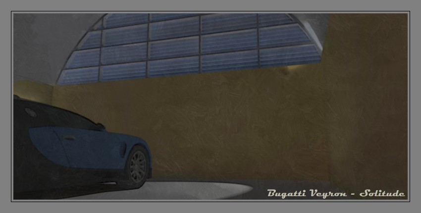
fast Twilight render + Photosketcher ... and Bugatti

(car model is downloaded from 3dwarehouse - modeled by Marian87)

-

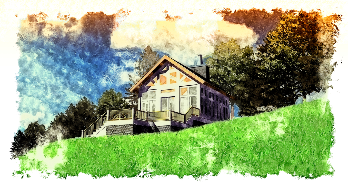
a student's work from a couple years ago run through FotoSketcher then PS.
-
these are really great I didn't know you could do this so easily
-
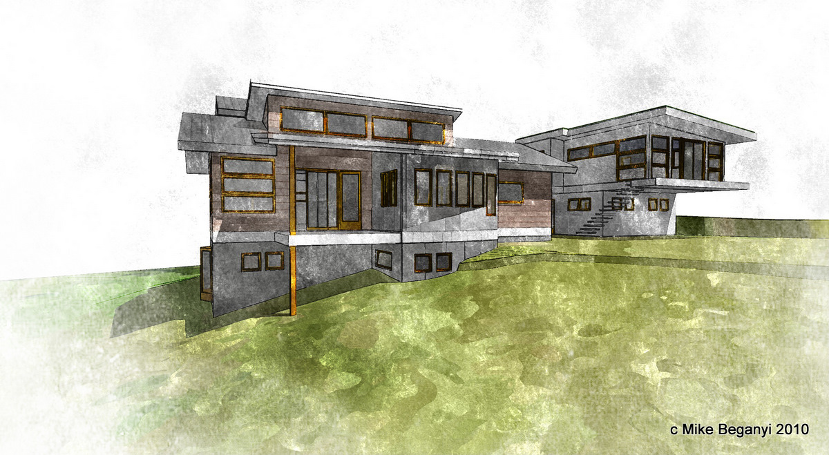
from an old model...
-
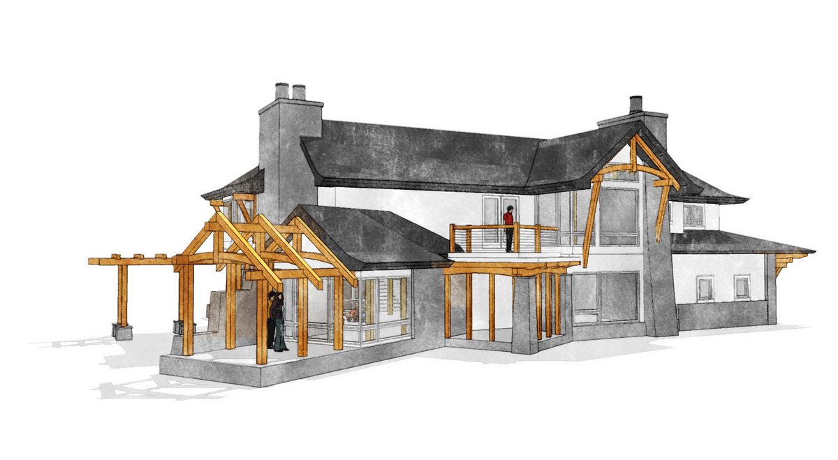
another, from an older project
-
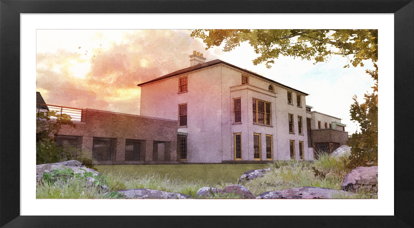
An external view of a project I have uploaded previously.
The foreground elements are all originally .png photo elements brought thru fotosketcher and edited in photoshop.
-
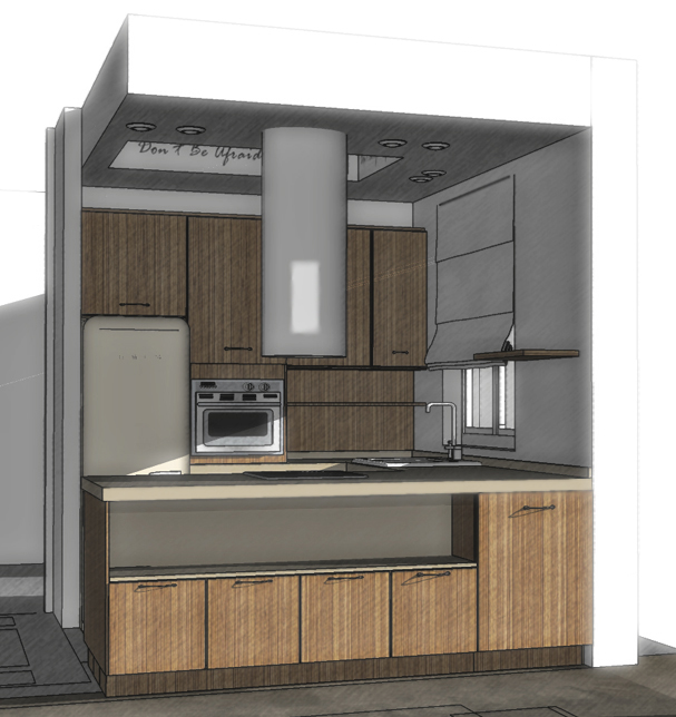
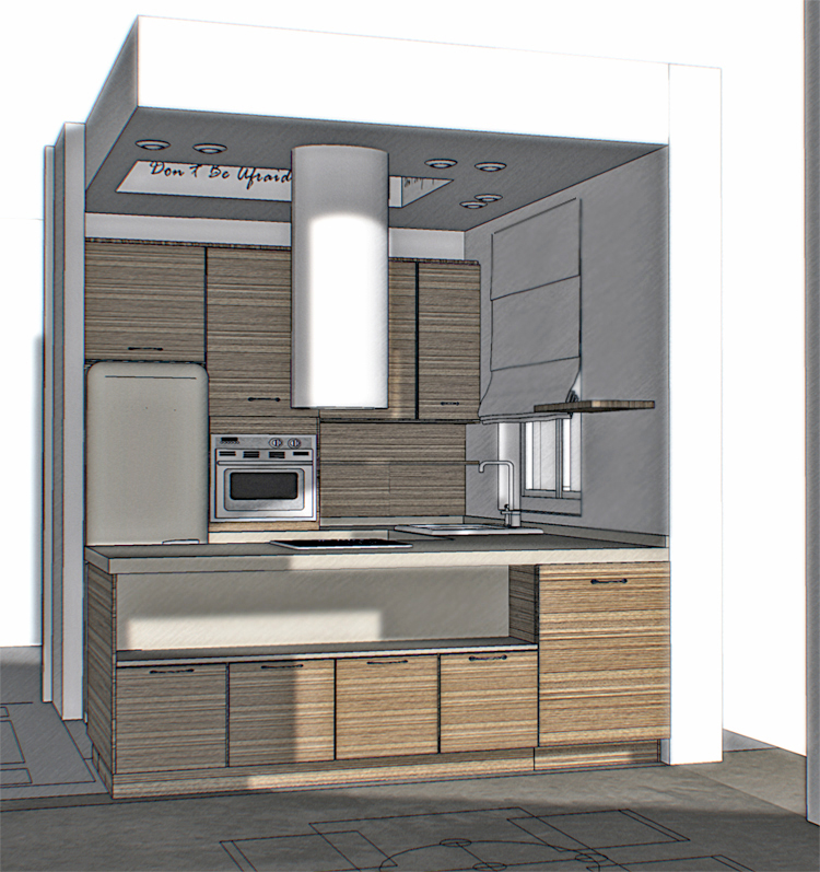
How would you like these ones as NPR? Was experimenting the other day... SUp, obviously Fotosketcher, and Photoshop.
I like better the one with the vertical running zebrano veneer, which is wrong in reality, but can't remember how I got to that result !
!
-
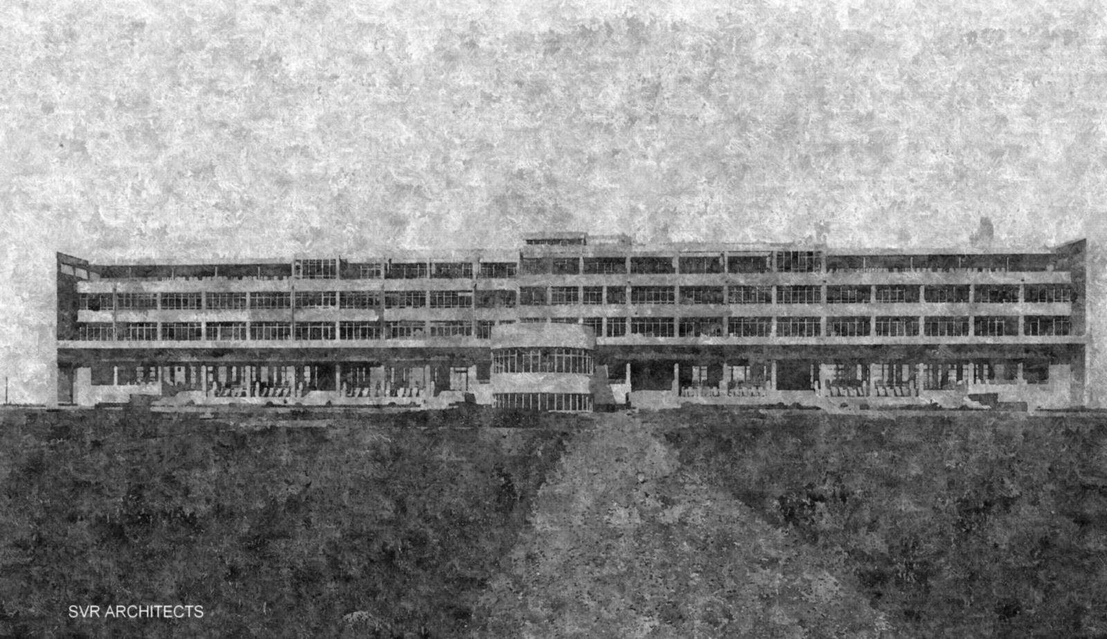
A monument our office is currently restoring. This is from an old photograph.
Good find, Oli. Parallels has me switching to windows whenever, too, btw.
-
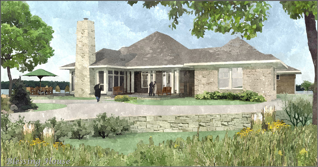
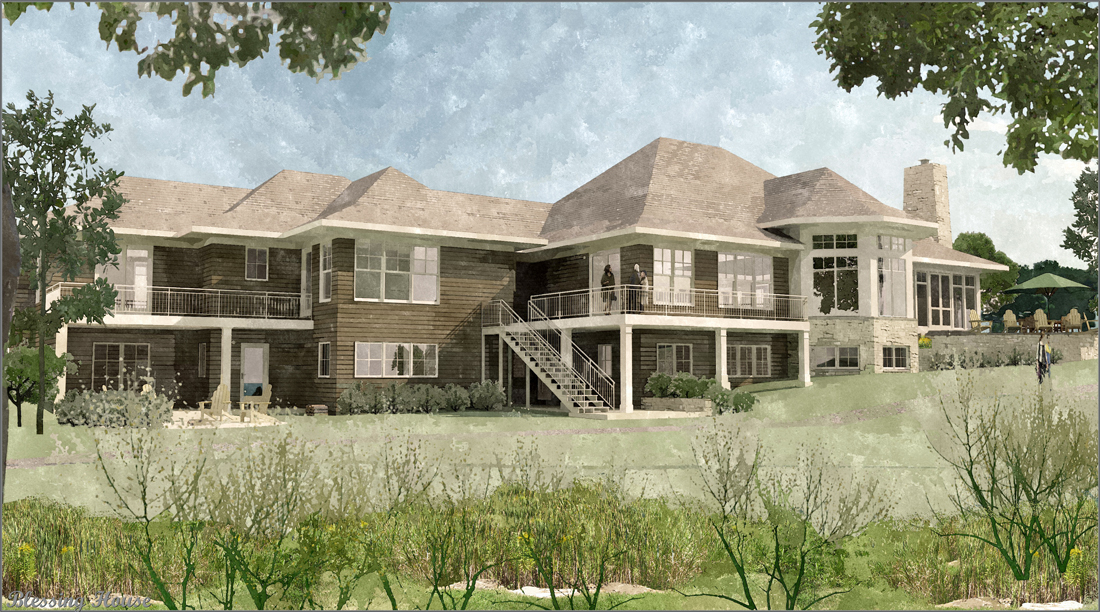
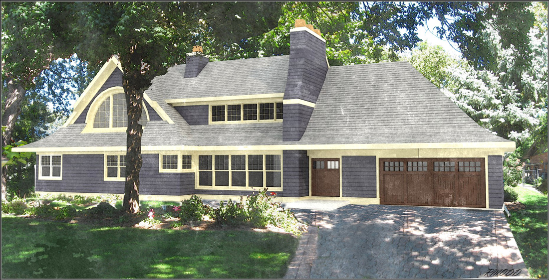
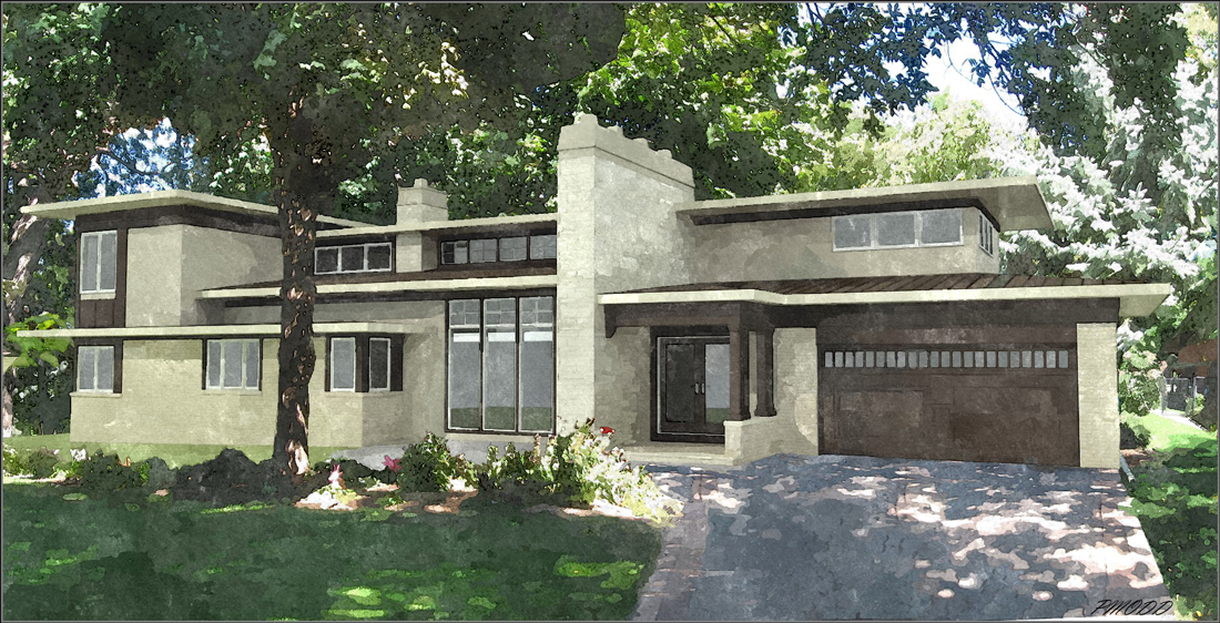
Here are a few.
su modeling - podium rendering - photoshop landscaping - and last, but not least, Fotosketcher!

-
Paul - your SU>Podium>PS>FS work is looking great. You should try adding a final step overlaying in PS some fine SU linework to see if it brings the renderings to the next level: Zen perfection.
Regards, Ross
-
Thanks for the comments Ross,
I do not know how line overlay is accomplished in photoshop.
Could you point me towards a tutorial?
Is it doable in elements?p
-
Hi Paul, nice renders!
Search the TT&T topic in podium forum, zem wrote a good one once upon a time.About this fotosketcher topic: Better to try to achieve something more close to painting, that means you can overlay lines, fade some areas, heavy PP I mean.
To use it as a texture filter over a nice already render, this I don't understand. Whatever a client says. Give them a vision, don't listen to them. That's why they pay, even they don't realize it.
-
cool plugin. good job for sharing your works.
-
@michaliszissiou said:
To use it as a texture filter over a nice already render, this I don't understand. Whatever a client says. Give them a vision, don't listen to them. That's why they pay, even they don't realize it.

michaliszissiou,
I agree to a certain extent.
The real world design build industry has some very real limits to
artistic expression. $$$$! A photo-realistic image is wonderful and compelling, but can also
scare off clients by being too real. They can sometimes come away feeling as if there is no room for
change. The water color filtered or pencil sketch filtered images can create a feeling of a work
in progress with enough reality mixed in to help nail down concepts without limiting creativity.The added bonus of this approach is that one can do a quick not perfect render, slap some background
and foreground clutter in with pp, and hit it with fotosketcher and have an image that feels architectural,
artistic, & invoice worthy without spending time most clients are unwilling to pay for.Sorry this is not art, its work & it works. Having said that, I still want to do the nicest work I can do
within the limitations of what I can charge for.Thanks for the direction and comments here and in the past, I always learn something when you put your two cents in.
James,
Thanks for the link and directing me back to that website. I had forgotten how much info there is there.p
-
It seems like we have an argument here. Not at all. I mostly agree and understand.
Some more washing and overlay lines could help though. Less like a filter, more like a painting. Why not? I've seen some great presentations using just SU raw 2d output.
A question: what's the resolution of these images?
Hello! It looks like you're interested in this conversation, but you don't have an account yet.
Getting fed up of having to scroll through the same posts each visit? When you register for an account, you'll always come back to exactly where you were before, and choose to be notified of new replies (either via email, or push notification). You'll also be able to save bookmarks and upvote posts to show your appreciation to other community members.
With your input, this post could be even better 💗
Register LoginAdvertisement


