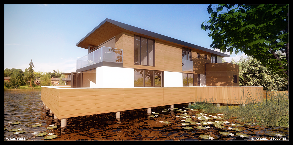
New old renders
-
Vignette in a new white layer, resized via wrapping (having in mind to keep some heavier tones in the front grass), duplicated it and color burn. Ctrl+U for greens. Thats all sid. Its your render anyway I couldn't spoil it more than this.

-
I like the colour burn.

-
Nice render very convincing, the grass in particular looks great how did you achieve it ?

-
great and amazing render mate


-
Sintra it is grass texture with bump. The rendered image was postprocessed in photoshop adding vignette, color balance, contrast etc and finally disaturated.
Thanks Majid

-
nice work sid, sky is great too, its got a "directional" feeling, some movement.
how's this project coming along?
-
Thanks Oli... The project is moving slowly. Final submission is around the corner. We have cleared all statutory bodies apart parish council.... We will not even bother as they will object on anything...you know the mantra ....very nice but not for here.

-
Thanks James.
-
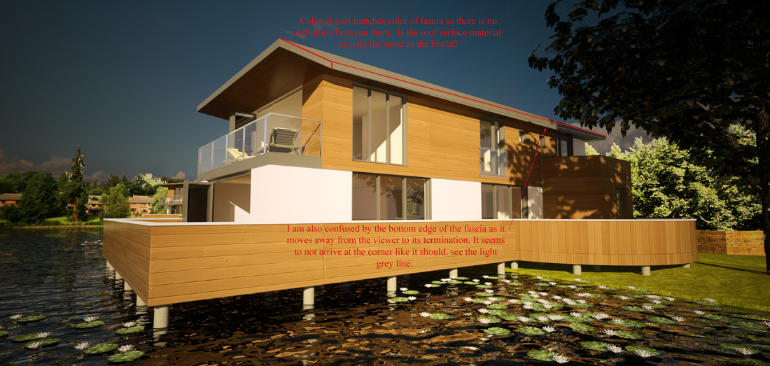
Last render of this project, I think, for the time being.We have applied, finally for planning approval. Rendered in Twilight, tone-mapping photoshop. I might , however, give it try in Thea on some later stage.

-
Nice Sid....love the tones!
-
Cheers mate

-
Really nice render, Sid...

@sepo said:
I might , however, give it try in Thea on some later stage.
With the instancing brush, some good looking Xfrog trees, I'm sure you'll be able to make wonders with Thea...

-
Thanks Frederik.... This is first time ever Thea render. Same scene like Twilight render. Its BSD and no outside postprocess. crf, vignette and glare all in Thea. Material editor is very powerful and quite easy to understand. Saying that I spend very little time setting this scene, literary only scratched the surface.

-
Excellent and huge render sid


You know what I like most...
the water texture
A dream house for an impressionist. -
great stuff sid...i got my thea today, cant wait to give it a whirl!! I was gonna suggest more reflection on the timber (in the twi render) but looks like you've sorted it with this one
 photo integration is seamless!!
  and yes its an impressionists dream! what are first impressions from planners? gets some dirtmaps on there and you got a photo!
 -
I can't believe I am actually doing this.
I am going to offer a criticism of a Sepo Render.
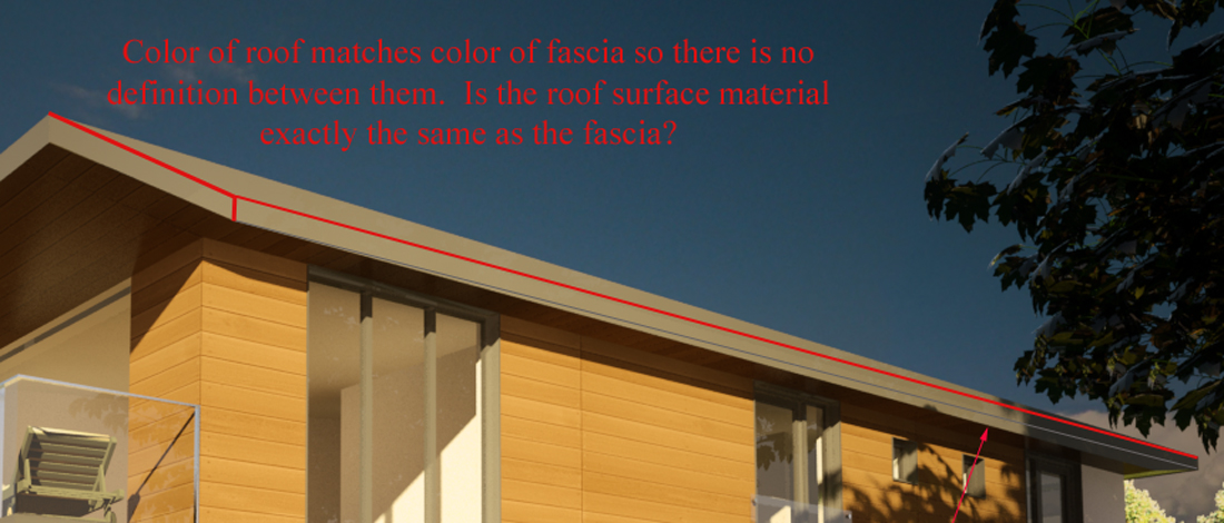
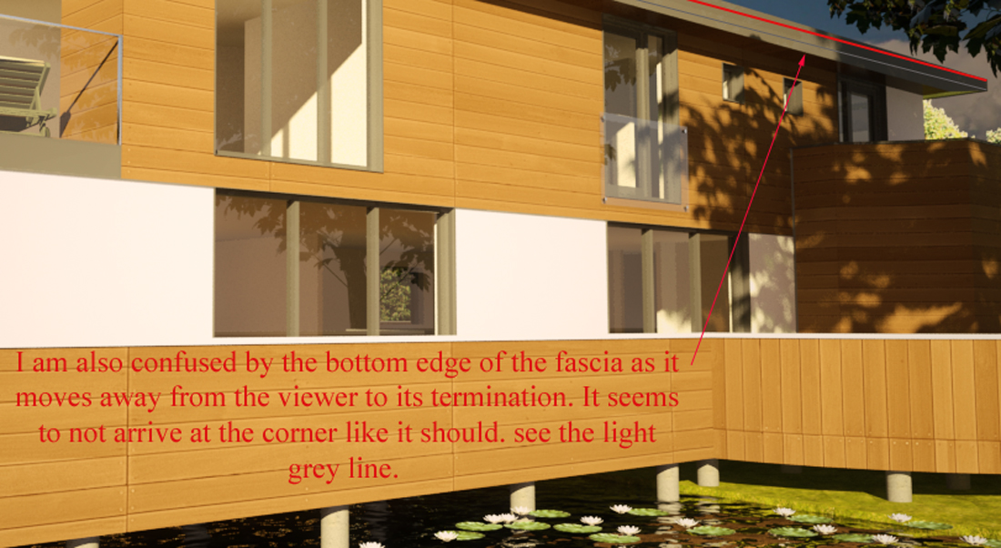
I must be nuts.In each of the renders the one negative that I see is the
right hand side of the gable end. The fascia and roof have
little or no color or edge distinction. It confuses my
eye.Humbly yours,
Paul
-
great stuff, sid. and I mean both the renders and the architecture.

-
Michalis thanks....yes I love the water as well.
Oli thanks... still no feed back. I suppose no news ...good news. I know from discussions design seems fine in their eyes. It will be power of local opposition which will make it or brake it. All consultation with relevant statutory bodies were positive so far. Keep the fingers crossed.
Yeah... I will try to add some dirt stuff and also test instance brush with xfrog trees at some point. I have only started to learn Thea.
Paul.... I am only kidding.
  I am not sure though what you really mean.
 -
@sepo said:
I am not sure though what you really mean.


It may be that my screen is not able to pick up the subtlties of color.
Or maybe I am reading the roof and facia planes incorrectly.I put some notes on the image to try explaining what I am seeing.
p
-
pmolson, it think sepo's building has a flat roof. Fascia narrows towards ends of the roof.
Hello! It looks like you're interested in this conversation, but you don't have an account yet.
Getting fed up of having to scroll through the same posts each visit? When you register for an account, you'll always come back to exactly where you were before, and choose to be notified of new replies (either via email, or push notification). You'll also be able to save bookmarks and upvote posts to show your appreciation to other community members.
With your input, this post could be even better 💗
Register LoginAdvertisement


