Hobbnob's WIP Thread
-
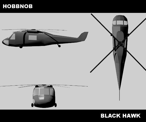
Thanks, I'll take a look after posting this. This is my attempt, using kerky rendering with GIMP to stitch it all together:
-
Well I won't be on for the next week, going to RAF Halton for my last ever summer camp
 Well tbh I have no doubt that when I come back it will be on the 3rd or 4th page of the gallery, so you lot probably won't notice I'm gone, have fun with all the buildings and other stuff.
 -
I like the render, but to be perfectly honest, the model could use much more work. There are also some needless polygons. Also, the windows are just drawn on, no 3d detail. Think once you get these done it'll be a better model. But as I understand it you wont be sketchuping much. Talk to ya soon!
-
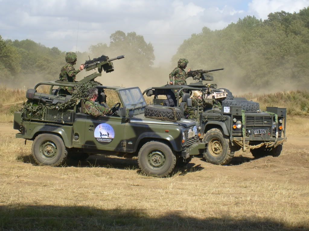
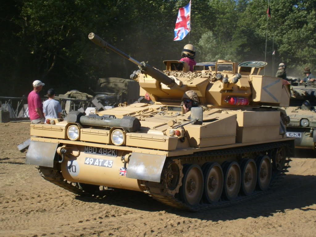
Well I'm back, cadet camp was good, I'll be going on su as soon as I'm back on my feet properly. For now though, here are a couple of pics of my various adventures
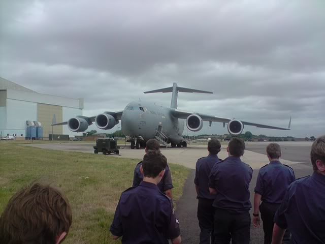
Here are a couple of pictures from RAF Brize norton, the UK's main base for getting troops and equipment from the UK to afghanistan.

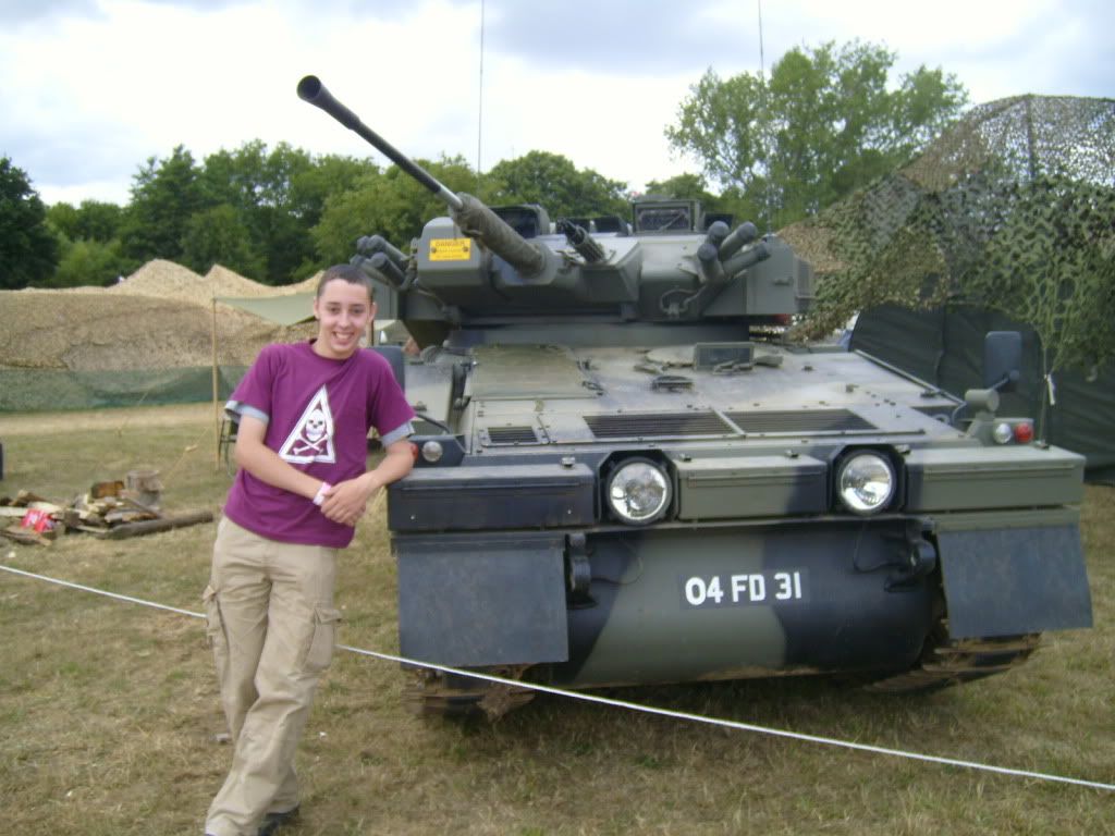
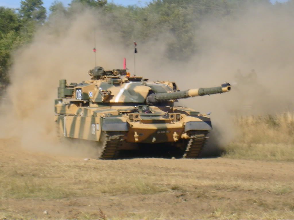
And these are from the war and peace show, this was actually a couple of days before the camp:
-
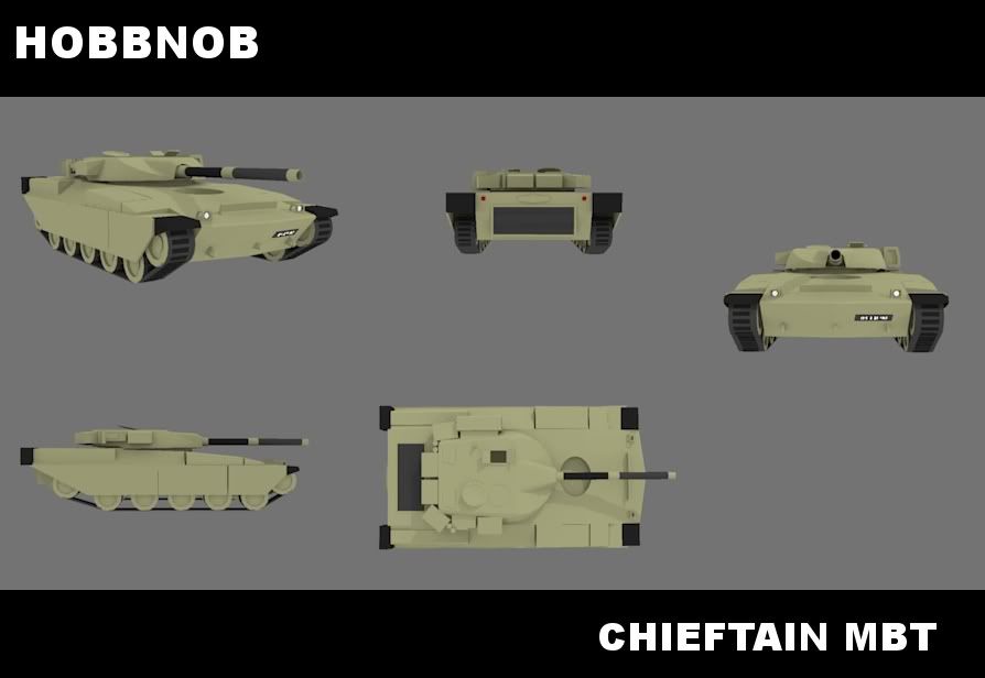
Been working on a chieftain main battle tank, the one in the last post. Heres my work so far:
-
Wow,
and the MBT is good aswell

when do we get to see the sketchyphysics version
-
No idea really, the static looks ok atm but it could probably be worked on a bit given time. The sp is almost fully functional, I'm waiting on a fix for the Blast function, then I can complete it.
-
I would work on the chieftain a bit more most of your proportions are off the turret is much smaller than it supposed to be and there are more wheels inside the tracks, good start tho!
You should look for some schematics or blueprints and arrange them in SU to help you build the model, thats what I usually do when building real life vehicles. -
@liam887 said:
If you wan to try and and present your work like I do for my works in progress I like to mix plain renders with lots of post pro work in photoshop.
You dont need photoshop use one of the free alternatives.Thats exactly what i do, i use paint.net and its suprisingly good. just takes some time to get use to it.
i honestly find that way much better than actual rendering programs, cus that way i can add the colour i want and the shading i want aswell.
-
this is my workflow for presenting my models when not rendering, although ive used PS you can use free versions such as GIMP etc

Tutorial – Illustrating your 3D models
People often ask me how I use sketchup the way I do and im always quite happy to write up tutorials and post them up. Everything I have learnt for 2D/3D and web design has either been self taught, tutorials, DVD's and books. Here is a tutorial using for sketchup and and 2D image manipulation…
Liam Keating (liam887.wordpress.com)
-
wow, they are good, if i can ill show you the ship im doing at the moment. its much better than just the plain old sketchup picture.

-
looks good but the front of the hull needs much more detail, and the wash needs work
-
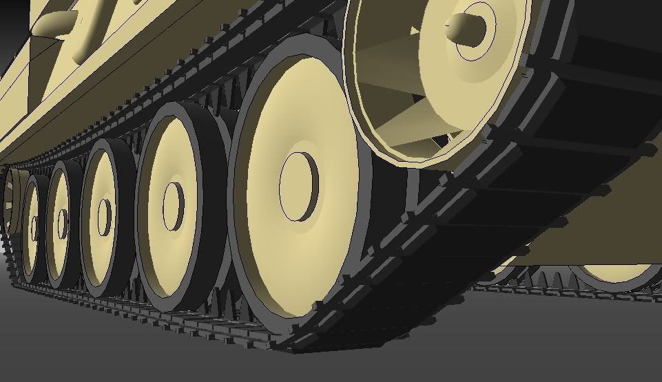
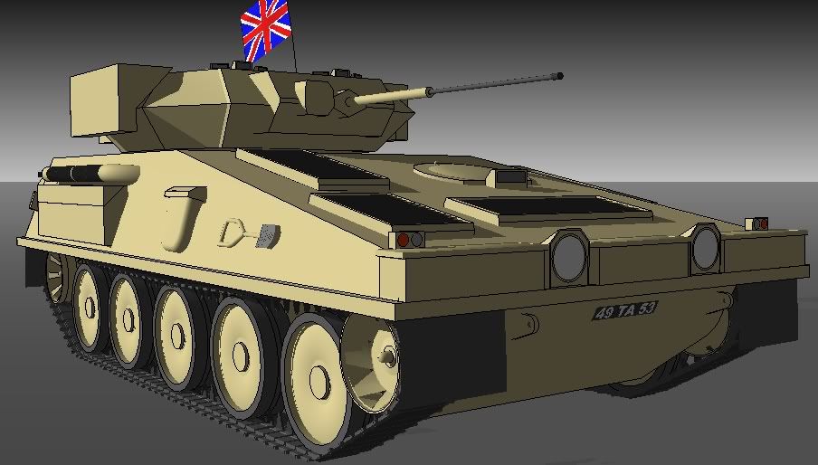
New project today, chieftain wasnt' really going so well so i started work on a scimitar, and as I had the whole day free. . .
-
Awesome! The British flag adds that perfect touch

How 'bout making the main gun larger.
-
@unknownuser said:
How 'bout making the main gun larger.
yeah i said that to him aswell.
looks amazing and beats mine.
few problems: SMOKE GRANADE LAUNCHERS!!!!!!!!
-
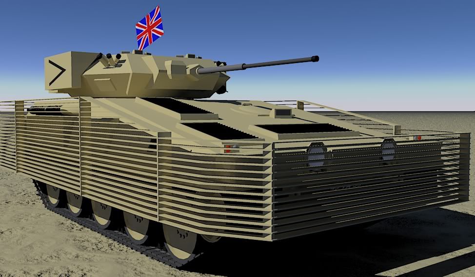
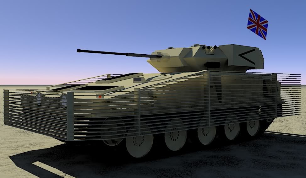
Well hearing both camokid's and golden's criticism I made the gun bigger and added smoke launchers, as well as a few other things.
The most notable addition is that of bar armour, used in Afghanistan to counter RPG threats.These renders were done in kerkythea, criticism is welcome
-
Looking good!
-
looking good, you should stick to one model for a while and really go to town on it. If you look at some reference images on google you can see al the details you could add to this model.
Put some panel lines in for a start. Also the headlights are restricted by the cage you should raise them and put them either side. You can use this for reference it shows good details for the front and side http://upload.wikimedia.org/wikipedia/commons/b/be/MCV-80.jpg
-
Liam, the real thing doesn't have panel lines, and it doesn't have raised lights either. The link you gave is to a warrior IFV, a different vehicle.
This is the one i'm making

-
@hobbnob said:
Liam, the real thing doesn't have panel lines, and it doesn't have raised lights either. The link you gave is to a warrior IFV, a different vehicle.
This is the one i'm making

ahh my mistake I thought you where trying to build a warrior.
Hello! It looks like you're interested in this conversation, but you don't have an account yet.
Getting fed up of having to scroll through the same posts each visit? When you register for an account, you'll always come back to exactly where you were before, and choose to be notified of new replies (either via email, or push notification). You'll also be able to save bookmarks and upvote posts to show your appreciation to other community members.
With your input, this post could be even better 💗
Register LoginAdvertisement


