Couple NPR WIP's. Let me know what ya think
-
It's been a while since I've posted here and thought I'd throw some images up for critique. Thanks for looking.
Office building
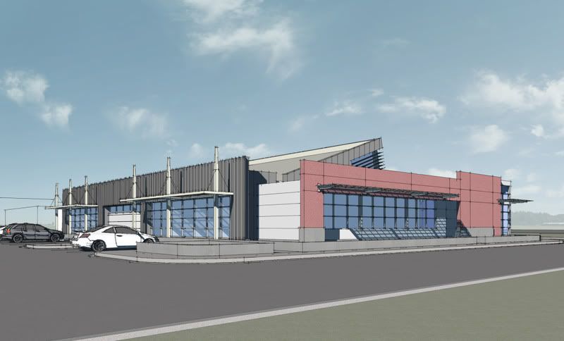
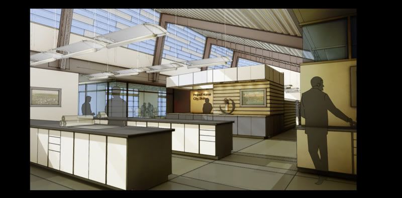
Senior housing
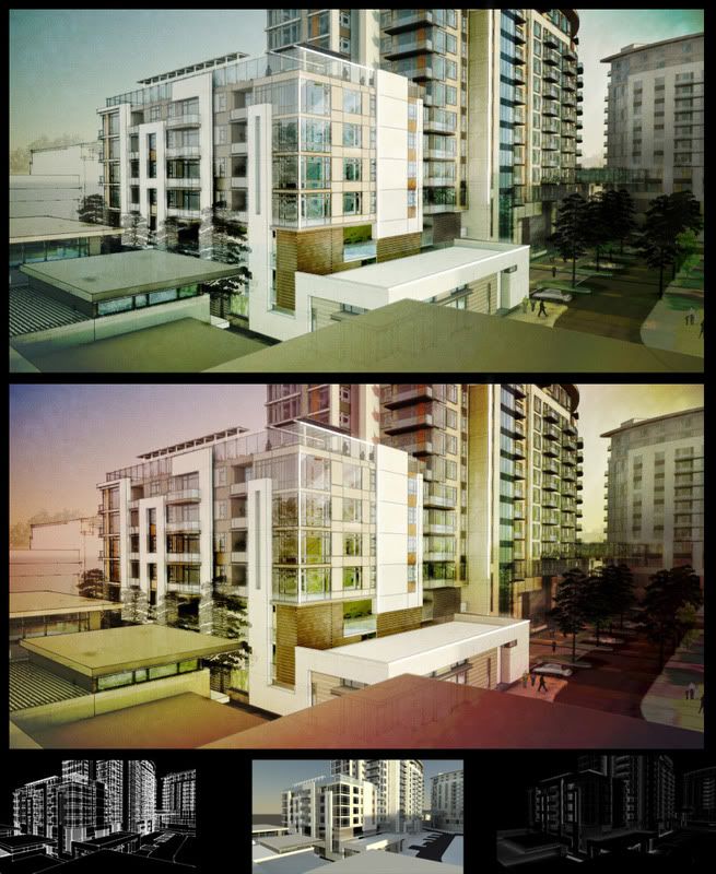
Pump Station
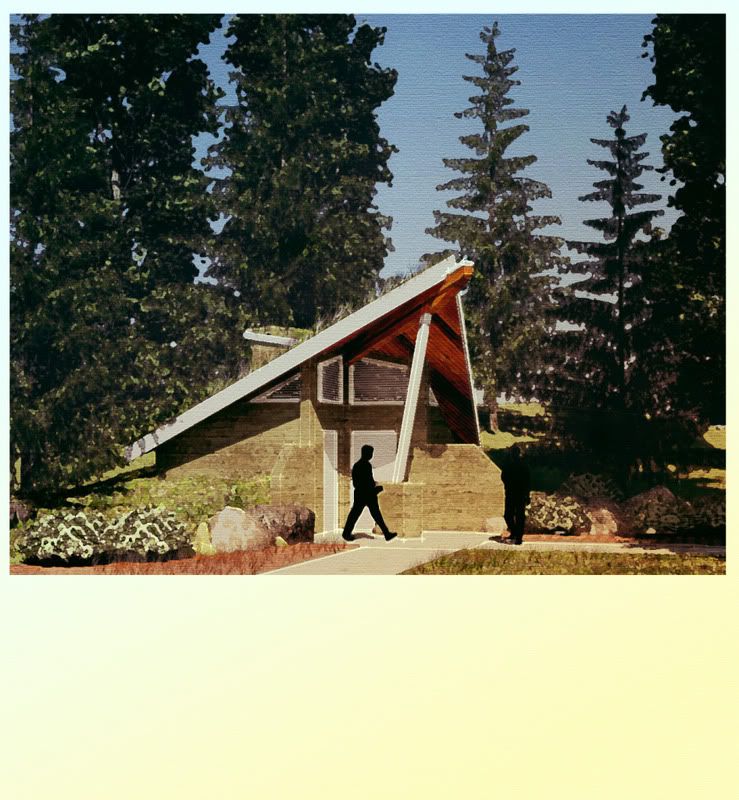
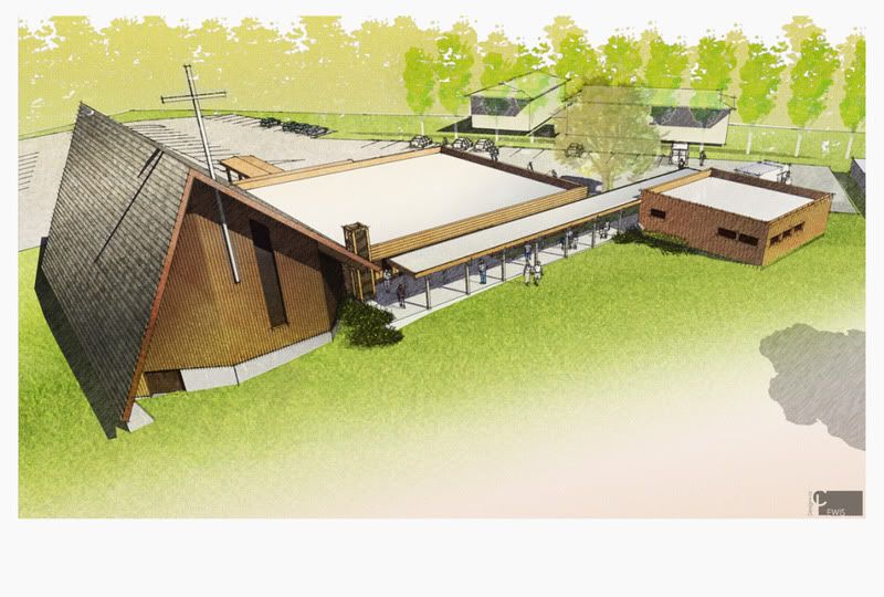
Church Addition
Chris "archytextural" Lewis
CLewis Design+Viz -
looking great! I really like the first 2, how did you achieve that effect in the interior? photoshop, or was it a SU style? my only crit would be that the 2nd last one has a bit too much emphasis on the trees... but that could be up for debate, anyways, looking good!
-
Thanks for the feedback. I agree the pump station rendering trees are a little bold. I need to run a seperate pass of just the trees so I can tone them down a little and let the foreground be the dominate item in the image. The effect on the interior is several layers of photoshop work, sketchup styles and 2 renderings in mental ray ( 1 Ambient occlusion and 1 materials) blend in photoshop and there it is.
-
Sweet! Such a variety of styles you master... I think my favorites are the interior and the senior housing, especially the top image of the senior housing-one. The pumpstation has a very seventies feel to it, not my taste

One crit about the interior, the dude on the right kind of feels like he's his own shadow at the same time. Maybe moving him a little to the left would've separated him from the wall a little more.
Oh and the church just works. Simple yet very effective

-
I really like the senior housing pic. Tutorial! Tutorial!

Hello! It looks like you're interested in this conversation, but you don't have an account yet.
Getting fed up of having to scroll through the same posts each visit? When you register for an account, you'll always come back to exactly where you were before, and choose to be notified of new replies (either via email, or push notification). You'll also be able to save bookmarks and upvote posts to show your appreciation to other community members.
With your input, this post could be even better 💗
Register LoginAdvertisement


