My first post
-
Hi all.
I'm new here and this is my first post in the forum.
I'm a 2D draftsman by trade, doing mostly structural drawings. SketchUp was my first 3D program and I've been using it for a couple of years, mostly on modeling and hardly do rendering 'cause I found it difficult and it's not my scope of work, anyway.
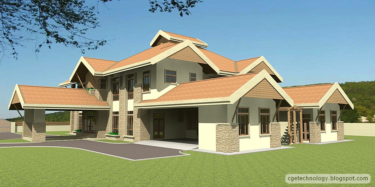
This is my latest attempt to render a model I created. Comments are welcomed.

-
Unclewk,
Welcome to the forum. There is a wealth of information/knowledge here.
As to your render:
Overall it is nice for a first post. A few things that pop out are:
The textures need some work as there are repeats in the grass, concrete and roof tiles.
The background does not blend with the building. It gives a disconnected feel to the composition.
The overhangs look a bit odd.
The doors do not have any hardware (door handles that I can see).
I do not see any roof drainage (downspouts).Details will really make this a much better composition. Things like landscaping and variation in the ground (not all flat) will help as well. I am not sure how the gardener will access the plantbox above the main doorway

Scott
-
Very nice visualization.
This is a design critique, not a render critique, because I cannot add anything to the obvious.
If this is a real project visualization:
Make sure that you have flashing at the wall to roof transitions. Looks like copper would be appropriate. Even the stone to shingle transitions need flashing, and may be good idea not to try to conceal the flashing, because of thermal and wind movement. You think it is insignificant, but nature has all the time in the world to do its thing while you go about your daily life.
The gable ends have an interesting treatment with the facias projecting above the roof planes. This will tend to direct the water back under the shingles and will migrate due to capillarity. Careful detailing will be essential here to keep water from spoiling the construction over the years. You might use ice and water shield over the entire roof, but it terminates at the facia somehow. I say this, even if the project is in a dry, or cold climate.The other interesting treatment is the use of vertical "awnings" in the gable peaks. Nice concept for sun control. What would be the finish on the back side of these awnings?
The planter box over the open portico will not only be difficult to access, but if it is not water proofed beneath, it will become a source of damage to the roof.
-
@unknownuser said:
The textures need some work as there are repeats in the grass, concrete and roof tiles.
The background does not blend with the building. It gives a disconnected feel to the composition.
The overhangs look a bit odd.
The doors do not have any hardware (door handles that I can see).
I do not see any roof drainage (downspouts).Thanks for your advices, Scott.
The textures are of SketchUp's and I must admit that I've no idea how to "work the textures". I think I need to browse the forum more for information and tutorials on how to do that.
I used "IDX Renditioner" to do the render, the background was sort of (in layman's term, I've no idea how 3D artist term this) "attached" to the render during the process. Yes, it's kind of "disconnected".
I'll update the model and try more renders soon.
Thanks again.
-
@mitcorb said:
This is a design critique, not a render critique, because I cannot add anything to the obvious.
Hi mitcorb. Thanks for your comments.
The model was made based on floor plans and elevations of a real project by an architect friend. It was an old project and I've no idea where or when the mansion was built.
As for the "vertical awning"... I supposed the whole thing is made of hard wood timber and varnished. And yes, the planter box... again, i have no idea why the architect put it there.
-
Hi Donald & welcome!
I always love to see the Threads titled "My First Post".
One never knows what to expect when opened.My comment is:
The overhanging trees in the
foreground are a nice touch, Gives a feeling
of depth.paul
-
Hey welcome uneicwk. Nice first post.
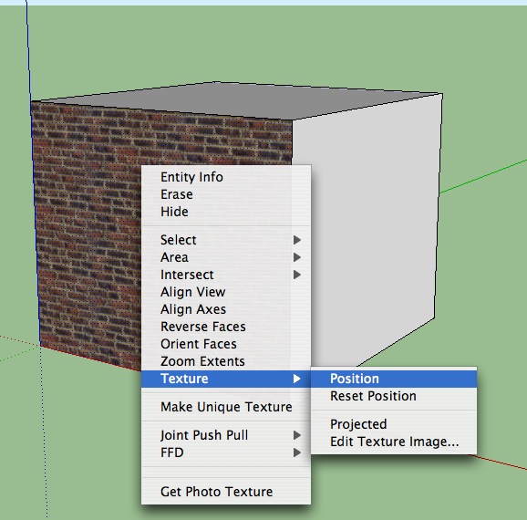
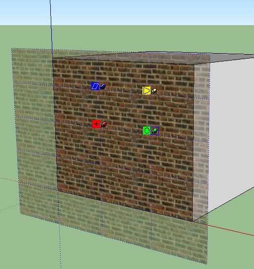
To scale do some work with your textures, right click on the textured face, a menu will come up and from it if you choose "texture", another menu will come up, and if you choose "position" the texture will appear overlayed to the wall surface. There are 4 "pins" visible on the texture, each perfoms various tasks. If you choose the green pin, you will be able to rotate or scale your texture. This sometimes helps get rid of the tiling.


-
Thanks pmolson. It's part of the background photo actually, though the background photo size is not the same with the render, hence the overhanging branches are blurred.
Thanks for your tips, dale, I will try that on my next render.
Cheers.
-
Hi guys.
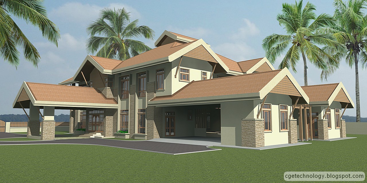
I've been busy my drafting jobs lately, hence the delayed follow-up. I get a friend to show me some basic tricks in pp (with Photoshop) and this is my latest attempt.
I modified the model a little bit (thanks for your comments, guys) and for the time being this is the best I can do. Comments are welcomed.

Hello! It looks like you're interested in this conversation, but you don't have an account yet.
Getting fed up of having to scroll through the same posts each visit? When you register for an account, you'll always come back to exactly where you were before, and choose to be notified of new replies (either via email, or push notification). You'll also be able to save bookmarks and upvote posts to show your appreciation to other community members.
With your input, this post could be even better 💗
Register LoginAdvertisement


