50's Living Room
-
Great render...
but "50s" ?
I was there... it looks more like very trendy early 60s.
Just because someone made a chair in the late 50s it doesn't mean it filtered down to anyone else for a good few years...
History ! Some of us lived there...
-
I was born more than 30 years later

it´s a bit hard to tell the difference to me.
I think the best furniture was designed between
50's and 70's im glad you liked it despite of its
style mistakes n_n.
By the way, your scripts and plug-ins are amazing and they make me happy. -
No criticism intended - just praise...
Trying to set history a bit straighter...
-
@tig said:
Great render...
but "50s" ?
I was there... it looks more like very trendy early 60s.
Just because someone made a chair in the late 50s it doesn't mean it filtered down to anyone else for a good few years...
History ! Some of us lived there...
Have to agree! Looks actually a tad later sixties! Though then that would have been a big fat scooby burning and not a cigarette!
The references to Playboy brings back memories of when I was about 13 - there was a second hand bookshop around the corner that was happy to sell me second hand porn mags for 40cents then I could take them back and as long as I hadn't stuck the pages together, get a 20cent refund and put that toward another! Ah the days of unlimited age to buy stuff!!
-
I know "if you remember the sixties you weren't there"... but I do - then again I was young enough not to be completely zonked through most of that decade...

-
60's... what 60's

But I suppose if it was the 50's that would have been a bottle of whiskey, at least out here in the colonies.
-
very nice render , i like your works , how you doing for Lighted cigarette , can you sharing your nice scene with your visoft , juste to know your nice textures , lignt and render
-
What were you doing with the woodglue Richard???!!!!

-
-
Works well that Gel.

-

-
-
Awesome as always, just one thought: you used the same brush for the cigarette smoke in each image... and this gives it away a bit.
Try using different brushes for the three images.. I think it will be a subtle change that improves things

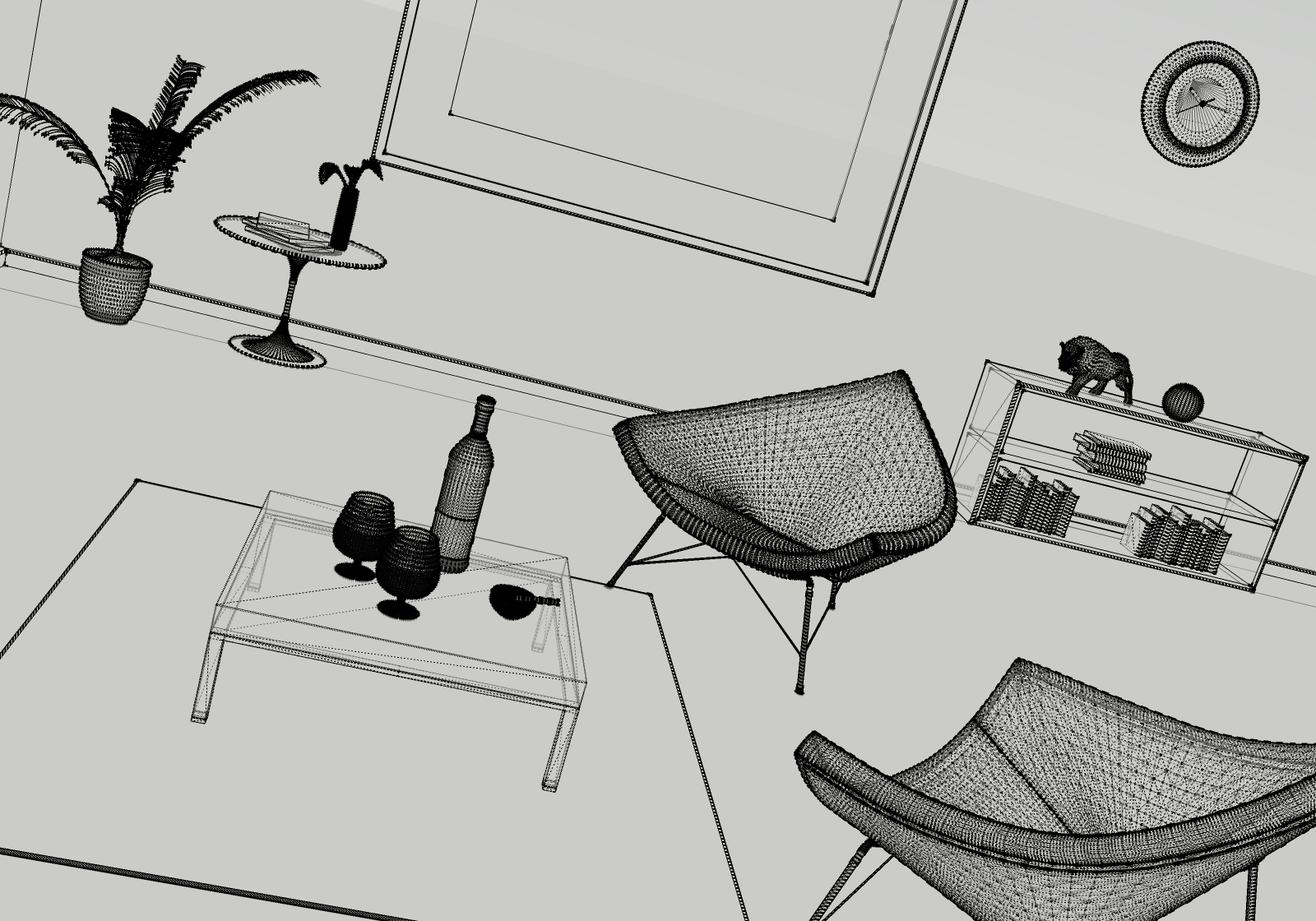
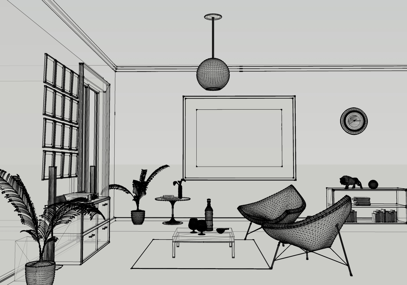
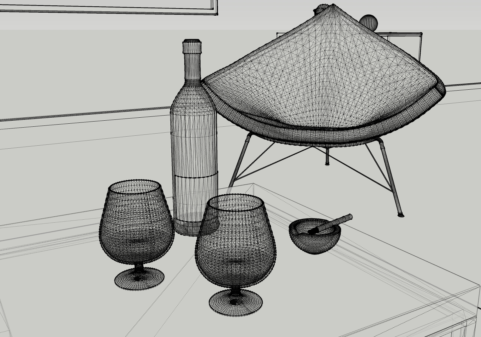
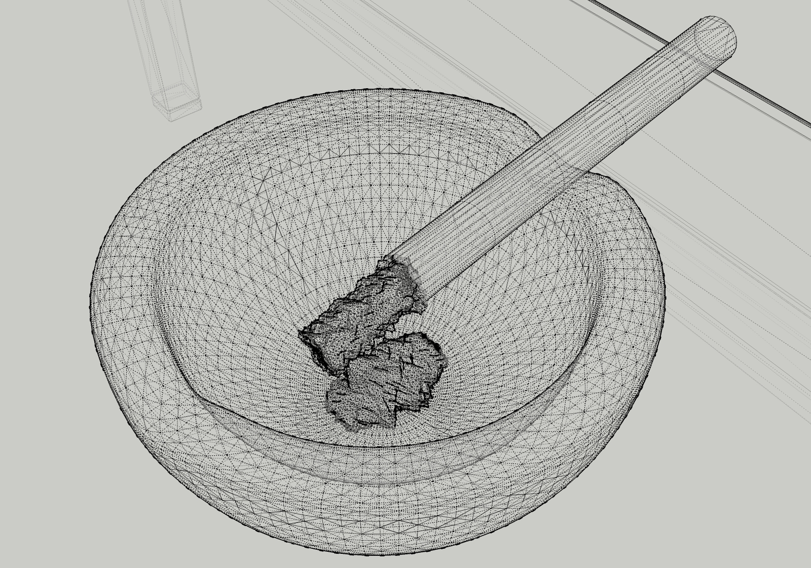
As with your bathroom, I'd love to se a wireframe of this

-
ThankYou Broomstick

there you go!
I thought it would look frozen in time
with the same smoke brush, but its a good
tought, thanks for the critiques, they
are always intended for improvement.


-
nektares , can you sharing your nice setting or your vispot plz, your interior render is fantastic ..
-
@nektares said:
ThankYou Broomstick

there you go!
I thought it would look frozen in time
with the same smoke brush,Oh that's what you wanted to infer, hadn't thought of that
@unknownuser said:
but its a good
tought, thanks for the critiques, they
are always intended for improvement.Obviously so.
Your wireframes = masterpieces

-
Thanks a lot!
-
naktares , this visopt is madosetting or anothe visopt ?
-
its madosettings

Hello! It looks like you're interested in this conversation, but you don't have an account yet.
Getting fed up of having to scroll through the same posts each visit? When you register for an account, you'll always come back to exactly where you were before, and choose to be notified of new replies (either via email, or push notification). You'll also be able to save bookmarks and upvote posts to show your appreciation to other community members.
With your input, this post could be even better 💗
Register LoginAdvertisement


