House
-
Hi all,
I'm starting a new project for my dad.
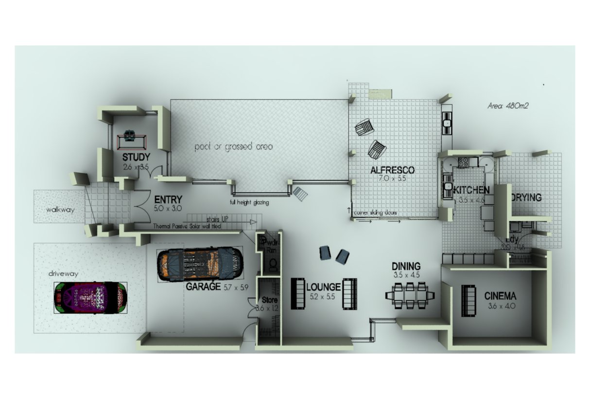
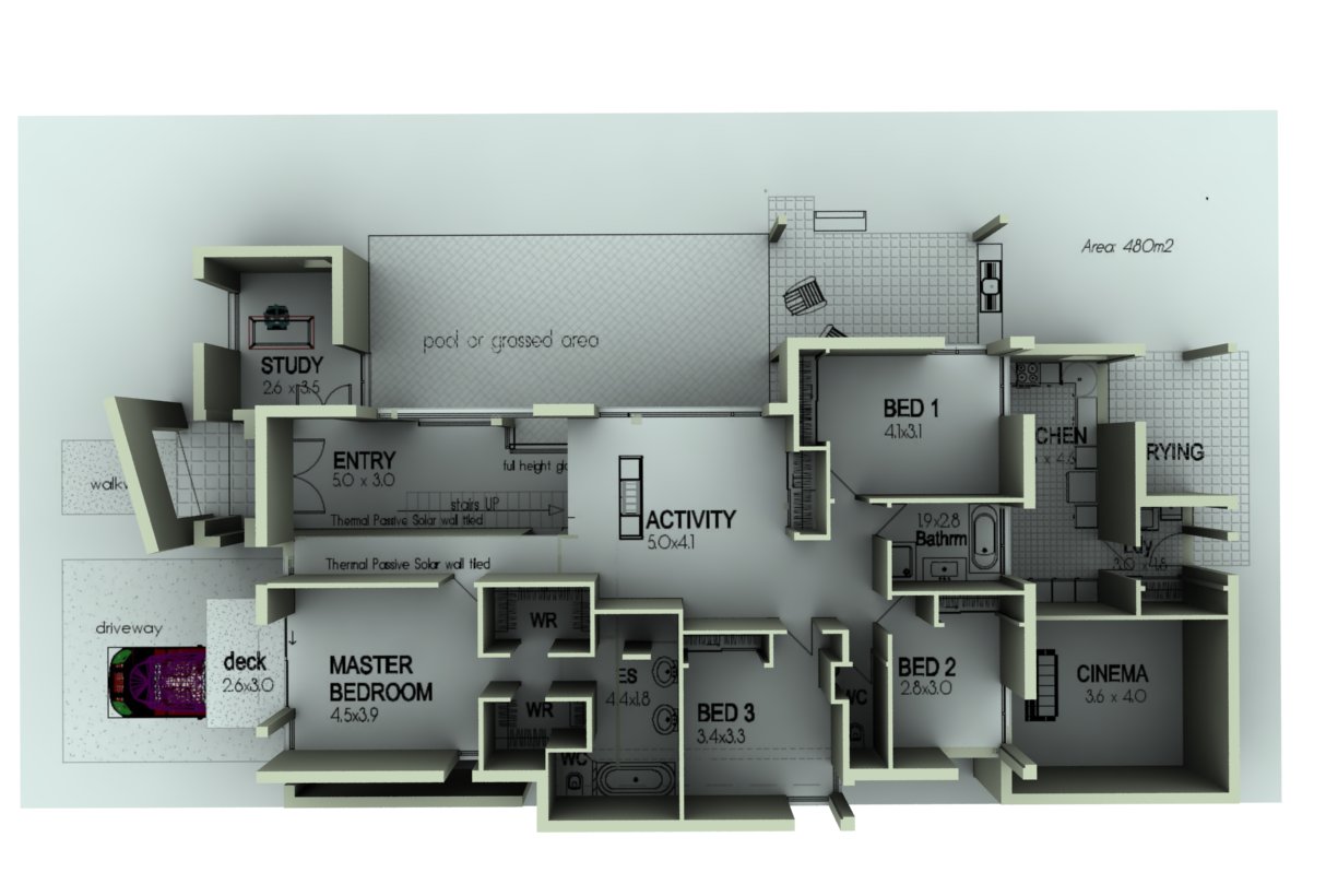
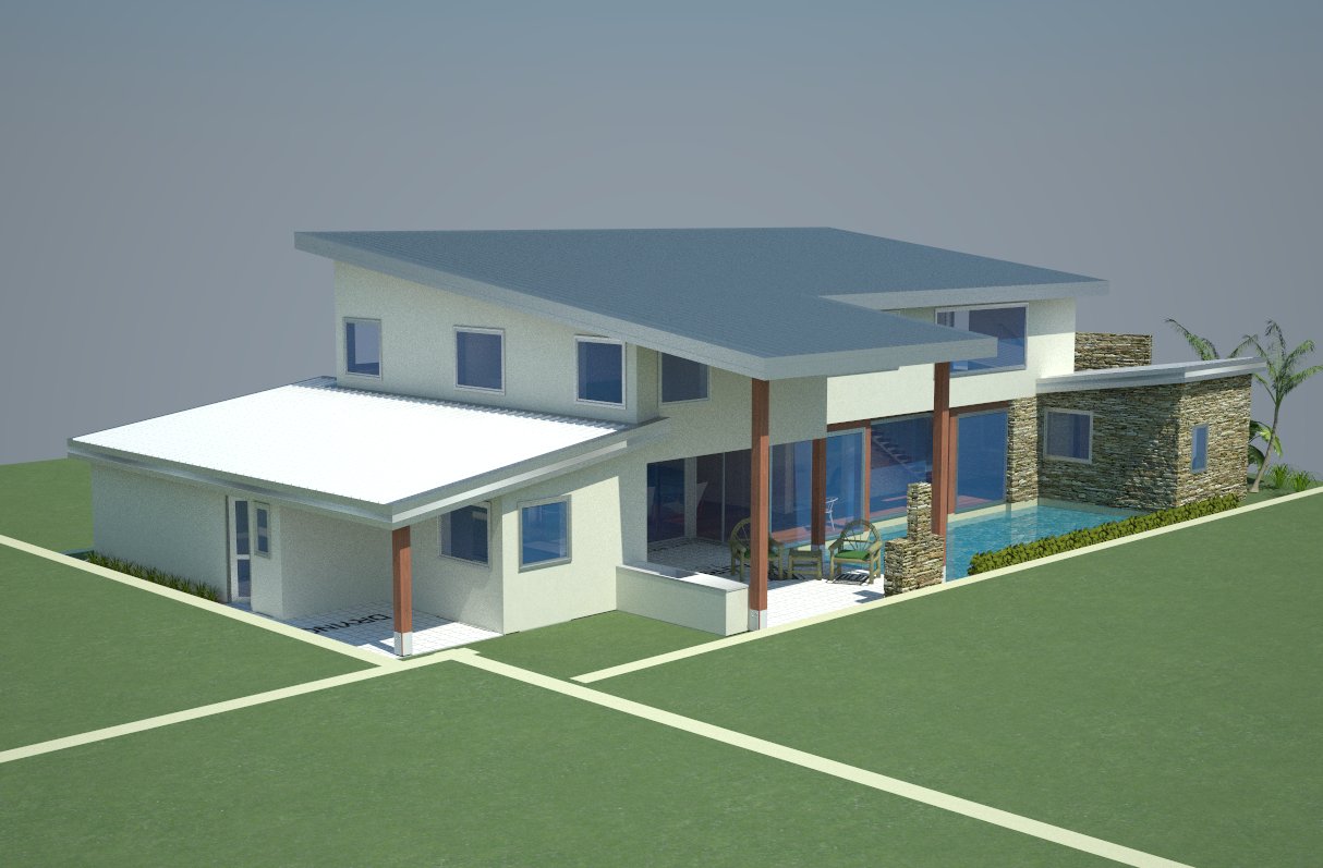
This is a couple hours in. I thought I'd do some progress shots.C&C welcome and any suggestions on modelling.
-
Hi Lyall,
I like the style you have used here. I think it should appeal to clients also.
Mike
-
Hallo Lyall, the house looks good
 .
.- I can't see the north.
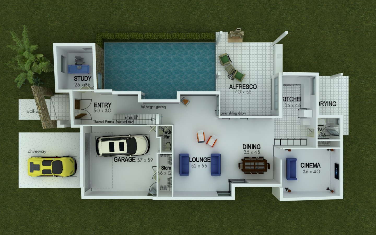
- Large kithen is cut out from the rest of living area. I would definitely join dining with kitchen.
- Too much space taken by cinema - definitely join with lounge - but the most important are points of the compass.
- I hope the staircase will be opened
 .
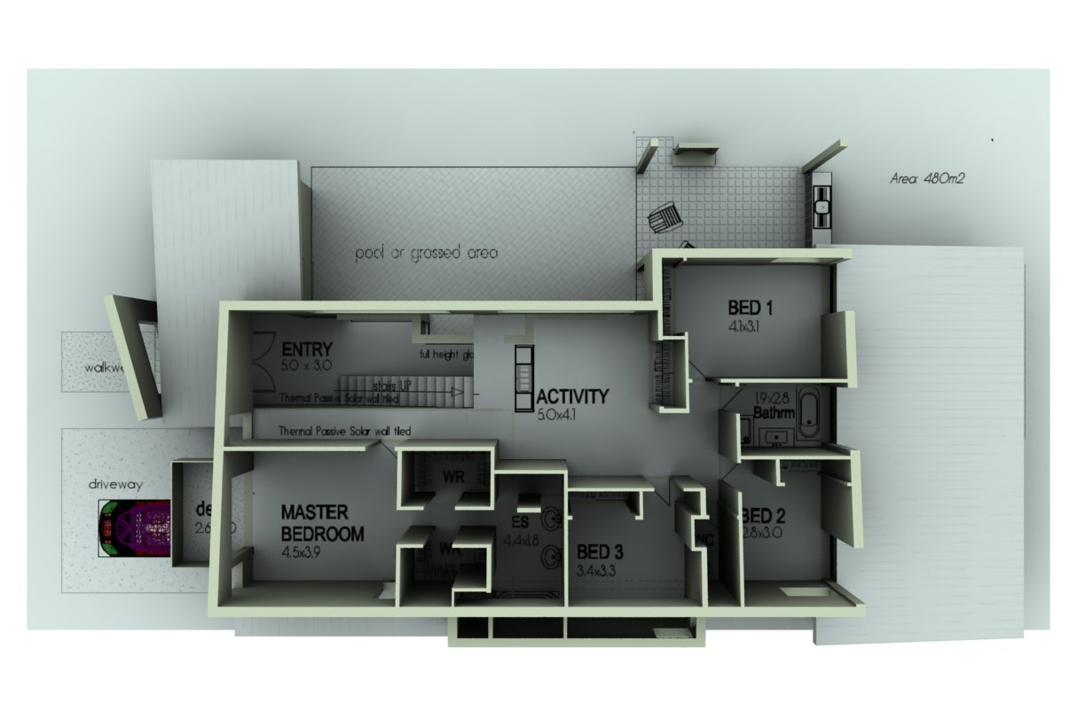
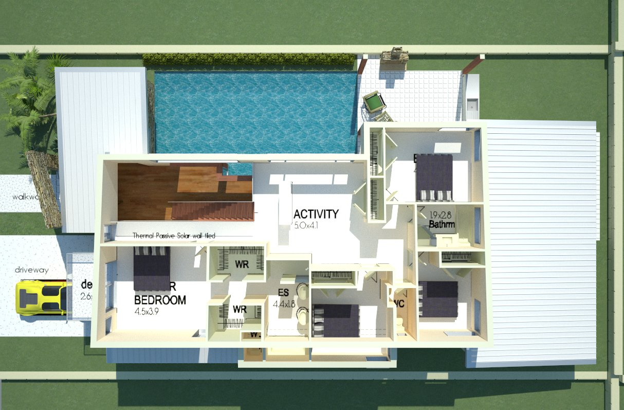
. - Second floor looks good
 .
.
Good luck

-
It's looking great and I love the layout.

Really hope the end result or interior would feel as spacious as compared to the facade.
-
hello,
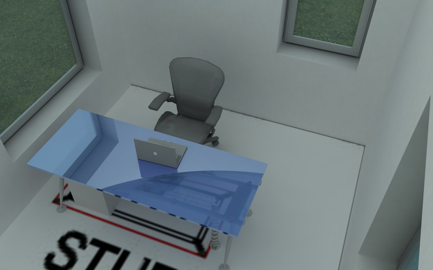
the study looks too small - you'd have to be able place book shelfs, file cabinets maybe and also probably a 2nd (3rd, 4th
 ) seat...
but this largely depends on how your dad would like to use it...
i personally like large and generous studies with different desks for different tasks

-
Lyall, looks like an interesting plan. Hope you post the finished model. You might want to reconsider the double doors into the study - it's awkward having to open two doors to pass through, and if they are wide enough to open only one, well what's the point of having two? Also, you might want to furnish that master bedroom to get a better feel for it's size - looks too small as it is.
-
Lol,
Thanks all for your comment. Much appreciated, however, I'm not the designer, I'm just the modeller, so all your wonderfull comments regarding the design will go nowhere. Even if I do agree with many of the comments.
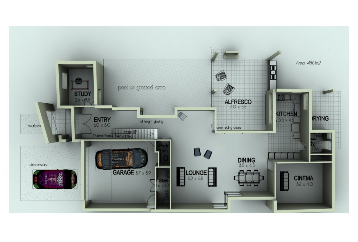
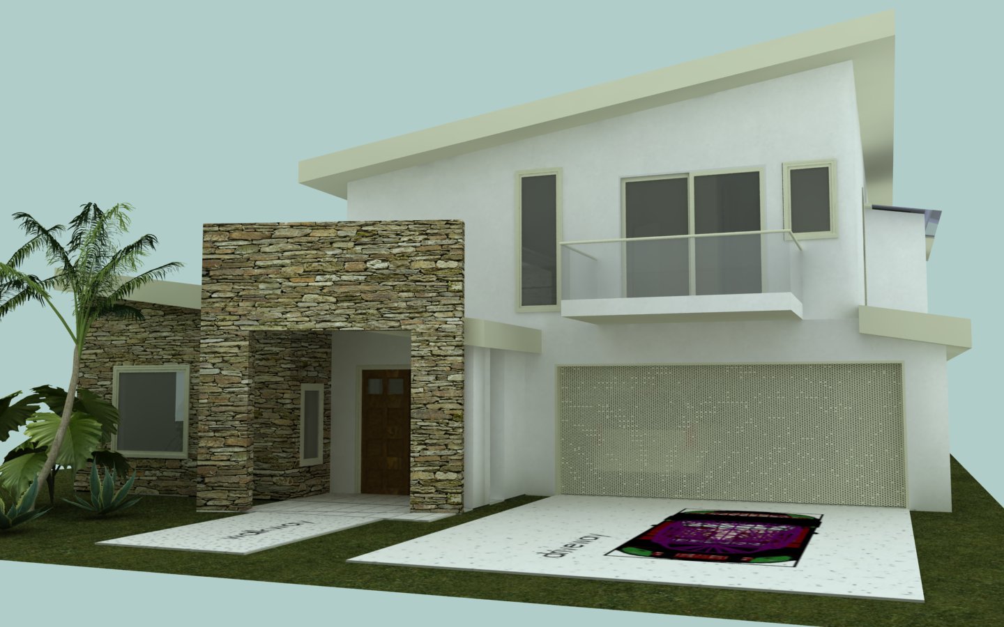
Here is a bit of an update, just tidying things up a bit.
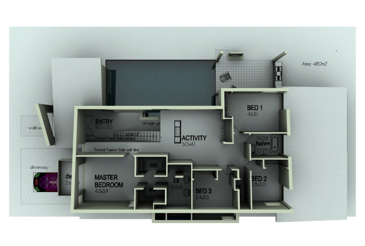
-
Thought that I'd show this one too, just to give a bit more of an appreciation.
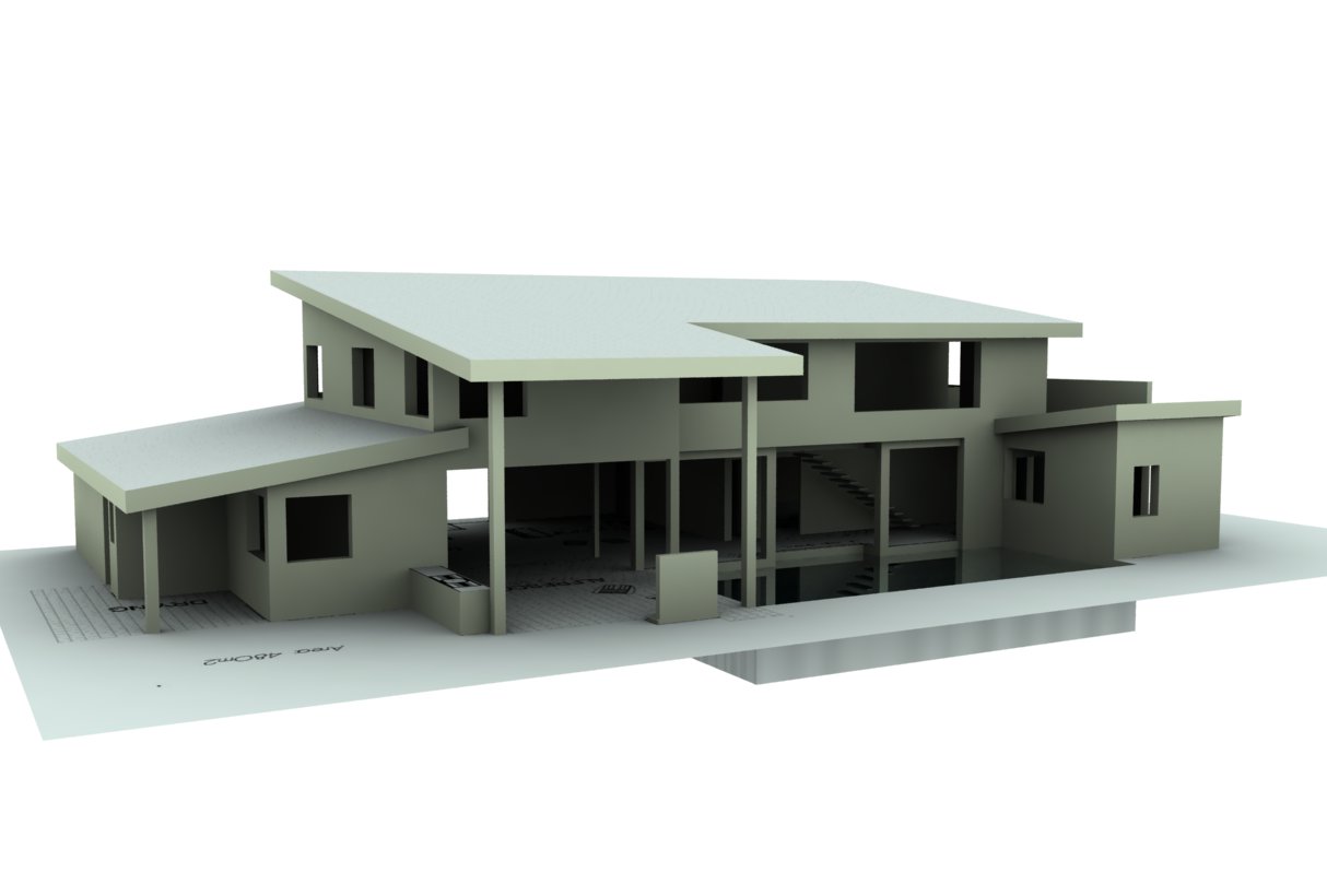
-
I like your model

I like the architecture of house
I dont like the floor plan
-
great renders, what renderer did you use?, also how did you get the plan to render out i have been trying to do this for ages but cant do it.
-
@leehanrahan said:
great renders, what renderer did you use?, also how did you get the plan to render out i have been trying to do this for ages but cant do it.
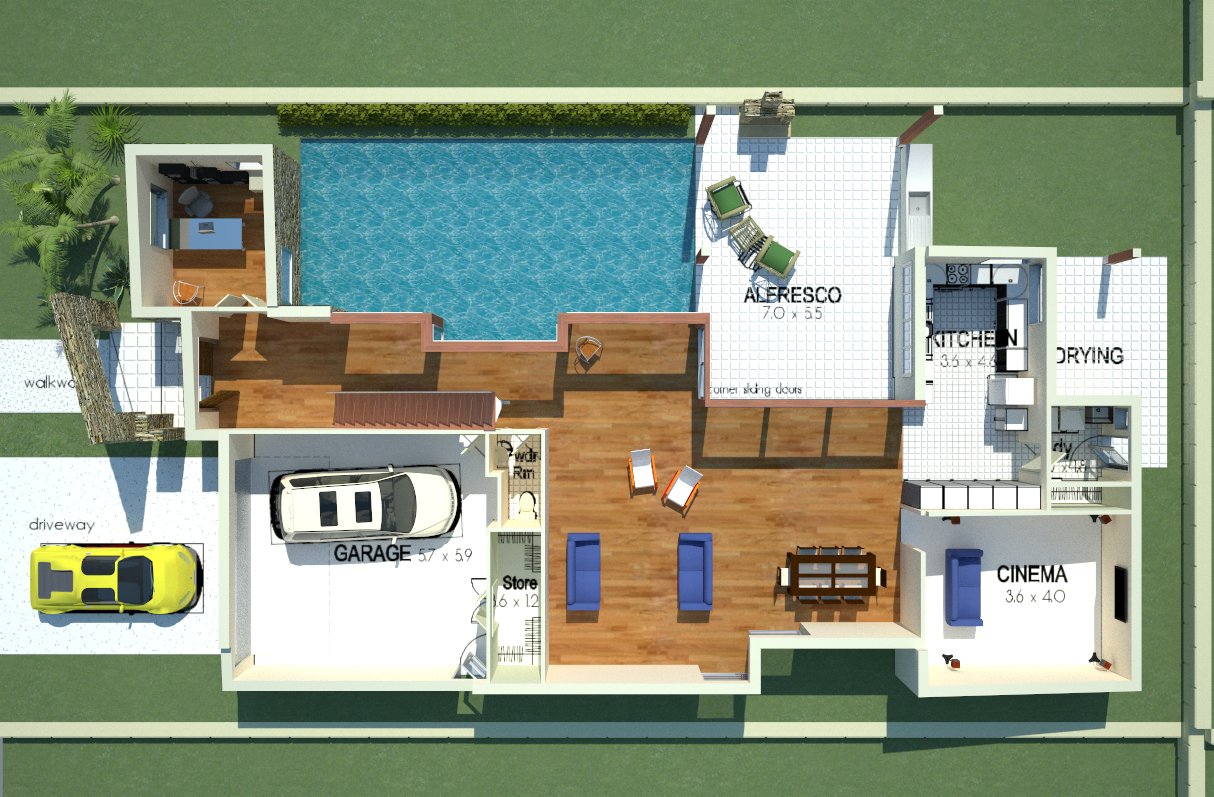
I used V-ray 6. And you just need to explode your plan. You can re-group it afterwards, but that kinda releases it from an imported image to a texture.
-
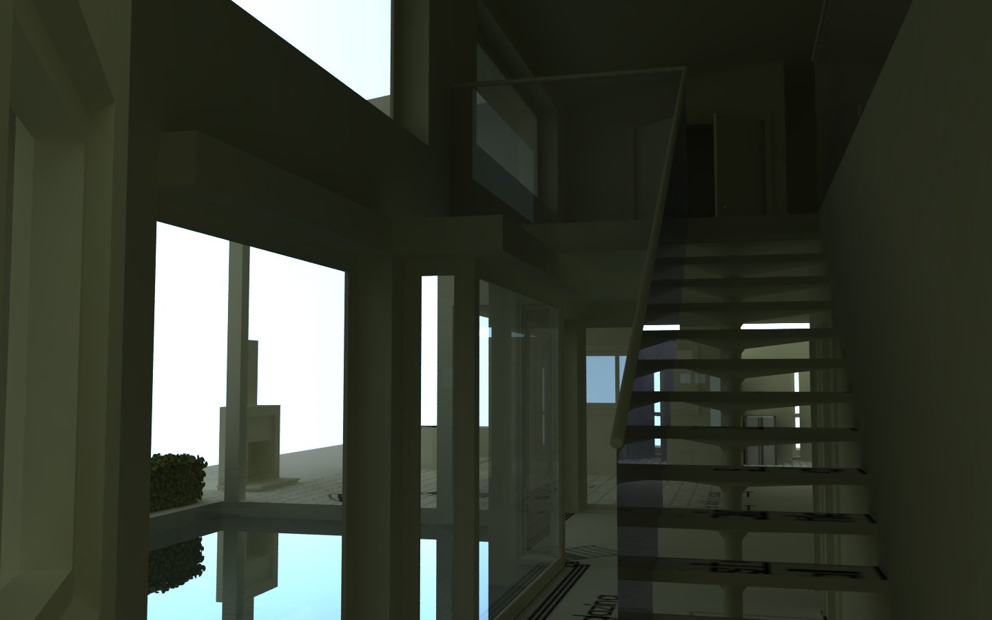
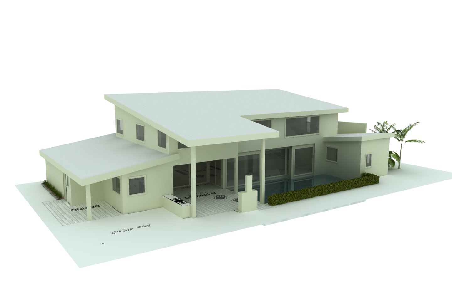
Here is where I'm at at the moment.
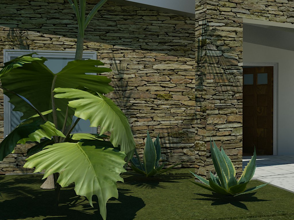
Does anyone recognise those beautiful 3D plants?
Oh, and almost forgot
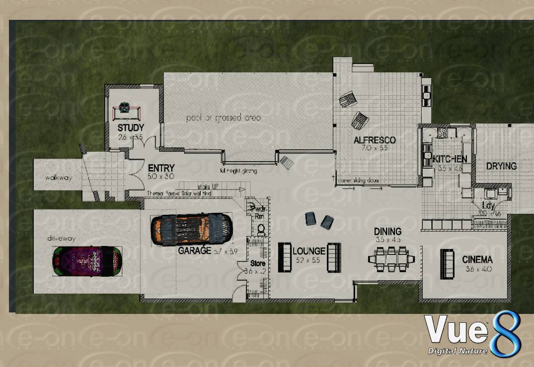
@jarynzlesa said:- I can't see the north.
North is the top of the page in plan view
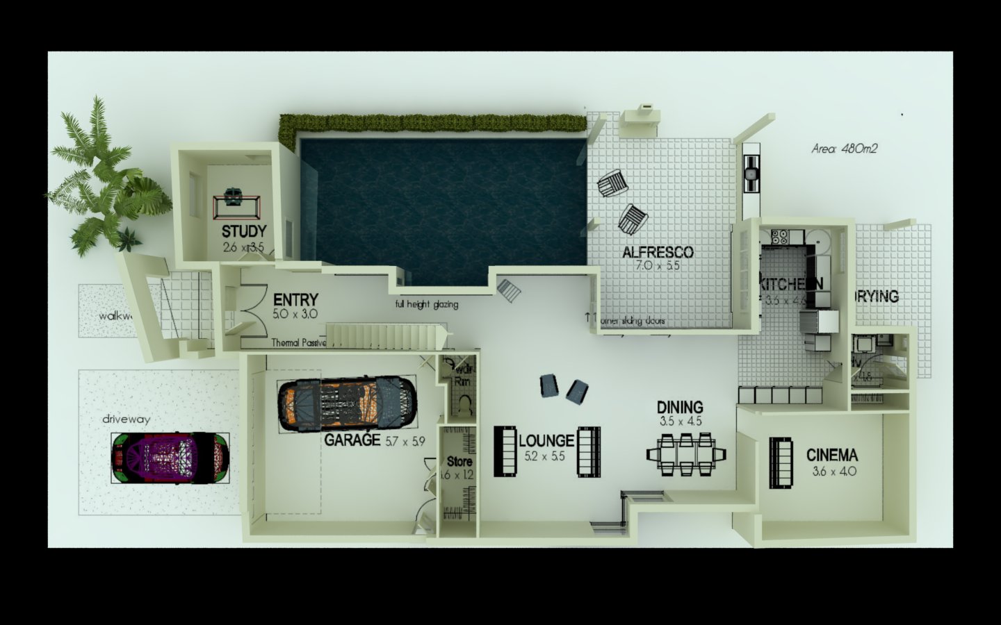
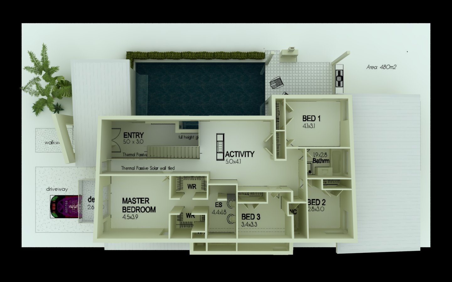
-
I was wondering if someone might be able to help me.
I want to put some lawn down, but I don't like the textures I have available.
I am rendering using v-ray.
I had a thought, and that was to take a snap shot of the plan view of the lawn made from Vue8, and use that as the texture, however, as you can see, my Vue is trial and comes up with the stamp. Is someone able to make a nice lawn for me that I can use?Pre-thanks
-
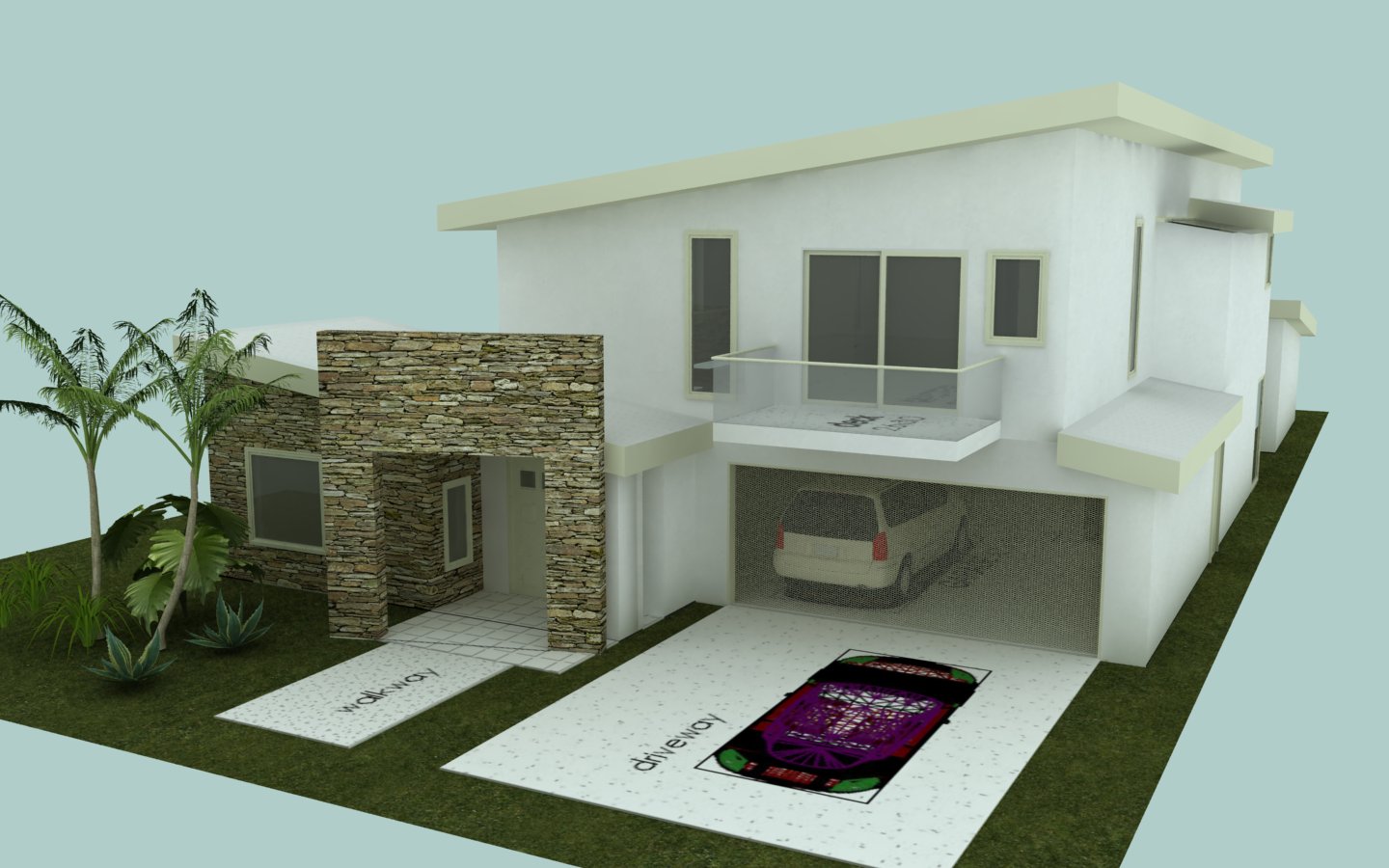
Done a little bit more.
-
Getting nearer to the end.
-
Hi again all,
I finished this ages ago, but life has been busy.
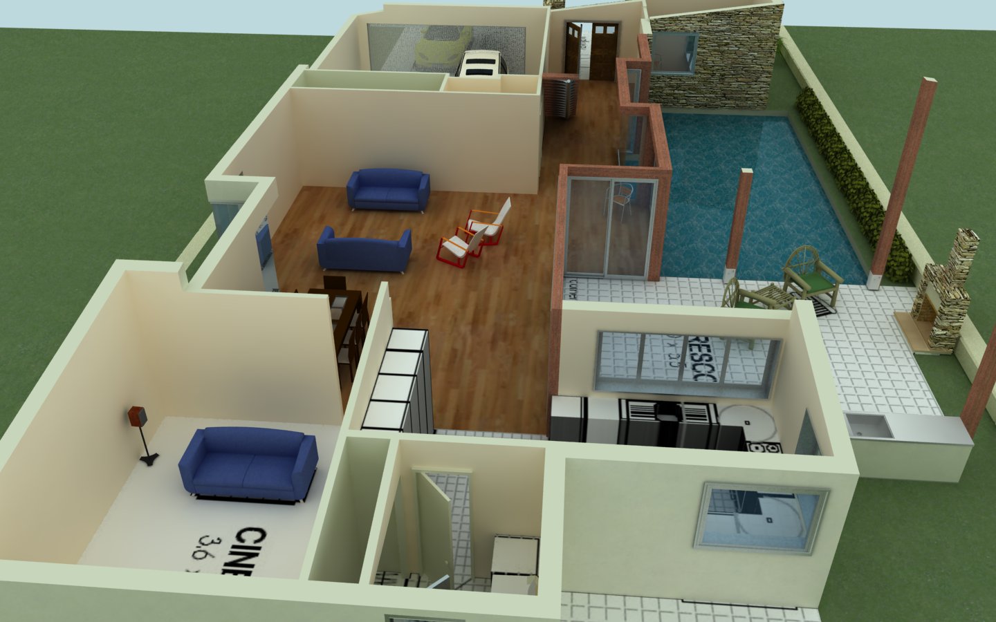
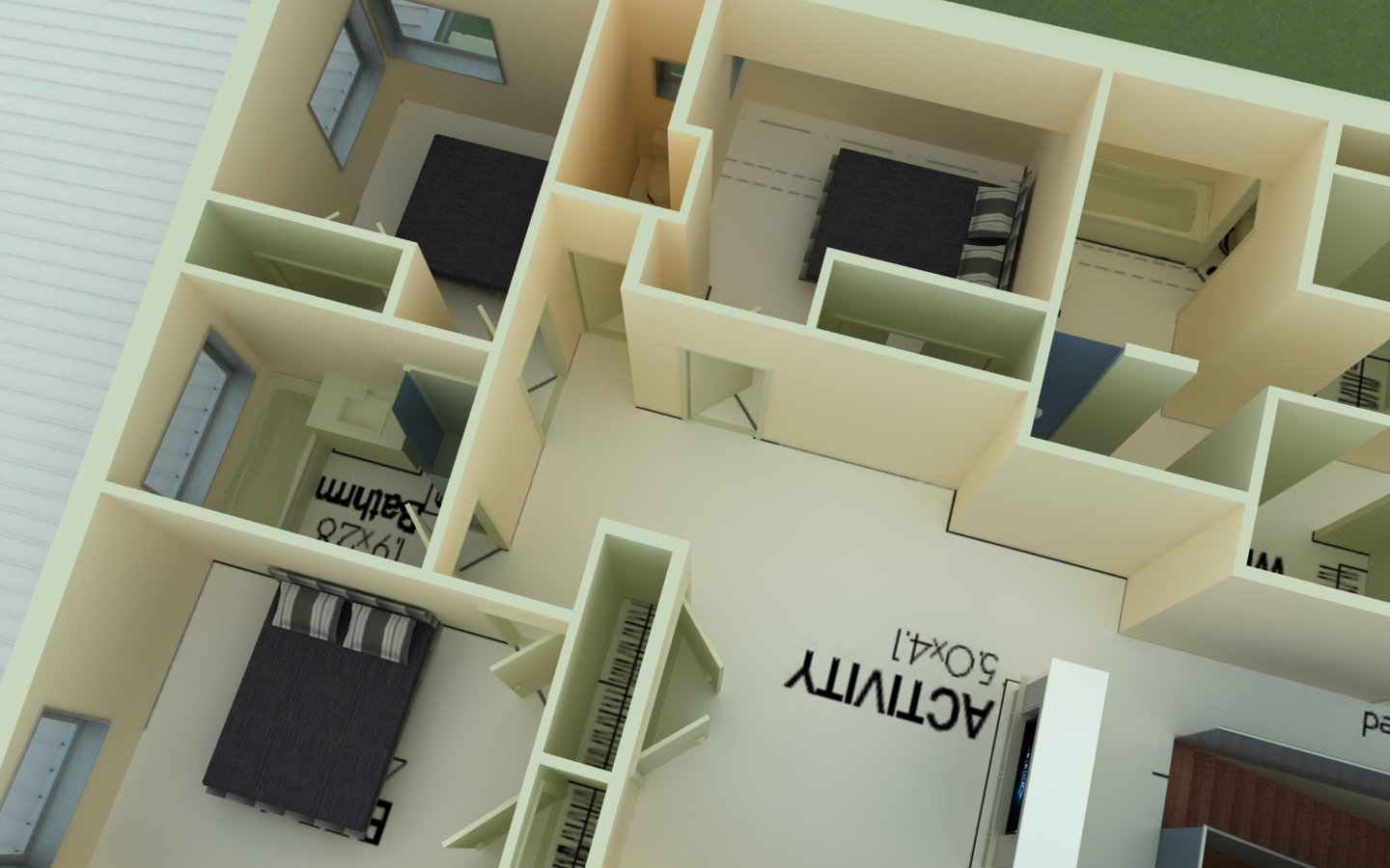
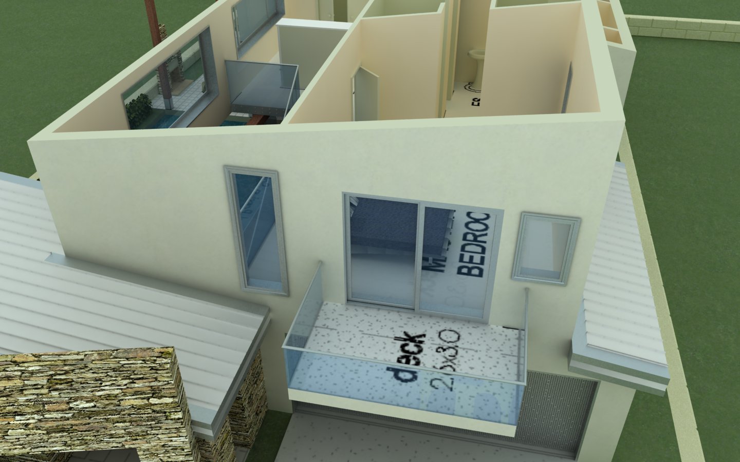
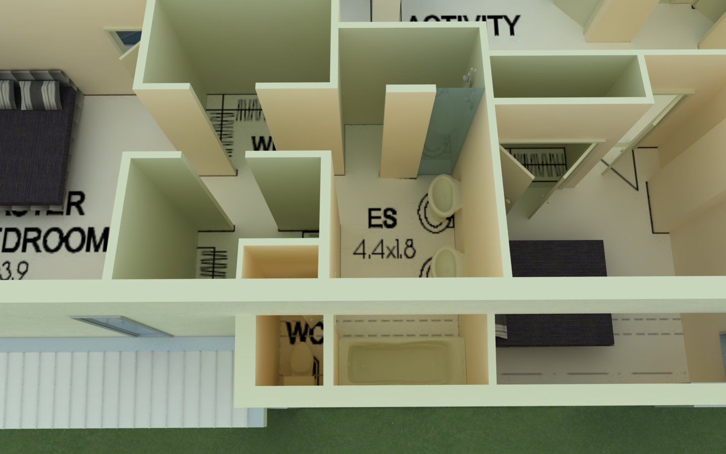
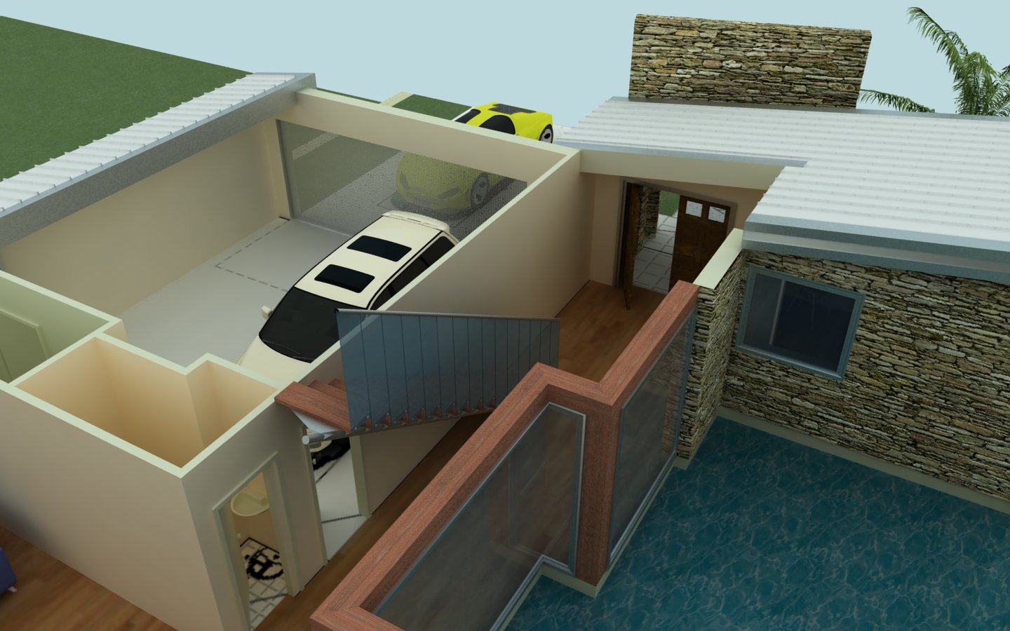
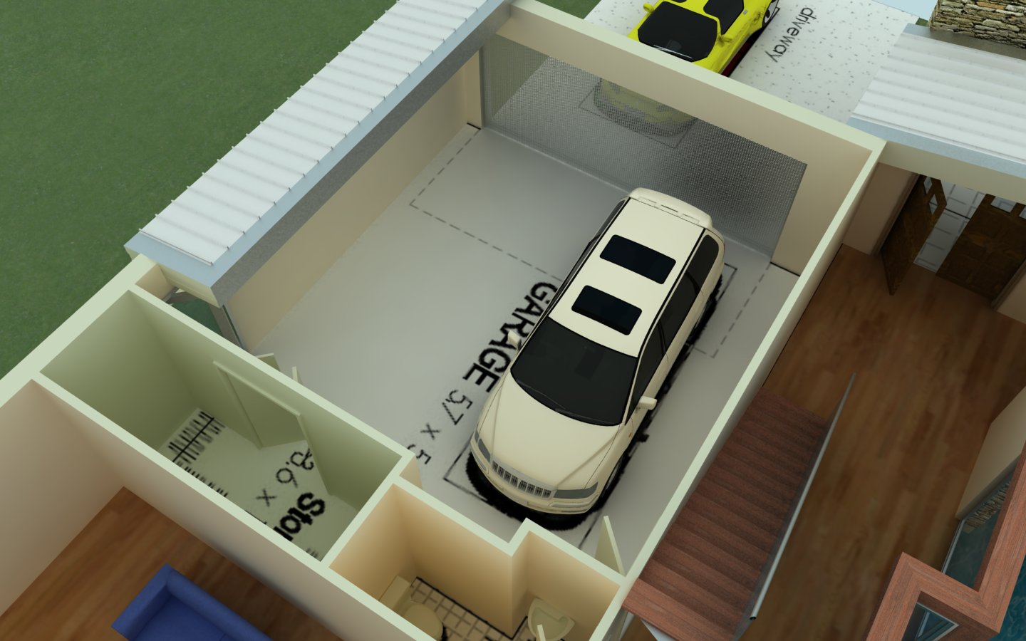
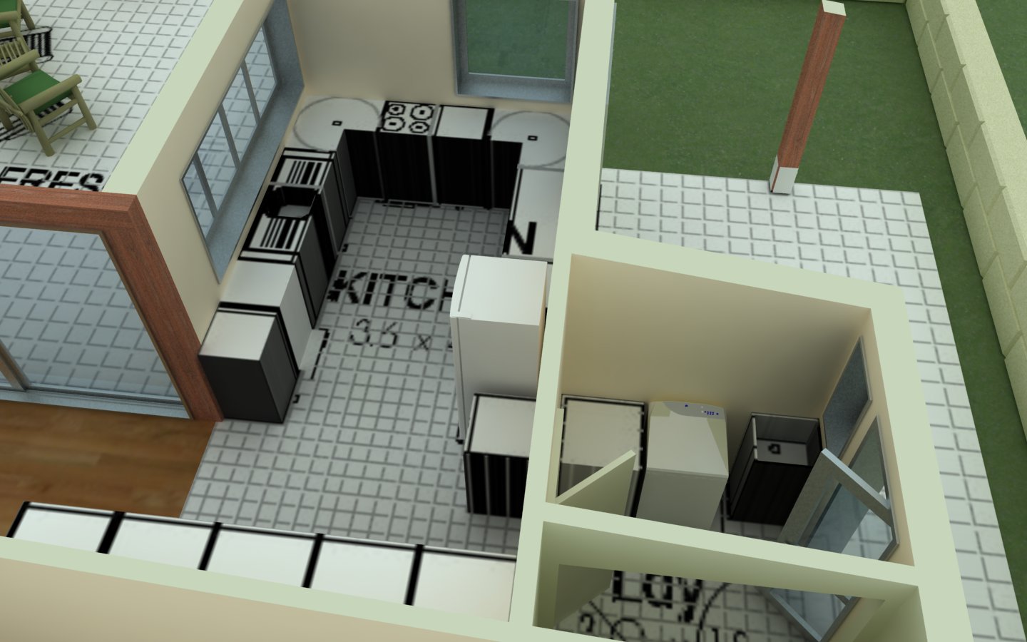
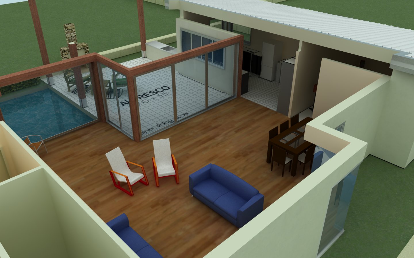
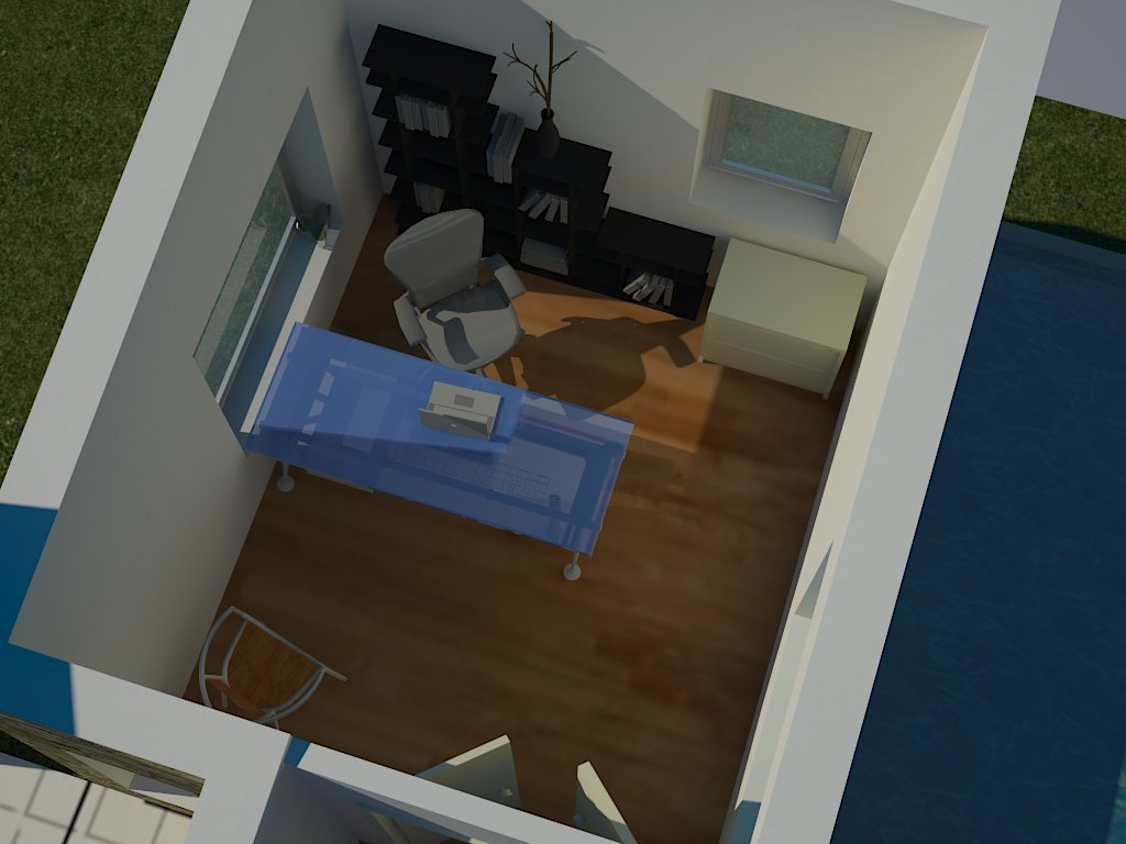
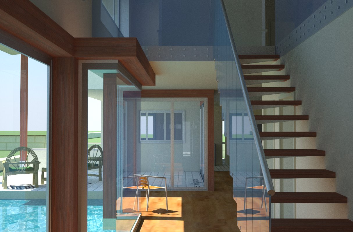
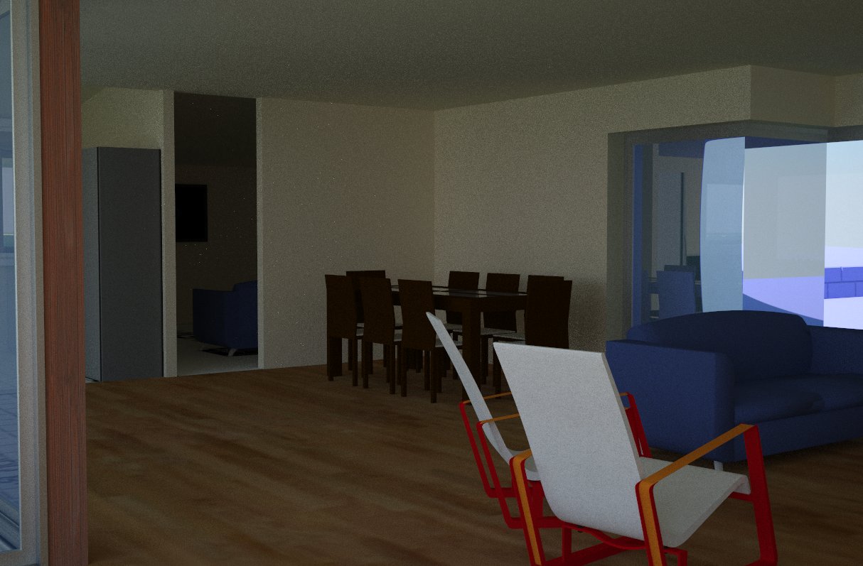
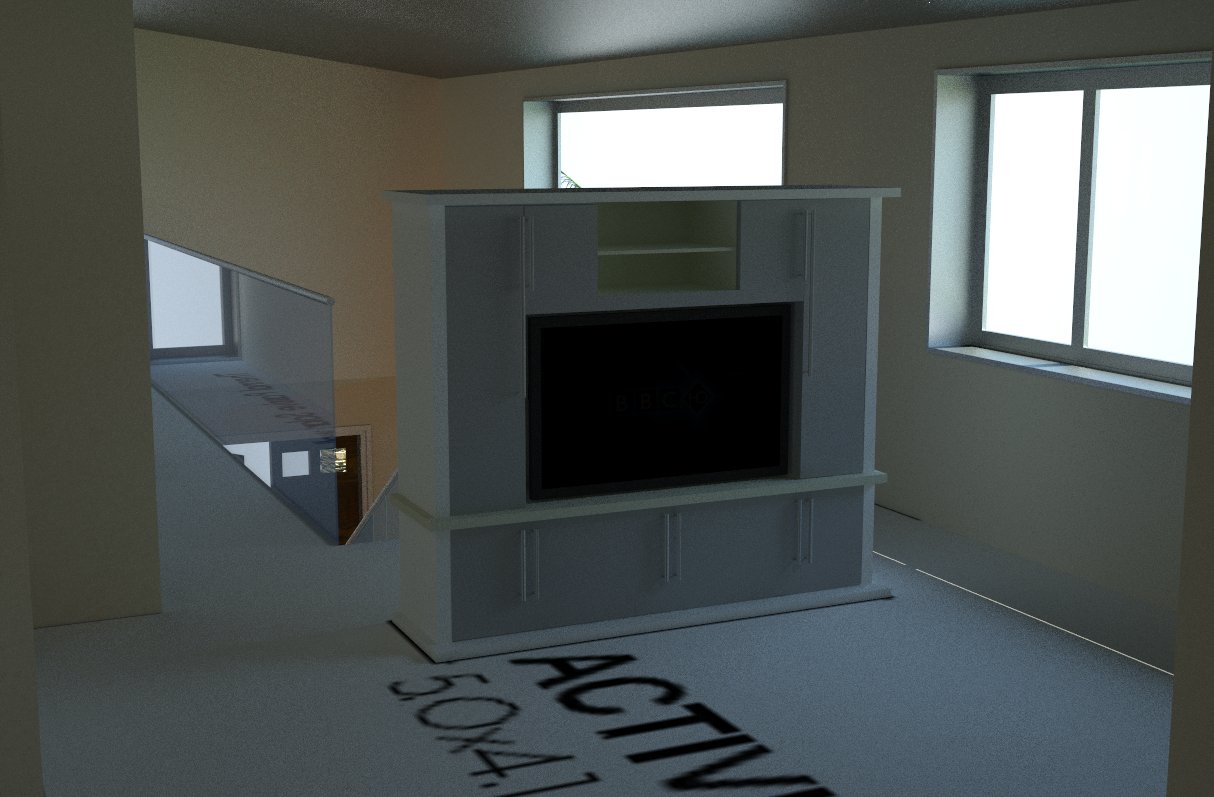
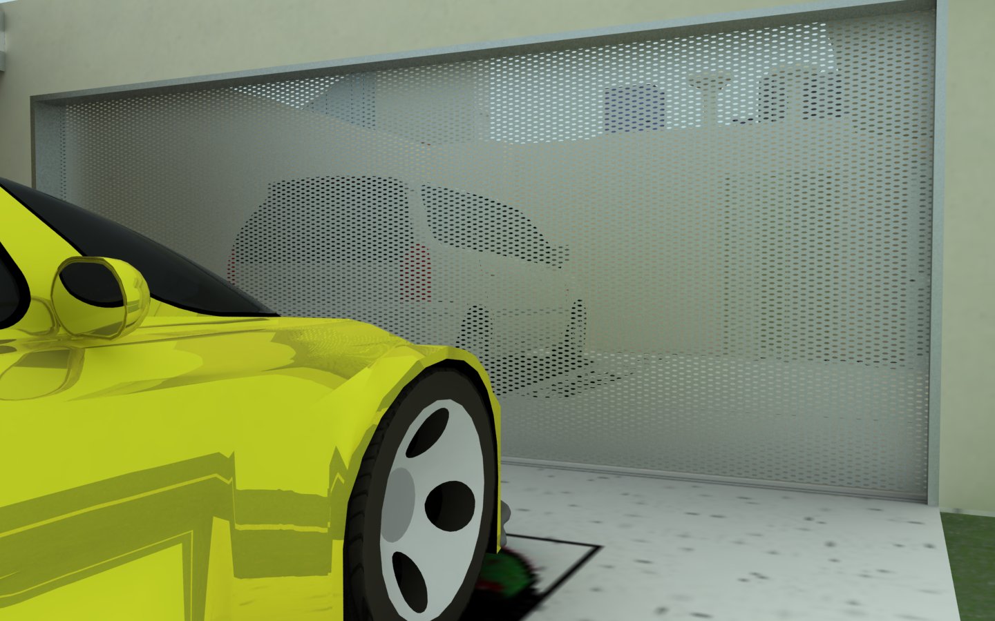
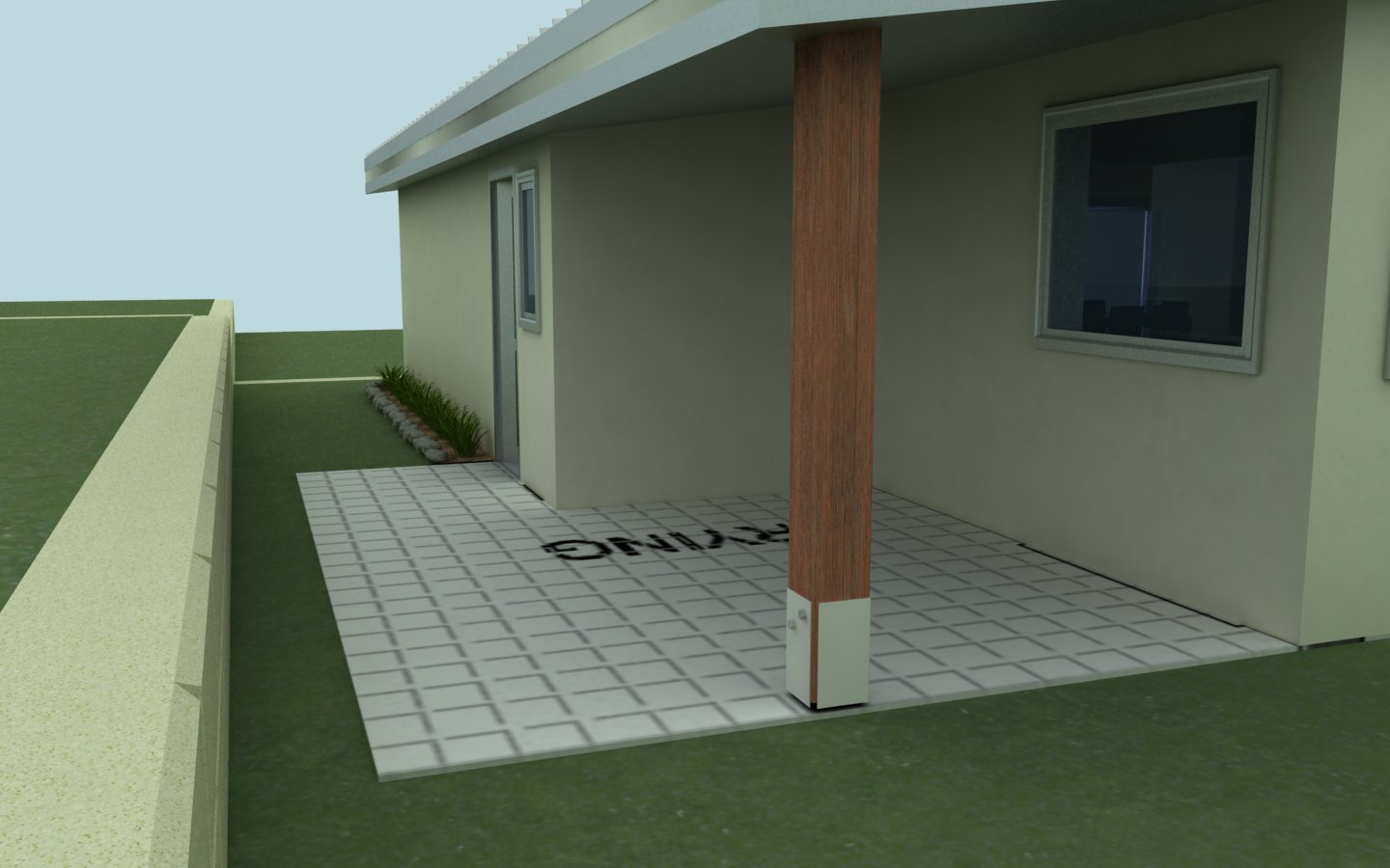
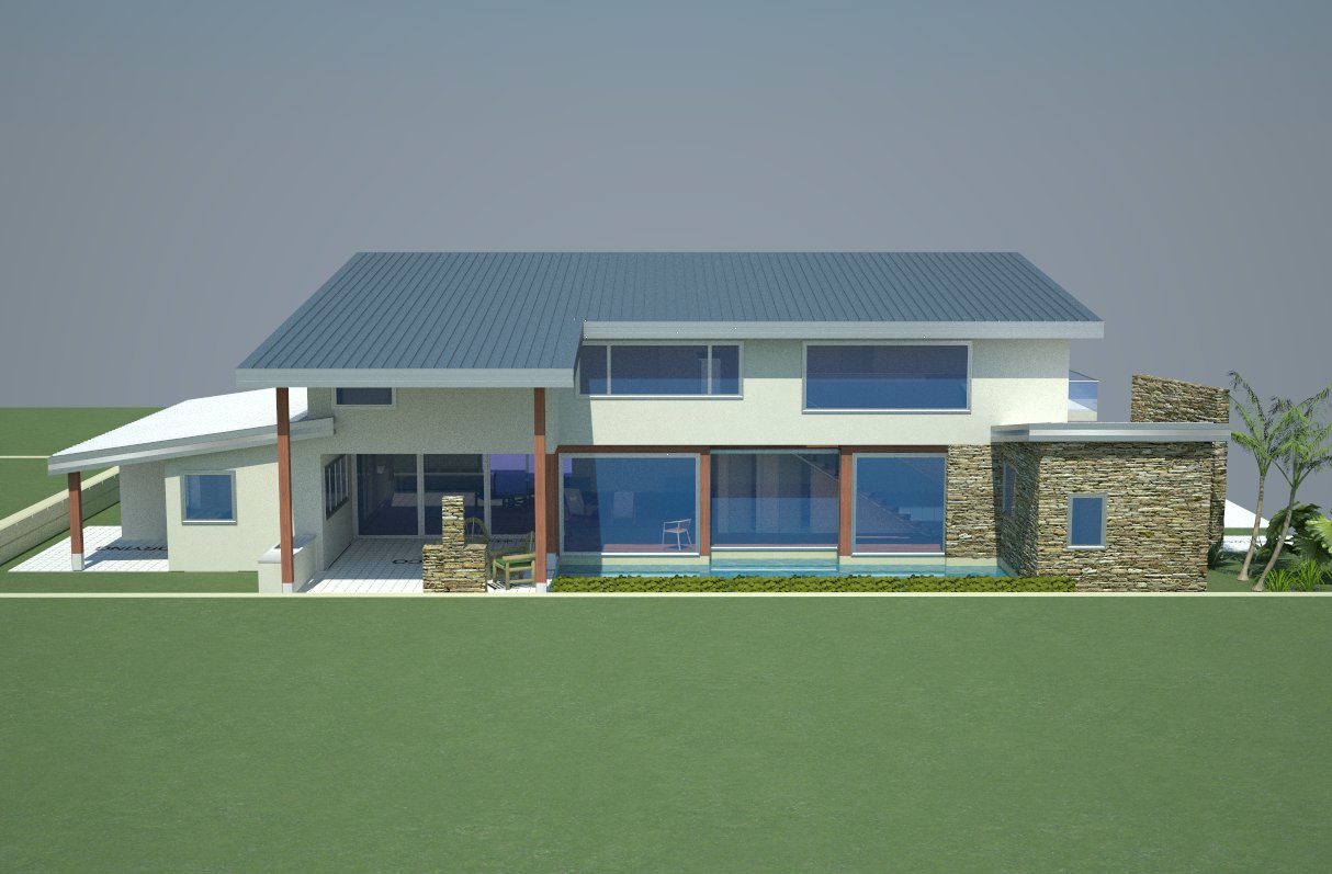
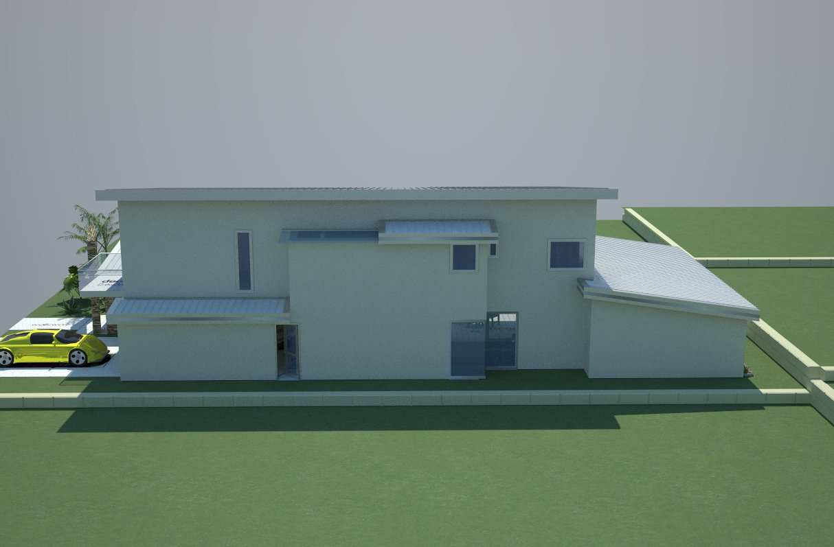
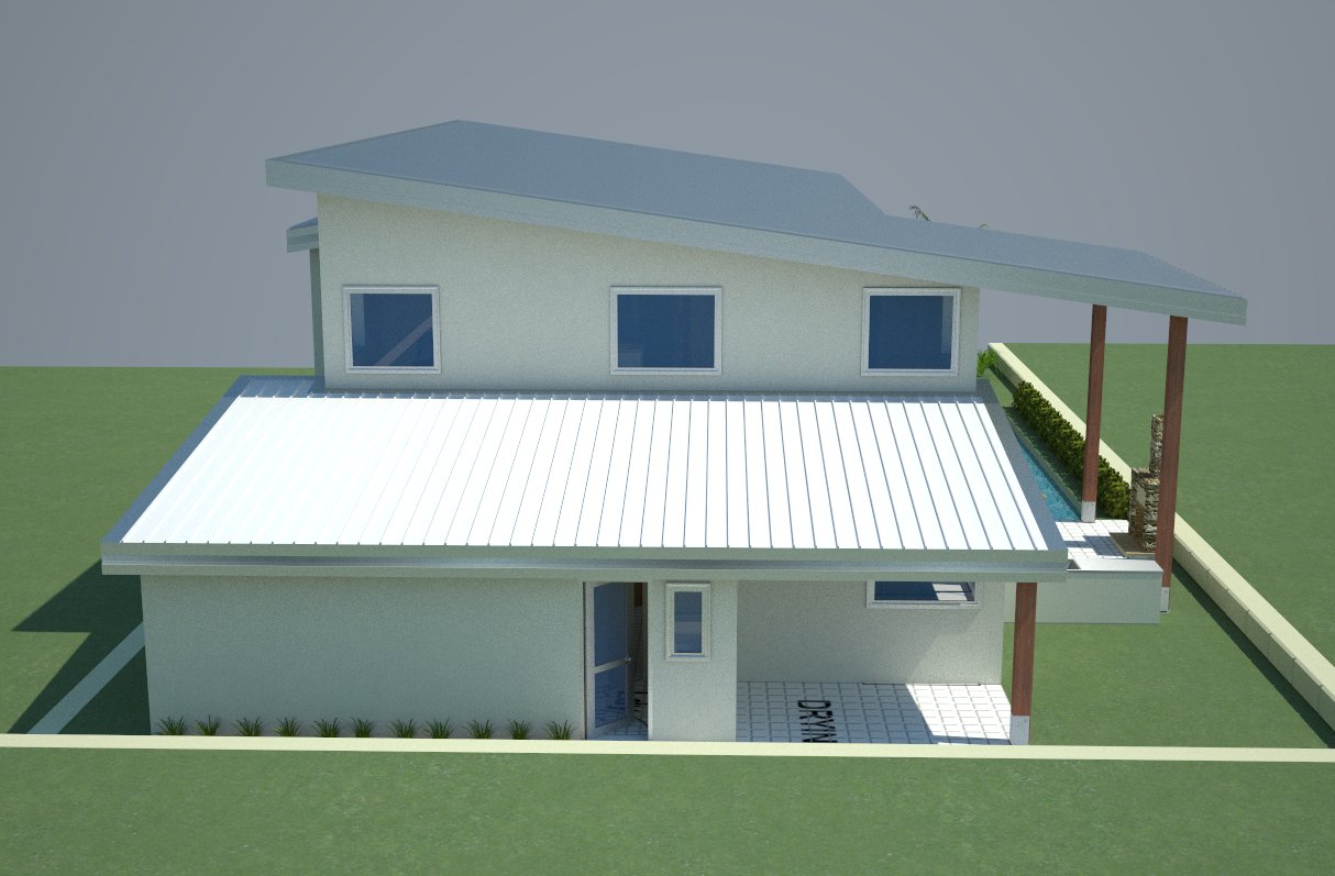
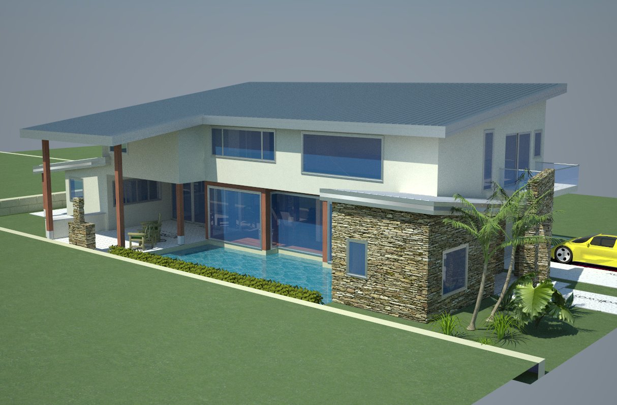
Here is the final product.
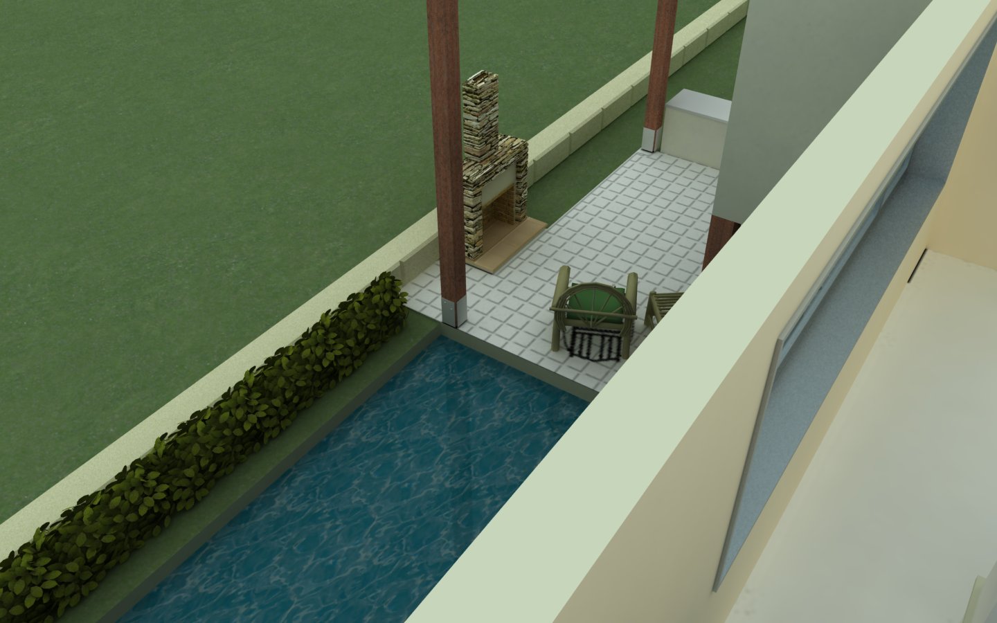
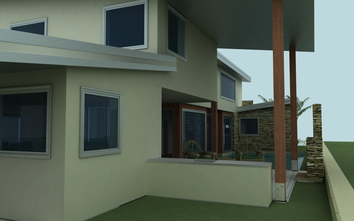
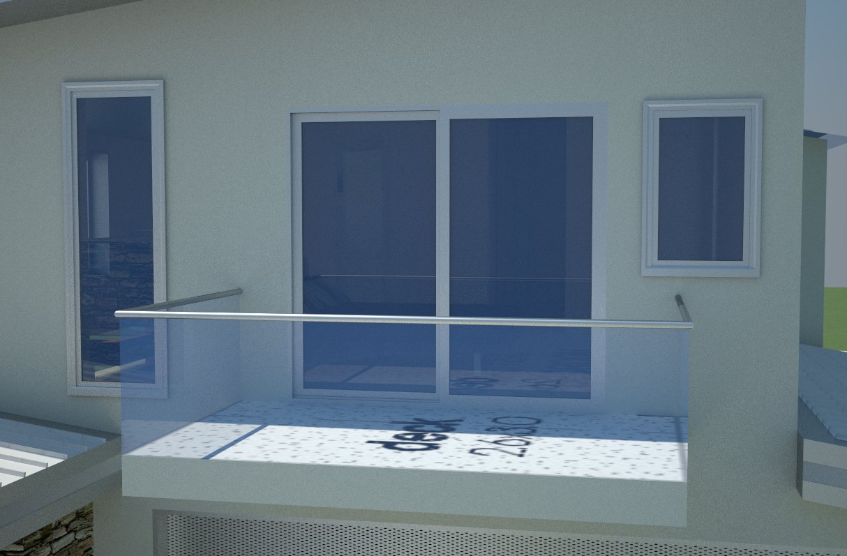
-
oops, too many pics...
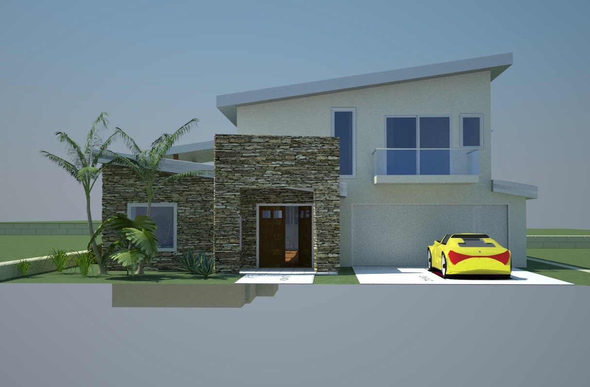
-
Very nice design. I missed it, what render software is this? The stone looks great, along with the vehicles and plants.
-
Your dad will enjoy living in that house - great series of renders.

-
Good job, Lyall! I like the house, and I like the way you show the volumes of the house. Very clear!
Cheers,
Stefan
Hello! It looks like you're interested in this conversation, but you don't have an account yet.
Getting fed up of having to scroll through the same posts each visit? When you register for an account, you'll always come back to exactly where you were before, and choose to be notified of new replies (either via email, or push notification). You'll also be able to save bookmarks and upvote posts to show your appreciation to other community members.
With your input, this post could be even better 💗
Register LoginAdvertisement


