WIP house rendering - Need comments
-
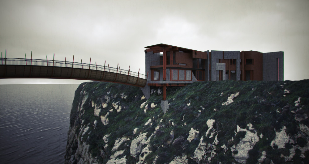
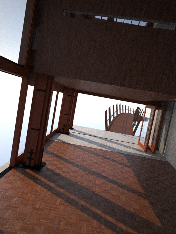
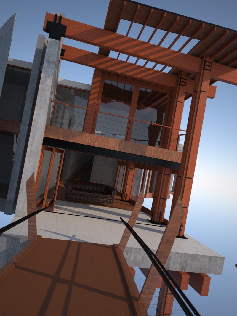
Here's some WIP images for a rendering contest I'm working on ( http://www.ronenbekerman.com/challenges/architectural-visualization-challenge-i-the-gh-house/ ). Love to get some advice on anything you have to offer. I still have a ways to go yet but anything you see or a direction to go would be helpful.
-Brodie
-
great start, i like mix of wood with black painted metal braces. where i live there is tons of houses like that.
is the house your design? -
thanks for the feedback.
No, the house was designed by some firm in Israel I think.
-Brodie
-
First of all, nice work!, The first image sure has some strength in it!
I'm wondering, if it's a Vue terrain or images pasted together?I see the atmosphere you're using one is quite 'dull', I'd go for a more vivid one,
I'm not saying you should use a nice blue sky with perfect puffy clouds in it, but if
you sill want it to be 'grey' use a more dramatic one but which still casts shadows
instead of only GI.The water could use extra 'volume', It looks like it'll feel like hard plastic, make it have more depth in the ripples
and some kind of 'volumetric-like' lightning.I get this isn't the final image, but just wanted to point this for sure, but make it look weathered,
would combine great together with a dramatic lit scene!The 'rock' where the house looks to be build on looks washed out, lacks depth and color.
To me it looks like there's a white layer on it with a 15% opacity.Note that I wouldn't know how to do half of the things mentioned above, just as you asked I wanted to give
you some advice. A great start nevertheless! -
@foxar said:
First of all, nice work!, The first image sure has some strength in it!
I'm wondering, if it's a Vue terrain or images pasted together?I see the atmosphere you're using one is quite 'dull', I'd go for a more vivid one,
I'm not saying you should use a nice blue sky with perfect puffy clouds in it, but if
you sill want it to be 'grey' use a more dramatic one but which still casts shadows
instead of only GI.The water could use extra 'volume', It looks like it'll feel like hard plastic, make it have more depth in the ripples
and some kind of 'volumetric-like' lightning.I get this isn't the final image, but just wanted to point this for sure, but make it look weathered,
would combine great together with a dramatic lit scene!The 'rock' where the house looks to be build on looks washed out, lacks depth and color.
To me it looks like there's a white layer on it with a 15% opacity.Note that I wouldn't know how to do half of the things mentioned above, just as you asked I wanted to give
you some advice. A great start nevertheless!Greatly appreciate the advice. It helps to have a fresh eye, and it's affirming that some of what you mentioned I'm already considering so I guess I'm on the right track.
Quite right about the atmosphere. What's shown currently is the HDRI I'm using for the lighting. I think for the final I'll be using a more interesting 2d image for the sky background and maybe add a light to give the building just a bit of shadow even though it's overcast.
Spot on with the water as well. Currently it's just a stock Maxwell Render texture. For my final image I'm wanting to give a real sense of movement a la a coming storm. So lots of wind blown trees and grass, white caps in the water, etc.
The water is basically just a flat plane with a texture on it, although it does have some displacement so there's just a bit of depth there. The island the house sits on is a big hunk of geometry textured with an image from cgtextures.
I hear what you're saying about the rock too. I ran a rendering with some trees and there's a noticeable difference between the shade of green on the trees and the green moss on my texture. I think I'll need to try and do some color modification on that texture to get it to look right.
Explain more about the weathering if you would. Anything in particular come to mind? Are you referring to any specific materials for example?
Thanks again,
-Brodie
-
I'm glad I could help! I see the changes you're willing to make are heading the good way IMO.
Like you said, adding a light to give it some soft shadows would really do a good job I guess,
adding Ambient Occlusion (if you have any in Maxwell) could improve it too I think.About the atmosphere, http://farm2.static.flickr.com/1110/882182728_69e822cb1d.jpg
something like this would be epic, with a weathered look on the home and tree's which are struggling
with the strong wind with some foliage flying around
Something extra I noticed is that you changed the white stucco with concrete and wood, but
this makes the building a tad too heavy in my opinion, I'd keep the stucco material but just
making it a tad darker, also if you would keep the wood, make it have slats.
I think a wooden material as below would look a lot better.
http://lh3.ggpht.com/_p7B16_gheLw/SXOjfqtp6vI/AAAAAAAAAIY/6bQ5kjGuMbo/DSC_0505.jpgHope this was helpful, if I come to mind with any new ideas I'll let you know

-
Great reference photos! That's just the sort of sky I'd like to have! So far I've had a tricky time finding a good high res photo with that sort of feel to it. Thanks for the suggestions!
-Brodie
-
No thanks

I'm almost sure you've took a look here already I still felt showing you though, there are some nice ones,
you could just map them in a sphere with the UV tools plugin.http://www.cgtextures.com/textures.php?t=browse&q=26544
Edit, I could give it a try rendering a sky in Vue so you can use that as a sky background image if you want to

Cheers!
-
Interesting design, but I question using wood posts and beams to support that heavy concrete floor.
On the last image, the texture on some of your wood elements needs to be reoriented.
Also, in the first image appears dark, as if that side of the house is in shadow; you might want to consider roming the sun or changing the time of day. -
Hello Brodie,
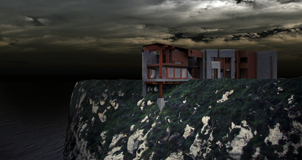
Hope you don't mind, rendered a sky (3 different variations achieved with post-pro)
and used that sky for your current picture.. Oh well.. I was bored
Edit: anybody feel free to use the sky for whatever purpose




Hello! It looks like you're interested in this conversation, but you don't have an account yet.
Getting fed up of having to scroll through the same posts each visit? When you register for an account, you'll always come back to exactly where you were before, and choose to be notified of new replies (either via email, or push notification). You'll also be able to save bookmarks and upvote posts to show your appreciation to other community members.
With your input, this post could be even better 💗
Register LoginAdvertisement


