Render This: Interior
-
Jarynzlesa a new member here at SCF started a thread asking how he could make this scene look more realistic.

So I thought I'd throw it out to y'all to tackle his model and render it 'realistic', the challenge here is that being a relative new SU user the model is not optimised, so the challenge is on you to take this model and either render as is or add to it. You cannot remove anything, you can rearrange, change views, textures etc.
Open to all render solutions.
Have fun.
edit Plants have been removed, you can add your own.
Model: http://www.box.net/shared/ooqghj5dmt
(in SU6 format) -
I didn't see the original thread....what was this image rendered with? Must we keep the plant?
-
Vray.
I have removed the plants.
-
I threw one together, but of course Vue managed to mangle the light. The floor looks good but other than that everything else is a mess. I'll keep working on it.
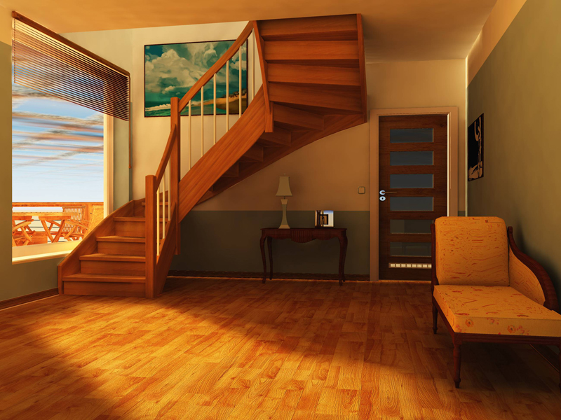
-
Captain, are you welding your verts once you import into Vue? If not, that's most likely what's causing the light leaks.
-
Been a while Pete...needed a decent render challenge to get my mind off of "real work"!! Here's my shot at it using Vray for Max. Decided to go a little more "grungey" with it.
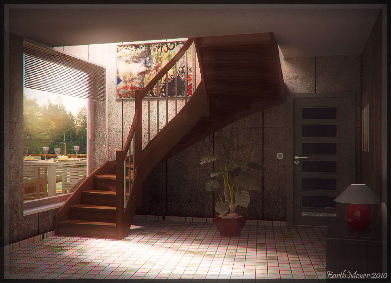
-
Adam,
Really nice image! Are you using the native sketchup file importer to get it to MAX? If so - have you had any issues with it?
Thanks,
Dean -
@earthmover said:
Captain, are you welding your verts once you import into Vue? If not, that's most likely what's causing the light leaks.
Adam, I wish that was the answer; it would make for an easy fix. Verts were welded after import. (on your render) see where the light escapes from the above room at the top of the stairs? I believe that light is what appears on the corner...?
-
Not sure. I thoight the light above the stairs was from a space in that area. Pete may recognize an easy fix for the corner leaks. I have another one cooking in vray. Maybe ill give Vue a shot next. Did you try removing the window glass?
-
There is only glass on the back door, not the large window. I'll be curious to see what you or pete suggest.
-
Here's my second one. Decided to tone it down and do something more traditional. Minimal Post Processing on this one.
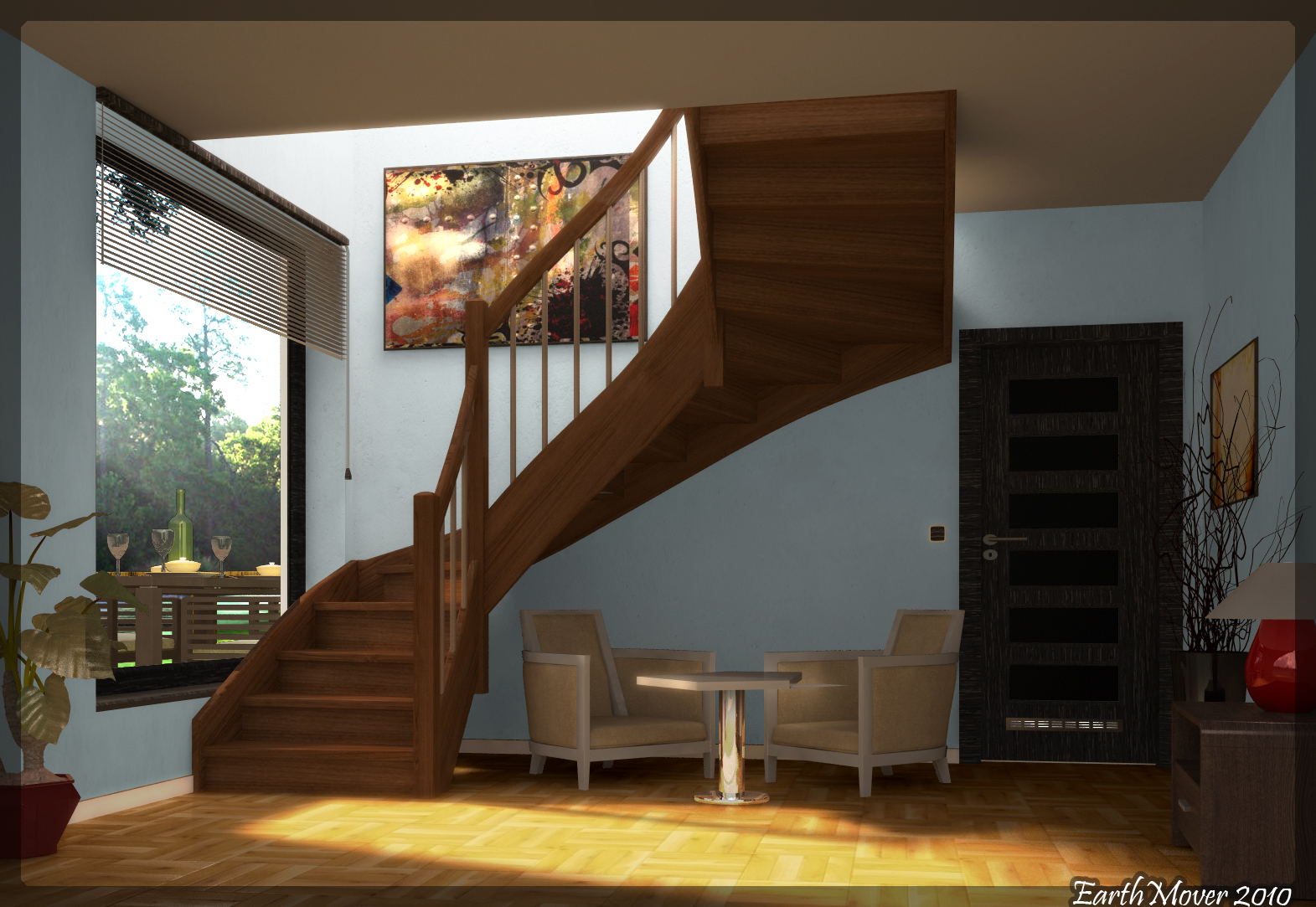
-
That looks great Adam.
I hope by Wednesday next week to have a gap in my current project to play also.
-
Yes, looking good Adam. Definately should use a helmet sitting into the left armchair
 but thats not an issue at that case
-
Fancied a place by the sea.
Bike by alpine2.
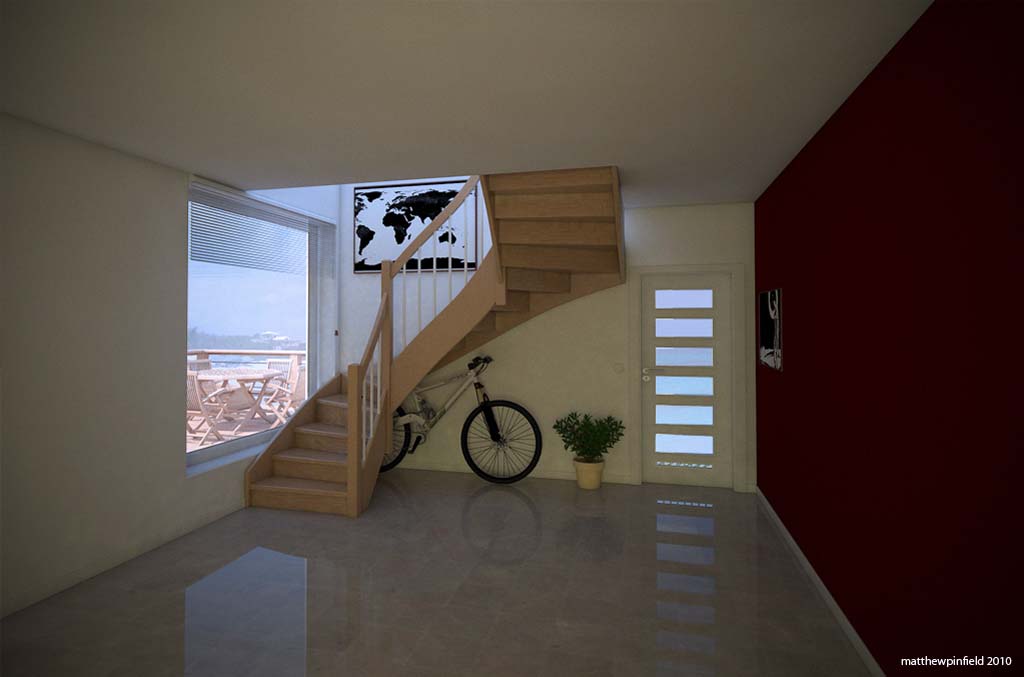
-
Nice work Matthew. The exterior atmosphere is super convincing!
-
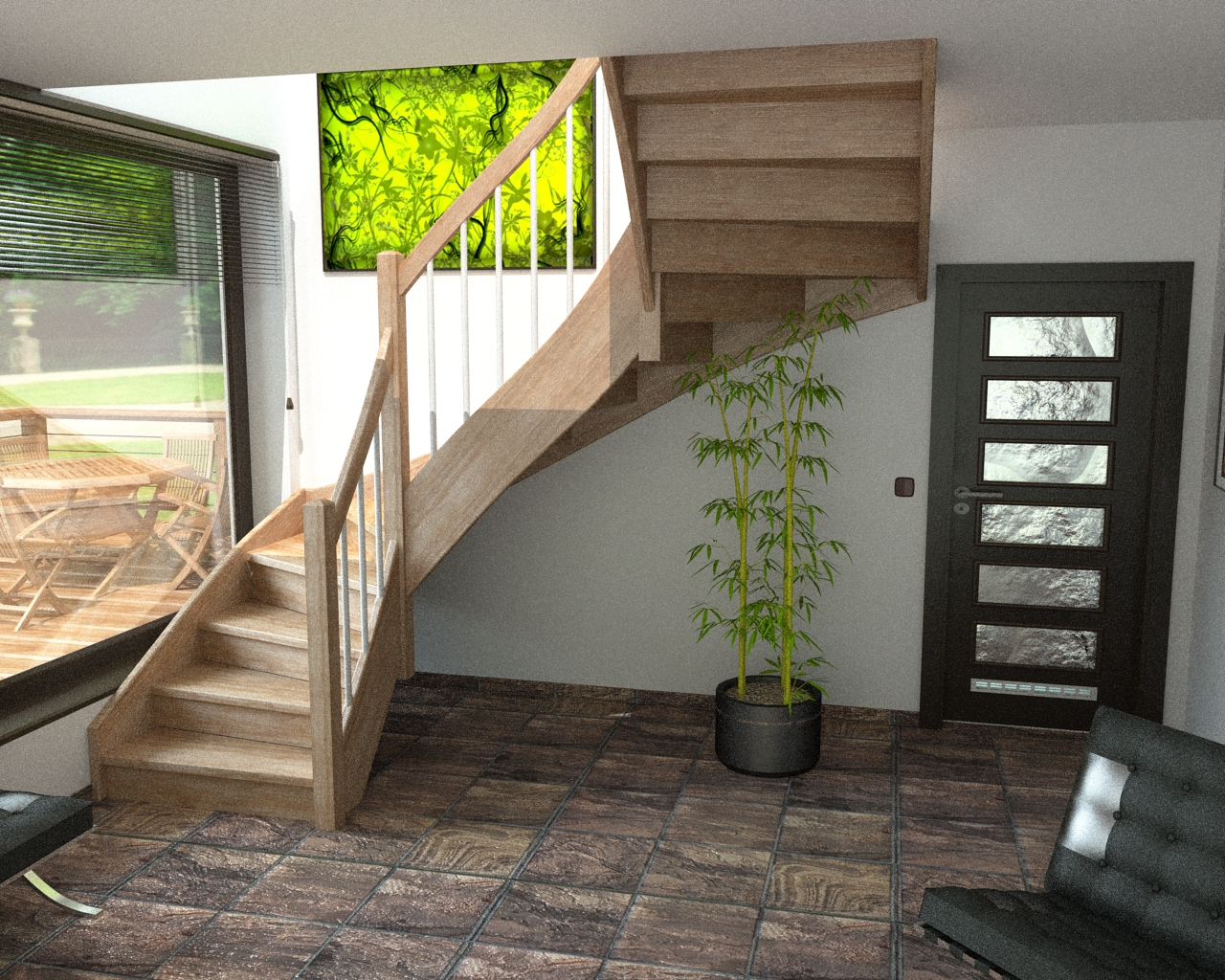
Noisy and too strong bump on the floor, but I do not have time for more.
-
Captain,
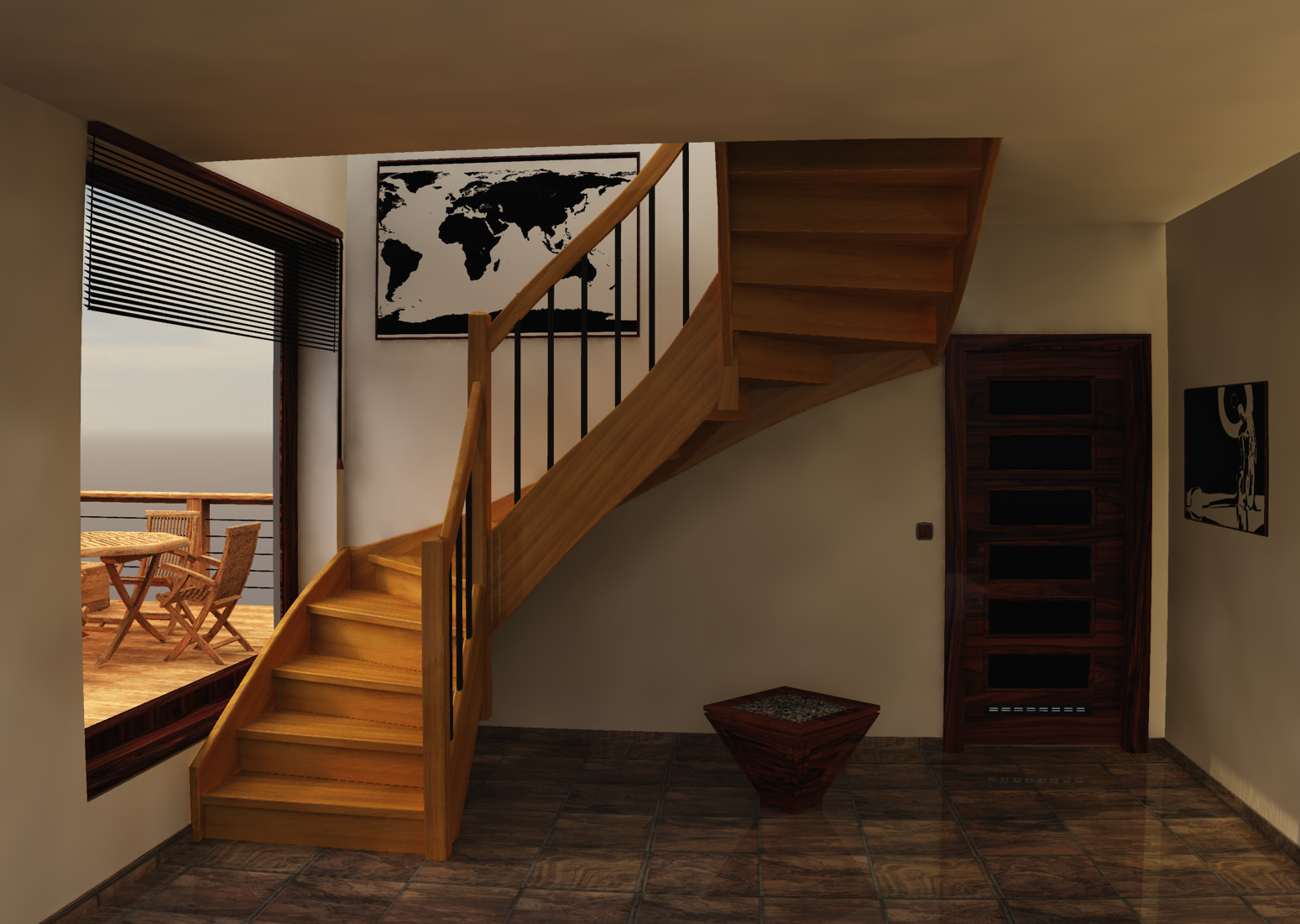
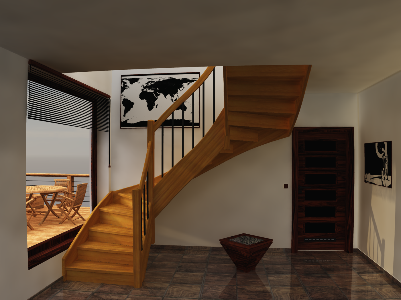
Here's a quick try with Vue. I rendered on Final, so there is still some blotchiness, but I think the feel is right. I used Image Based Lighting and an HDRI image to light the scene, but still using Global Radiosity. I also removed all fog and only minimal haze. There is still a little lighting issue in the far corner. I'm going to see if possible rounding that corner by a quarter inch or so might help to smooth it out.
EDIT - Ran it again with the far inside corners rounded off a tad. Help to get rid of the hard lines between ceiling and walls, but still some minor light trapping issues. Also bumped render settings up to production a moved the sun position a tad.
-
Great works!!
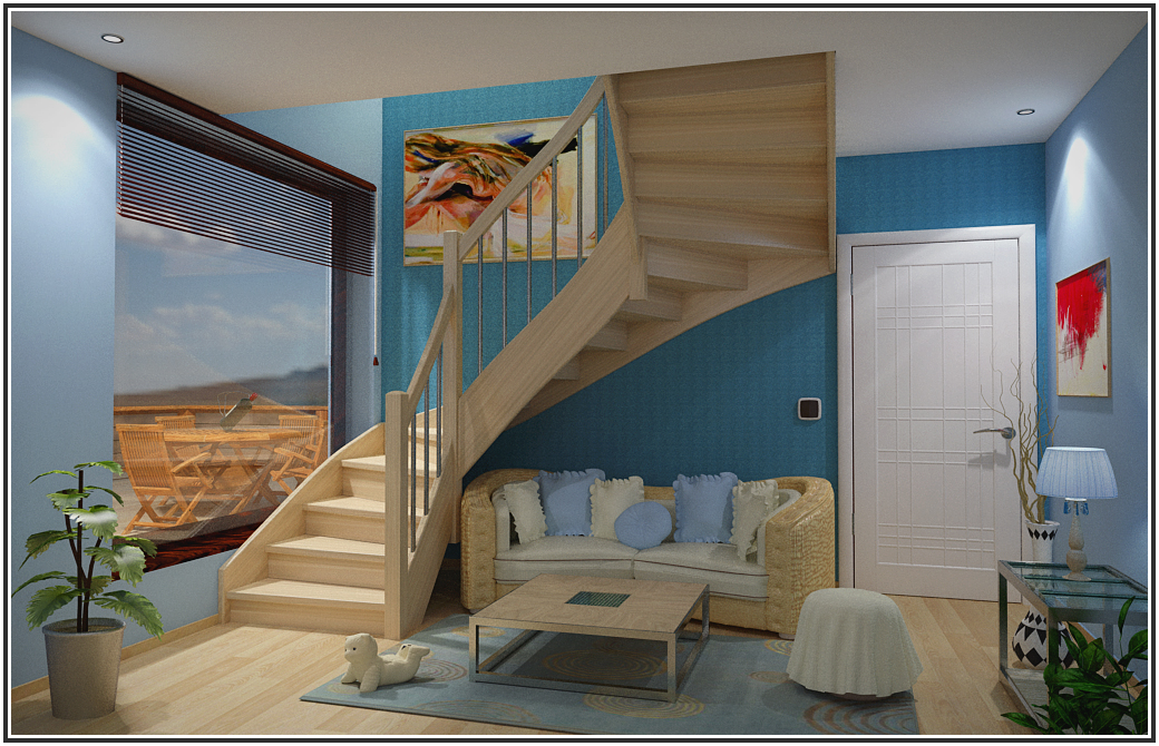
in the last image te wood from stairs is exellent.
Is vray? or another software? -
@rcossoli said:
Great works!!
in the last image te wood from stairs is exellent.
Is vray? or another software?Kerkythea
-
For Jarynzlesa

Hello! It looks like you're interested in this conversation, but you don't have an account yet.
Getting fed up of having to scroll through the same posts each visit? When you register for an account, you'll always come back to exactly where you were before, and choose to be notified of new replies (either via email, or push notification). You'll also be able to save bookmarks and upvote posts to show your appreciation to other community members.
With your input, this post could be even better 💗
Register LoginAdvertisement


