Ludic Living Room Project
-
beautiful images!

-
Beautiful work, but when I first looked at it I was somewhat confused - looks like you mirror copied everything to create a reflection, but looking at the views from above I thought they were additional rooms, with an open framed partition between them. You might want to crop them out of the image, or invest in a program that will add reflections.
Regarding Scott's comments on the jungle of plants and computers, I agree, unless you have a client that actually lives like that.
-
Thanks for all of you

It's a pleasure.@tridem said:
:shock:
 awesome!
just a criticism.. you need a flat TV
Lol ...but I love my old great tube TV.
@unknownuser said:
I like it , very lovely home, mate
Thanks, Majid.
My whife and me dreamed about this kind of room long years ago.
We need a "warm" room to spend time between house plants, our pets and our respectiv hobbies.@scottpara said:
Very nice modeling. Some crits would be:
There is alot of plants in the scene and it actually draws the eye away from the space itself.
Some better quality textures could do wonders to the scene.
What looks like an animal cage (between the closet door and the angled wall) is out of place in the scene).
There is too many computers/equipment. This give the feel of a working space over a living space.
I do like the mixed media look. That looks nice.
ScottHe he ! Thanks for the interesting feed-backs
We love plants, I would like living in a wood with just a little roof on our heads
I would like these plants "erase" the walls of this room...in fact, there will be much more plants
It's the same thing for the pet (cage and "cat tree")... I assume it be not the tast of everyone but it's quite funny and comfortable to see my rat and my cats everywhere I stay in the principal room of my house.
Yes you're right there it too many computer...
The desk top one would be stay inside the desk or the cupboard, the tablet PC (wich is used to record MIDI sequences) would stay on the keyboards, but the old one (I use sometimes)...I don't know. I tried to put it in a box beside the settee but it's not a good idea.
Even if I like technology, I would wish this room look "natural" ...Teuf
-
@daniel said:
Beautiful work, but when I first looked at it I was somewhat confused - looks like you mirror copied everything to create a reflection, but looking at the views from above I thought they were additional rooms, with an open framed partition between them. You might want to crop them out of the image, or invest in a program that will add reflections.
Yes these are are 4 mirrors (wall cupboards). I don't know how generate real reflections in SU without renderer.
I'll try to crop this "additional room". Thanks
@unknownuser said:
Regarding Scott's comments on the jungle of plants and computers, I agree, unless you have a client that actually lives like that.
Yes... I have one : me

In fact, the ony visible computer will be the tablet PC near the keyboards
"Unfortunately" ...I think there will be much more plants in my jungle
I'm quite surprise about comments regarding plants
 I feel good with them and so sad without greenery and sun.
Regards
-
For someone new to Sketchup, this is very inspiring work, great style.
I am trying to get up to speed with both Sketchup 7.1 and Photoshop CS;
which I plan to upgrade to CS4. Could you please point me in a direction
that will help me in creating this type of style. Thank you,Bob -
Very impressive, I really like the style and all the green around the home, I would like to live with that much green too at my home,
but with a more simplistic/clean interior, but really I like it!Keep it up man!

-
Thanks FoXar,
Glad to ear you.@bob-designer said:
For someone new to Sketchup, this is very inspiring work, great style.
I am trying to get up to speed with both Sketchup 7.1 and Photoshop CS;
which I plan to upgrade to CS4. Could you please point me in a direction
that will help me in creating this type of style. Thank you,BobThanks Bob,
I'm no so a newbie ...I work with SU since november 2008 after 10 year with autocad

I obtain this style using two JPG :
One with black wire-frame on white paper.
Another one with color and textures.
I use photoshop elements to mix them (eraser with diferent levels of transparency)Another exemples with this kind of style :


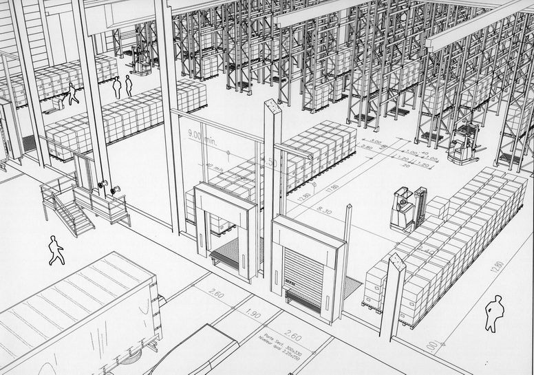
And what I did with autocad :
With Wire frame :
With autocad built in renderer :
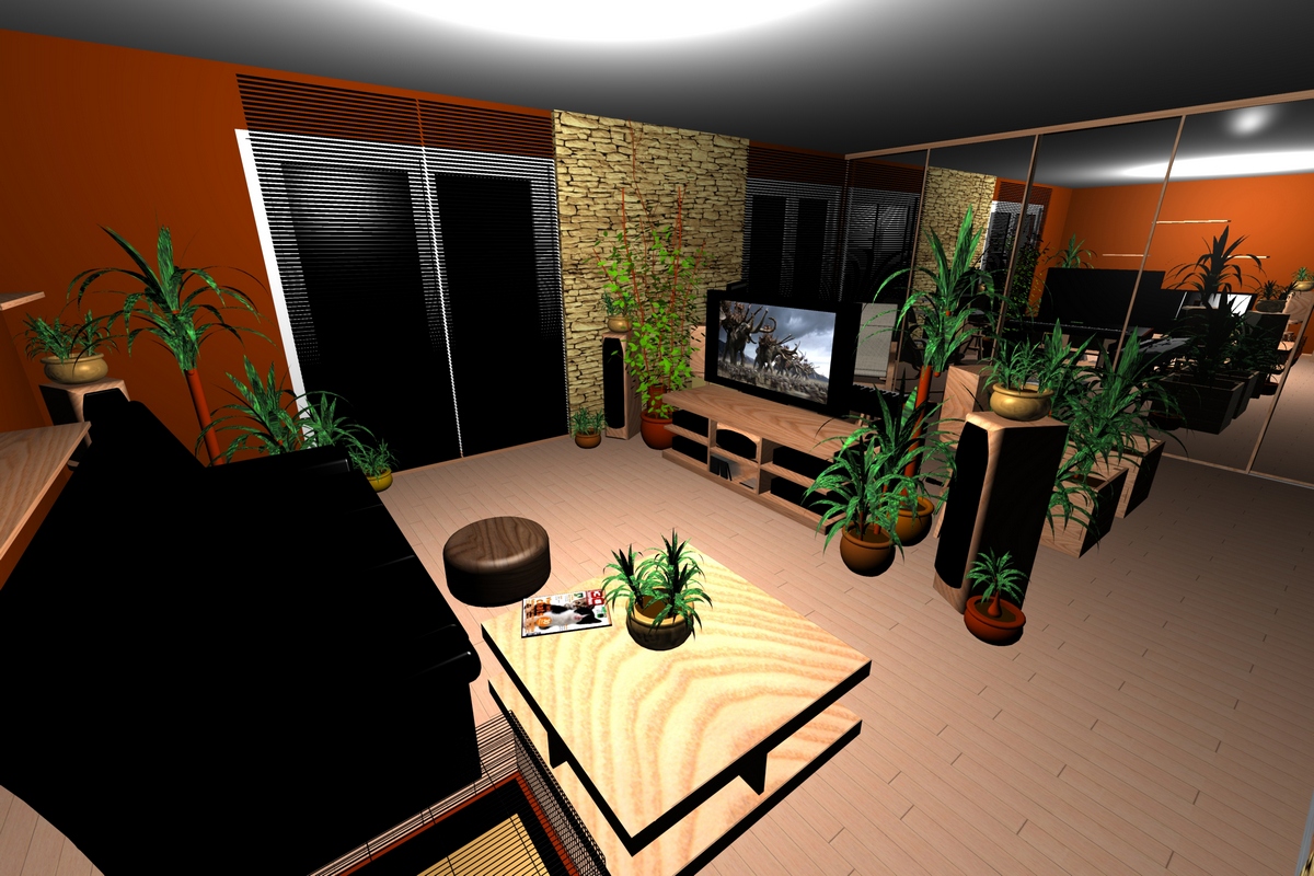
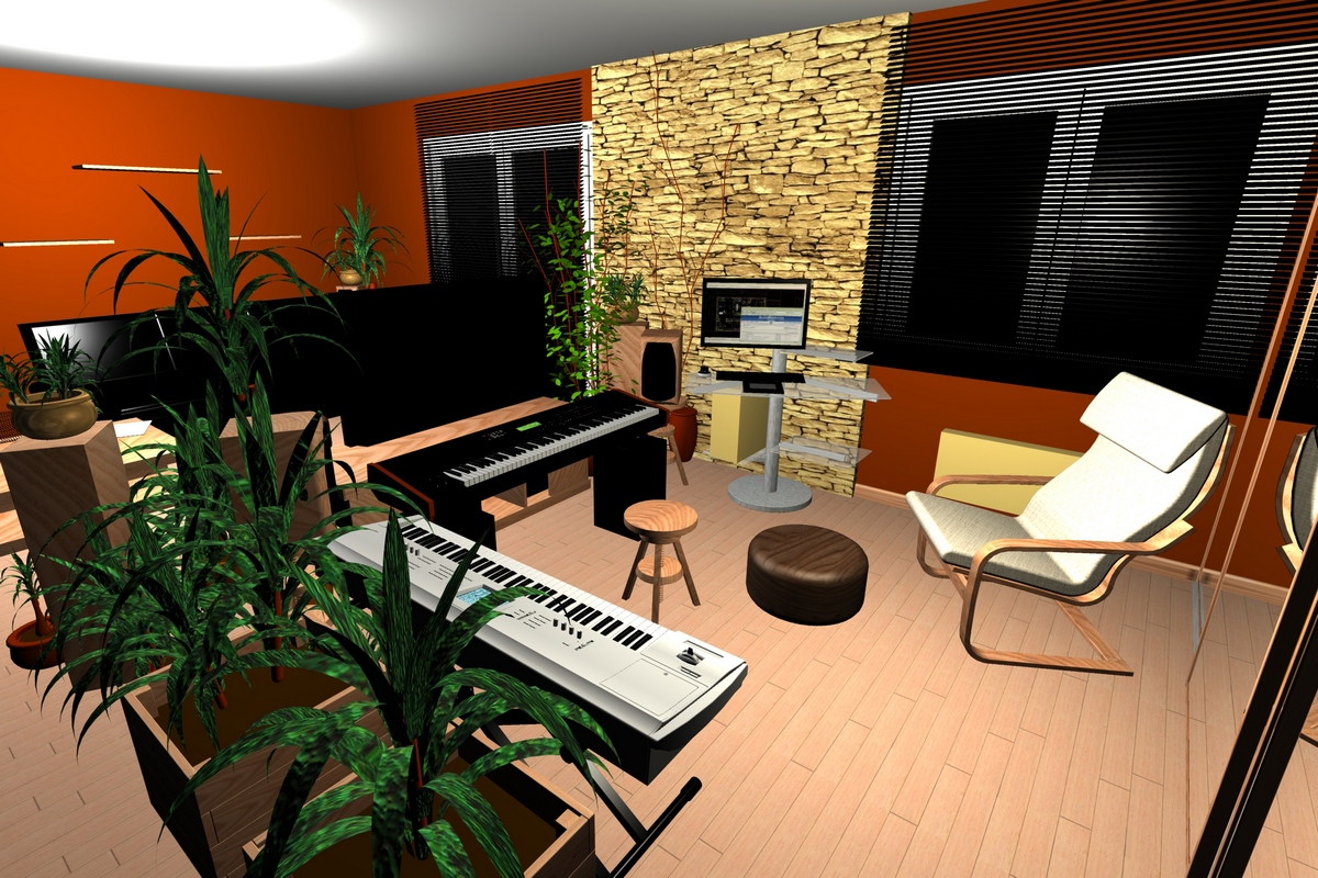
Quite cold, istn't it ? (I did that to make me an idea about space and colors)
Far behind from what Majid and Solo are able to do
(Very great work, Majid !!! )
) -
Beautiful image style...more please!?!
-
Love this style - very well done.
Can you say where you got the pallets, racking, forklifts, etc for the storage image?
I'm working on something similar and trying to decie if I should build my own components or buy them in.
-
@john.warburton said:
Love this style - very well done.
Can you say where you got the pallets, racking, forklifts, etc for the storage image?
I'm working on something similar and trying to decie if I should build my own components or buy them in.
Thanks.
In fact I use to draw my own 2D and 3D components (except plants, audi A4 and Smart in sketchup, which I downloaded on Google 3dwarehouse)
-
Really nice rendering style. Love it.


-
uh, I really like the fourth image, the line drawing with dimesions.
how did you get these dimensions in there? is it a texture? or 3D text? -
Very cool style. I played around with some of my sketchup images and Photoshop 7. to try to create a similar effect. I'm very happy with the results. Thanks for the inspiration!

-
Thanks

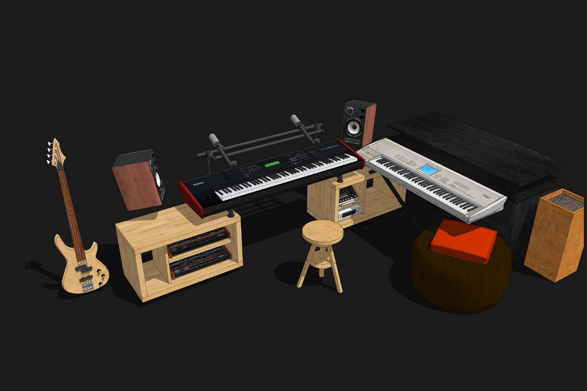
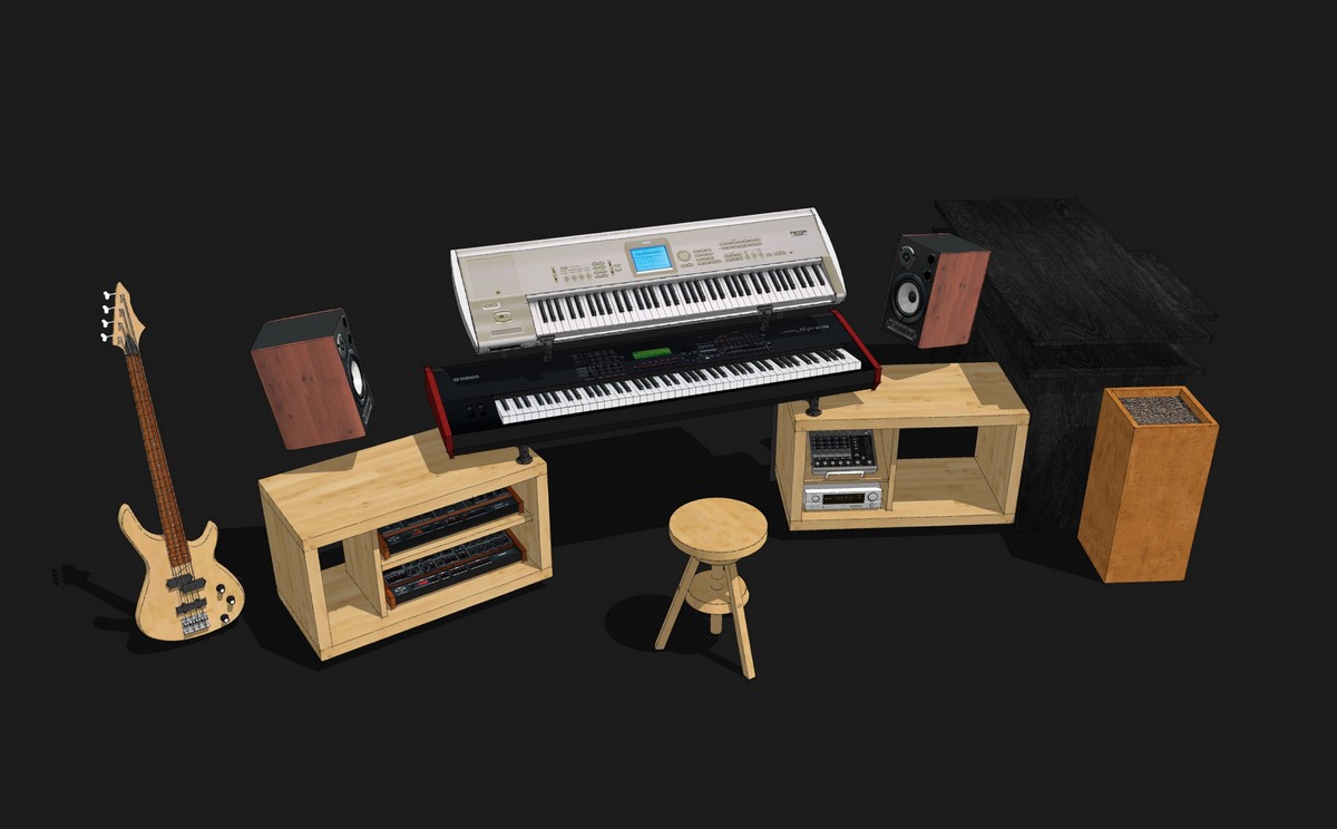
If someone is interested by these music instruments, I share them on Google download page :
http://sketchup.google.com/3dwarehouse/search?uq=17371800824893020755&scoring=m@unknownuser said:
how did you get these dimensions in there? is it a texture? or 3D text?
These are autocad 2D text view in 3D.
-
@tridem said:
:shock:
 awesome!
just a criticism.. you need a flat TV
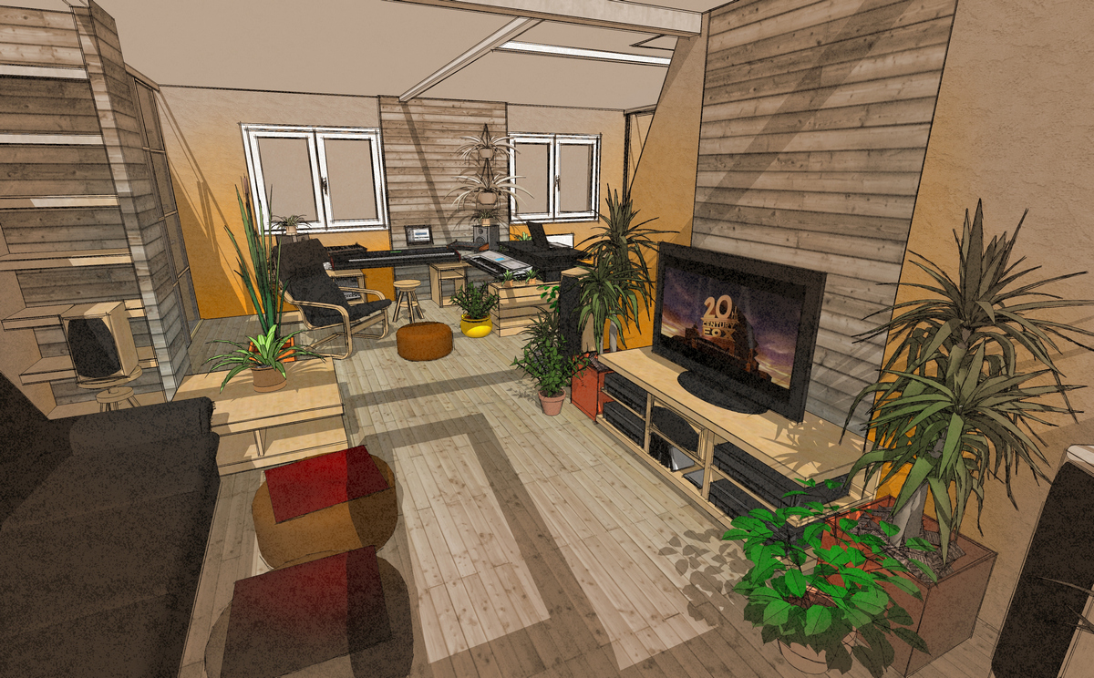
So, a little update with flat TV ...
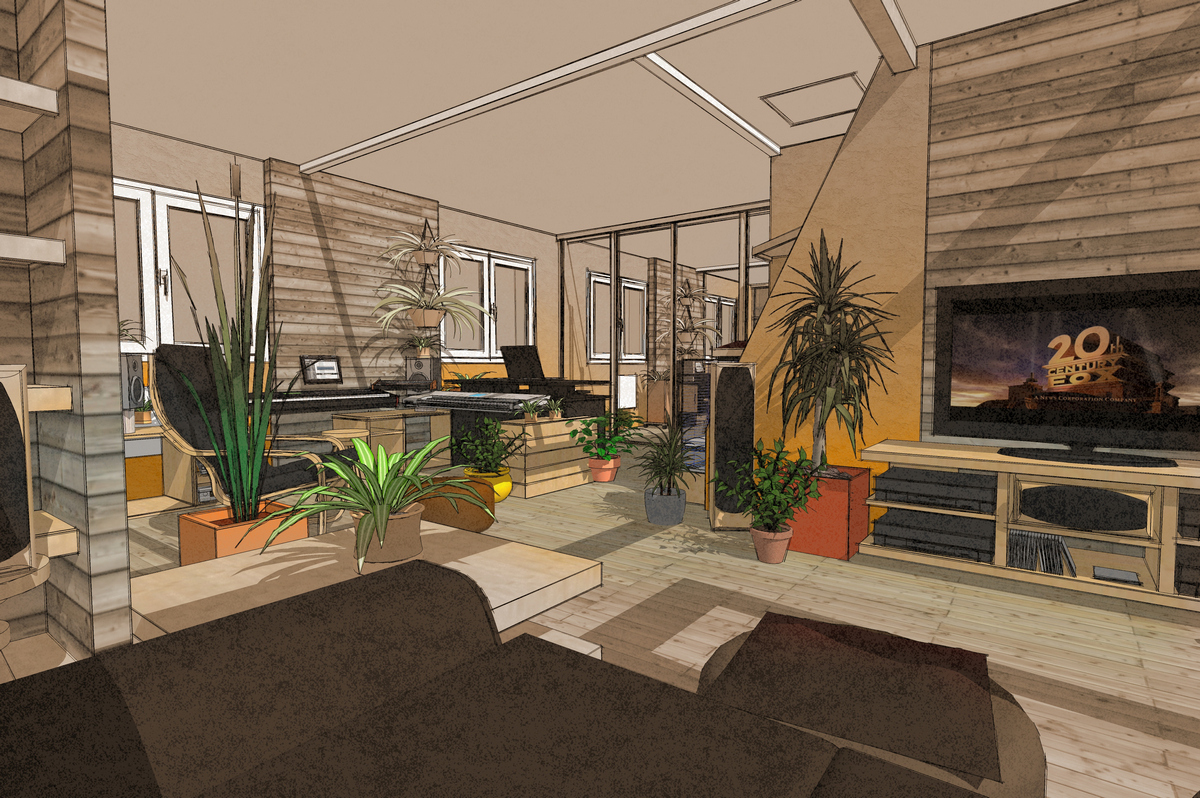
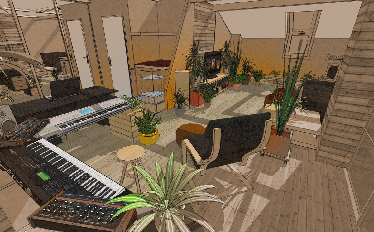
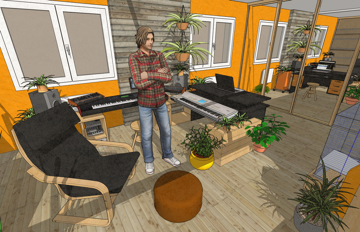
-
very nice model but it looks like there is no ceiling because of the shadows.
-
@teuf said:
I'm quite surprise about comments regarding plants
 I feel good with them and so sad without greenery and sun.
Me too. Life is better surrounded by plants. Looks like you had fun with this personal project. Keep up the great work!
-
@jo-ke said:
very nice model but it looks like there is no ceiling because of the shadows.
The lower face of the ceiling is white but the higher face of the ceiling is transparent.
With this easy way I can have shades in the rooms (Sketchup can't show light from "spot" like rendering software, so I use the sun...It's not a perfect way, I know.
Any ideas ?Teuf
-
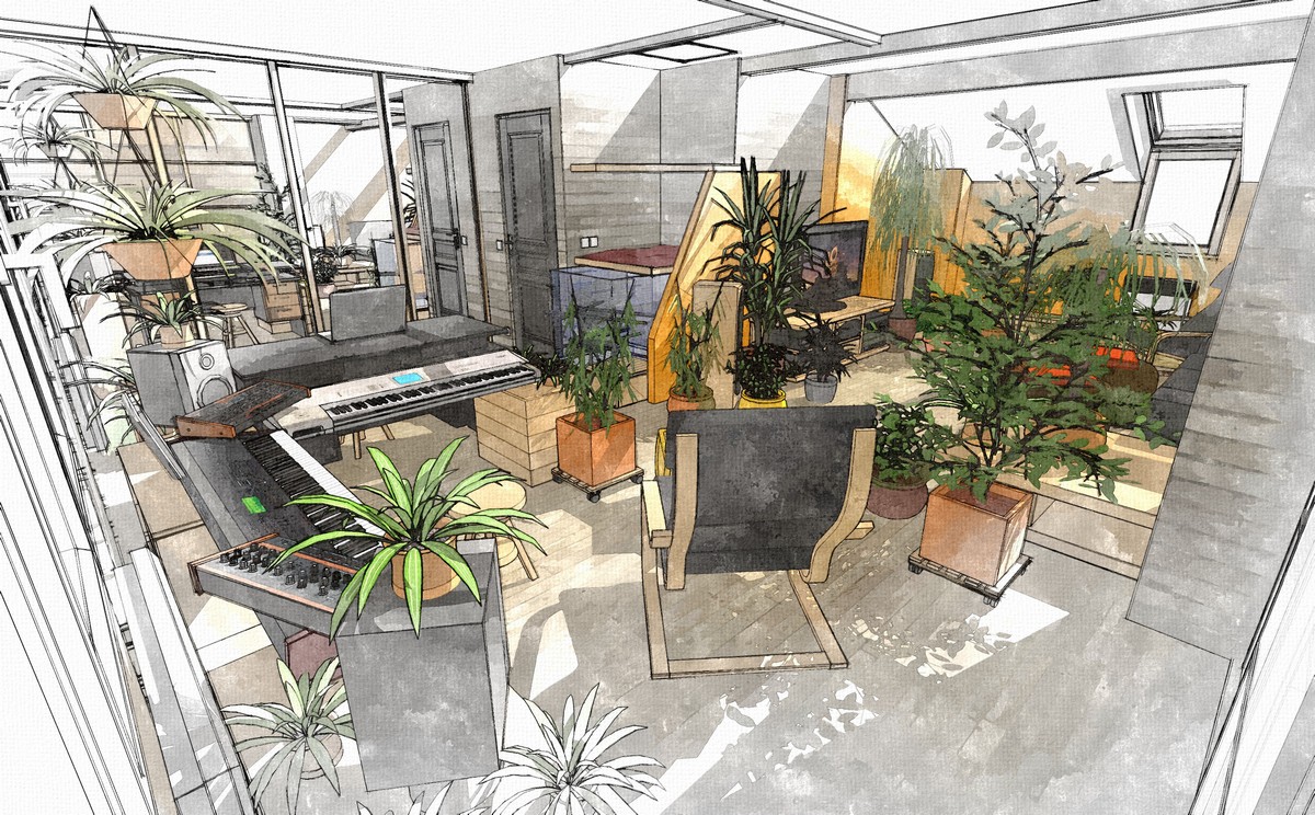
Trys with Photosketcher :
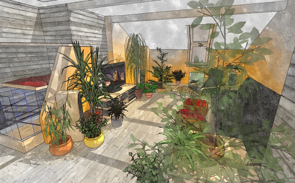
Try with Maxwell render :
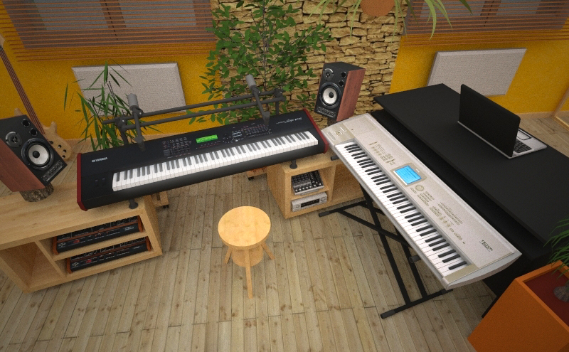
Somes latest changes :
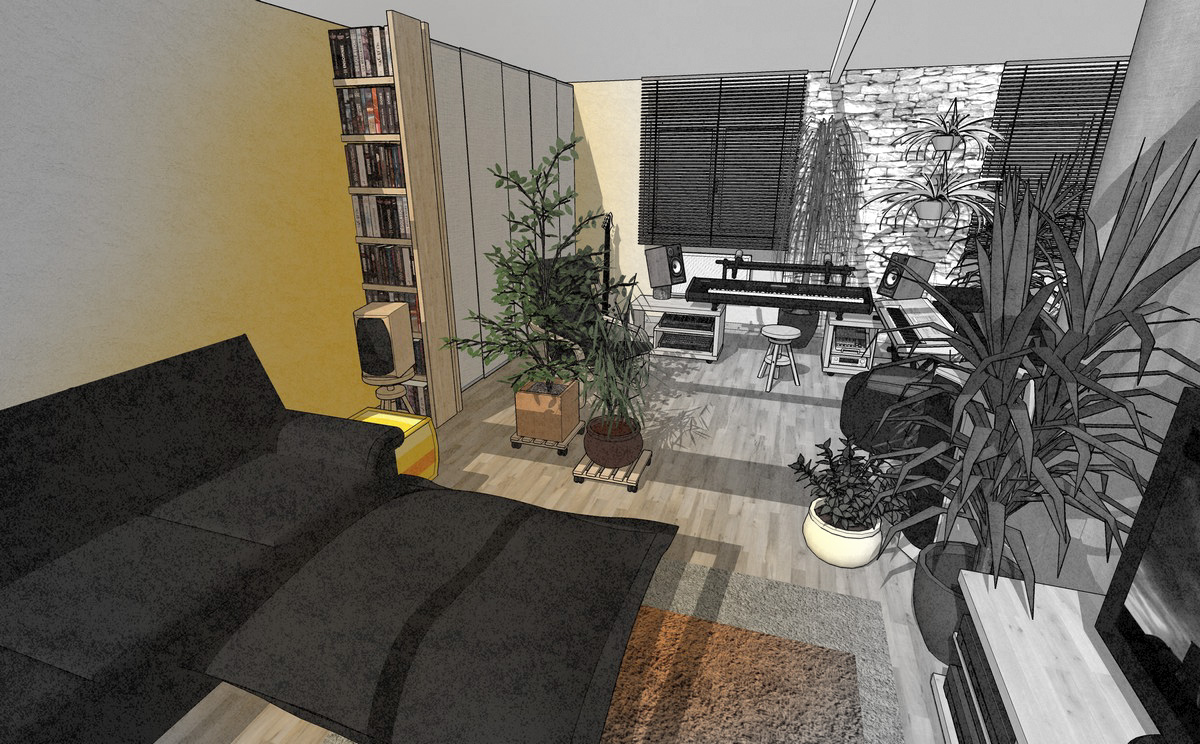
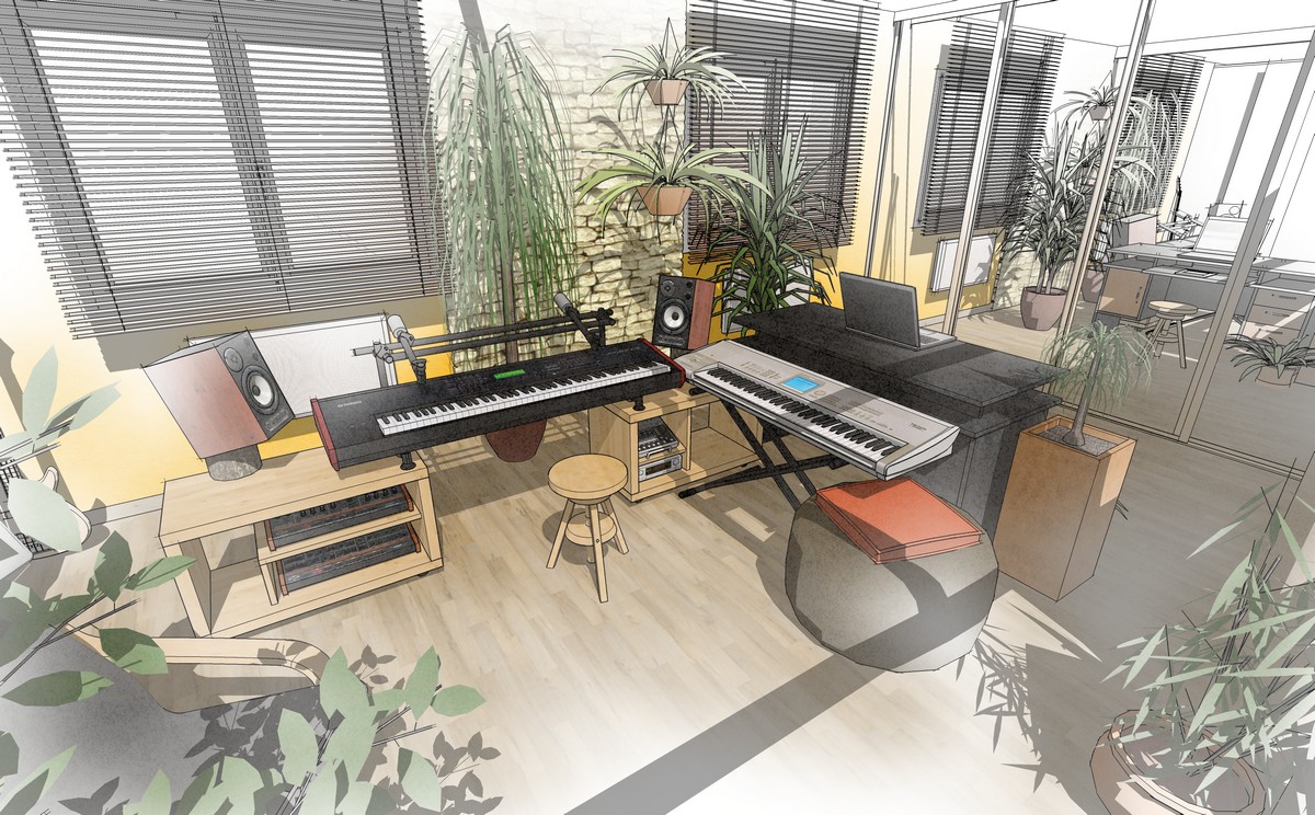
-
@teuf said:
I'm no so a newbie ...I work with SU since november 2008 after 10 year with autocad

Do you work with both now or only with SU? Would you advice others to switch to SU?
Great visualizations!
Hello! It looks like you're interested in this conversation, but you don't have an account yet.
Getting fed up of having to scroll through the same posts each visit? When you register for an account, you'll always come back to exactly where you were before, and choose to be notified of new replies (either via email, or push notification). You'll also be able to save bookmarks and upvote posts to show your appreciation to other community members.
With your input, this post could be even better 💗
Register LoginAdvertisement


