Tridem's WIP with SU and Kerkythea
-
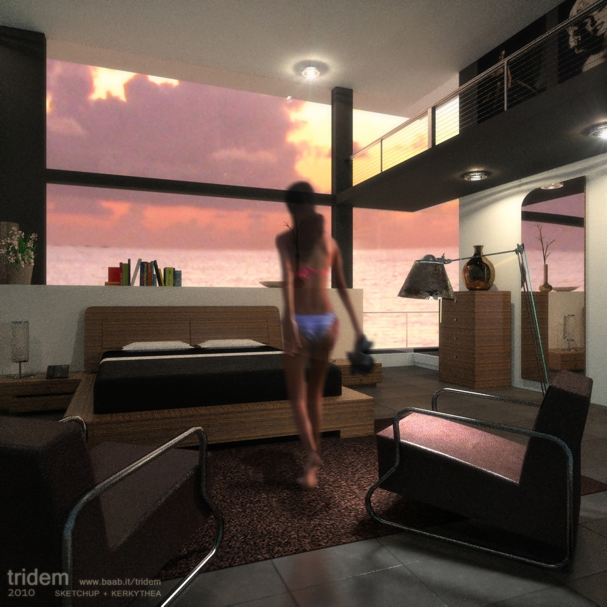
another one, this is my first attempt with 2d people added in postpro, I usually don't like silhouettes, but it seems this is not too bad

Still a lot of material and lighting issues... and absolutely too much noise, I've promised myself to work again on this scene, but it takes a lot of time to get clear
-
PS. For this last one I'd like getting some 'style' comments. I mean, I easily see myself the technical issues and possible improvements, but about the composition of the scene, color tones, point of view etc. better I need other people's impressions

-
Although i am a complete render-noob, the thing that jumps to my eye is that in photo 1, the couch that is facing us, has 2 pillows that have the exact same shadow. This is maybe supposed to be, but it looks funny.
-
@swindel said:
2 pillows that have the exact same shadow..
 ..it means there was nothing more noticeable to comment
well, I assume the rest is perfect
-
On the left window/door, the middle piece of wood has dark edges and a little lighter wood in the middle. (weirdly worded). This imo, looks very realistic!
For the ceiling you could also model a mechanism wich closes. Because if it is dark outside that room will be rather dark aswell.
-
I would light the little light on the left just so the entire composition doesn't get lost in shadow on the left and my eye tells me the light shining directly off the water from the sun should put some sparkles on the ceiling.
-
Sort of like this.
-
i think you are starting to develope a style, but the graineness/quality of the materials really takes away from making a good assessment on your style
-
thanks guys for precious comments
@Steelers: I know the sharpness is very bad but a such image takes 10 hours to cook, I'm trying to improve it before spending much more time to render.
@Roger: totally agree about the left light, thanks for letting me notice it. Since the sea is a background picture it doesn't produce reflections, I should add them in postpro like the reflection of the girl on the ground... but I'm not so sure those reflections could be so visible into the room...I'll think it over
-
how come you are using MLT preset? what's the advantage?
like the last image, nice mood. entourage well integrated too.
-
@olishea said:
how come you are using MLT preset? what's the advantage?..
as I know, there are no really alternatives for a interior nightime shot. apart MLT gives the best result in terms of realism, biased methods need very high settings to resolve the complexity of lights and reflections. perhaps wait anyhow 10 hours or more, and finally find the picture full of white dots...
 no thanks
 -
Angle of incidence equals the angle of reflection. The sun is low in the sky so light will reflect off the ocean from way out. When you can see that bright pool of light on the ocean, it means , you the viewer, are in line with the sun's reflection. This is why sailors and pirates used to wear eye patches. They were going blind taking sun sights. My daughter has a pool outside a west facing window and it send sun sparkes dancing all over the living room ceiling. Because the pool is small and close to the house this happens much earlier in the day. If the pool were stretched to the horizon you would see it closer to sunset.
-
@tridem said:
@olishea said:
how come you are using MLT preset? what's the advantage?..
as I know, there are no really alternatives for a interior nightime shot. apart MLT gives the best result in terms of realism, biased methods need very high settings to resolve the complexity of lights and reflections. perhaps wait anyhow 10 hours or more, and finally find the picture full of white dots...
 no thanks
MLT being unbiased is physically accurate but better tweaks on lightings are necessary esp for night shots. Probably can halves the noise and the rendering hrs.
Biased presets, ie Photon Map..would looks somewhat different compared, but decent rendering time is possible. But tweaking the presets is a tough call for most users IMHO.
Also couple of color or curves adjusments PP are needed to make the image look right.
Probably can achieve somewhat closer to what QMC GI can produce.Btw..MLT is equivalent to preset #9 for TL

-
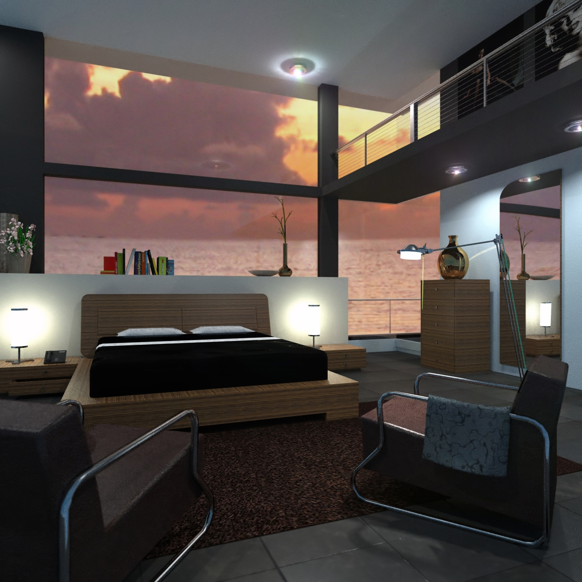
So, I've done some adjustements, in the meantime the girl has gone, I'm sorry

raw KT view plus light flares added, I'm gonna work on Gimp.
I thought back to the environment reflections, I'll keep just the light coming from the spherical sky, I've seen the scene also from another point of view and I believe it's ok
-
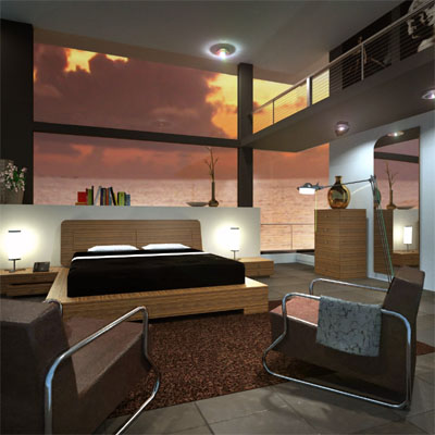
The render has become much better although I do miss the girl. The interior, for me, just needs a touch more pop. I have done a little post processing on your latest image to illustrate what I mean. Good work by the way.
-
Hi Roger, thanks for your suggestions once again. I like your version, there's another point of view I want to render (time permitting...) surely I'll take it into account.
Luca -
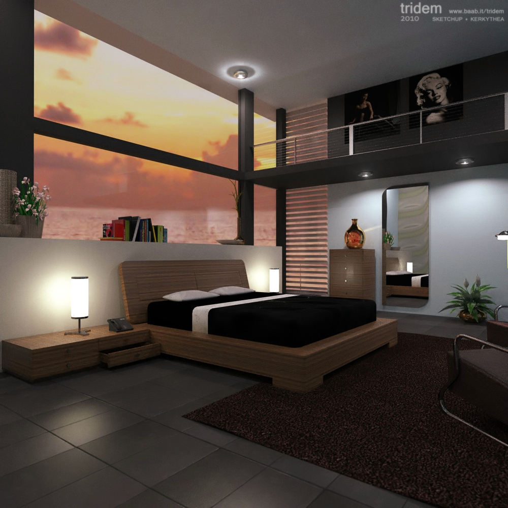
here is my last attempt...
-
The new view made me notice that the perspective is off. The vanishing point is somewhere in the middle of the water. It should be on or slightly above the horizon.
-
 not a thing escapes you! You're right, I noticed the sea surface was bended but didn't realize the background was too high
...one more lesson to learn tridem... -
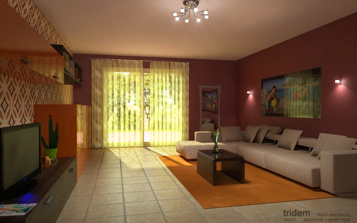
this is a scene wich I've been played around for a while, now I'm just fed up with it

Hello! It looks like you're interested in this conversation, but you don't have an account yet.
Getting fed up of having to scroll through the same posts each visit? When you register for an account, you'll always come back to exactly where you were before, and choose to be notified of new replies (either via email, or push notification). You'll also be able to save bookmarks and upvote posts to show your appreciation to other community members.
With your input, this post could be even better 💗
Register LoginAdvertisement


