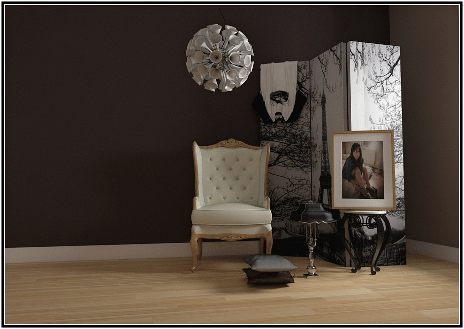
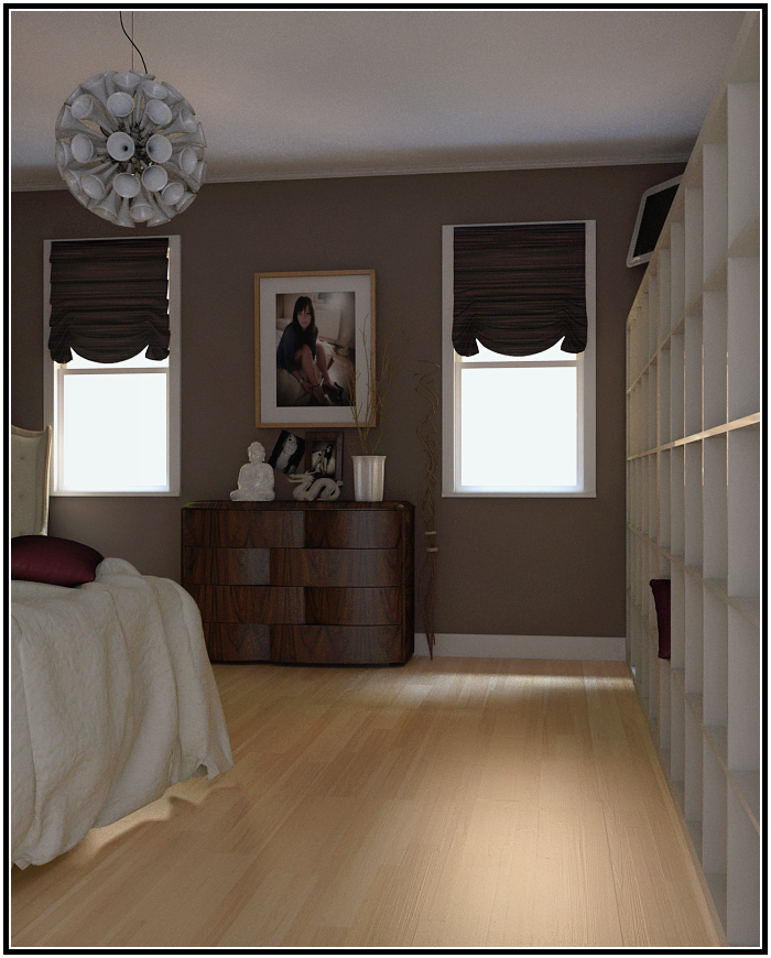
First Start : My Bedroom Wall
-
@carrozza said:
Could you share some insight on the creation process?
For example, how did you model the (wonderful) cloth on the bed and windows?There were no creation, models were built from libraries (eg Warehouse) and randomly placed thus creating a room in the process.
Images were generated just for fun and with the aid of comments from the forum of course.

-
Thanks for your answer and - hey! - please stop showing off your sister pictures because I'm hardly stopping myself from hot comments...

-
just give me your sisters facebook name and i'll sort out the rest haha

nice renders, great detail.
-
this last one has a lighting that doesn't convice me, in terms of realism, it's like the objects were matched...
 btw say your sister beware of that lamp! it's just at head highness
-
Guys! Guys! Things are getting a little out of hand for me.

Tridem was the one who instigated me to ditched the warhols for something more "attractive".@Carrozza- I'll try my very best to prevent those "hot" comments.

@Olishea- Oli, thanks for the comments.
For hunks like you, I'll try my very best to get the FB address, plus a couple of Twitters to go with. Hopefully you carry a blackberry too.
@tridem- your comments are spot on this time.

The Last Render
The render was stop early, lower quality as a result.I had a hot light coming from the window, which will produce longer throw or fall off..wahtever..which will create better shadows and realism IMHO.
But on a 2nd thought, the "hot" light might burnt out or over-expose the "attractive" poster near it.
I'm just posting early to get more feedback for the "theme".
-
wow, pimping your sister!! good work!!
-
@olishea said:
wow, pimping your sister!! good work!!
Thanks Oli, now I know I can pimp too

I would aboslutely love to render another gal for you after you're done with the first.
Welcome to the virtual world.
-
.........a little revision.


-
Nice lighting in that last one. Good job.
-Brodie
-
@unknownuser said:
Nice lighting in that last one. Good job.
-Brodie...apart from the pillows: a bit too stiff.

-
@carrozza said:
@unknownuser said:
Nice lighting in that last one. Good job.
-Brodie...apart from the pillows: a bit too stiff.

Thanks guys, thanks for the stiff comments. Merry Christmas!

Here's another revision.

-
anyone else find the sister idol a little strange...
 Nice renders non the less...
 -
no, no billet. its business you see.
he is her pimp, we have discussed this.

-
Ohhh in that case....
-
You guys should have known it's "strange" from the start.

Oli, no offence the last time out. See you been working hard and churning out loads of great stuffs recently. Nice going for you.
It doesn't matter if the render looks good, I'm not Helena and I'm just trying out a couple of things.
Hello! It looks like you're interested in this conversation, but you don't have an account yet.
Getting fed up of having to scroll through the same posts each visit? When you register for an account, you'll always come back to exactly where you were before, and choose to be notified of new replies (either via email, or push notification). You'll also be able to save bookmarks and upvote posts to show your appreciation to other community members.
With your input, this post could be even better 💗
Register LoginAdvertisement


