External Visuals [WIP]
-
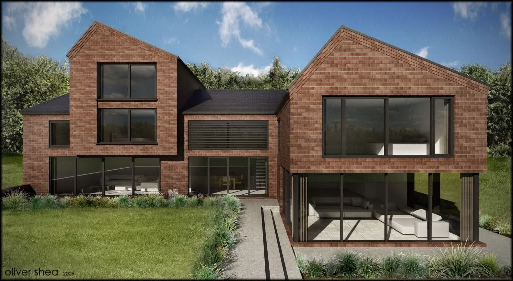
Update on the house I'm working on:
Twilight and Photoshop

-
Look pretty good for a wip Oli...

-
Thanks fred....will be finished by the end of this week! I've been working on this too long!
-
Looks good Oli for WIP...I thought it was Podium

-
its a joint venture

-
Very nice - the corbels arent getting any better with the brick render!!!
-
I was nearly in tears when I started drawing them into the elevations

but what client wants client gets

-
Looks fine, and if the client is happy....Why don't you modify this project into a "killer" , only if it is for your own pleasure?
-
hmmmm....
-
thnaks a lot james. I haven't drawn everything to (exact) brick dims yet...its almost there but not quite. theres been about 10 revisions! also the texture isn't stretched to standard brick dims eitehr its like 3 mm out at the moment. I know some of the fenestration is unsettling to this elevation in size and relative orientation but I can't do anything about it....its really frustrating-this could be an absolute killer of a house. but then again the client is blown away and loves it! you can't win either way!

-
Yeah man! Doing those high box features out of brick just seems heavy and depressing - Oli I can feel your pain! I must say in situations like that I just tell the clients "NO I'm not doing it, whether you like it or not, just no!".
Mate you have a funny halo around the background trees (like bloom
 ) and that brick map just looks a bit plastic not sure why!
The grass looks great!!!
Well done Oli!!
-
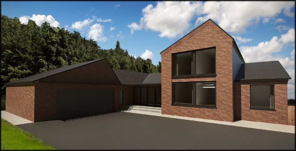
Hi people here is another angle:
-
This second image looks a bit dark. You have lost definition on the left side of the building.
-
The shadows on the tree line in the background doesn't match the sun position in the render...
The ground material seem too flat...I'm sure that a mixture between NPR and the render will compliment this scene much better...

-
well this is north elevation. this whole side would be in shadow but I kinda faked it so some of it was in sunlight. maybe I shoulda done it with sun off for more overcast appearance. I cant do a NPR render because its in a set of two other (more) realistic renders. cheers for comments they help me improve!!
-
Yeah mate what is happening in the shadows there?? Could be someone hiding!
-
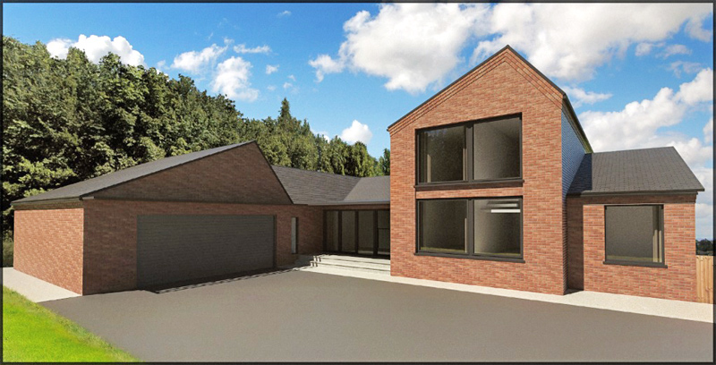
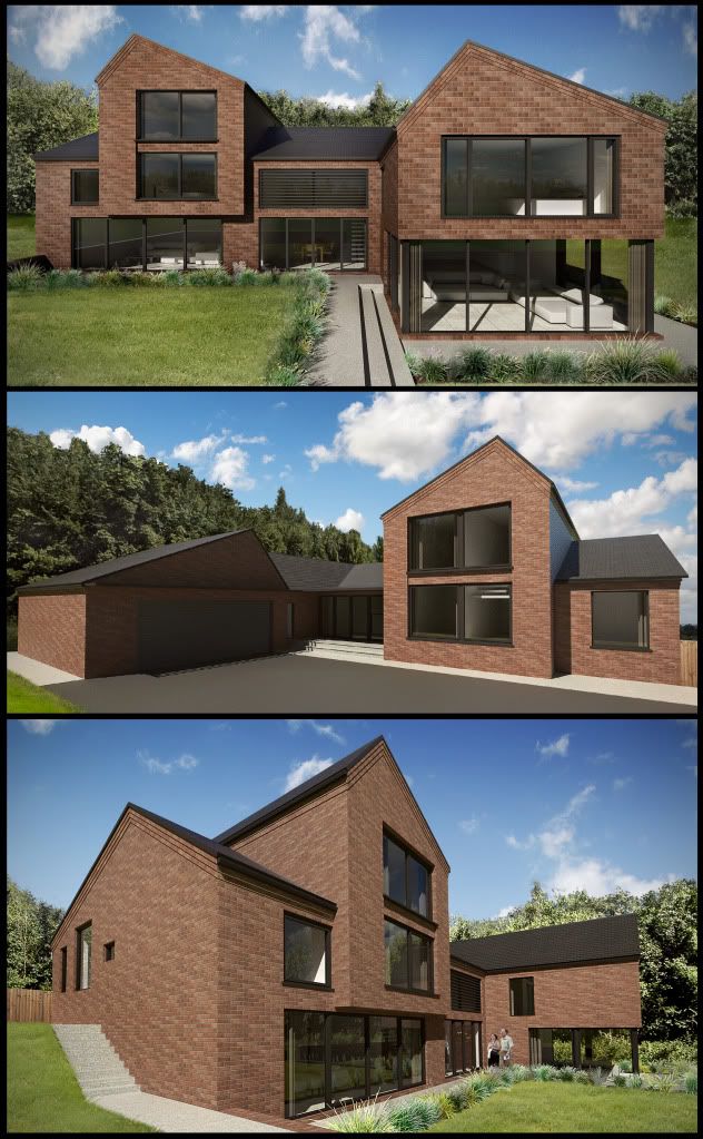
Here is the final of the three images:
I couldn't spend longer than a couple of hours on it I'm afraid so please excuse the mistakes here and there!!
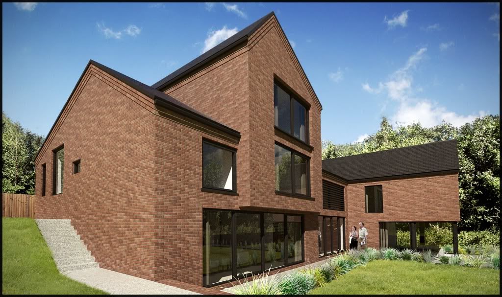
I think the images look great as a trio on a drawing sheet, in isolation they are not so spectacular. Remember these are just for planners to get an idea of the building form. I think I went a bit OTT, again!
-
Hi Oli
They look pretty good to me - and if they get the house passed for the client then Job done!!
-
and all 3 together:
frederik: perhaps now you can see why I couldn't do just one NPR image on this sheet, it would stand out too much.
-
Great images
I really want to walk with bare feet through that grass.
Advertisement


