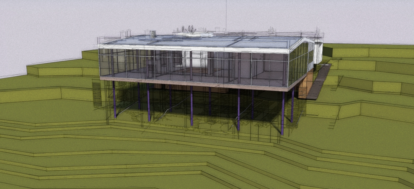
Twilight NPR Test - Updated 12-13-09
-
i love it when there made into a progressive animation too.
-
LOVE it...!!

-
Looks fantastic - I really love this mixture of styles - I want to achieve this sort of look from Piranesi
I aspire to this level of rendering.
Well Done
-
Thats very cool.
-
it's awesome man. i have some very similar things i'm doing for my C.V a the moment, but nothing as cool as this.
one thing i have noticed though, there is a measurement showing on the right h-hand side roughly in the centre, it doesn't really fit with the rest of the comp, personally i'd remove it.
other than that, spot on!
pav
-
It is an impressive style you have created.
It certainly appeals to me. I would lose the dimension though.
-
eye candy for architects... I like it a lot!
...but I'm afraid my clients would be confused by it.
-
Thanks for the feedback guys! I cleaned up the dimension (not sure how that slipped in there
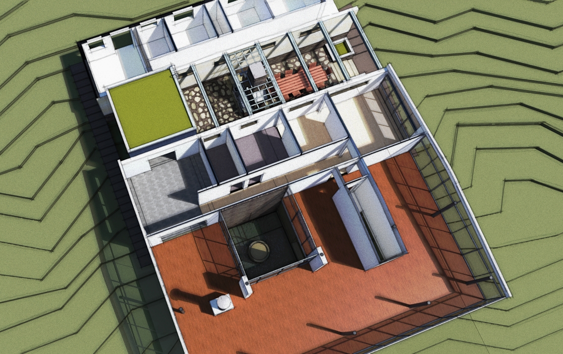
 ) and have developed the model a little further and am playing with a new mix of layers. I like the progressive animation idea - may give it a go if I can make time for it. Yeah Fletch - I see your point. It is getting a little busy now - so I will likely lose the cad linework next go-round and rely on the model line output.
Here is the update!

-
Very nice style in that last one mate!
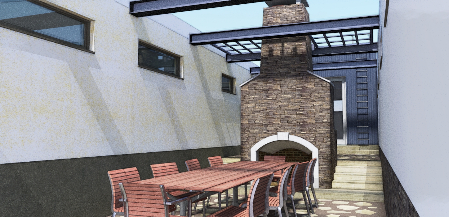
Just a little thing I noticed is the centreline of the chairs where they are likely flipped components. Line work needs to be hidden.
Well done!!!!
-
Back at it a little after being away for a while.........one of several new views - this one of the courtyard area off of the kitchen tower. Will post more soon!


Hello! It looks like you're interested in this conversation, but you don't have an account yet.
Getting fed up of having to scroll through the same posts each visit? When you register for an account, you'll always come back to exactly where you were before, and choose to be notified of new replies (either via email, or push notification). You'll also be able to save bookmarks and upvote posts to show your appreciation to other community members.
With your input, this post could be even better 💗
Register LoginAdvertisement


