Rendering Challenge - Bathroom sink
-
@gaieus said:
OK, maybe a close-up - now with marble sinks to make it even more extreme
 (now only used Low+ preset).
Marble works pretty well
-
Imagine I wanted marble sinks at home. My a*ss would be kicked.

-
Nice Challenge Al - thanks!
Here is my go - npr composite using multiple line exports from su and 3 different Twilight Render images. 1 = #9 preset @ 97 passes, 2 = #9 preset @ 1 pass, 3 = clay @ interior fine. I would probably try something to emphasize the lighting a little - same trick for the cans as Gaieus.
Gaieus - really like your images!

-
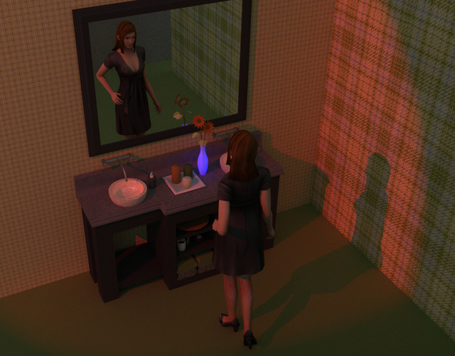
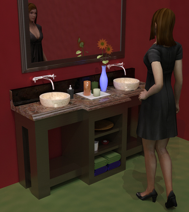
There is no way I can compete with the last two renders so I cheated and added a diversion....and tried to add a story. I used Kerky with no clue about what I am doing....it seemed so simple in the brochure. (ha)
Trying to make a decent render shows how hard it actually is (well for me.)Thanks for the challenge!
-
@tallbridgeguy said:
There is no way I can compete with the last two renders so I cheated and added a diversion....and tried to add a story. I used Kerky with no clue about what I am doing....it seemed so simple in the brochure. (ha)
Trying to make a decent render shows how hard it actually is (well for me.)Thanks for the challenge!
If this is your first rendering - Good Work!

What did you use for the human figure?
-
This is my first interior and I really don't know how to get the lighting right. (and the walls and the)
I found the young lady on the google warehouse. I can't take any credit for her.thanks again for the challenge!
-
This is a "clay rendering" with the addition of lights, highlighting, reflection, and sketchy edge lines.
(Click on image to remove scroll bars)
[Edit: New image with vanity moved up, and better lighting]
(Clay Rendering is created by treating all the materials as white, and ignoring textures.
It highlights the quality of the actual model, rather than colors and textures)(Rendered with IRender nXt using the Clay Rendering option and the Edge Line overlay option. 6 indirect lighting passes - 13 minutes rendering time)
-
@eulgrand said:
Al, your sketchy edges say your ground is too high (maybe on purpose ?). But the charcoal effect is fine.

Oops - I need to learn better how to put a room around an existing object.
I'll lower the floor if I try any more renders.
[Edit: I replaced the image in the original post, with the vanity moved up]
-
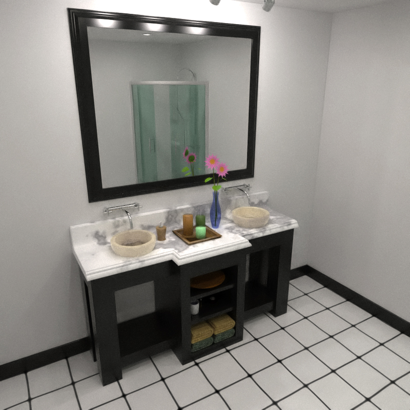
Kerkythea - MLT (BPT) approx. 70 passes (6 hours - my machine is sooo slow
 )
)
A bit of post-pro (heavy noise reduction + warm filter)Bytor, definitely like your walls

-
@tallbridgeguy said:
This is my first interior and I really don't know how to get the lighting right. (and the walls and the)
Hopefully someone will offer some good advice.
My "first" advice is to add more lights - probably a ceiling light or 2.
Then,, when you get good lighting you should try adding some more reflection. I think you made the bowls reflective - but you should make the countertop reflective as well, and of course, the faucets. It may be that you have already made these reflective,and the highlighting will show up better when you add more lights.@tallbridgeguy said:
thanks again for the challenge!
I guess I don't like the word challenge. I implies that only the best designers should participate. I think I'll call the next one a "Rendering Workshop". This should be a good place for renderers (people) of all levels to show their work and get advice and learn from others.
-
For this one, I turned off the lights and lit the candles. (I also used the post-rendering brightness slider to adjust the brightness of the final image. Otherwise auto-exposure compensates for the low lighting level.)
However, with this little light, my camera could not get good focus.
 (I set focal distance to 7' and the depth of field to 1.0 to blur the image. You can see the faucets are slightly out of focus.)
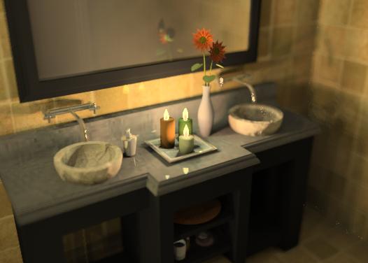
(IRender nXt - 16 rendering passes - 43 minutes - to let the candle light bounce off of the other surfaces.)
-
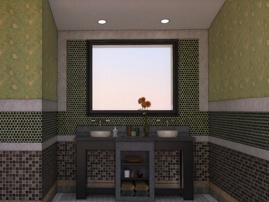
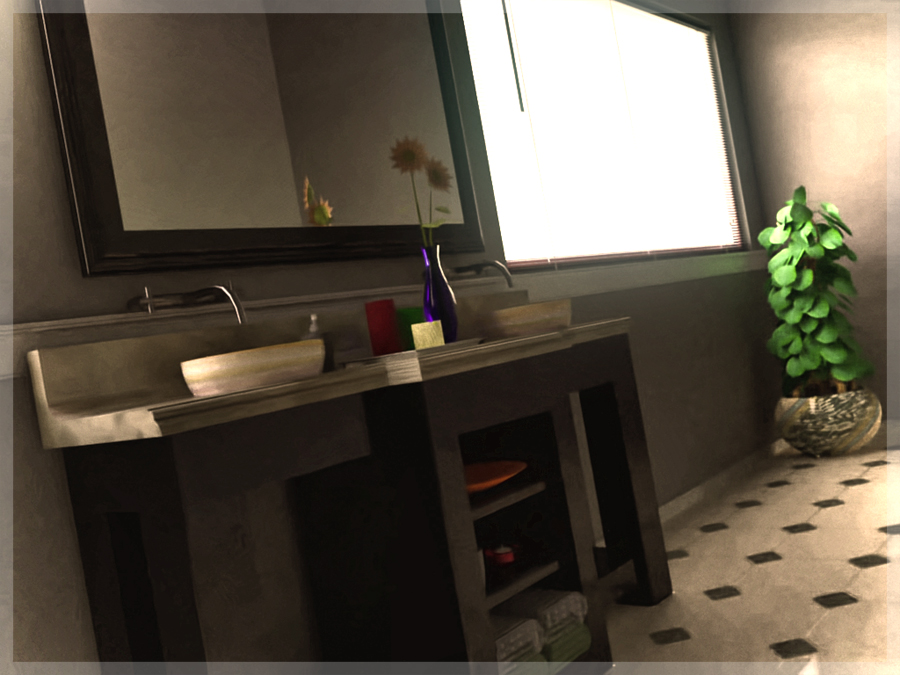
Here's a go using Fryrender...I only let it cook for 3 hours on my laptop, then did some post work in photoshop. I'll probably let it go overnight and update tomorrow.
-
@earthmover said:
Here's a go using Fryrender...I only let it cook for 3 hours on my laptop, then did some post work in photoshop. I'll probably let it go overnight and update tomorrow.
It's hard for me to evaluate this view.
It may be just me, but the only feature I can really see and evaluate from this view is the daylight effect on the far wall. And of course, the excellent plant. But I would to see more of the shadows to the right of the plant to see how well the daylight effects are working.
If you decide to change the model, pehaps you can put the window on a different wall so it illuminates the sink more directly, and raise the camera above the sink so we can see it better.
-
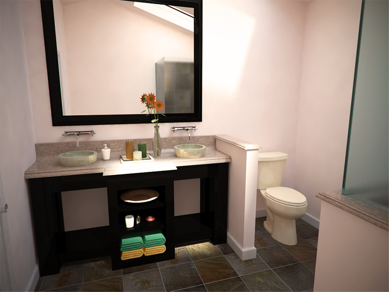
Here's my Vray try, 12 mins at 1024x768. Only sunlight, coming through skylight. Some post pro, brightness/contrast adjustment, vignette, and resize.
-
Darn everybody is still doing better than me! Oh well I am learning a lot.
KT - MLT for an 1.5 hours....
-
Some people are adding lights above the mirror.
Unfortunately the ones I grabbed from the 3D Warehouse added about 300,000 faces to my drawing.
But Ms. SketchUp could see better if there was some light up front.
-
@tallbridgeguy said:
There is no way I can compete with the last two renders so I cheated and added a diversion....and tried to add a story. I used Kerky with no clue about what I am doing....it seemed so simple in the brochure. (ha)
Trying to make a decent render shows how hard it actually is (well for me.)Thanks for the challenge!
I assume you have already read getting started tutorial and tutorials master list.
Add more light and use some nice materials from file repository or Documentation and Sharing > materials and turn on soft shadows. Perhaps you could use some IES lights, easy to set, but you need to get definition files from manufacturers website. Bevel all edges... or use DOF to soften sharp edges. -
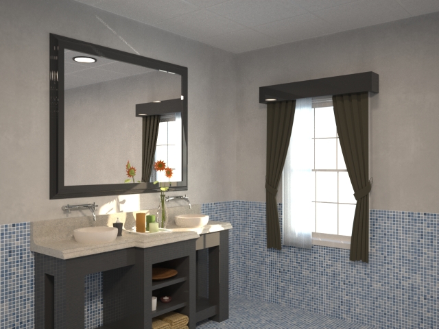
I actually ran a render of this same vanity awhile back to give a client an idea of the difference between straight SU output and a rendered output. This was done in Maxwell at only 640x480. I'm afraid I don't remember how long it rendered. Probably 30 minutes or so. It was pretty quick and dirty so many of the materials are garbage. I nearly redid it when I realized how bad the material was on the base cabinet but it got my point across so I let it go.
-Brodie
-
@unknownuser said:
I actually ran a render of this same vanity awhile back to give a client an idea of the difference between straight SU output and a rendered output. This was done in Maxwell at only 640x480. I'm afraid I don't remember how long it rendered. Probably 30 minutes or so. It was pretty quick and dirty so many of the materials are garbage. I nearly redid it when I realized how bad the material was on the base cabinet but it got my point across so I let it go.
-Brodie
This is a good image. It quickly shows how just a little refection - the mirror and the faucets - can improve a rendering.
Of course, adding reflection to the rest of the surfaces (almost all of them are somewhat reflective in real life) will add even more realism.
-
earthmover-great image there

Hello! It looks like you're interested in this conversation, but you don't have an account yet.
Getting fed up of having to scroll through the same posts each visit? When you register for an account, you'll always come back to exactly where you were before, and choose to be notified of new replies (either via email, or push notification). You'll also be able to save bookmarks and upvote posts to show your appreciation to other community members.
With your input, this post could be even better 💗
Register LoginAdvertisement


