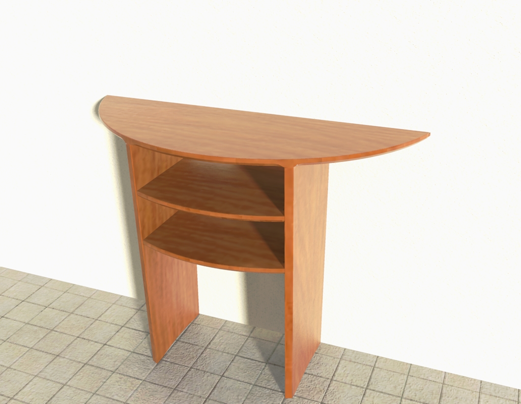
Small hall table
-
Dear Bob,
Nice work on that table. I think, if I were designing it, I would probably bring the shelves out flush the front edge of the legs since the top is flush. It would work either way though.
As to the stopped sliding dovetails, you've drawn the ends properly if the housings are cut with a router. The end of the tails don't need to be rounded but it doesn't hurt. Typically dovetail angles range from 1:6 to 1:9 although there are some dovetail bits that are at 14°. 30° is pretty steep.
Keep up the great work.
Dave
-
Dear David,
Thank you for your comments. I enjoy modelling wooden furniture as the task is complete in itself and time limited, and there are often small tricks to be learned. The chamfered edge of the table top is what caught my eye, and I wanted to see if I could model the way in which the chamfer blends with the legs. In the end I used a 3D shape like a router. The router was divided into two using a mid-plane. After rotating the router into place (about the centre-point of the arc), I exploded the shape, intersected the router with the table top, deleted what wasn't needed, and then used the residual mid-plane with follow me to complete the 45 degree chamfer. A small amount of cleaning up was needed at the join between the curved and the flat chamfers, but the approach seemed to work quite well.
Kind regards,
Bob -
Dear Bob,
I meant to comment on the chamfer because it turned out so nice. Thinking of how the cutter would move through the work to create the shape is an excellent approach for something of this sort. Good job.
I think you need to set up a shed in the back garden and do some woodwork.

Dave
-
Hello Bob,
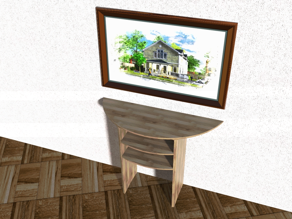
I really hope you don't mind me playing around with your model a little bit...

-
Gosh Gaieus, that looks really nice. The original table in the magazine was made from oak to match an oak floor, and the width of the table chosen to match a picture frame which was placed immediately above the table. It is amazing what a bit of colour and context will do for an object like a table. Thank you.
Kind regards,
Bob -
Nice table.
What happens when you put that table up against a wall that has a base? I ask because I had a table similar to that one I modified to fit against the wall flush. -
Eric, that's a very good question. Generally the furniture ends up standing out away from the wall by at least the thickness of the base molding. Bookcases frequently end up that way. Of course on carpet they tend to lean forward too because they end up standing on the tack strip. Seems like a good idea to design around that.
-
OK, so here is another version with some different materials (which I don't like personally) and a picture on the wall.
Who can recognise the artist?


-
Can you zoom in on that picture a bit.

I'll guess it's Tom's work.
-
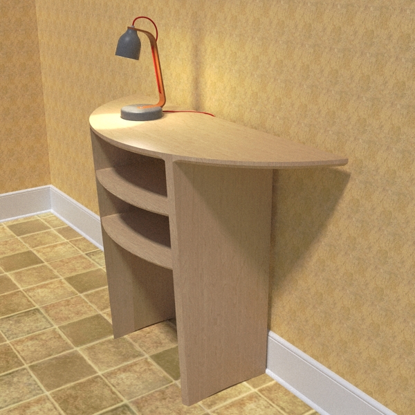
I had a quick go at this too.

-
Nice work, too Eric. Did you draw that concrete lamp? I saw a thing about it and how they make the shades on one of the design blogs I read.
-
I did, thanks. It is called the Heavy lamp.
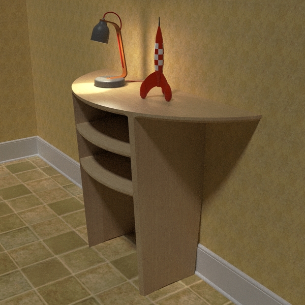
Here is another shot, modifying the table to account for the base. I added my Tin Tin rocket too and turned down the house lights


-
Dear Eric and David,
The original table (the one in the magazine) was designed to accommodate a skirting board in exactly the same way that Eric modified the table. Eric, that is a very nice composition.
Kind regards,
Bob -
Again, nice work Eric.
I like that method of dealing with the skirting board.
-
Thanks again.
I do like the design on this table better than the one I had. It had turned legs and no shelves.
There is a spot in my entry that needs a table like this. I just may make this my next sawdust challenge.
Hello! It looks like you're interested in this conversation, but you don't have an account yet.
Getting fed up of having to scroll through the same posts each visit? When you register for an account, you'll always come back to exactly where you were before, and choose to be notified of new replies (either via email, or push notification). You'll also be able to save bookmarks and upvote posts to show your appreciation to other community members.
With your input, this post could be even better 💗
Register LoginAdvertisement


