Sketchup / Artlantis / Lumion / Octane - el azul estudio
-
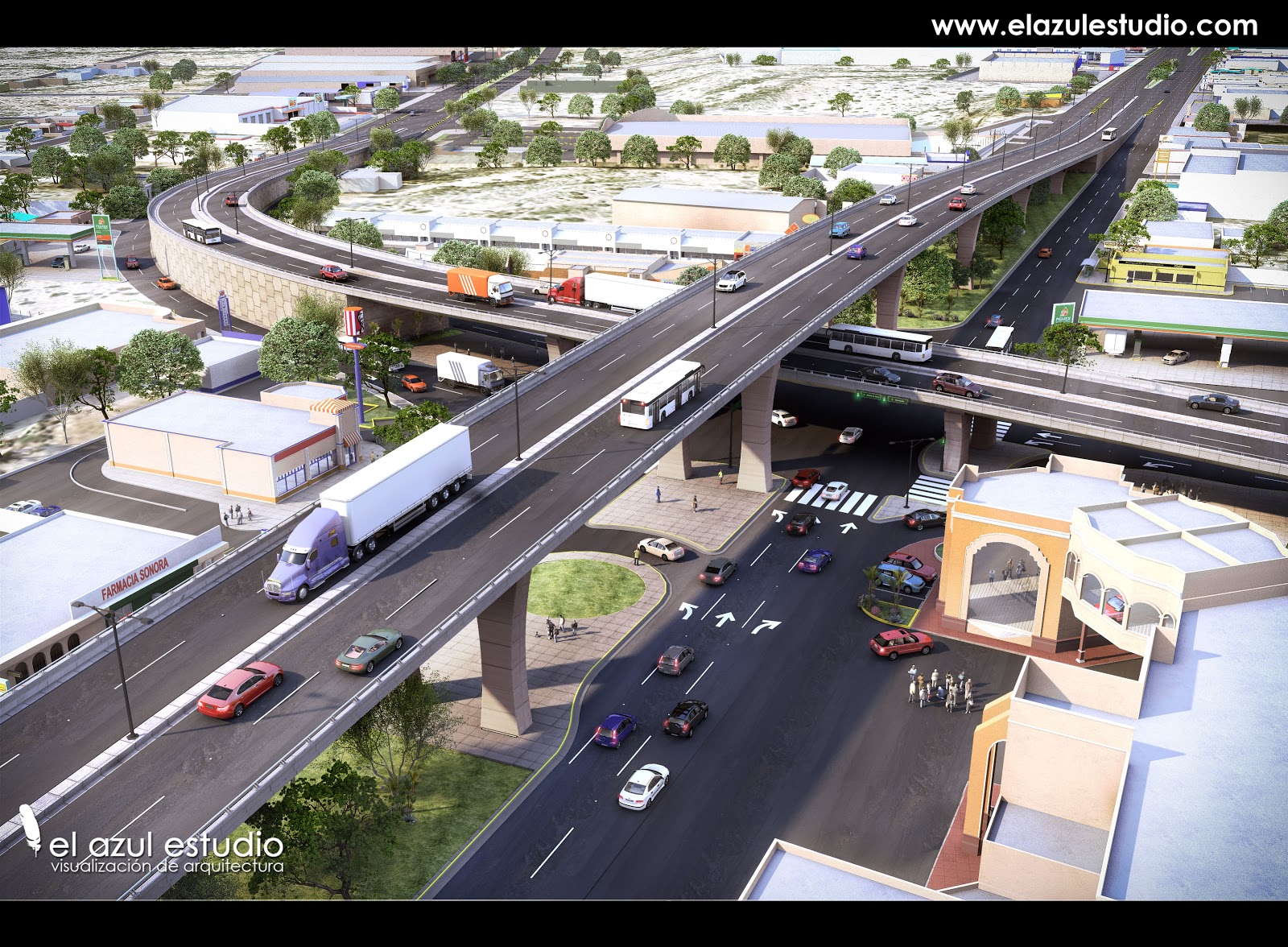
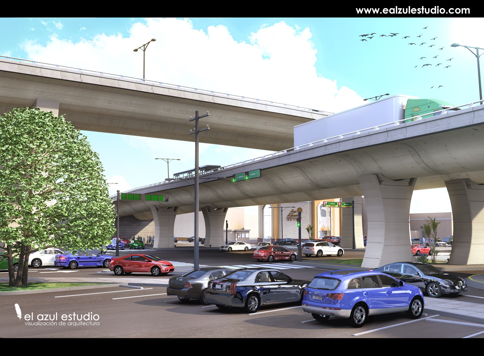
Hi Chris, the bridge its under construction in Hermosllo, Sonora, Mexico.
Right Here: http://maps.google.com/maps?q=hermosillo,+sonora&hl=en&ll=29.03723,-110.95858&spn=0.002007,0.004034&sll=37.0625,-95.677068&sspn=58.685917,132.1875&vpsrc=6&t=h&z=19&layer=c&cbll=29.037155,-110.958594&panoid=rqSC1CjFJbuMHCmi6zR3Xg&cbp=12,334.38,,0,2.93regards
nacho -
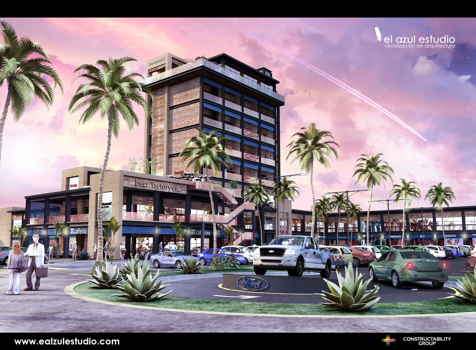
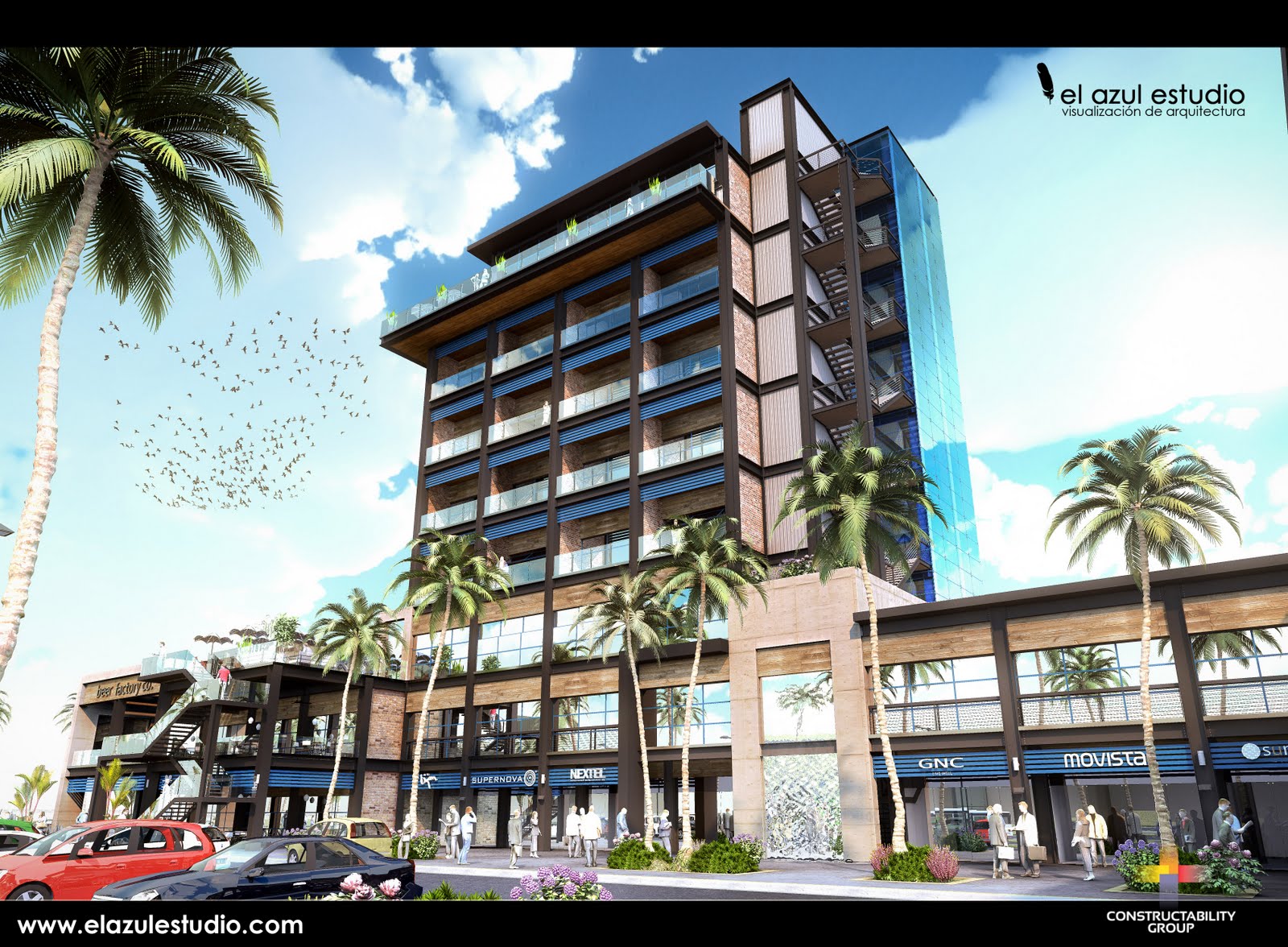
new one
regards
nacho -
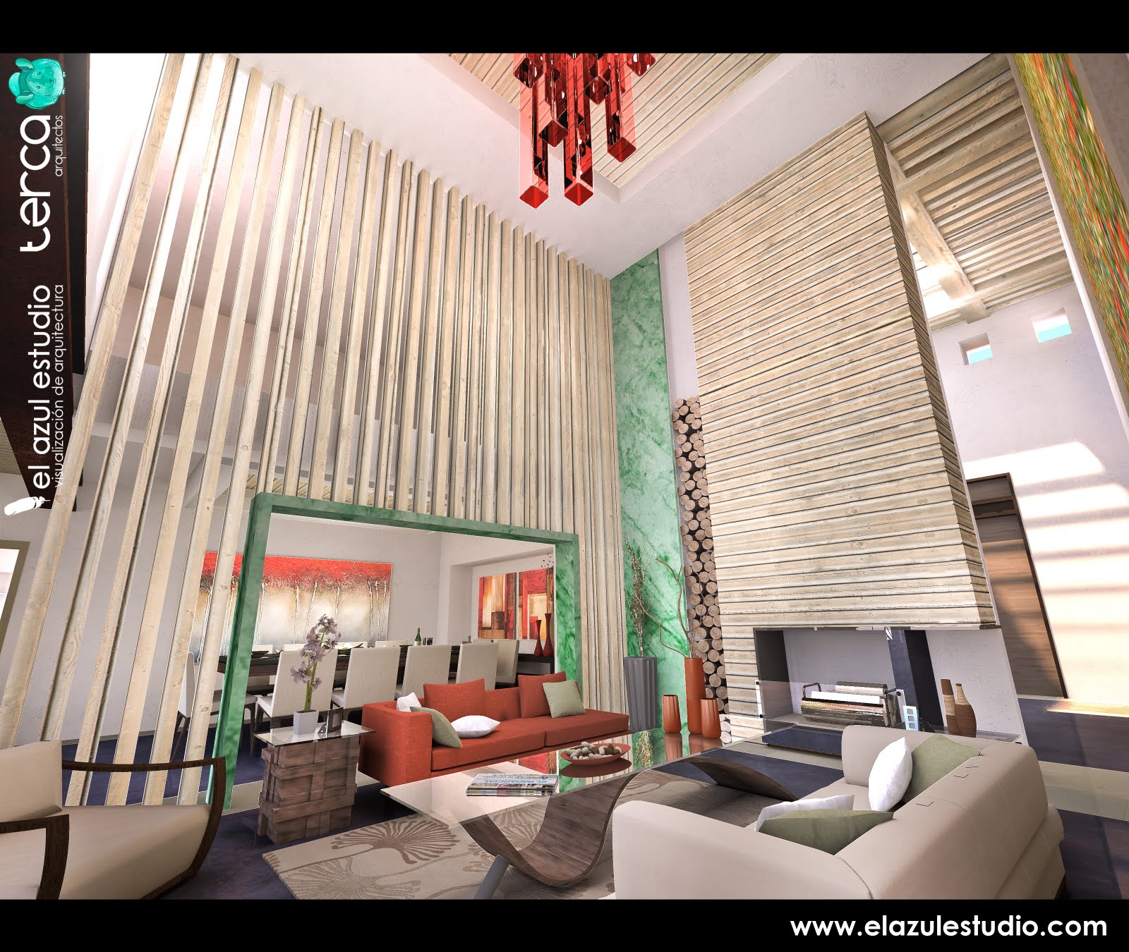
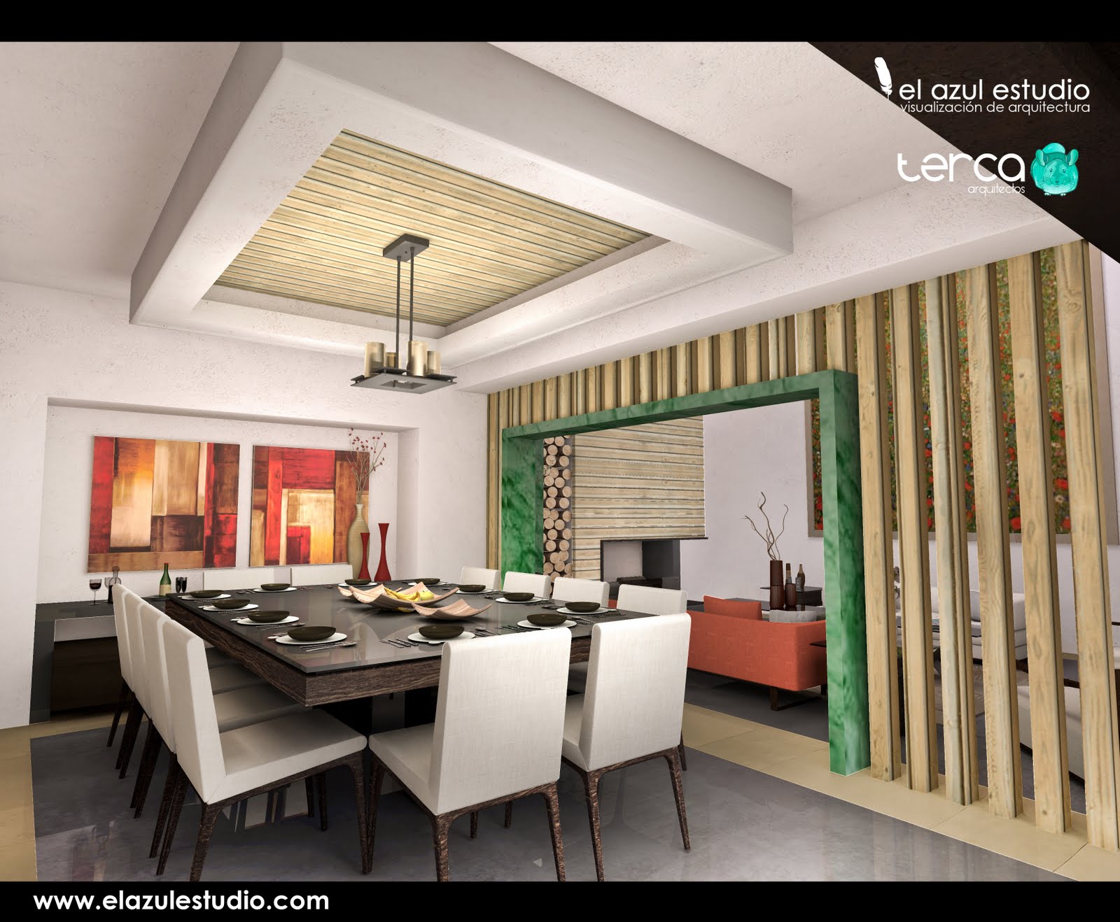
Interior
regards
nacho -
http://www.360cities.net/image/residence-interior?override_cache=true#-116.26,90.00,70.0
360 Panoramicregards
nacho -
animation urbanism, restore the historic center of a mining city
sketchup / lumion / artlantisregards
nacho -
bridge
regards
nacho -
@nomo81 said:
hi Brodie, thanx for your comments, and yes we are a team of architects/designers
new one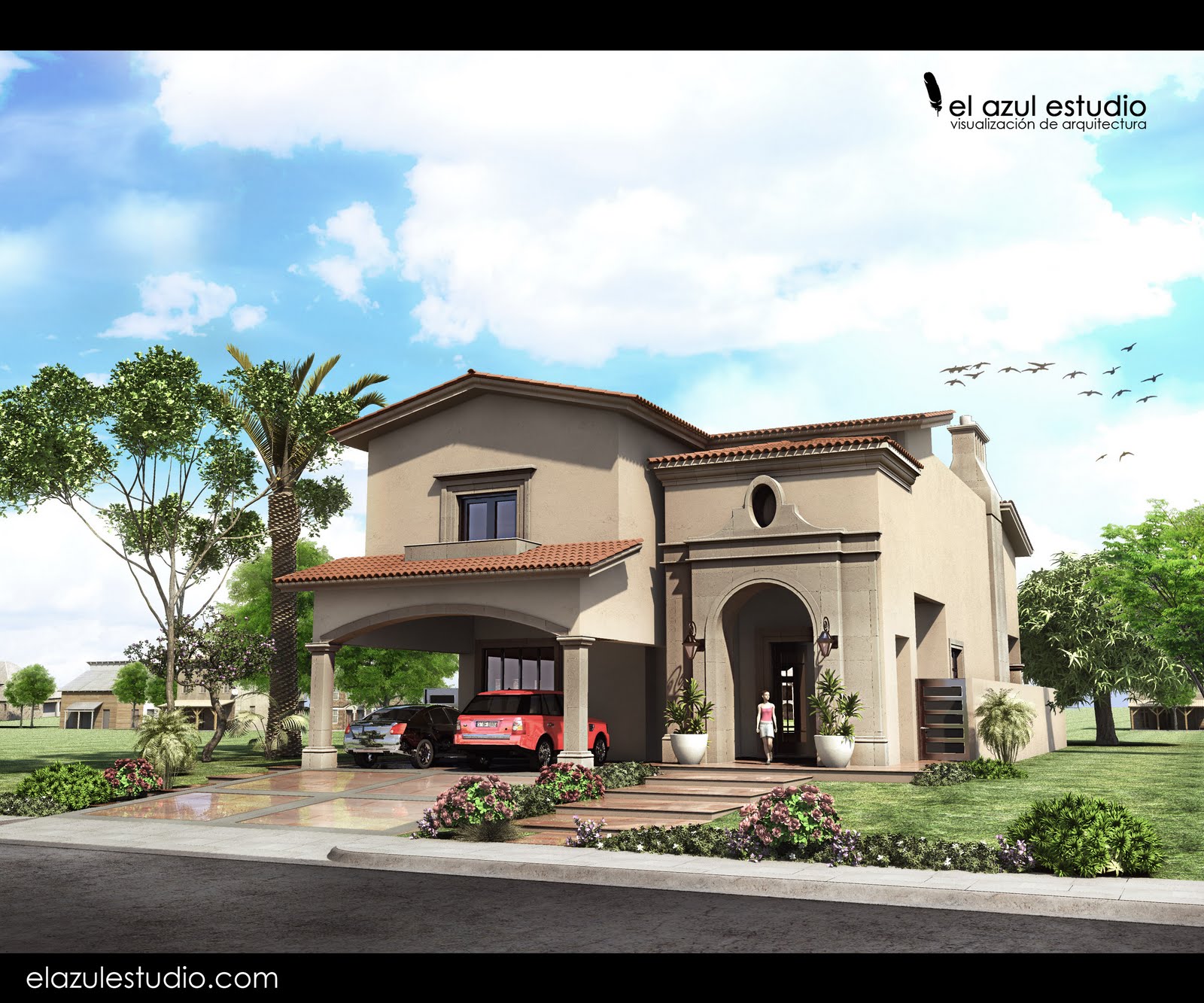
regards
nachonomo81, can you share with me how you do that exquisite clay roof tile?
I can't believe its a texture only. perhaps your using a combination texture and 3d tiles?
TIA! -
hi tomot,
it pretty easy make single tile, convert it to component and repeat it, make a group and repeat it.
not much work... take it easy with the object faces, cuz can overload your model and crash your render engine.regards
nacho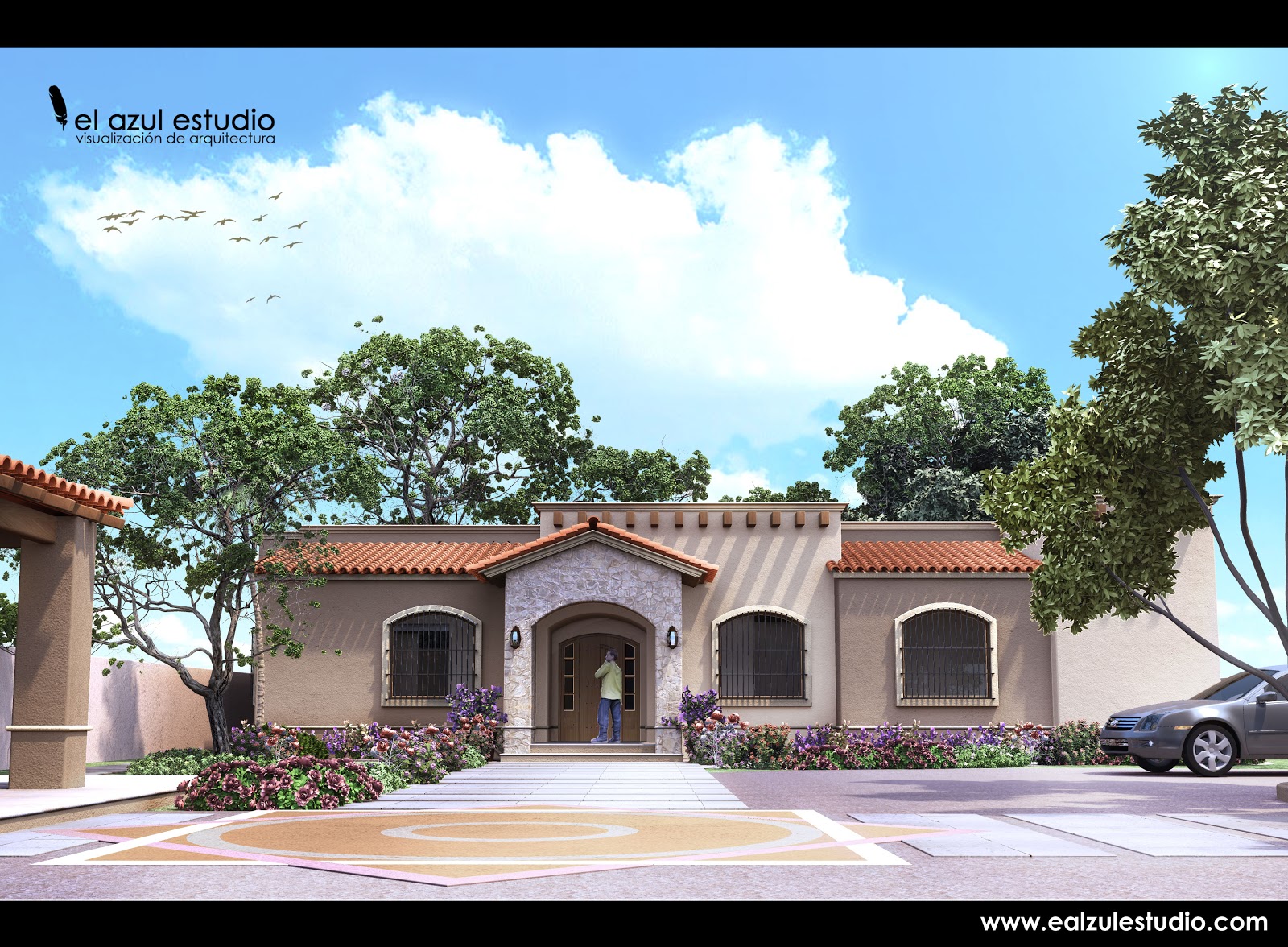
-
nomo
Great image,like the wall textures.
What's up with the prison bars?
-
Yeah, great great work. I would be interseted in hearing about how you make the road surface. That is one that always is difficult for me, and it always comes out looking fake and flat. Yours - especially that recent freeway overpass one - looks amazing! Any chance you could explain how you make it? Do you have certain texture maps you use?
Chris
-
Thanx Solo and Chris
solo
you are right about the prison bars heheh :s, we base our desing in some pictures that our client sent to us.chirs
we use clasic cement or road textures that you can find in cgtextures.com or google image search, and then we adjust the light and sharp in photoshop.new ones..
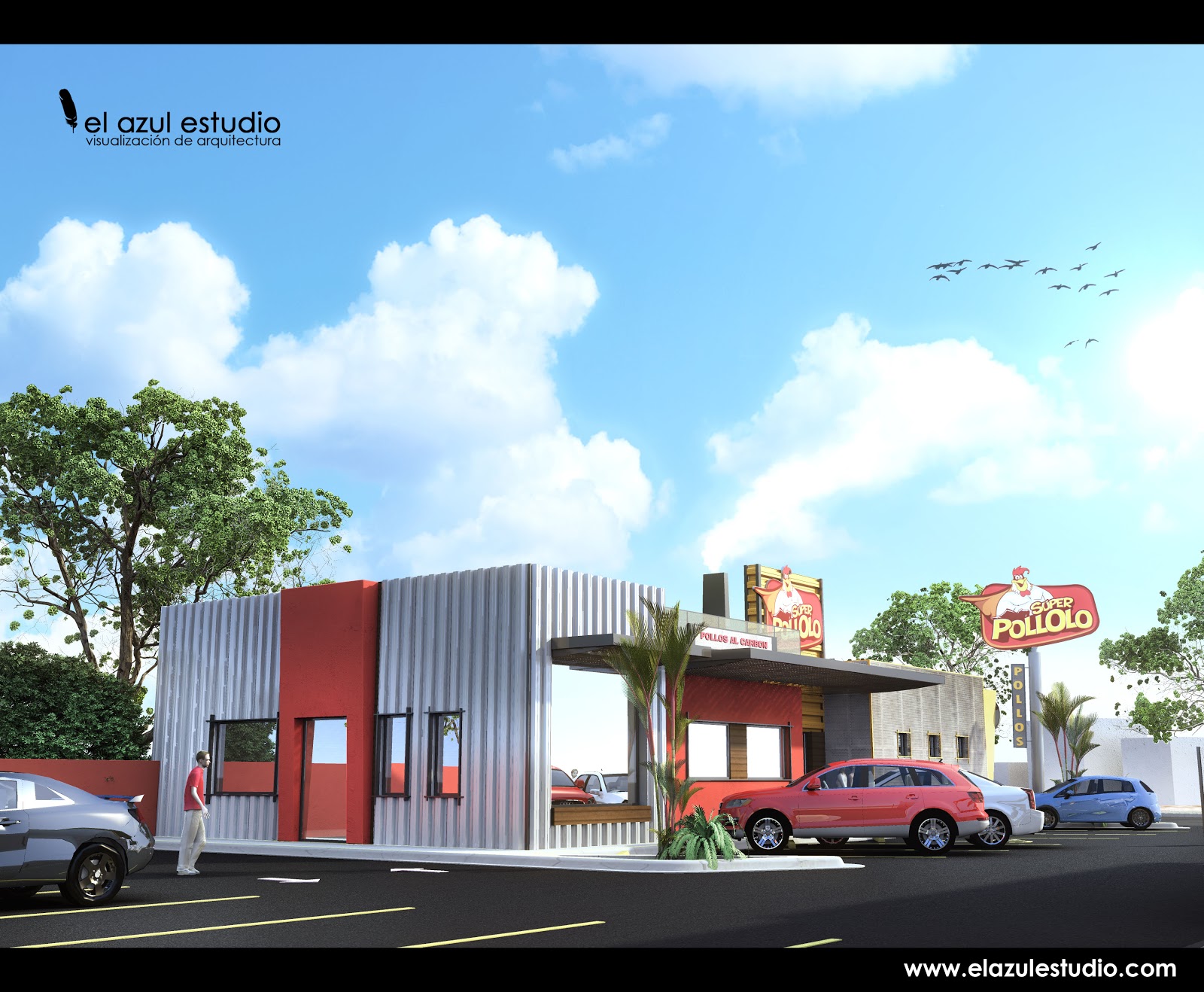
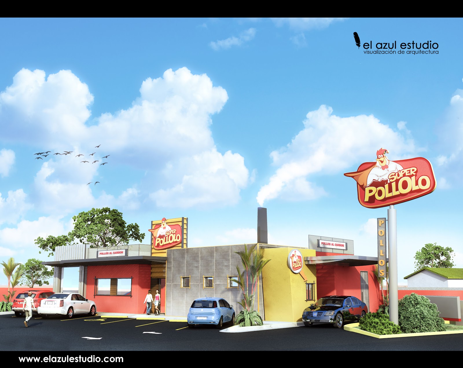
regards
nacho -
Bridge "el gallo"
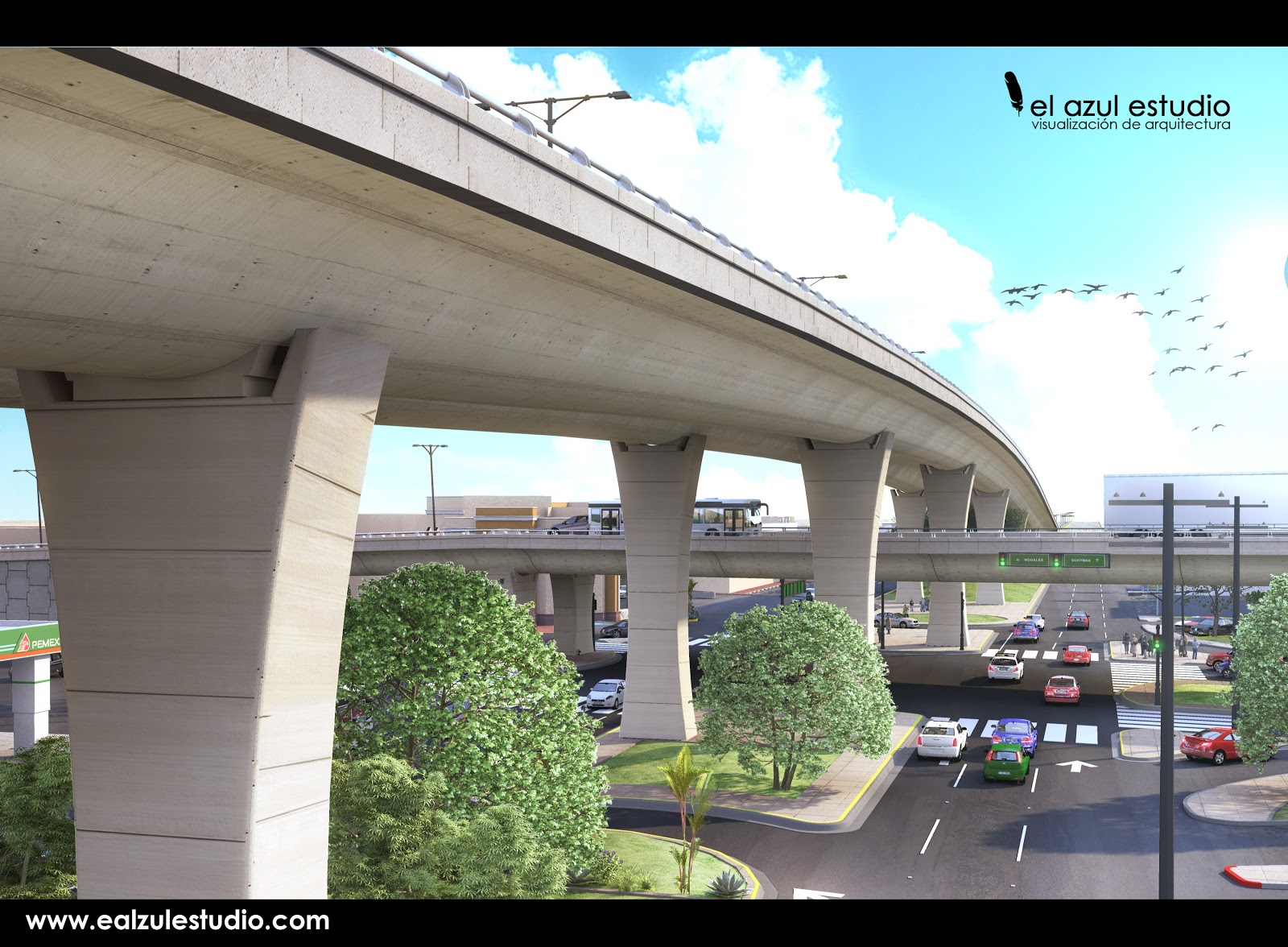
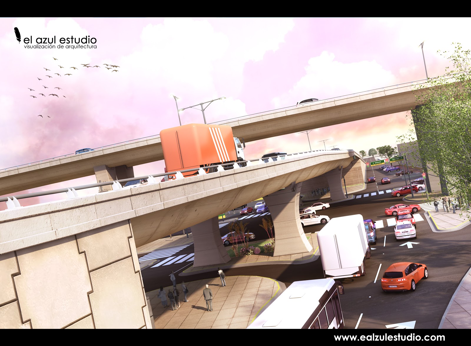
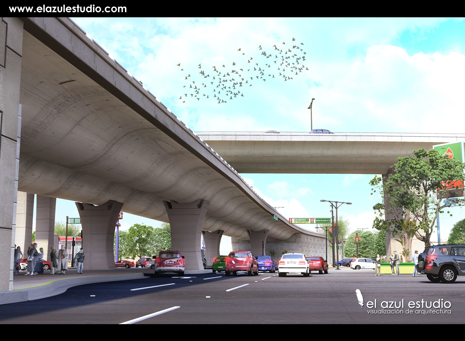
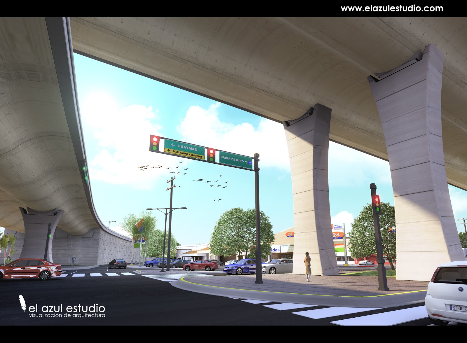
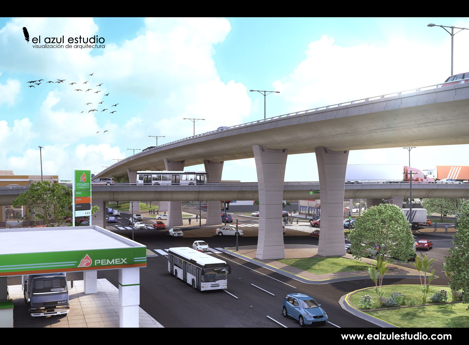
regards
nacho -
hermosillo,
I always love to see your stuff, excellent as always.
Interesting combination of street signs and stop lights, makes total sense.
Only one negative, the curbs are very low poly (showing segmentation) which takes away from overall quality.
-
[flash=560,315:179j9ezr]http://www.youtube.com/v/1l8Jj4srNcw[/flash:179j9ezr]
the animation
thanx solo, we need to use a low poly in the curves because its a very big scene (check the animation) but your are right.
its like a xbox game quality.regards
nacho -
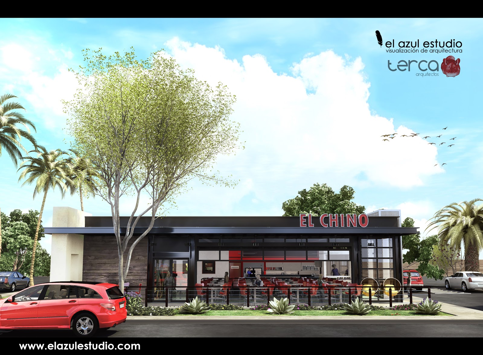
regards
nacho -
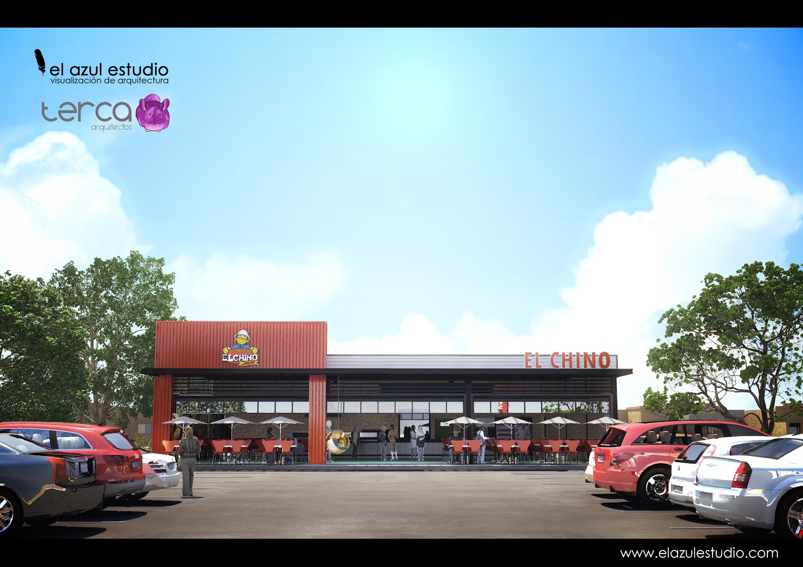
nacho
-
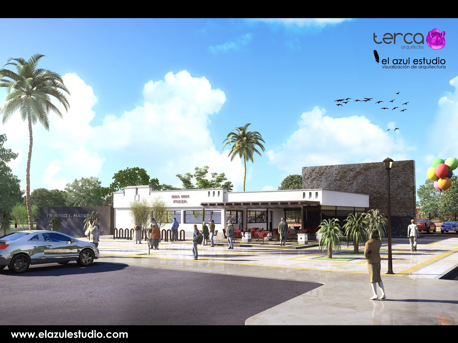
pizza place in a park
regards
nacho -
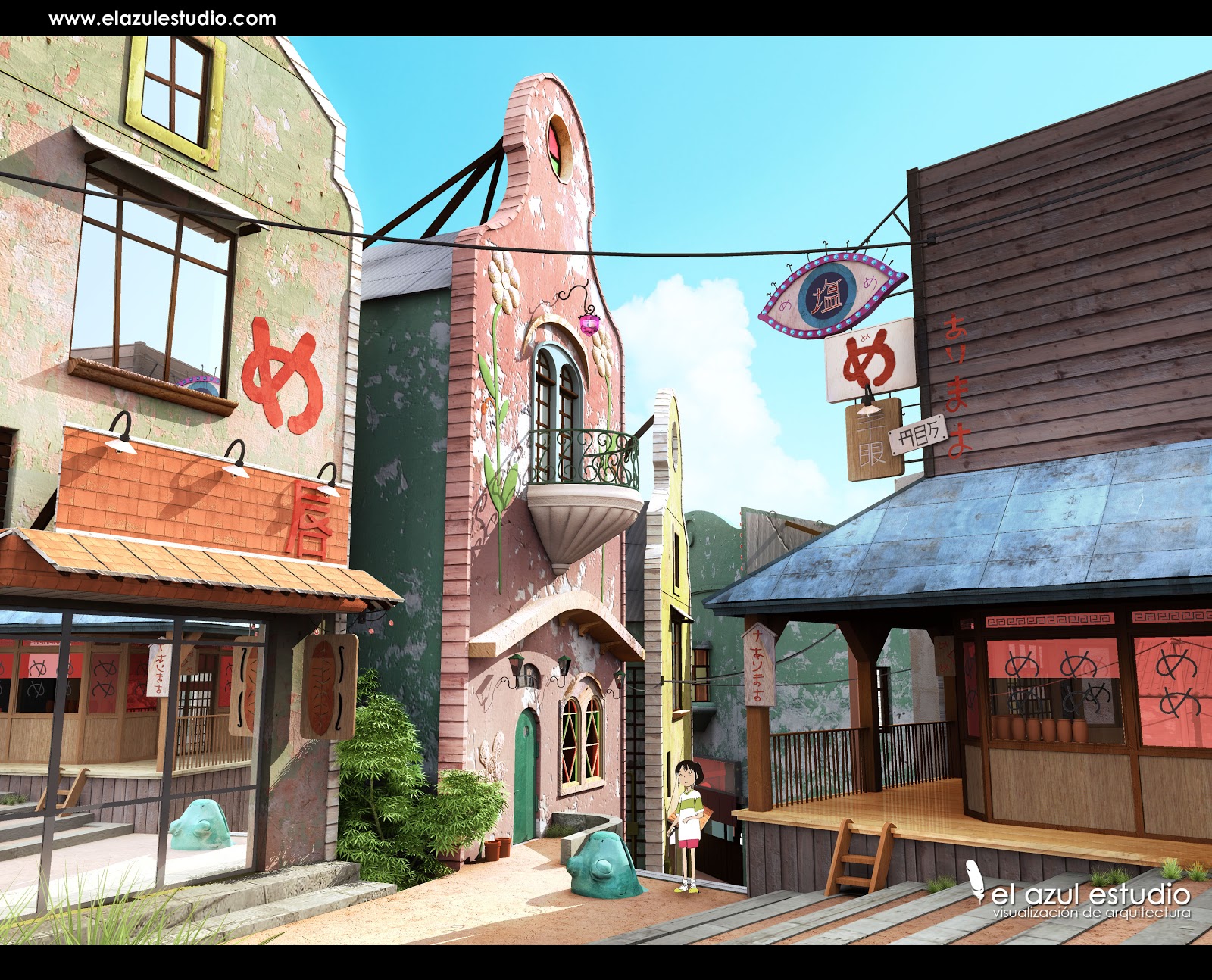
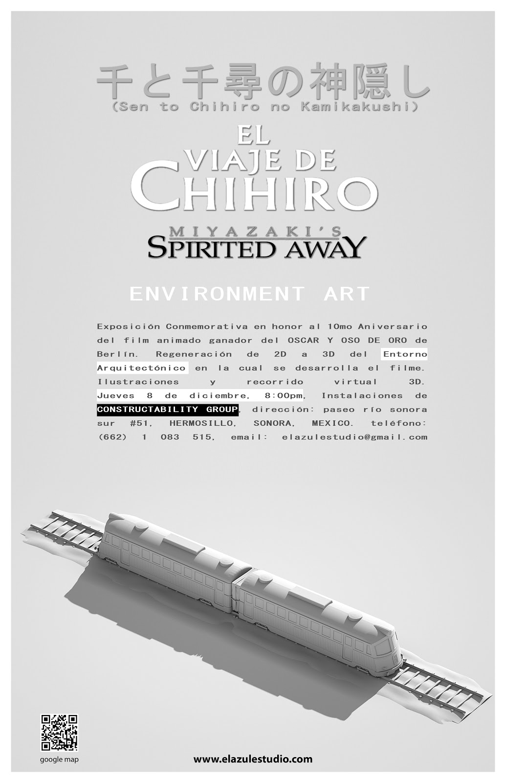
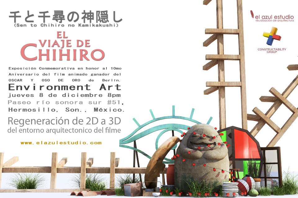
spirited away tribute
10 annyversaryregards
nacho -
-
i enjoy your Miyazaki work. Perfect detail and feeling. Thanks for posting.
Regards, Peter
Hello! It looks like you're interested in this conversation, but you don't have an account yet.
Getting fed up of having to scroll through the same posts each visit? When you register for an account, you'll always come back to exactly where you were before, and choose to be notified of new replies (either via email, or push notification). You'll also be able to save bookmarks and upvote posts to show your appreciation to other community members.
With your input, this post could be even better 💗
Register LoginAdvertisement
