Kitchen reno
-
a
-
hrm...I can't see your last image. Sometimes the internet blocks they have at work here do that too me. Could you attach it like the other images?
-Brodie
-
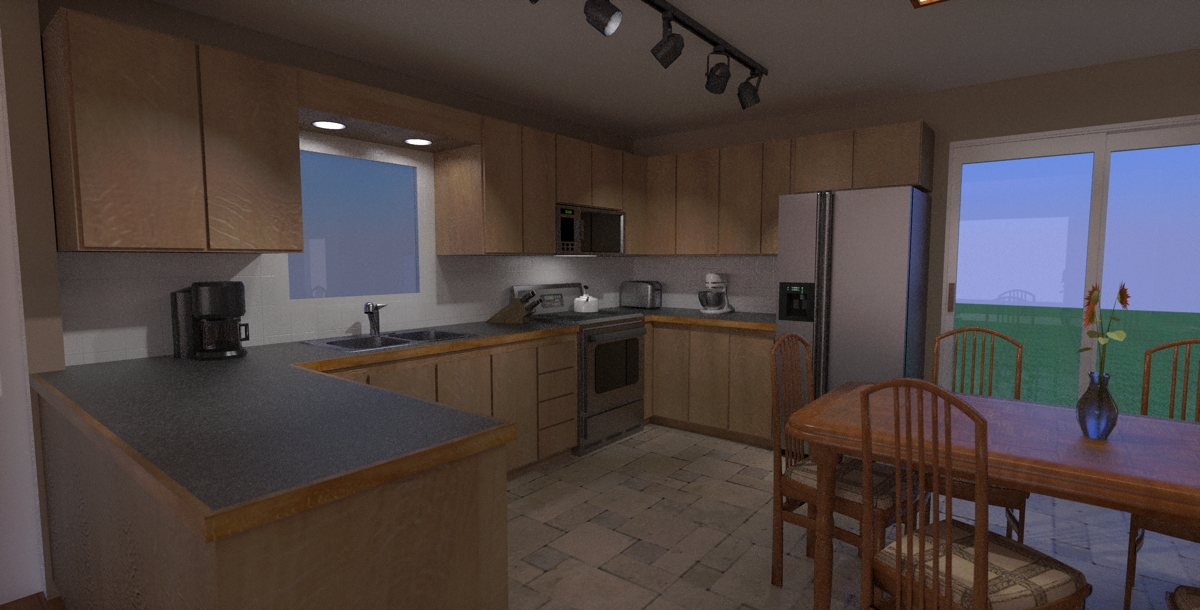
well i can see it but here it is again, cooked longer now anyways. the DOF isn't even noticable to me!? i set the focal point to the faucet and the f-stop to 4??
guess i'll try 2.8 and see what happens.
-
Wow, that's really coming together. For supposedly not focusing much on the rendering aspect many of your materials are looking quite good (the laminate countertop and stainless steel appliances in particular).
As for the space above the cabinets I've never really seen anything very appealing myself. I prefer the cabinets to go all the way up personally. They end up going way too high to be used on an every day basis but you can always put junk up there you don't need often.
I like your minimalist cabinets but something seems off to me. I'm not sure if it's the coloring (reminds me of unfinished oak) or that the style may not fit the rest of the space (I'm used to seeing those minimalist cabinets in arsty renderings or photos of downtown lofts that no one lives in yet).
Are you planning on doing cabinet knobs or are you sticking strictly minimal?
-Brodie
-
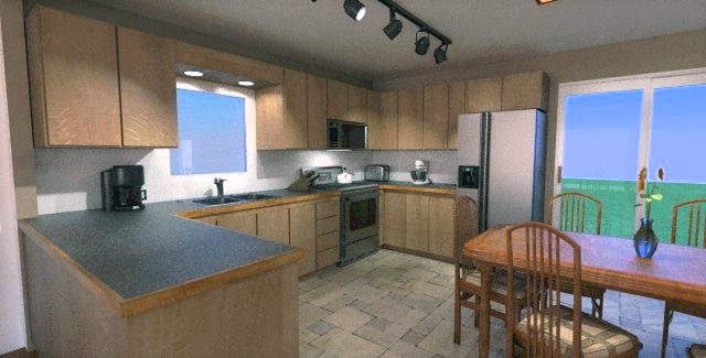
Hi xrok1, Your renders are dark. I did a quick pp on one, but not sure if those are your colors. Upload a SU image, might be easier to evaluate.
Btw, although wood edges look nice along the counter top, they look bad after a few years. Better to use something that wears well, and looks good. The row of track lights will cast your shadow on your work at the counter. Unless you put them there to light the render, move the track closer to the counter top.
-
thanks brodie, i have to admit i am a minimalist, i figure my wife will clutter everything enough that i don't have to.
 i really didn't plan on handle but maybe if i can find some small, curved, brushed metal to match the appliance handles (not the ones in render) i may reconsider??
  BTW, i really appreciate your (and everyones) comments, it great to get other views from experienced people
  . cheers!
honolulu, thanks foe the tip on the lighting, very good point. as for the brightness they look maybe a little darkish not dark on my machine, but the one you did looks a little over bright to me. maybe its because i'm used to mine or maybe because i'm going for a warm area and prefer it a little darker i don't know. opinions anyone?
by the way i'm onto the living room so i'll post some renders of that soon.

-
Hi
Dedmin made some great handles. Maybe it can help (saved me a lot of time): http://www.forums.sketchucation.com/viewtopic.php?f=40&t=21698
Great work so far !
-
I don't think the microwave it's placed very well. Imagine you, taken a hot bowl with soup from that place. I also build allot of kitchens. Yours it's looking very good.
-
Hi xrok
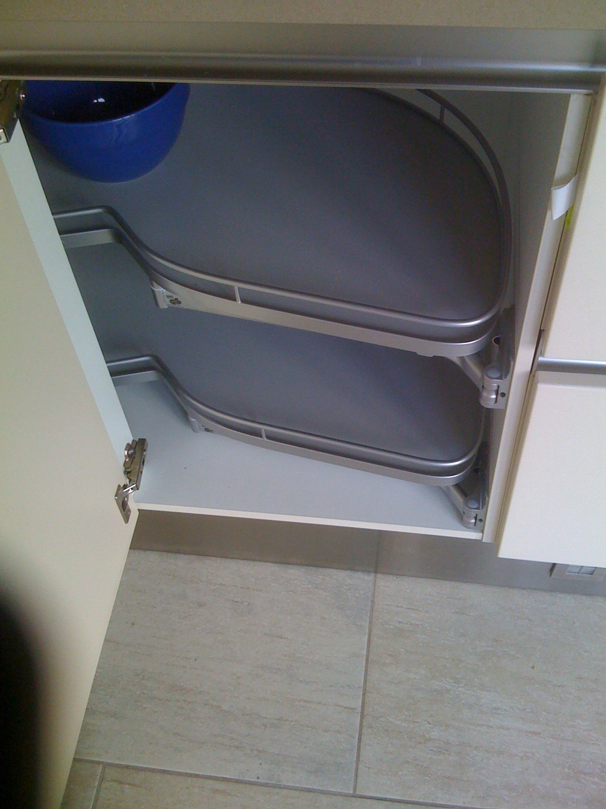
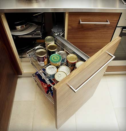
I am impressed with your kitchen layout - only one comment - in the corners I suggest you make the doors bigger for access as slim doors mean difficulty in getting into them - 500mm (ca 9") is the minimum I use. Are you planning on using corner cupboard storage hardware such as "Magic Corners" or Le Mans Corners". The make use of most of the space in corners like this by taking everything out to you. I've attached pics of both to give you an idea about I'm talking about. Would love to be able to render my models like that!!!
-
Flapsy, thanks for the tip, those are some excellent handles.

Stefang, the microwave i'm installing has the hoodfan built in so it kinda has to go there; it probably will be a little lower in the final build though, i didn't pay much attention to that measurement for now.
 Also thanks for the compliment its nice to be getting positive feedback.
Dermot, i was considering making the small door part of its neighbor to create a bigger single door:
but i do really love that "Le mans" you posted.
BTW i'm no renderer, i just mostly use the templates in Twilight renderer, you should try it you might surprise yourself thanks for the encouragement.
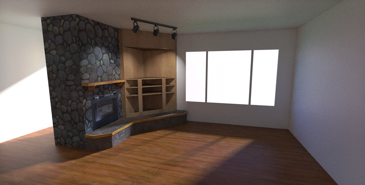
So, onto the next room please comment on this, and remember i'm working with existing limited space.

-
The colors of the fireplace render are better on my monitor then the kitchen renders. Don't have much use for fire places in my part of the world, so I can't comment.
Looking again at the kitchen, I hadn't read the other posts, so sorry if I say something already covered. I just noticed that you do not have the "so called" kitchen work triangle with the sink between the refrig/pantry, and range, each connected by the counter top.
- First get stuff, 2. then clean, and prep, 3. then cook, and present.
If you don't have pantry shelves at counter height, you will be bending down, or reaching up a lot. I would also place a single drawer just below the counter top where ever possible along its length, cab doors below (as you show), or additional drawers (again as you show) where necessary. If you use pulls, although you seem to have enough space, make very sure that when the oven door opens, that it doesn't hit any hardware. I don't like to put this appliance in the corner, its nice to have counter space on the sides. Use a range hood that vent outside. Some of my preferences may be due to local taste, so adapt to your neck of the woods. I love to cook, but have a lousy kithchen. Takes some of the fun out of it.
-
ery good points honolulu, i'll see if i can work any of your suggestions into my design. i'm going to start construction tomorrow, replacing window, doors etc...
wish me luck

-
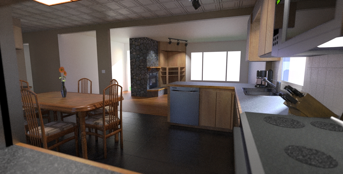
overview of project. i'd love some opinions on the kitchen ceiling and floor. the floor tile is actually a little lighter than the render, its supposed to be slate light tile.
-
I prefer lighter ceilings, as they make the space feel more "open" in my opinion.
-
@ecuadorian said:
I prefer lighter ceilings, as they make the space feel more "open" in my opinion.
yeah, its supposed to be white, i'm just having a hard time getting enough light in the room without faking it???

-
I guess the dark floor and the reflectivity of the ceiling contribute to making the ceiling look dark. Mainly the dark floor.
-
i'm going to try unlocking the color channel and making it white, then using the texture just to bump it and see what happens. will post results.
-
i also decided to change the paint from eggshell to semi-gloss and increase the sky brightness to 1.5, we'll see what happens.

i guess the next step will be sky portals if that doesn't work. but can you see background through sky portals? i do plan on adding a background.
-
Sky portals only allow for more skylight to enter the room.
 If you're using the physical sky this will just produce a small blue cast in your kitchen.
The problem, as I see it, is that unless you have some direct light reaching the ceiling, it will look relatively dark. A hanging lamp, for example, showers the ceiling with direct light, but the kind of fixtures you're using do not. How about adding a couple of apliqués?
-
i really don't want to add lights just to make the render look better when i have no intention to add these lights for real. i switched to the linear tone mapping and that seems to be helping. i'll post a render in a couple of hours.
Hello! It looks like you're interested in this conversation, but you don't have an account yet.
Getting fed up of having to scroll through the same posts each visit? When you register for an account, you'll always come back to exactly where you were before, and choose to be notified of new replies (either via email, or push notification). You'll also be able to save bookmarks and upvote posts to show your appreciation to other community members.
With your input, this post could be even better 💗
Register LoginAdvertisement


