sketchucation logo sketchucation
    • Login
    ℹ️ Licensed Extensions | FredoBatch, ElevationProfile, FredoSketch, LayOps, MatSim and Pic2Shape will require license from Sept 1st More Info

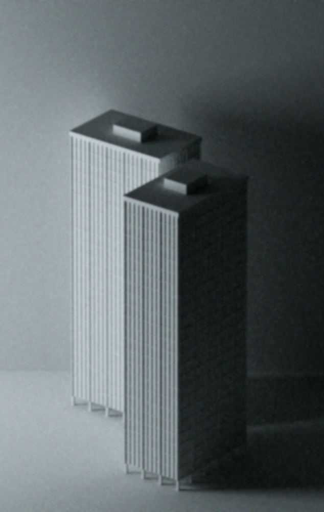
    Noisy 'n' blurry ...

    Scheduled Pinned Locked Moved Gallery
    10 Posts 5 Posters 477 Views 5 Watching
    Loading More Posts
    • Oldest to Newest
    • Newest to Oldest
    • Most Votes
    Reply
    • Reply as topic
    Log in to reply
    This topic has been deleted. Only users with topic management privileges can see it.
    • StinkieS Offline
      Stinkie
      last edited by

      ...but I like 'em. At the moment. Not sure about the blue.


      M1.jpg


      M2.jpg

      1 Reply Last reply Reply Quote 0
      • R Offline
        remus
        last edited by

        Nice, very old skool.

        http://remusrendering.wordpress.com/

        1 Reply Last reply Reply Quote 0
        • soloS Offline
          solo
          last edited by

          Dang!! for a moment there I thought I needed to get my eyes re-evaluated.

          Tom, you are a strange one, bordering on morbid. πŸ˜‰

          http://www.solos-art.com

          If you see a toilet in your dreams do not use it.

          1 Reply Last reply Reply Quote 0
          • StinkieS Offline
            Stinkie
            last edited by

            I could swear you've been talking to my exes. πŸ’š

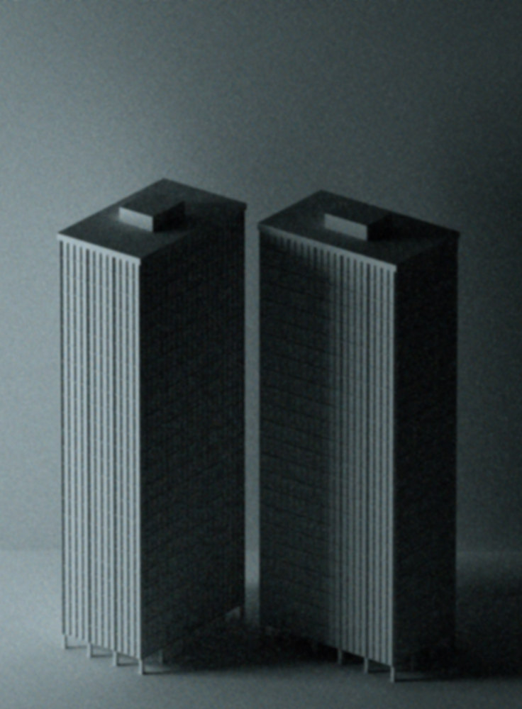
            Stick with the blue or go with the gray?

            M1_2.jpg

            M2_2.jpg

            Oh ... I'm available for all sorts of parties at a very reasonable hourly rate. I do great balloon nooses.

            1 Reply Last reply Reply Quote 0
            • StinkieS Offline
              Stinkie
              last edited by

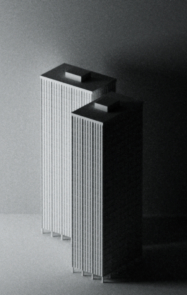
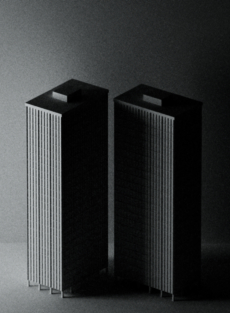
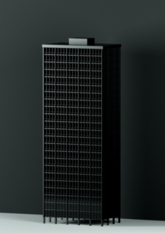
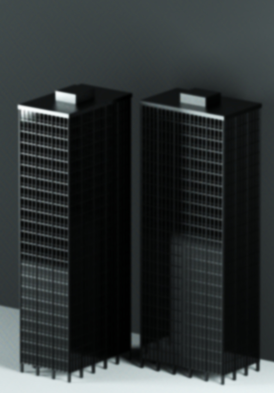
              A couple of variations.


              hooha! hooha!.jpg


              boom! boom!.jpg

              1 Reply Last reply Reply Quote 0
              • R Offline
                RustyShack
                last edited by

                I like blue + blurry + noisy for the mood they create. They grey reads more like an old photo and the final ones without noise seem a bit too "real" without being hyper-real (which would be a good way to go: either completely abstract (like the first ones) or ultra-realistic).

                1 Reply Last reply Reply Quote 0
                • StinkieS Offline
                  Stinkie
                  last edited by

                  Those are some good points. Thanks.

                  1 Reply Last reply Reply Quote 0
                  • brodieB Offline
                    brodie
                    last edited by

                    Interesting, definately different from what I'm used to seeing from you (gray and crisp). My first impression is that I sort of favor the gray. However, the capitalist in me thinks that maybe the blue would look better on some people's walls (seeing as how you already have a plethora of choices for those who's crayola set consists of 64 varieties of gray πŸ˜‰ ).

                    Be interesting to see such a blurry image printed out and hung on a wall. Might be a good way to go blind or crazy or both.

                    -Brodie

                    steelblue http://www.steelbluellc.com

                    1 Reply Last reply Reply Quote 0
                    • StinkieS Offline
                      Stinkie
                      last edited by

                      @unknownuser said:

                      However, the capitalist in me thinks that maybe the blue would look better on some people's walls

                      I was thinking the same thing earlier today. πŸ’š

                      @unknownuser said:

                      Be interesting to see such a blurry image printed out and hung on a wall.

                      I printed the first two yesterday - you know, to see if they work. In my (very, very biased πŸ˜„ ) opinion they look rather appealing.

                      1 Reply Last reply Reply Quote 0
                      • brodieB Offline
                        brodie
                        last edited by

                        Glad to hear they looked good. Variety is the spice of life so I'm told. πŸ˜„

                        -Brodie

                        steelblue http://www.steelbluellc.com

                        1 Reply Last reply Reply Quote 0
                        • 1 / 1
                        • First post
                          Last post
                        Buy SketchPlus
                        Buy SUbD
                        Buy WrapR
                        Buy eBook
                        Buy Modelur
                        Buy Vertex Tools
                        Buy SketchCuisine
                        Buy FormFonts

                        Advertisement