Noisy 'n' blurry ...
-
...but I like 'em. At the moment. Not sure about the blue.
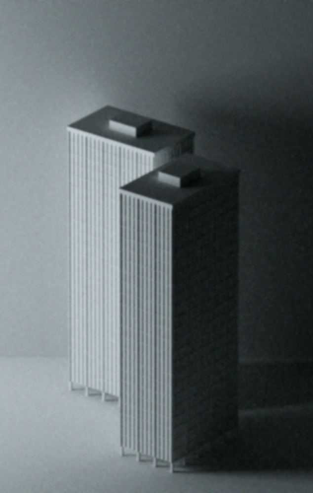
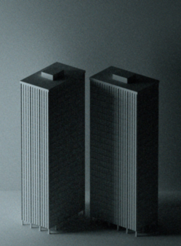
-
Nice, very old skool.
-
Dang!! for a moment there I thought I needed to get my eyes re-evaluated.
Tom, you are a strange one, bordering on morbid.

-
I could swear you've been talking to my exes.

Stick with the blue or go with the gray?
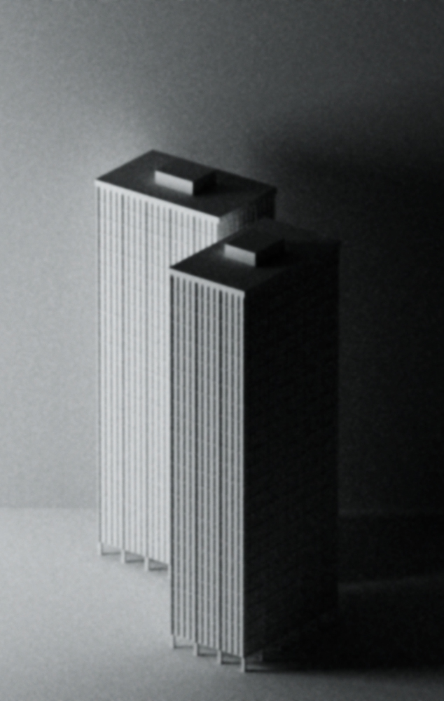
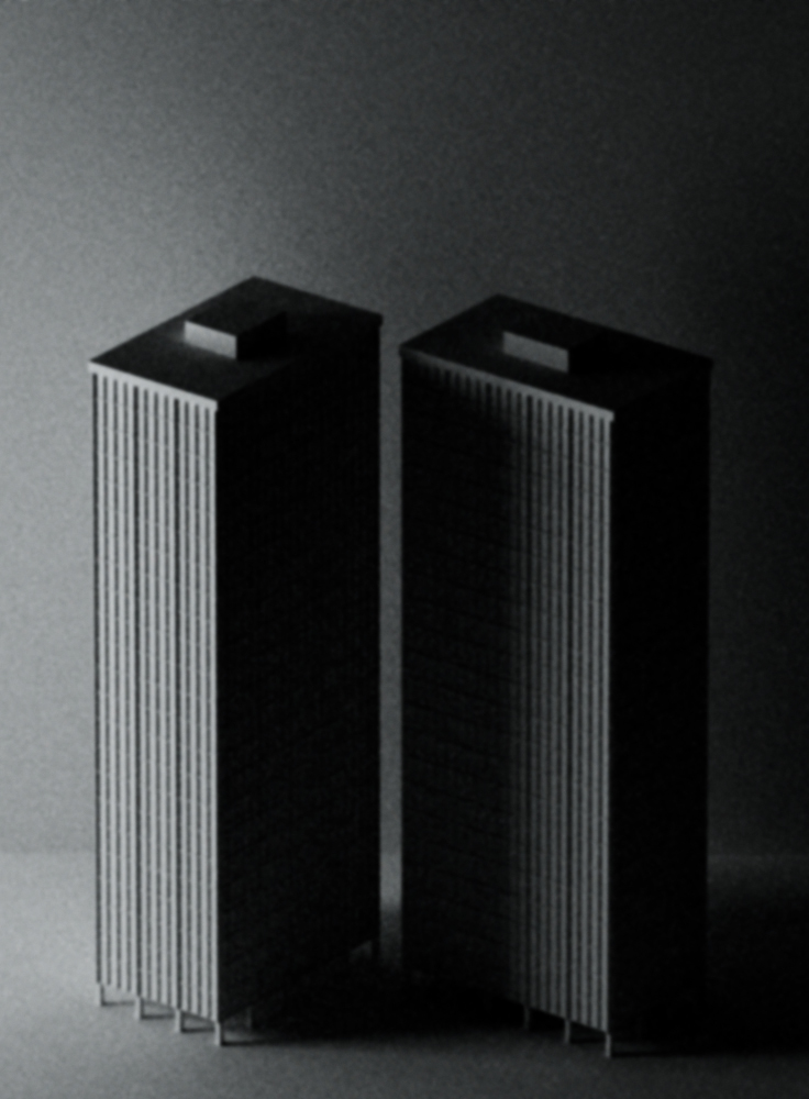
Oh ... I'm available for all sorts of parties at a very reasonable hourly rate. I do great balloon nooses.
-
A couple of variations.
-
I like blue + blurry + noisy for the mood they create. They grey reads more like an old photo and the final ones without noise seem a bit too "real" without being hyper-real (which would be a good way to go: either completely abstract (like the first ones) or ultra-realistic).
-
Those are some good points. Thanks.
-
Interesting, definately different from what I'm used to seeing from you (gray and crisp). My first impression is that I sort of favor the gray. However, the capitalist in me thinks that maybe the blue would look better on some people's walls (seeing as how you already have a plethora of choices for those who's crayola set consists of 64 varieties of gray
 ).
).Be interesting to see such a blurry image printed out and hung on a wall. Might be a good way to go blind or crazy or both.
-Brodie
-
@unknownuser said:
However, the capitalist in me thinks that maybe the blue would look better on some people's walls
I was thinking the same thing earlier today.

@unknownuser said:
Be interesting to see such a blurry image printed out and hung on a wall.
I printed the first two yesterday - you know, to see if they work. In my (very, very biased
 ) opinion they look rather appealing.
 -
Glad to hear they looked good. Variety is the spice of life so I'm told.

-Brodie
Hello! It looks like you're interested in this conversation, but you don't have an account yet.
Getting fed up of having to scroll through the same posts each visit? When you register for an account, you'll always come back to exactly where you were before, and choose to be notified of new replies (either via email, or push notification). You'll also be able to save bookmarks and upvote posts to show your appreciation to other community members.
With your input, this post could be even better 💗
Register LoginAdvertisement


