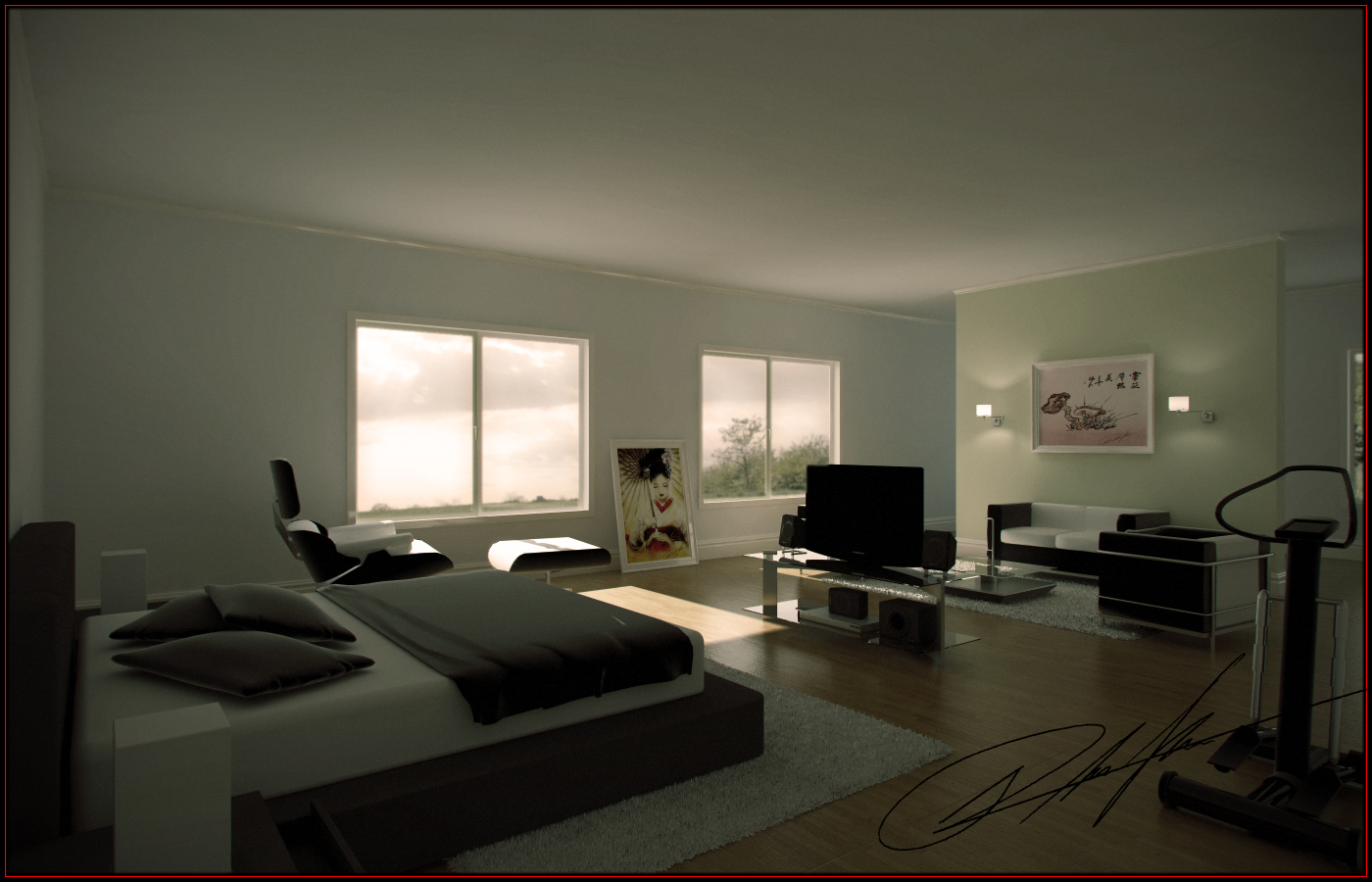
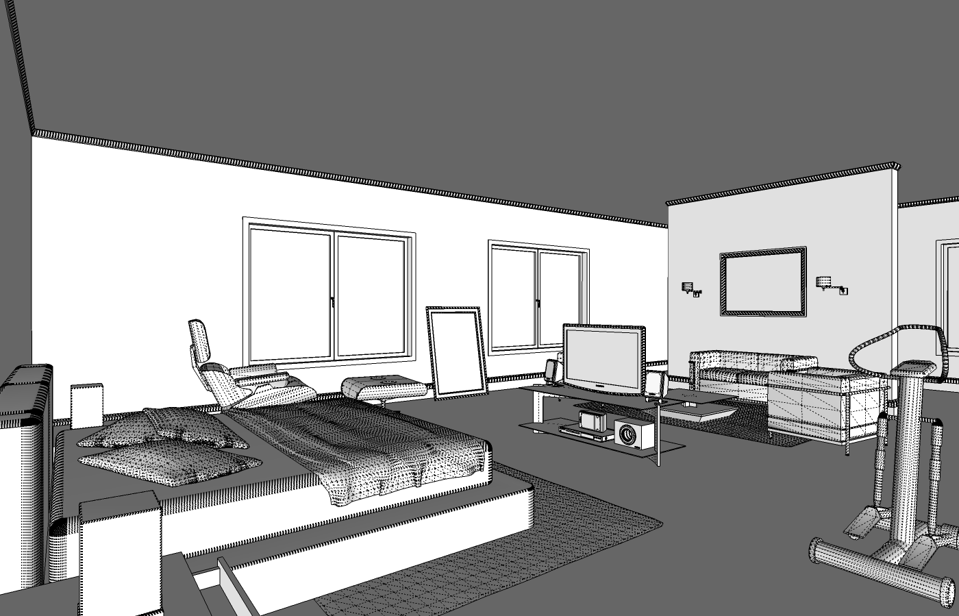
Bachlor pad (SU+VRAY)
-
Hi all,
this is a interior project i've been working on....
and i would love to hear from you some C&C,[Modeled in SU - Rendered with Vray4SU]
thnx for wathing,
Rachid de Wind


-
There's a bit of text on your site that sounds very familiar to me. Am I hallucinating?

-
@unknownuser said:
There's a bit of text on your site that sounds very familiar to me. Am I hallucinating?

nope....that is because i wanted to launch the site in a rush and still haven't had time to personalize it...

i will be changing that mate
what do you think of the "Pad"???
-
looks good, but a single bloke would never be that tidy!
-
Nice render, I really like the sunlight filtering in.

-
@21d said:
@unknownuser said:
There's a bit of text on your site that sounds very familiar to me. Am I hallucinating?

nope....that is because i wanted to launch the site in a rush and still haven't had time to personalize it...

i will be changing that mate
Good. Next time, ask permission first. I gave that bit of text to Solo, not you.
@21d said:
what do you think of the "Pad"???
Far too gloomy - let some more sun in.
-
Very good work!!, I like the color and ilumination of scene

-
looks good. just adjust perhaps the background, to match with the model's horizon line.
-
Very nice. I'd change the background as well but the horizon doesn't really bother me, just looks like you're up a story or two. But I'd brighten it up. Like Stinkie said, it feels rather gloomy. I think it's a combination of the scene outside that looks like a storm just past by and the overall lighting in the scene which looks rather dark. For example the TV, at such a low light level, just sort of turns into a big black spot with very little definition to be able to tell the material difference between the plastic and the screen. I'm looking for some can lights in the ceiling, maybe some lamps, that sort of thing. Those two sconces on the far wall wouldn't do much in reality.
Only other thing I might mention would be the pillows on the bed. The material seems great on the blanket but for some reason it seems to have a white halo around it, particularly on the pillow closest to the camera.
All fairly minor fixes though for such a great model. You've done a wonderful job on the textures in my opinion.
Is this for a client or more of a marketing tool?
-Brodie
-
i think the room is extreamly dark and the output is too small to see in detail the materials,, but looks good, keep posting bro!!
-
@unknownuser said:
@21d said:
@unknownuser said:
There's a bit of text on your site that sounds very familiar to me. Am I hallucinating?

nope....that is because i wanted to launch the site in a rush and still haven't had time to personalize it...

i will be changing that mate
Good. Next time, ask permission first. I gave that bit of text to Solo, not you.
dammit now im currious...
-
Just visit both sites and its quite obvious to see what he stole from Solo's site
-
No big deal, unless Stinkie has issue with it (he helped me with my wording as he is a copywriter)feel free to use it, I have no objections by the way.

-
I gave Rachid a slap on the wrist. I am sure that gave him food for thought. Case closed.
As I was saying ... render's a tad too gloomy. Could do with a bit more contrast, as well.
-
wow solo! what a great attitud, your a nice person
 , other would make a big deal but not you,,
 -
Just a question? How did you create the blanket in SU, did you use a plugin to create the folds and creases? Ive always struggled with cloth like surfaces in SU and have always had to import them from MAX as a 3Ds.
-
First of all, thank you to all for you comments....
I am now working on a brighter version of the model.@unknownuser said:
....Only other thing I might mention would be the pillows on the bed. The material seems great on the blanket but for some reason it seems to have a white halo around it, particularly on the pillow closest to the camera.
All fairly minor fixes though for such a great model. You've done a wonderful job on the textures in my opinion.
Is this for a client or more of a marketing tool?
I changed the material of the pillows because i couldn't get a realistic looking effect for them,
the halo is due to the color of the bed it self, that is why the sheet does not give this halo.
so i left the pillows for now with a normal diffuse color.and nope this is just one of a series of projects i'm trying to model for a personal portfollio.
@dzinetech said:
Just visit both sites and its quite obvious to see what he stole from Solo's site
@solo said:
No big deal, unless Stinkie has issue with it (he helped me with my wording as he is a copywriter)feel free to use it, I have no objections by the way.

@unknownuser said:
I gave Rachid a slap on the wrist. I am sure that gave him food for thought. Case closed.
As I was saying ... render's a tad too gloomy. Could do with a bit more contrast, as well.As I said before I did this in a rush for a quick launch of my site, but also does not rectify my error, so I went home and changed the text immediately, I do apologize to both STINKIE and SOLO for my wrong doing, and hope that this does not affect your criticism of my work or myself. Again my sincerest apologies.
@liam887 said:
Just a question? How did you create the blanket in SU, did you use a plugin to create the folds and creases? Ive always struggled with cloth like surfaces in SU and have always had to import them from MAX as a 3Ds.
it is actually part of a tutorial that SOLO made and with help of the SANDBOX tool and the Sub&Smooth plugin.
-
@21d said:
(...) and hope that this does not affect your criticism of my work or myself.
Not at all. Looking forward to seeing more work.
Hello! It looks like you're interested in this conversation, but you don't have an account yet.
Getting fed up of having to scroll through the same posts each visit? When you register for an account, you'll always come back to exactly where you were before, and choose to be notified of new replies (either via email, or push notification). You'll also be able to save bookmarks and upvote posts to show your appreciation to other community members.
With your input, this post could be even better 💗
Register LoginAdvertisement


