NY Subway Station
-
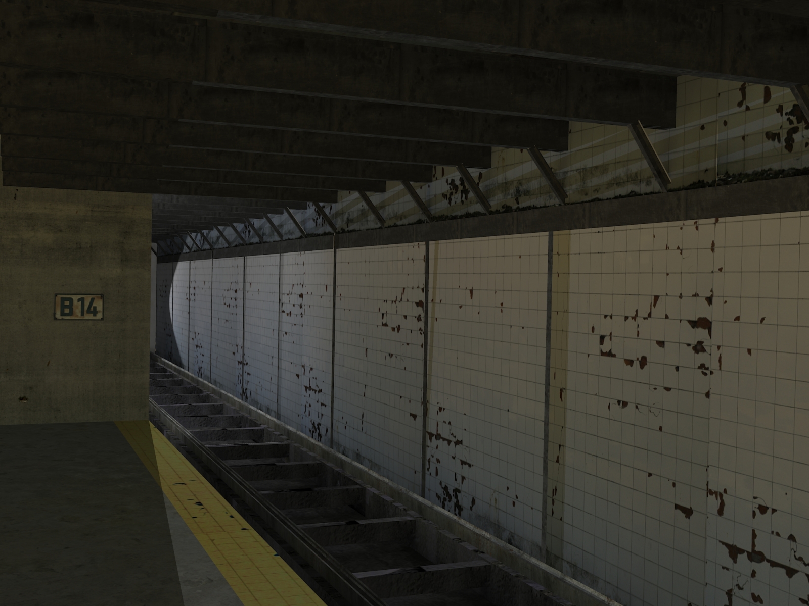
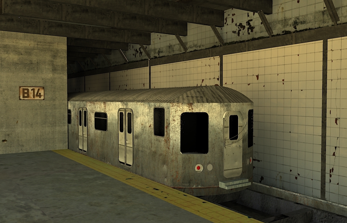
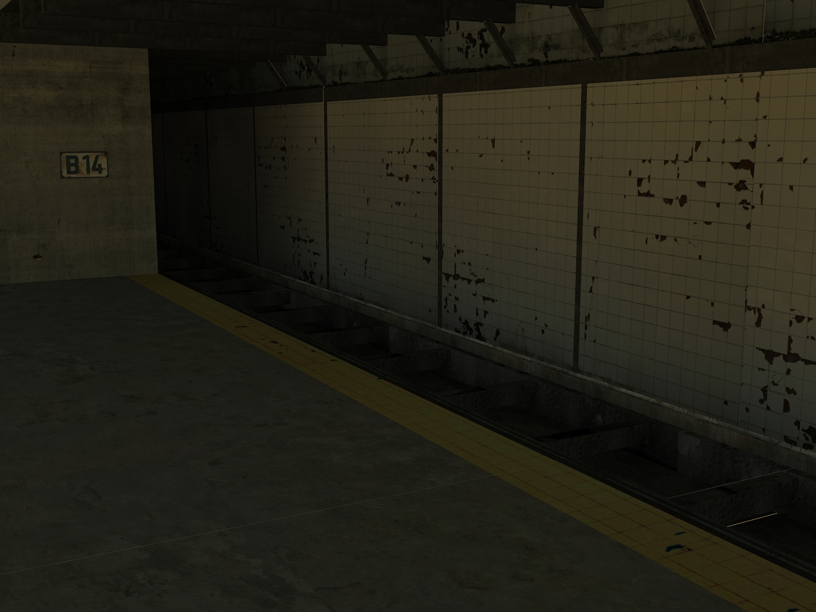
A New York subway station. Rendered in Kerkythea


-
Smokin' your renderings are good... but they are a little dark and lack something. I'm not sure what, but something that is more engaging.
-
Same as your other render. Tiling textures stand out. The train has a weird feel to it. Maybe its the texturing but it looks like its made from tin.
Scott
-
Hi. Think the problem is that these scenes appear to be lit largely with ambient light. An interior scene like this would be lit entirely with artificial light, which will be more directional and give more defined shadows. This will give your renders more contrast, depth and energy. And yeah, as said the tiling of textures needs a little work. Don't want to come across too negative though, as I think there's the beginnings of something really good in here

A.
-
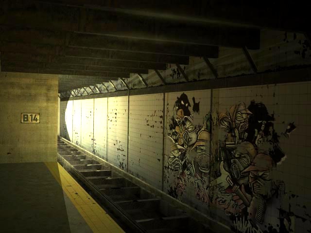
To follow on, and hopefully be constuctive, I've done a quick paint-over on one of you renders Smokin' (hope you don't mind) - to show what I meant about strengthening the directional lighting, and adding a bit of 'punch' to the image. Hope this helps.

A.
-
Nice improvement Andy, and also very nice website some excellent imagery on there!
-
Nice remake
-
Nice edition Andy and your description was spot on. I couldn't express what I was feeling. I like the grafiti, it is engaging.. interesting which is the point I was trying to make. Cool!
-
I like the original image with the train. The surface looks like galvanized tin. But when is this train from? I've been here since the late 70s and I don't recognize the design.
I do think a bit more contrast in the lights would be helpful. The improvement by Andyc is great but it seems to me to be a bit too much. It looks like either daylight coming in or a train headlight much more powerful than we actually have in NYC. But I do think it points to the direction you should take.
Good luck.
Hello! It looks like you're interested in this conversation, but you don't have an account yet.
Getting fed up of having to scroll through the same posts each visit? When you register for an account, you'll always come back to exactly where you were before, and choose to be notified of new replies (either via email, or push notification). You'll also be able to save bookmarks and upvote posts to show your appreciation to other community members.
With your input, this post could be even better 💗
Register LoginAdvertisement


