Office Exterior WIP
-
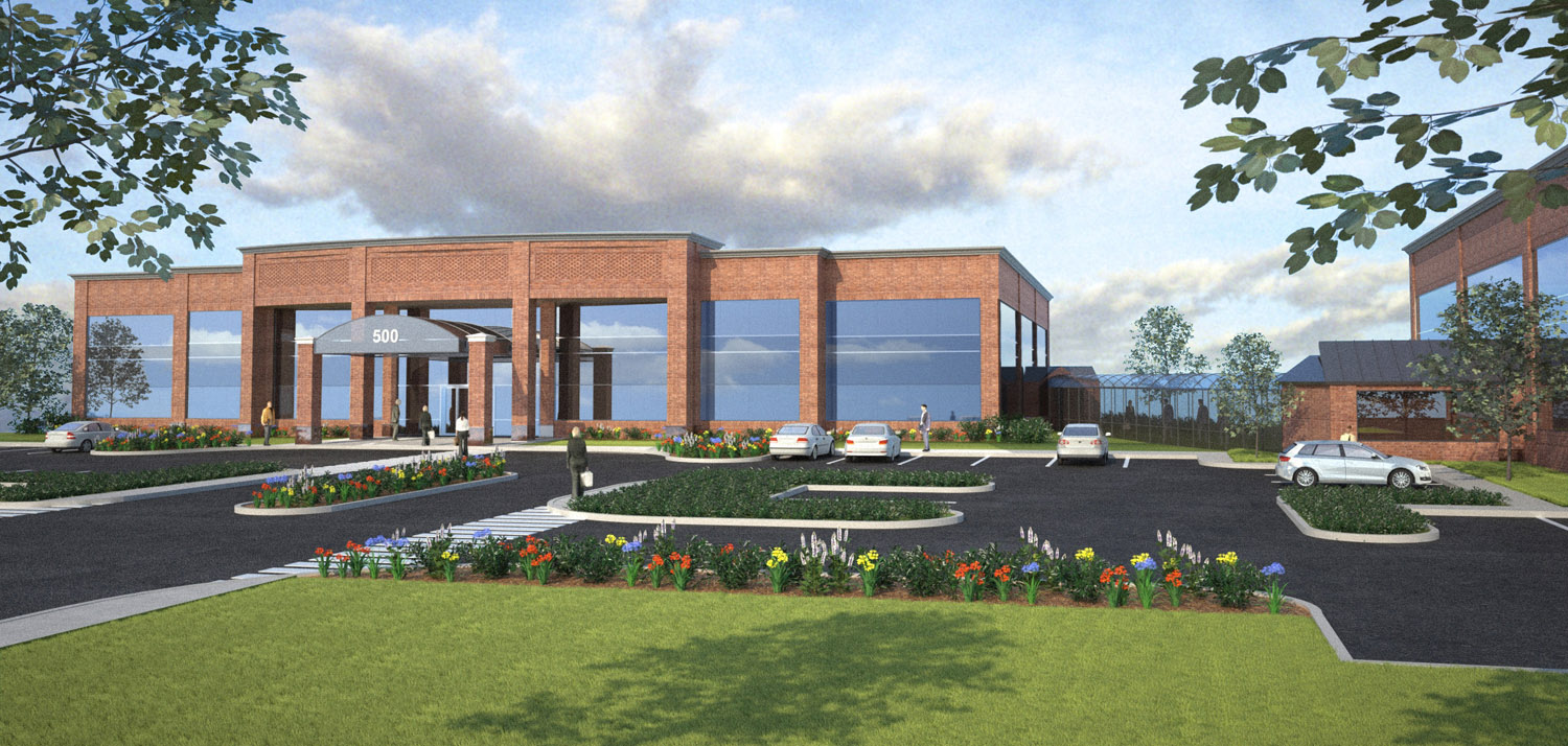
Jason, this looks great! A couple comments,humbly if I may as your work is fantastic:
-
Reaching back into my horticulture experience, the landscaping while beautiful and colorful is too high maintenance in reality. You would see more low maintenance shrub massing in most of those areas with the color only for accent. Maybe just at the base of the building near the entrance and in the island. And code, at least around here, would require some small trees in some of those beds. However they would block the view of the building so that is a tough call... leave them out or not???
-
Also the reflection in the glass is too flat. You need some buildings or tree massing in the reflection. Nothing special just a hint that this new building is not sitting on the top of a hill all by itself.
-
-
thanks eric...and this thing is hardly fantastic! i'm strugglling with it.. obviously. i think the client may have given up on me, as i havent heard from them in 4-5 days... oh well

i did have more shrubs originally.. but they wanted more colorful flowers... maybe because the rest of the image is so boring? who needs reality... i am, ultimately, going to pshop some reflection in those windows... i was going to look for an hdri, but i cant deal with the time it takes to keep rendering and adjusting til its right

-
Well if they wanted it more colorful then it is right.
I hope they are just on vacation or something like that.
-
Yeah, the worst part about doing this sort of thing for money is that sometimes with clients there's just no accounting for taste. What can you do?!
 Wish I had time to just do pretty kitchen renderings and bathrooms like you see all over the rendering forums. Just can't figure out why these people take so much time to render those sorts of things. Are they making money on it? Who's paying all this money for bathroom images? Oh well, some of us are stuck doing exteriors of not so interesting buildings like banks and hospitals - could be worse.
-Brodie
-
haha...yeah, i wonder that too brodie.
gotta pay the bills

-
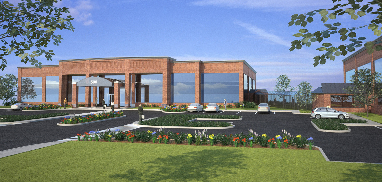
here's the latest...

-
Very good. Bravo.
-
Top notch, its come on leaps and bounds since you first posted. Good stuff, what renderer do you use?
-
yeah, little bit of a progression.... just didnt have the skill to totally get rid of that tile in the brick
 going to do one more update with a sky minus that big ass cloud....
this was done in Maxwell.. sky and reflections were added in post.
-
looks very good marked. My only comment would have been on the sky and it sounds like you're taking care of that

Good job on the reflections too!
-Brodie
-
ONE more time.... haha.

-
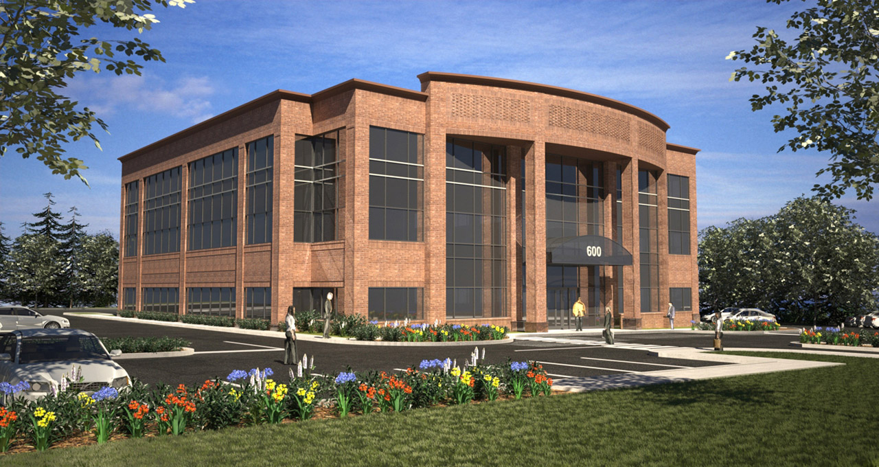
this doesnt really deserve its own thread, so i'll stick it in here. here's another image of another building in this development...

-
good job Marked, I like the glass better in this one, maybe it's the mullions. Some tree reflections might help a bit imho but overall nice work.
Is this the building to the immediate right of your previous building?
-brodie
-
i initially had an HDRI with trees that was reflecting...but the sky was too dark...now that i'm typing this..i guess i could've used that one for reflection and the other for background..whoops...haha... i like the way this one came out way better than the first though...for some reason..
no, that one is already built...this is across the street, i think...
-
Already built? you guys are fast!
I don't know if this had anything to do w/ your sky issue but I find that I typically have to crank the Intensity of the HDRI image up to like 10-15 in Maxwell to get a nice bright day. I bought the HDRI pack from dosch (well, I had the company do it
 ) about a month ago and am really liking it so far. It's got the HDRI at various resolutions that I throw into the appropriate slots, then it's also got like 30 flat images of the same scene that can be used to photoshop in as a background (you could also use the 12,000 pixel HDRI in the background slot but it seems to bog things down.
I agree that this one looks better than the previous one. It seems a lot...fuller, or maybe richer? More trees in the background, more going on, nice composition, closer to the building, more dynamic shadows, etc. If your job is anything like mine I suspect many of the issues with your last one were due to restrictions put on you rather than any lack of skill on your part. Some buildings just seem to lend themselves better to coming out favorably despite the restrictions (show the whole building, show the site, don't let the windows on the bottom that are reflecting ground be darker than the ones reflecting the sky, make the flowers brighter, make the sky like this, etc).
-Brodie
-
haha.. no no, the building to the right of the first rendered building is an existing building... i dont work in this office...so i dont really know what's going on.. but yeah, architects are definitely annoying to work with

Hello! It looks like you're interested in this conversation, but you don't have an account yet.
Getting fed up of having to scroll through the same posts each visit? When you register for an account, you'll always come back to exactly where you were before, and choose to be notified of new replies (either via email, or push notification). You'll also be able to save bookmarks and upvote posts to show your appreciation to other community members.
With your input, this post could be even better 💗
Register LoginAdvertisement


