sketchucation logo sketchucation
    • Login
    Oops, your profile's looking a bit empty! To help us tailor your experience, please fill in key details like your SketchUp version, skill level, operating system, and more. Update and save your info on your profile page today!
    πŸ«› Lightbeans Update | Metallic and Roughness auto-applied in SketchUp 2025+ Download

    Building

    Scheduled Pinned Locked Moved Gallery
    9 Posts 6 Posters 615 Views 6 Watching
    Loading More Posts
    • Oldest to Newest
    • Newest to Oldest
    • Most Votes
    Reply
    • Reply as topic
    Log in to reply
    This topic has been deleted. Only users with topic management privileges can see it.
    • S Offline
      sanzoo
      last edited by

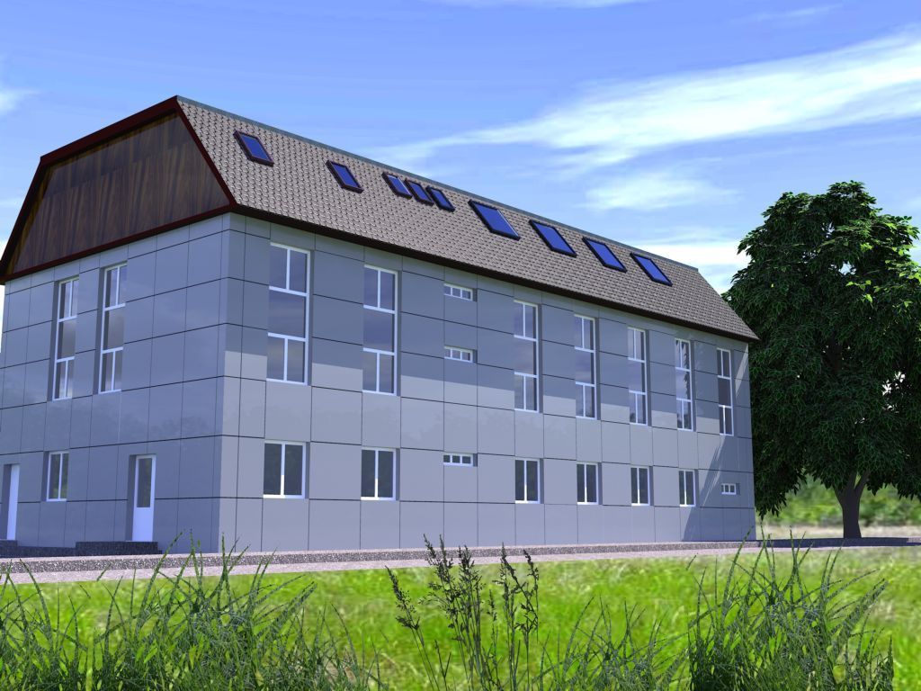
      this is my first renderer in kerkythea

      1 Reply Last reply Reply Quote 0
      • boofredlayB Offline
        boofredlay
        last edited by

        Welcome sanzoo. Nice image.

        http://www.coroflot.com/boofredlay

        1 Reply Last reply Reply Quote 0
        • K Offline
          kevsterman
          last edited by

          Yes welcome sanzoo.

          Good image. The roof texture is tiling a bit but I really like the grass at the bottom.

          "Avoid keeping more than 3 items on your desk that you can't fit into your mouth."

          1 Reply Last reply Reply Quote 0
          • R Offline
            remus
            last edited by

            Personally i think the grass would be a bit better if you matched the colours a little more closely. A few more trees in the background would be good, as well.

            Overall a very good image though πŸ‘

            http://remusrendering.wordpress.com/

            1 Reply Last reply Reply Quote 0
            • brodieB Offline
              brodie
              last edited by

              Looks pretty good. What kind of building is it? Reminds be a bit of the AEG building by Behrens in Berlin.

              -Brodie

              steelblue http://www.steelbluellc.com

              1 Reply Last reply Reply Quote 0
              • boofredlayB Offline
                boofredlay
                last edited by

                @remus said:

                Personally i think the grass would be a bit better if you matched the colours a little more closely. A few more trees in the background would be good, as well.

                Overall a very good image though πŸ‘

                Hmmm, it does seem that the grass is greener on the other side πŸ˜„

                http://www.coroflot.com/boofredlay

                1 Reply Last reply Reply Quote 0
                • DanielD Offline
                  Daniel
                  last edited by

                  Very nice, sanzoo. You need to adjust your composition so the building isn't clipped on the left.

                  My avatar is an anachronism.

                  1 Reply Last reply Reply Quote 0
                  • S Offline
                    sanzoo
                    last edited by

                    Thanks for all comments my friends, I try make more adjusting . Apologize for my bad English.

                    1 Reply Last reply Reply Quote 0
                    • R Offline
                      remus
                      last edited by

                      no need to apologise, your english could be a lot worse.

                      http://remusrendering.wordpress.com/

                      1 Reply Last reply Reply Quote 0
                      • 1 / 1
                      • First post
                        Last post
                      Buy SketchPlus
                      Buy SUbD
                      Buy WrapR
                      Buy eBook
                      Buy Modelur
                      Buy Vertex Tools
                      Buy SketchCuisine
                      Buy FormFonts

                      Advertisement