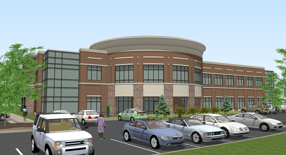
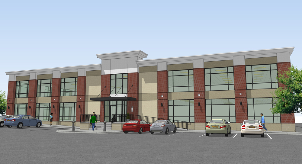
Office space...
-
Here are a couple of recent projects... what'cha think? I also wanted to thank Tom for the tree you see in the first pic, can't wait to see the whole pack!


-
David, since I don't see any handicap parking spaces, I guess I will have to bitch about something else. In my considerably overblown opinion, I think the two photorealistic fir trees in the first image do not match the rest of the composition style-wise.
-
Nice, veggies are the hardest for me. I like the people and cars, what was your source?
-
In the second image there needs to be some people and furniture inside the building.
I also don't think the realistic trees fit with the scene.
Other than that, good work.
-
Nice. Those would fit right in my neighborhood.
-
Good work bubba. You always seem to have a way to make the best of the basics in SU without using a rendering engine. I love seeing that.
-
@unknownuser said:
David, since I don't see any handicap parking spaces, I guess I will have to bitch about something else.
I'm not finished with either rendering so I will add these when they're updated.@unknownuser said:
I think the two photorealistic fir trees in the first image do not match the rest of the composition style-wise.
I don't think these trees look photorealistic in my opinion. I will probably be rendering these in Kerkythea anyways...@unknownuser said:
I like the people and cars, what was your source?
FormFonts@unknownuser said:
In the second image there needs to be some people and furniture inside the building.
I will definitely be adding some interior entourage as I'm doing a night and day rendering. I just gave them this so they could look over the design before moving forward!Thanks everyone for the comments and suggestions...
-
add some depth/contrast/richness w/ some photoshop tweaks... and get a better glass material for SU and these will be very nice.
-
It would be great to see some renders of this model, I think I see something of your work with kerkythea, or at least add elements with photoshop (as I said) maybe the sky, vegetation and things like that.
-
I personally wouldn't tilt the camera up when composing a pretty straightforward shot of a 2-storey bldg. A 2-point persperctive would be nicer IMHO.
Hello! It looks like you're interested in this conversation, but you don't have an account yet.
Getting fed up of having to scroll through the same posts each visit? When you register for an account, you'll always come back to exactly where you were before, and choose to be notified of new replies (either via email, or push notification). You'll also be able to save bookmarks and upvote posts to show your appreciation to other community members.
With your input, this post could be even better 💗
Register LoginAdvertisement


