{ Southwestern Home
-
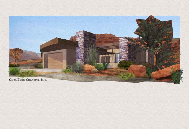
Here is a piece from a project of 26 renderings. It was one of my favorites because I liked the drama of the perspective. I revised it replacing the background from the original which required showing the majestic views of the area.


-
classy! i do love how you compose your images and how you mix the colors.
The revised work looks much better; the original background is very dramatic, but the perspective looks wrong.
-
I really like the first one and the overall composition is nicely done.
The second one looks a bit off to me. I am not sure if it is the background or the perspective of the background is not matching your camera angle but it give a weird feeling to the image.
I love the matte and the vegetation coming off onto the border, unique.
Scott
-
wow..yeah, the revised background is sooo much better. i'm with scott, that original background just doesnt match the perspective or something.
but either way, beautiful work.
-
Looks great Tina! Is that home being built in Kayenta? Over the holidays I watercolored Red Mountain. Once I get it scanned I'll use it as my avatar so you sen see it. I think that is such beautiful country!
Chris
-
So very nice as always. Revised perspective much better, I'm agreeing with everyone else that there is something wrong with the perspective on the second one. I really like the texture you have going.
-
Hi Tina.
Lovely work as always. Hope you'll forgive me - I've 'butchered' the second image - the horizon lines in your background and foreground images were different. I've lined them up -very roughly and badly

Regardless, outstanding work, and I trust your client was delighted.
best,
Andy
-
Thanks for the comments guys. I get what your saying about the background and perspective of the building. There was always something that I couldn't put my finger on.
Andy, believe it or not that house sits right up against that hill. I looked through my stash of pictures to post but I couldn't find the one that showed how it sat right at the foot of the red hill. I could only find the shot of the back. Maybe I didn't actually take one from the perspective I used....

Hello! It looks like you're interested in this conversation, but you don't have an account yet.
Getting fed up of having to scroll through the same posts each visit? When you register for an account, you'll always come back to exactly where you were before, and choose to be notified of new replies (either via email, or push notification). You'll also be able to save bookmarks and upvote posts to show your appreciation to other community members.
With your input, this post could be even better 💗
Register Login


Advertisement