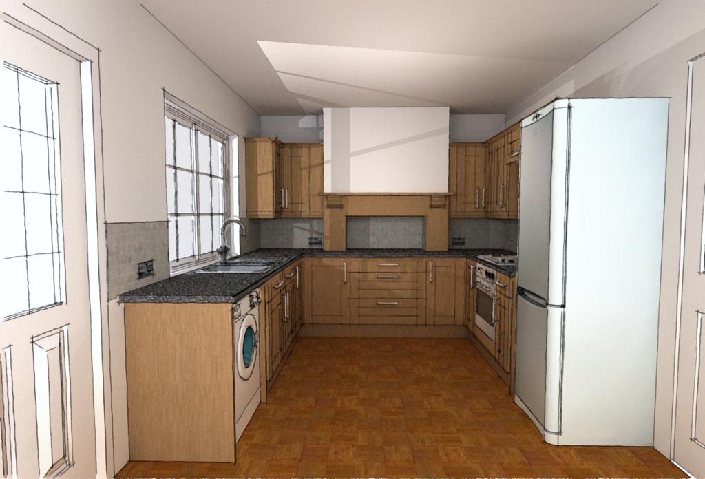
Kitchen redesign
-
This is the design I've done to replace my dad's old kitchen. It was rendered in Podium and then was overlaid with sketchy edge linework.

-
It needs something outside of the windows. Other than that, I quite like it.
-
And maybe some refrigerator magnets. Nice work.
-
Nice render with architectural character. The parquet wood floor would be a problem for me; I am a messy cook, and am always splashing water on the floor

-
Nice rendering, Kevin. I'd add some "stuff" like you'd find in your average kitchen, to make it personable.
-
Nice one Kevin.
-
I like it too, Kevin: nice comfortable feel to the image.
-
@kevsterman said:
It was rendered in Podium and then was overlaid with sketchy edge linework.
This is great style tip Kevin

-
Thanks for your comments guys.
I've got the kitchen bug now and I'm working on 3 different kitchen models at the same time. Will post some images when I have some.
-
I love it!
It's a great style and effect you have created with the overlay
-
wow...its very nice touch..seem like manual drawing..i like it

-
nice work kevin
mike d
-
Dear Kevin,
Do you draw your kitchen units and appliances from scratch, or do you have access to a library of UK/EU kitchen units and equipment?
Regards,
Bob -
Bob
I got all the units from FormFonts which are all to standard UK sizes. I probably got the appliances from the same place tho I can't remember for sure. It was either there or the 3D Warehouse.
-
Great image. That's a style I'd like to try. Sounds like it is not too time consuming.
If you can fix something, I'd say the muntins on the left hand door might be modeled more, as they are close to the camera. I have done tapered muntins in doors and I know the line work becomes too dense--if you are using lines. So I've smoothed the outer lines and it works out pretty well. Is that an undercounter clothes washer / dryer?
Is there enough room to add a short wing wall by the refrigerator? Anything that hides the side or the view to the back side is nice, I think. Some builders recess the rear of the unit into the wall, which also sets the front better in relation to the counter, in the deeper models. It looks like the door is too close for a wall.
What is the element straight ahead? it looks like a range hood but I see the range is on the right.
Hello! It looks like you're interested in this conversation, but you don't have an account yet.
Getting fed up of having to scroll through the same posts each visit? When you register for an account, you'll always come back to exactly where you were before, and choose to be notified of new replies (either via email, or push notification). You'll also be able to save bookmarks and upvote posts to show your appreciation to other community members.
With your input, this post could be even better 💗
Register LoginAdvertisement


