Office Building - Variations on a theme!
-
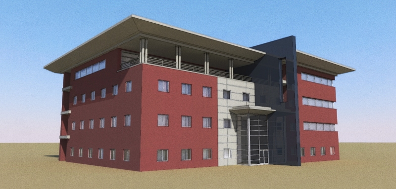
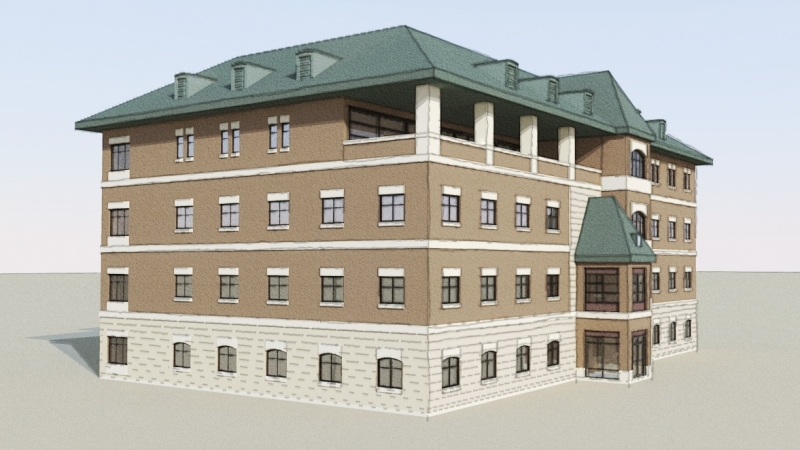
Two schematic images for a client to select a design direction for their corporate headquarters. Not my designs - just the modeling & rendering work. One contemporary, and one more traditional looking. Mixed SU output and Kerky renders - looking for some feedback on the "presentation style" of the images. Designer specifically asked for no site context at this stage.
Bytor


-
I like the first one better for view angle. In the second picture something bothers me about seeing too much blank space beyond the building and having the building feel so "forward" in the picture.
I like the second one for context colors.
the first building looks like it is sinking in the ground. Is there no base detail to the wall to define it better?
The colors are probably important to you, and they look great. But a monochrome presentation might be easier to take with zero context.
Great models.
-
Great modelling man! Congratulation.
Hello! It looks like you're interested in this conversation, but you don't have an account yet.
Getting fed up of having to scroll through the same posts each visit? When you register for an account, you'll always come back to exactly where you were before, and choose to be notified of new replies (either via email, or push notification). You'll also be able to save bookmarks and upvote posts to show your appreciation to other community members.
With your input, this post could be even better 💗
Register LoginAdvertisement


