Tri-Library
-
This project is not as finished as I would like it to be. However, I presented it and now want to move on. (still... I would appreciate all comments about renderings and design)
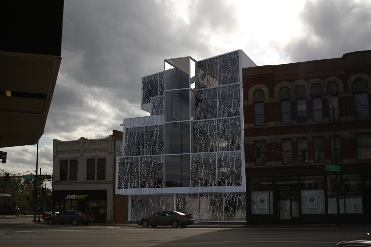
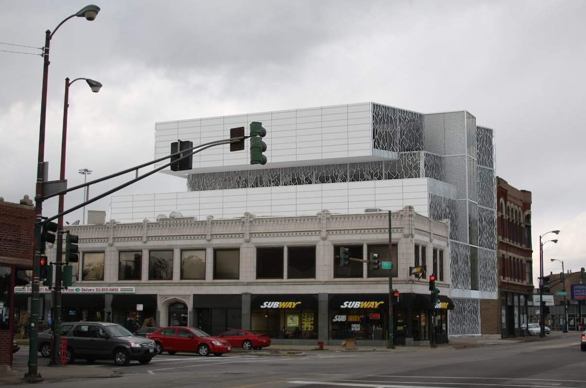
The site is located in Chicago, IL at the intersection of Milwaukee Ave. and Chicago Ave. This is my take on the design of a 21st Century library that could be built on this site.
-
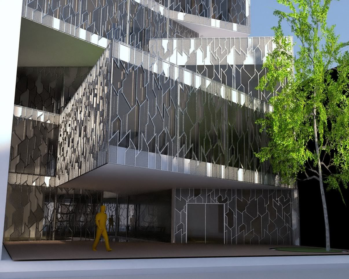
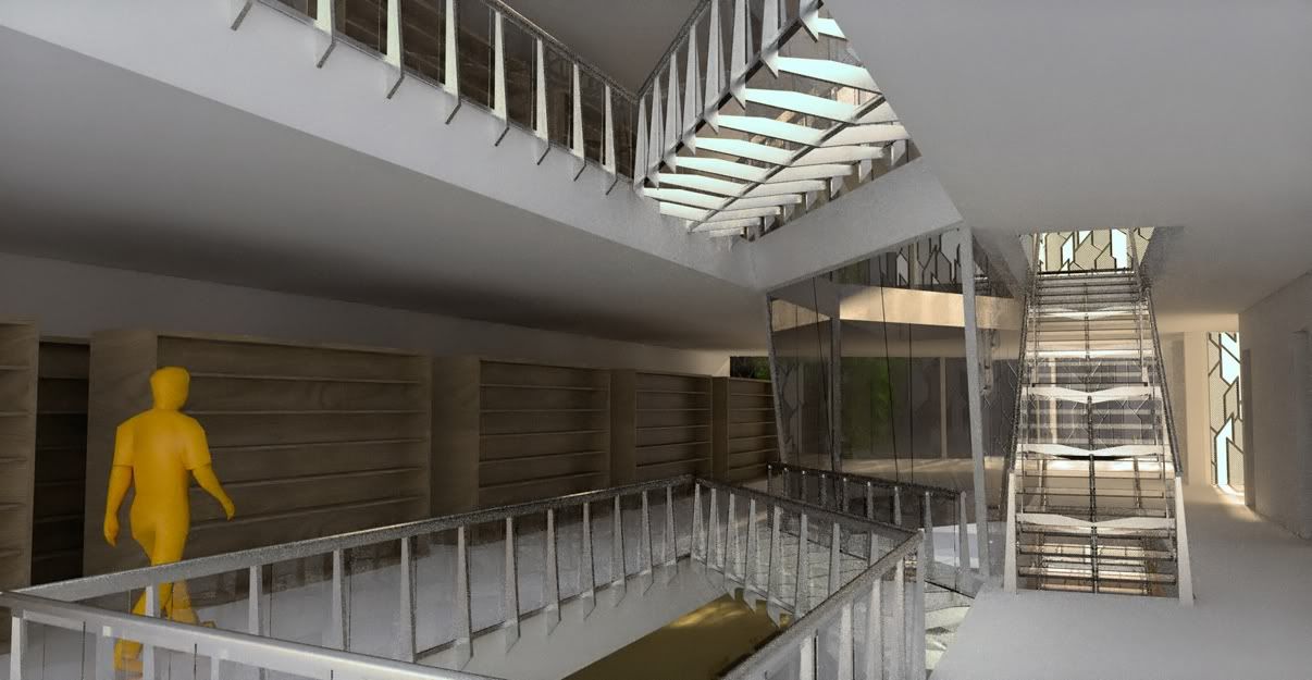
Your photomontages look great. On the others, I'd lose the yellow man; he looks odd in a photorealistic rendering. In the third image, the paving in front of the door is floating above the sidewalk. Also, if your going to show the interior with the stacks, IMHO I think you should show some books on the shelves; I think you should always show a building how it is used, not as an empty vessel. If you are going to use wooden shelves, those are too long (without intermediate supposts). I think you will find most librarians would prefer open shelves they can see through (a co-worker used to work in a library, and you might be surprised what goes on in them. Areas they cannot see are a security concern).
Before commenting on the design, can you tell us something about it?
-
hi Blugarero
I like the decorative facades you've done to your building but i also think that it could be take one step further like how they influence the interior, structure and so on of the rest of the bulding instead of beeing just decorative.
For the images the weakest points are really the yellow doll you've put in the renders (it just don't relate to the building or any of the other images presentation) and the book shelves (for a modern looking building like yours using sheelves like that it doesn't seem to work).
By the way what render did you use?
nice work
David
-
I agree with anyone else - why a yellow figure? A black or grey figure would have looked much better.
Otherwise, fantastic renderings!
-
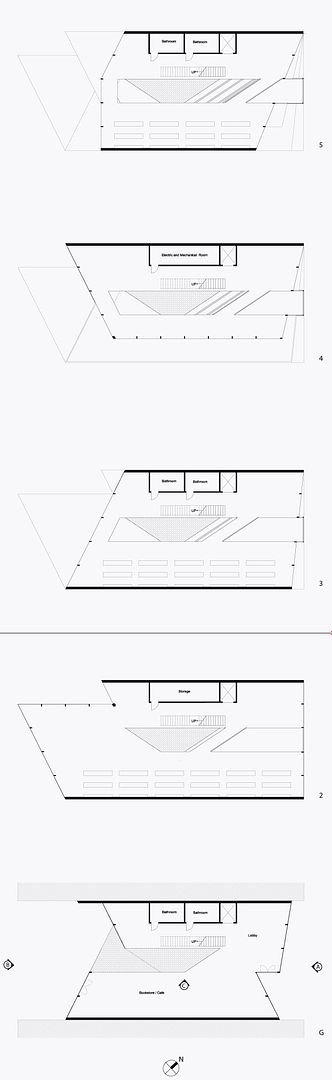
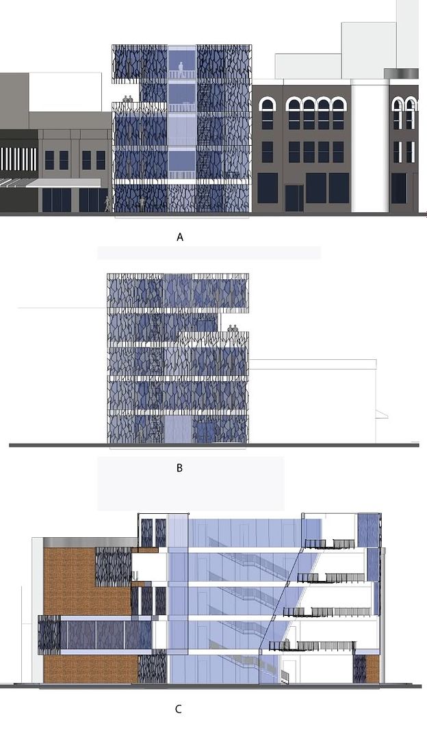
I agree with everything that you said. The interior does not have the correct fixtures and furniture; they are generic... (didn't have time to focus) I mostly worked on the massing and how it relates to the site. The site has three streets that intersect each other and form an island in the shape of a triangle right in front of the library. I wanted to use this geometry and express it in my library. The front facade has a more subtle movement, while the rear facade is more extravagant. (3rd image is rear façade) The entire library is divided into 3 parts and the middle there is an opened atrium and a outside space (which has a reflective pool of water at the bottom of it). I'll post floor plans and sections and elevations.
@DacaD
The decorative screens connect the front façade with the rear façade. The screen in the front is never filled with perforated sheet metal, while for the rear façade the screen is randomly filled with this perforated sheet metal. However, I really like the idea of how the screen could influence the interior. If the interior would have been more developed, then the screen would be filled accordingly to what function occurs in that space.
I used Kerkythea for rendering.@kwick7
Yep… I could have used clips of real people…@all
Thank you very much for the constructive comments. I am a beginner, at designing (second yr) and this is my second project where I had to design such a building.
Again Thanks. -
I really like these, looks very realistic except for mr simpson

Hello! It looks like you're interested in this conversation, but you don't have an account yet.
Getting fed up of having to scroll through the same posts each visit? When you register for an account, you'll always come back to exactly where you were before, and choose to be notified of new replies (either via email, or push notification). You'll also be able to save bookmarks and upvote posts to show your appreciation to other community members.
With your input, this post could be even better 💗
Register Login


Advertisement