Stuff Topic (Once "My Projects and W.I.P.s")
-
oh i've already had some.
Pav
-
Kevin,
Obviously you're a bit young to understand, but contrary to what you might think, having a high post count won't win friends here if most of the posts are just one word or a smiley, in fact it has had exactly the opposite effect. Likewise, the SCF community tends to be more impressed by intelligence, honesty and generosity than claims of maturity or wealth, so pretending to be someone you're not only makes people angry.
My advice would be to edit your profile to reflect your true age and interests, or just leave it blank. Then concentrate on reading and understanding people's posts and deciding if you can actually offer helpful advice (suggesting someone "try reading the help file" doesn't count) before you reply. Most people spend weeks, months or even years simply reading other people's topics and posts before starting to post themselves and this has created a very healthy community of contributers as well as an extremely useful forum for people working (or playing) with SketchUp. Hundreds of posts with just one word or a smiley make the SCF forums much less useful and enjoyable to visit for everyone, young and old. If you posted less often and with more thought you will find people here will be much friendlier and patient, just as we have been to many of our other younger members.
As a gesture of goodwill here's a component for your car Kevin.
Regards,
-
jackson, thank you for your clarity, and honesty in the previous post.
i think it is just the ticket.Pav
-
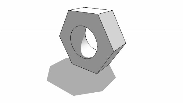
Nice nut jackson.

-
@pav_3j said:
jackson, thank you for your clarity, and honesty in the previous post.
i think it is just the ticket.Pav
I agree.
Jackson did a far better job than I did.
-
uhh idk what im going to use it for but what the heck.
-
wtf?
when i try to download it it comes out as a PHP wtf? -
its the fact that this post was made in 3dwh (yes that is possible)
-
My last contribution, this is addictive.

-
@kdsdesign said:
uhh idk what im going to use it for but what the heck.
It's just a gesture of good will, young man. Accept it graciously, and take Jackson's recommendations to heart.

-
wait what?
btw-anyone got a good company name? something in german? i cant think of anything. -
[EDIT] Mein Esel ist tot.
sums up this thread excellently.
may i ask why?
Pav
-
wait the name? i need one
-
Uhmmm ... Designjugend? PushPullStaffel? Vorsprung durch Clickclick?
-
i thought of Comodità.
good? -
what is it for i'm confused.
Pav
-
That'd be Italian, no?
In any case, I don't do any copywriting for free. You owe me $ 800. Tax and tip not included.
-
I've worked hard to get ober 600 posts, that are largely responses to people needing help, or sincere questions. Once in a while I'll post here in the Corner bar on completely non-SU-related topics just for fun. But its taken me well over a year to get my post count to where it is and full of real posts.
Kevin now has 200 in just under 3 weeks. 154 in the corner bar, and 92 in this thread alone.
I wish you'd leave our recipe sharing thread alone now and go post your work, edge by edge, somewhere else.

Chris
-
Chris,
Posting just ..?..or
is a sure way to get your post count up. 
And Kevin.....youve been acting like a brat......I really hope you had a good look at Jackson's post. He quite clearly laid out what is expected here.
If you dont take this advice onboard and continue acting as you have, I would guess that you time here is going to be pretty short
-
im not fibing stu... seriosly...... are your posts to anoy me?
Hello! It looks like you're interested in this conversation, but you don't have an account yet.
Getting fed up of having to scroll through the same posts each visit? When you register for an account, you'll always come back to exactly where you were before, and choose to be notified of new replies (either via email, or push notification). You'll also be able to save bookmarks and upvote posts to show your appreciation to other community members.
With your input, this post could be even better 💗
Register Login


Advertisement