Overly dark renders, and etcetera
-
@remus said:
Cool stuff BTM.
Do you model for a game mod?
No... Fun.

...although, I have thought about purchasing the Unity game engine. -
long time since my last post here...
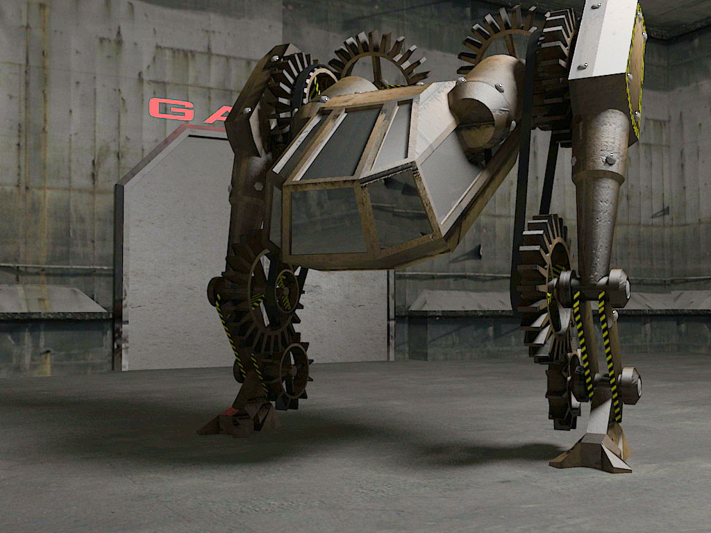
Old and new renders, and a WIP.
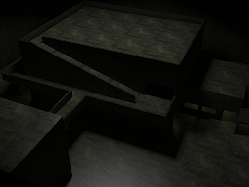
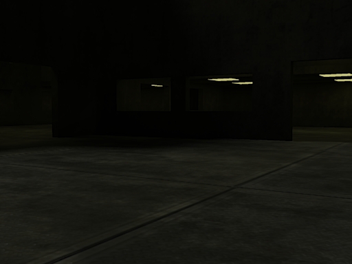
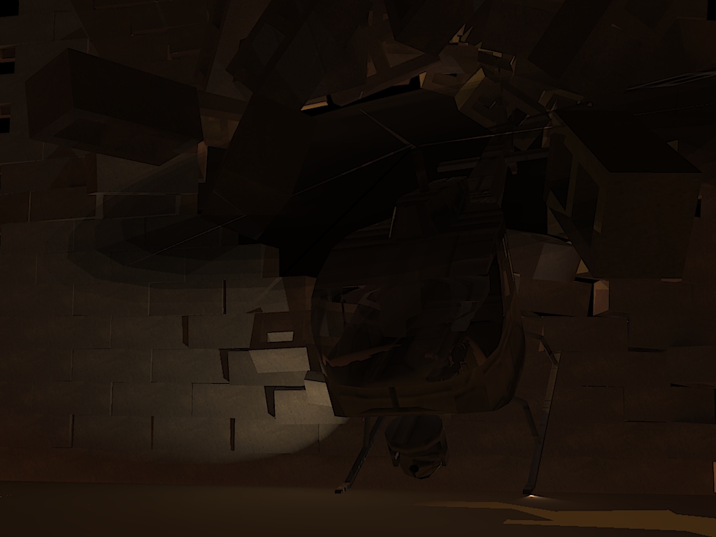
-–—-–—-–—-–—-–—-–—-–—-–—-–—-–—-–—-–Note; Images are dark, if your display is dark, you may have a hard time seeing them.

-–—-–—-–—-–—-–—-–—-–—-–—-–—-–—-–—-–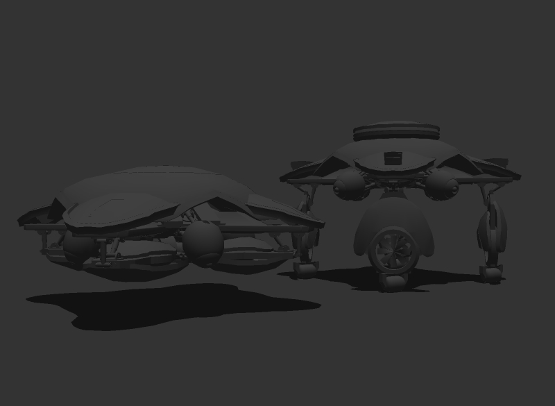
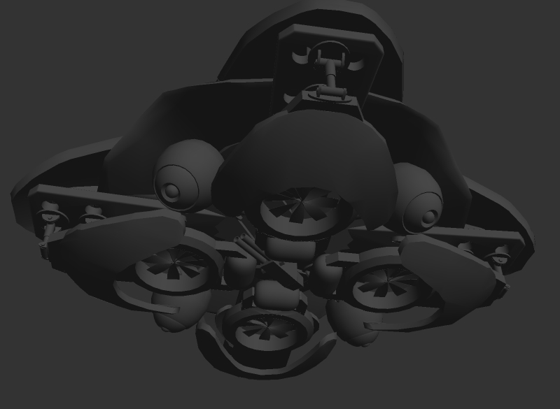
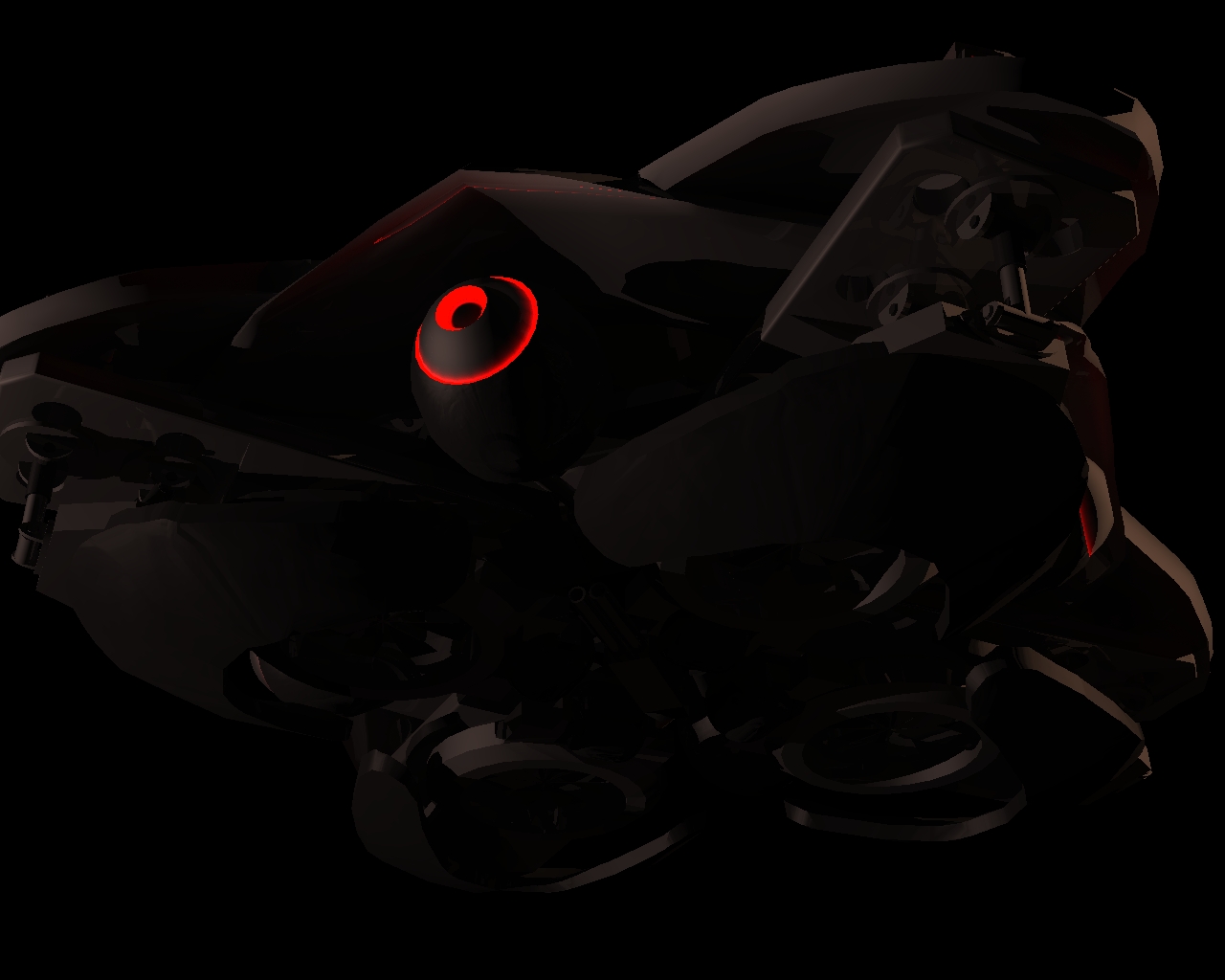
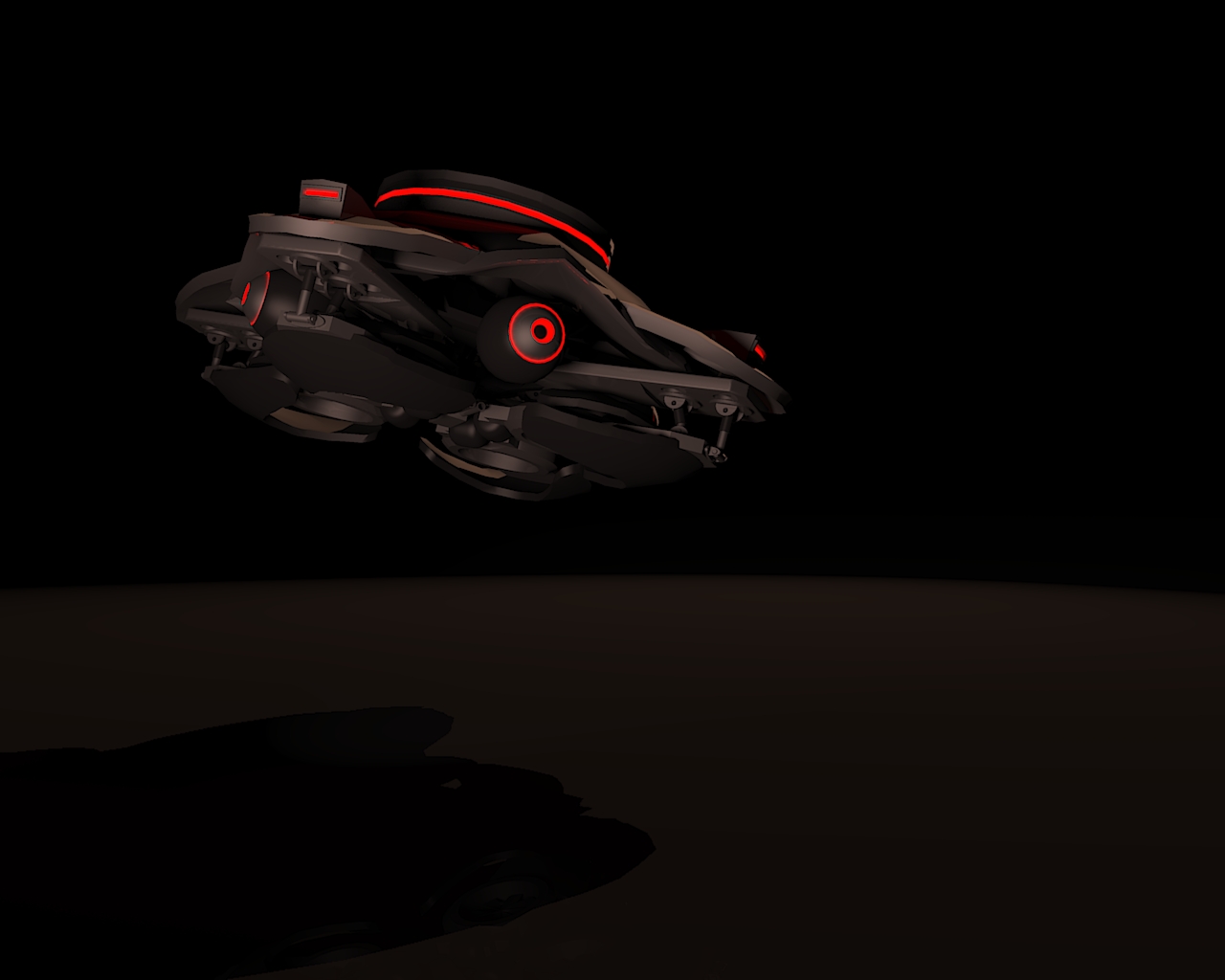
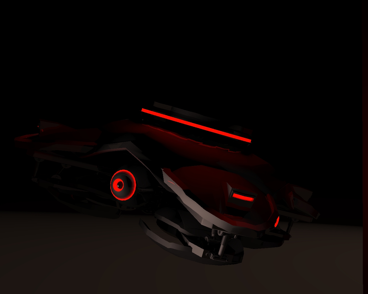
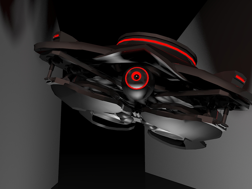
I will probably change the legs so it walks, replace the hydraulics with joints, add upper leg, and and take out the wheels. also, add some details to the shell.
Haven't bothered to render current progress, just trying to see what setting it appears best in.Any advice, opinions or ideas would be appreciated. Especially if you have ideas for joints.

-
More stuff, including old/ new renders, and progress i did on that robot thing. Forgot about it for a while.

Oh, and a sketchyphysics game: http://sketchup.google.com:80/3dwarehouse/download?mid=bfd21efedcc2b867ffa95f224611fcb6&rtyp=s7&fn=HELI+attack2&ctyp=sm&ts=1238807705000
You fly a helicopter.
A/D=turn
W/S=thrust
left/right=roll
up/down=tilt (forwards, backwards)
R/F=tilt gun (can't see, unless shooting)
spacebar=shoot
Other than that, the game should be self explanatory.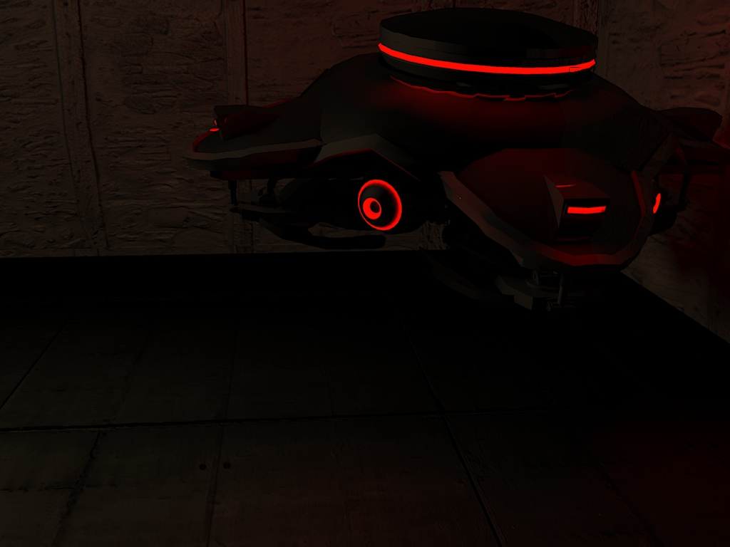
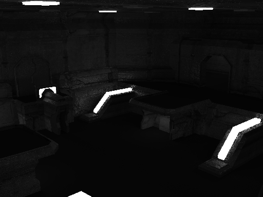
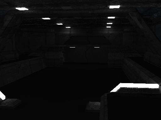
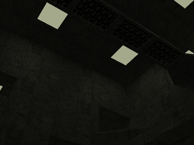
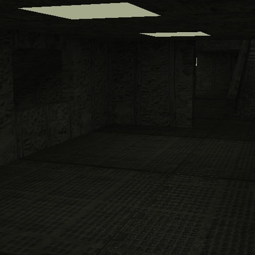
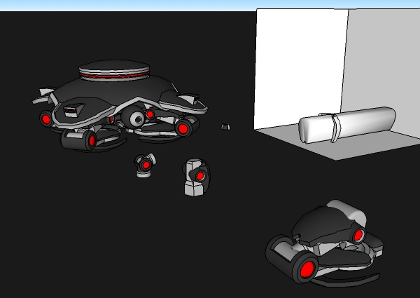
...As you can see, It's possible to save bandwidth (that's what it's called, right?) by hosting models/ examples on the 3D warehouse, than adding the download link. I just figured that out a little while ago.
 -
Hi BTM,
From what I can see, those look great, but damn, I have my LCD set to max brightness and most of your images are still too dark to see.
-
Another vote for turning down your monitors brightness, no point hiding those beautiful models behind a veil of darkness

-
nice model! and a lot better lighting.
-
Renders of speed-modeling entry:
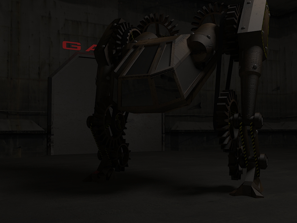
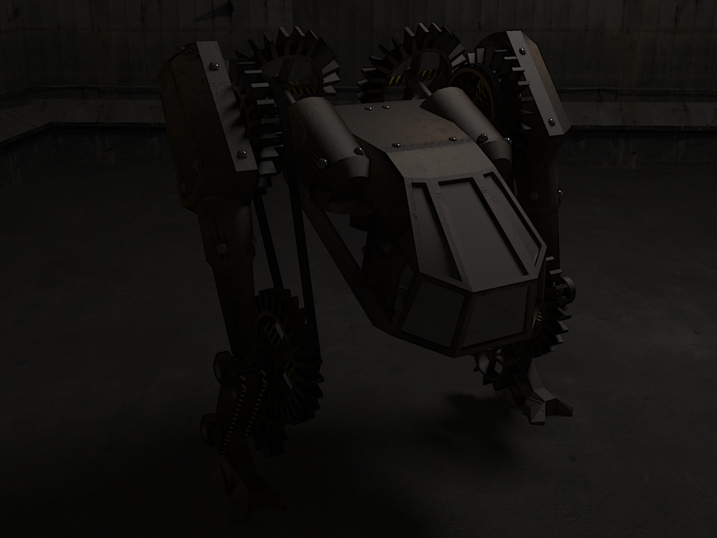
... Probably too dark again. I've gotta turn down my monitor's brightness for renders or something.
Also: How is this thread still only on one page? Look at the scroll bar!
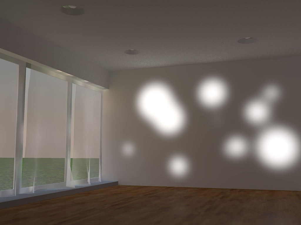
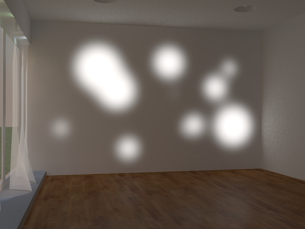
Here's a less dark render. Any better/worse?
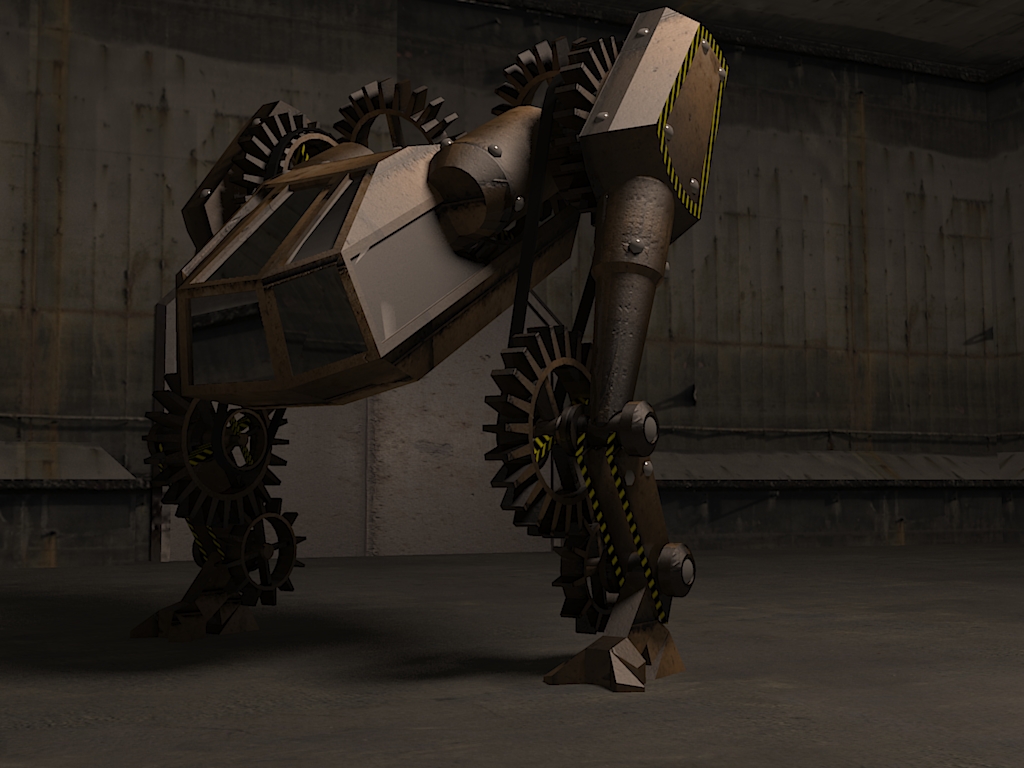
-
I tried to make a non-dark render. Any better/worse? (also updated last post to tell difference)


-
i concur much better lighting on the second one

-
Oh wow, much better! The second one looks great!
-
I sure hope you don't mind...
Just took your first render through a quick tonemapping adjustment in Adobe Lightroom...Not sure if your screen is adjusted to some games or alike, but they seem really dark...
Next time you render, you should try and increase the exposure settings a bit...
-
Thanks for the advice

I was going for a bit of a nighttime look in the first 2 renders, and although they aren't too dark for me, I did intend them to be a bit dark. My 3rd one looks more like someone just turned the lights on.Frederick:
 . Also, how do I use volume lighting to create god's fingers without slowing my render down to 1% for 10 minutes?
(I use KT) -
Great renders.
However, let me quote a line from those pesky Competition rules
@unknownuser said:
-Sketchup output only (and as much as i know you love rendering your models, it would be appreciated if you could hold of posting them in the gallery until after the comp.)
-
Oh, I didn't notice that... but it's not in the comp section... so we can't even post them in the gallery?
-
@unknownuser said:
Frederick:
 . Also, how do I use volume lighting to create god's fingers without slowing my render down to 1% for 10 minutes?
(I use KT)Volume lightning and soft shadows is a bad mix...

Which also makes sence, since KT is a GI render application...
Only use one of them at a time... Never together...
click Settings > Scene...
You'll now see a window with 3 tabs... (Lights, Cameras and Global Settings)
Select the Global Settings tab...
In the Ambient & Volume Lightning field, you need to check that Volume Lightning is ticked...
In the Global Fog field you just need to adjust the Scatter settings... (you may start with .05 or .1)You can find a small scene here, which you can use to play with...

Please note!
 Volume lightning will increase your render time significantly...
If you don't like longer render times, you can make Gods Ray in post pro...
-
@unknownuser said:
Oh, I didn't notice that... but it's not in the comp section... so we can't even post them in the gallery?
Correct.
-
so...do I remove them untill after the comp???
-
That is up to remus.
-
I think leave them in place this time. I'm too lazy to copy them all and put them back in after the comp

Please dont do it again, though. If i'm in a bad mood theres a good chance i'll just delete the offending posts.
-
i like the dark style but think its maybe a little too much, maybe some more lites too add more life to the renders, but good job!! i like them

Hello! It looks like you're interested in this conversation, but you don't have an account yet.
Getting fed up of having to scroll through the same posts each visit? When you register for an account, you'll always come back to exactly where you were before, and choose to be notified of new replies (either via email, or push notification). You'll also be able to save bookmarks and upvote posts to show your appreciation to other community members.
With your input, this post could be even better 💗
Register LoginAdvertisement


