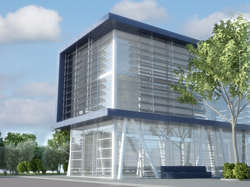
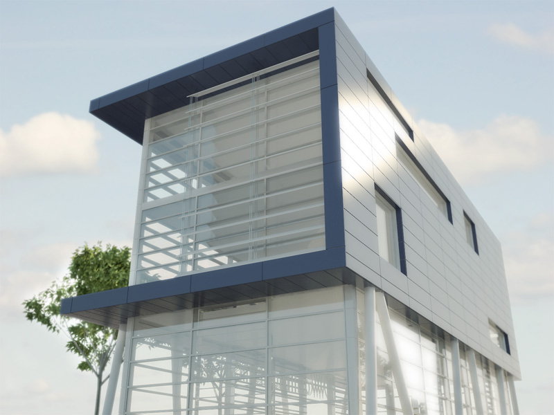
DUTCH office complex
-
This is an fictional office complex I designt to test my skills...
I would like to know what you all think about it, all C&C are welcome.| http://www.dwanimations.org | Dirk de Jongh |


-
Great looking images, well done.

-
Looks geat, Dirk. The only thing missing are some people or other scale references.
-
excellent work! I like the way your website works as well.
what's your favorite rendering engine? -
I would add some people(oh no my shiny perfect world invaded!
 ) to get a sense of scale. If that is a two story house, there really isn't a lot of floor space. Very nice and smooth picture otherwise.
 -
Those are fantastic renders and a great detailed model
What rendering app did you use?
OMG!! I navigated to your site ... I dunno if I want to cry or worship you.


I am inspired to reach your level, thanks for sharing and setting the bar a little higher for me.
-

Beautiful work, beautiful website
-
Good stuff, i like the architecture as well.
-
wow...
people thanks for the replays,
I will work on the people in my renders, Do you all think the tree`s look ok?solo and linea thank you for all the compliments about my site, glad you like
d it. Id just started my one small company, so thats ware the site is for. I only need a client now unfortunately thats not so easy.
I will post more renders when I am able to render the interior.
My render engine is Maxwell and Vray -
Dirkkkk,
I had a look at Your site and those top interior presentations are one of the best
I have ever seen, they are just amazing.
@unknownuser said:
I`d just started my one small company, so thats ware the site is for. I only need a client now
 unfortunately thats not so easy.
You are so right here . From My own experience I can tell You that it took me Years to get some good regular clients maybe 5-6 of them that pay 80% of my bills. So its a big world out there but they are not exactly hurling in.
-
Well done, Dirk
Success !
BertB -
@solo said:
I dunno if I want to cry or worship you.
The first option would be best, as our friend here, if memory serves me right (correct me if I'm wrong, Dirk), is about ... twenty.

Great stuff indeed!
Dirk, it would probably be a good idea if you let an editor take a look at the text on your site, just so everything is right up there on the same high level.
-
Lot of great work you got going. Best of luck with your company. I am curious about the vegetation you used in a lot of your images, any insight into that?
-

 This is SU? I can't believe it! The furniture models, did you make them or imported from Max?


-
Hey Dirk,
Alles goed? Heb je misschien nog tips voor beginnende ondernemers op dit gebied. Wil graag een eigen ontwerp studio opzetten. Ben zelf veel aan het renderen en een vriend van me is zeer sterk in het ontwerpen.
Groeten uit Limburg
-
great technique, very nice clean images Dirk...well done
....i prefer images without people and cars...the best architectural photographs rarely ever show people in them (strange though, when i think that the purpose of the building is for humans...)but they look much better without them...
....it's all about the architecture...!!....and you have achieved that...!!
Cheers,
Gareth
-
@unknownuser said:
........
I would like to know what you all think about it, all C&C are welcome.Hi Dirkkkk,
C&C not only restricted to those two nice renders, I hope.
Your site looks great, the way you set it up. And so do the renders.
However, there is something wrong with some of them that you do need to take care of.
Shaddows from vertical objects (like window frames) on horizontal planes (floors) should be parallel if sunlight is involved. In some renders it's obvious that the light source is to close to your model.
Take it as a minor hint, not as criticism.Looking forward to seeing more of your work!!
All the best with your young company (in Hollands glasstad).
Wo3Dan -
Thanks all for the VERY VERY VERY VERY VERY VERY nice comments
 ,
,Wo3Dan,
I do not know exactly what you mean whit the shadows...?pugz1983,
(in Dutch)Tips voor starters heb ik nog niet echt een nuttig atvies... ik ben zelf pas een maandje begonnen, en de markt is krap dat weet ik wel maar s6..
Gareth,
Tanks mate relay appreciate what you are saying.chango70,
Tanks for the commend, the most model`s I made my self an some are from the 3D warehouse.. -
@unknownuser said:
......
Wo3Dan, I do not know exactly what you mean whit the shadows...?
........
Dirk,What I mean is that at least in some of the 'Plattegronden' the information you get from the geometry
contradicts what the shadows are telling about the model.....unless the light source is close.
With exaggerated FoV it would be more difficult to tell but in some 'almost' topviews where walls
left and right are sort of parallel on screen it becomes noticable.
Have a look at attached file (with basic geometry of one of your 'plattegronden').Wo3Dan
Hello! It looks like you're interested in this conversation, but you don't have an account yet.
Getting fed up of having to scroll through the same posts each visit? When you register for an account, you'll always come back to exactly where you were before, and choose to be notified of new replies (either via email, or push notification). You'll also be able to save bookmarks and upvote posts to show your appreciation to other community members.
With your input, this post could be even better 💗
Register LoginAdvertisement


